
Saul bass is a famous American Graphic Designer and artist. He was born May 8 1920, and is widely known for his successful simplistic designs and creations. Saul Bass has created many designs for films, logo's, posters and title sequences & has won many awards for his work.
 Throughout his 40 year career he has created many title sequences and logo's for famous companies and institutions such as The Bell System's logo in 1969 and AT&T's in 1983. He has also worked with people in the film industry such as Alfred Hitchcock and Otto Preminger.
Saul Bass is famous for his simple but successful work. He uses a very small range of colours, usually combined with silhouette to create his image. The small amount of colours he uses defines his style as very minimal regarding details. His simple designs broadcast his ability to create very powerful designs with such a simple style. Saul Bass's work has inspired many people and is a common style used to offer a fantastic look for even low budget films today.
Saul Bass Inspired Title Sequence
I like this title sequence as I feel the methods used to cut to each shot are very effective when combined with the simplistic style of Saul Bass. The clip often uses objects such as a boat or rock which combined with a camera track in or a pan movement, creates a very fluid transition from clip to clip. I am particularly interested in the font designs and how they sync together with the colours. I feel the font is effective in terms of standing out to the viewer when they appear.
Dark Cloud 2 - My chosen game
.jpg)
Dark Chronicle, or released as Dark Cloud 2 in North America is an action role-playing game released in 2002. The player controls 2 characters throughout the game: Monica, a girl from the future, and Max a boy from the past. The player moves through dungeons battling monsters and collecting items.
The games main antagonisy is Emperor Griffon who desires to destroy the present from deep in the past. The two protagonist travel the world and through time in an attempt to stop Griffon, and discover why he seeks to destory the world through time.
The Game is a sequel to it's previous game Dark Cloud and primarily revolves around similar story setting. In Dark Cloud 2 the only remaining city in the world that hasn't been wiped out of existence is Palm Brinks, where all it's residents are unaware that cities have been erased from existence. The story begins when Max is chased by Flotsom, who seeks Max's family ornament: his Atlamillia. Little does he know the Atlmallia lets it's user travel to the future.
The Player travels the world and through time, in an attempt to prevent Emperor Griffon from erasing existence, as well as restoring parts of the world that have been erased.
Saul Bass Typography Designs
Here I created a selection of different initial designs relating to the Saul Bass style. I used the Playstation 2 game Dark Cloud 2 as my chosen media product for this task. I found the task to be quite challenging at the beginning due to the adjusting to a specific style of work.

I began with something less developed and lesser Saul Bass to begin with to ease myself into the work. I attempted to create my first piece of typography; although this design is my least favourite design i feel it is core in regards to begin my developments. I had not been used to drawing text for a long time, so this task came across as a little unfamiliar to me.
From this I discovered that I need to go for a more bold approach to the title, rather than keeping each letter secluded from each other. In my next designs I will try to incooporate the Saul Bass style as well as making an improvement to my technique.

I took a more bolder approach to this design, as well as incorporating the Saul Bass style. I feel this design was a massive improvement from my first design as it has more boldness. The boldness in the design allows it to feel more intense on the eyes, unlike my previous design. I had issues with the "Cloud" in the title, specifically the "O". I hope that in my next designs I'll be able to create more fluidity to it.

With my next design my primary focus was ensuring the "Cloud" letters were more defined and intense. I feel that I have greatly improved upon this, by doing so I also took the opportunity to experiment with combining letters together, making them seem squished. However although my focus was on the "Cloud" I feel that the "Dark" wasn't as strong as my previous design. I will try to change up the style to fit more next time.

I attempted a new approach with this design and went for a more of a "spiky" effect. I achieved this by drawing the edges of the letters with more of a point rather than a straight square. I feel this design offers more uniqueness than my previous designs and is more suited to the word "Dark" as the pointed letters suggest a devilish theme. I found the number "2" a little more difficult to tackle, and will attempt to complete a design with it next time.

Following onwards from the pointy effect I was attempting, I decided to use the style a second time for this design, to see if I could improve it. I attempted to incorporate a "messy" feel into my designs by changing up the proportions slightly, unfortunately I feel this design is a little weaker to my previous design as some letters feel "squished" and don't really fit the style well. I also attempted to add the number "2" back into this design, but found it difficult to achieve the correct appearance for it.

My final design of Dark Cloud 2; also my favourite design, as I feel I finally achieved the correct porportions to fit the overall theme with the game. From combining everything I discoevred throughout my drawing practice I feel this design offers most potential. I posistioned the letters fairly close together to ensure they still have the intense, defined look. In addition I used the pointy technique, and applied it to the number 2, and feel it worked out well.
I also added in some shading to create a 3D effect - although not really Saul Bass style, i thought it was a fun experiment to see how it would look, I also added a cloud as an initial idea for my future work.
As I progressed my work became more obvious that it was Saul Bass inspired. I developed and improved on my skills in regards to creating artist inspired work, in addition to developing my typography skills.
Saul Bass Typography Digitalised
I found this task challenging as the approach i took to the pen tool was an approach i had never used before. I was experiencing issues in terms of accuracy with the pen and found it difficult to achieve the correct proportions. The Pen tool involves clicking from point to point to create a line. I feel this task greatly enhanced my Adobe Illustrator skills as i had never used the program before.

In regards to bringing my work into the digitalised world I have mixed opinions. Although I have used the pen tool before, I have never used it for this kind of task. As a result I found the initial task quite challenging to get the proportions right. I began working off my most favourite design of Dark Cloud 2, I used all the techniques I discovered from drawing, however I found it was much more difficult to achieve inside the computer.
Eventually I managed to create a design which somewhat resembles my favourite design, including adding the points to create a devilish look. Unfortunately my weakest point with this design was creating a defined look for the typography.

With this Image I attempted something a little different. I had looked up on similar text which could resemble the Saul Bass style and attempted to mirror the typography and create my own design. For the most part I am happy with the overall design, in most particular, the "Dark" part of the design.
I was able to develop new skills that I wouldn't have been able to develop without referring to some previously made fonts.

I also added colour which are references to the game - Purple. My weakest point with this design was the 2, it feels out of proportion compared to the other characters, perhaps the size was too large.

Taking a step backwards from my designs I referred to one of my previous paper designs and attempted to create it in the digital world to see how it would look. In my opinion the design feels very simple and fits the Saul Bass style well, however I feel that the "cloud" isn't as strong as it was in my previous designs. I also experimented with some more colour and feel that black and orange fit well for the theme of the game.

Saul Bass Related Fonts

I researched fonts on the web using sites such as Dafont.com and spent time discovering Saul Bass similar fonts. The research has broadened my knowledge to what the Saul Bass style is, and a more defined idea into how I can relate to Saul Bass in my designs.
During my research I discovered 16 fonts related to Saul Bass. From researching each individual font I would picture how the font may look as if it were combined with a silhouette image, and formed to create a design.
Dark cloud 2 - Brainstorm

I created a brainstorm of initial thoughts for Dark Cloud 2 and what the game has that can be related. The game is famous for it's Time Travel, Two Moons and weapon upgrades. The Brainstorm has offered me the opportunity to broadcast the relevant relations has inspired ideas for my development.
From creating this brainstorm I have realized that there is much more potential to the game, and what could be created from it. The brainstorm is a core part in the development as it's the trigger for the beginning of my storyboard.
Moodboard - Dark Cloud 2

The Moodboard was an opportunity for me to visualize the relations to Dark Cloud 2. By combining a bunch of images into a Moodboard I was able to develop a more broadened perspective of images that represent Dark Cloud 2 as a game, and what defines it's genre and story.
Dark Cloud 2 is famous for it's mass world of forests, towns, volcanos, oceans, castles and future setting. After creating the Brainstorm for ideas, I now have an understanding on how my ideas would look, in addition discovering potential designs for my future designs.
Dark cloud 2 30 second sketches - Saul Bass Style
I attempted to bring some ideas from my brainstorm and moodboard to life by creating Saul Bass styled drawings. To create this i decided to restrict myself to 30 seconds for each drawing to help myself not go overboard with details. Going overboard with details goes against the Saul Bass styled which I wanted to avoid.

This 30 second design were sketches of the Atlamillia's - a Time travelling object from Dark Cloud 2. There are two different Atlamillia's in the game, a red one which allows you to travel to the future, and a blue one which allows you to travel to the past. I found the designs difficult to begin as I feel my weak point is drawing circles, however with the restriction of time, I managed to create some successful designs.

The next 30 second Designs I attempted to draw was a sword. This was an extremely challenging task as I was always tempted to spend more time on details rather than establishing the actual drawing as a whole. Although I struggled with the details of the sword I managed to draw the proportions of the swords reasonably well. As a unique sword in the game it has a different looks to any regular sword, as a result the drawing of the sword was unfamiliar to me.

I drew a bunch of images a once on this page, consisting of wrenches, Atlamillias, swords, trains and the falling moon(spoiler) as seen on the games front cover. With my first time of drawing a train I was concerned with my ability to be able to draw it. Surprisingly the train drawing was a success and I'm happy with my improvement in ability to draw.
The Games main weapons are Swords, Wrenches, Pistols and Magic. In this case I prioritised drawing a weapon from each of the main characters; a Wrench and a sword. I was reasonably confident when it came to drawing the sword as I had, had practice in my previous designs, however the wrench was a new object to me. Overall I am satisfied with my progress with drawing, as when compared to my first typography design, I feel my drawing as a skill has improved.
I found that this exercise was great potential to develop the Saul Bass style. Initially i found it difficult to draw within the Saul Bass style with the objects, however the 30 second restriction was a big help in regards to ensuring I don't become too engrossed with detail.
Dark cloud 2 Sketches Digitalised
Combining the 30 second sketches and Moodboard I created, I was able to create designs using Adobe Illustrator (& Photoshop to a degree). The designs act as screen shots and refer to the title sequences created with a Saul Bass Style. They show potential title sequences I could create. I found this task very beneficial as I was able to develop a feel to how my title sequence could look.

With this design I attempted to create a title background using the Two Atlamillias. I drew each Atlamilla seperatly using the pen tool, the using the shape tool, I created a square, and cut it in half to represent the colour.

blue Atlamillia - From Dark Cloud 2

Red Atlamillia - From Dark Cloud 2
I like this structure of this design, including the position sizes of each Atlamillia, however the bright red and blue colours I added to the background, don't really represent the Saul Bass Style.

For this design I took the idea of the Two Moons from my Brainstorm and Moodboard. As a prime factor in the game, I felt adding it to my title sequence would prove most effective. As seen from the image below ( a screenshot from the game), I managed to pick the best colours in terms of relating to the game.

Screenshot from Dark Cloud 2.
I felt as if the design itself was too simple, so I added some colour to allow it to seem more like the two moons as seen in the game. I feel this design offers lots of potential as acting as a title sequence for the game.

I was confused in regards to how to incorporate my sword designs into a digitalised version of a Saul Bass, theme I found it initially challenging to avoid going into lots of detail with the design and keep it simplistic. I feel there's lots of room for development with this design.
I experimented placing the sword above the letter "L" in an attempt to make it look as if the letter was part of the design. I will select this design for my Storyboard as I want to develop this further.


Dark Cloud 1 - Title Screen.
I felt that using orange and black as colours were most effective, as I found it difficult to select the right colour for this design as the introduction has many different shades of colours. As a result from selecting the orange and black colours, the title portrays a feel of dawn.

I took some time to research into other similar Saul Bass - related Designs for some inspiration. I found this title sequence for Dexter, by Ty Matson. I was interested in the designs that were created and attempted to create my own design related to the video. The above image is my attempt of creating at what is seen in the video at 1:30 to 1:46.
Inspired Intro - Ty Matson
I found it quite simple to create the dropper, however when it came to the tip of the dropper I found it difficult to achieve the correct proportions to achieve the same appearance as the one created by Ty Matson.

I decided to create a wrench in Illustrator as i felt it would be a good idea to try and challenge myself. I found it difficult to create the right proportions for the wrench. I found it difficult to draw the wrench on paper so I thought it would be more difficult to create a wrench on the computer. I
feel I managed to correctly link the lines to portray a wrench image, and am happy with the overall look for the wrench my weakest point for this design was the colour. I was unsure what colour to select for the wrench as i felt grey looks too dull.
Dark Cloud 2 Digital Sketches recomposing
Using my digitalised sketches I was able to warp my designs, using different colour, location and enlargement options. By doing this I was able to discover other potentials for title sequences. From this task I feel as if it has given me an idea to how I could animate my title sequence, aswell as giving me a strong idea to how my storyboard would function.

With this design I used the Atlamillia I have previously sketched and digialised. I began experimenting with different locations and sizes for the Atlamillia. The most prominent design is the 3rd one as the others aren't as effective in broadcasting the title. I also experiemented with the colour in image 4, giving the Atlamillia a higher saturation colour. I changed them to their respective colours (as seen in the game) red and blue. I feel the difference in colours don't really match well for this design.

These designs refer to the Two Moons symbol from Dark Cloud 2. The game is known for it's Two Moons and what they resemble (as discovered at the games ending). To keep to the Saul Bass style I created the two moons with minimal detail. To make up for lack of detail and over-simplicity I decided the core of this design would be experimenting with the sizes for the moons. I am particularly fond with design 3 as I feel it acts more as a logo for the game.

The clouds in these designs are my most favourite designs so far. I feel the 2 clouds I have added resemble the 2 in the games name. In addition the colours that I have used (Black and orange) are very effective in terms of giving the title some recognition. My most favourite design in these set would be design 2, as the position of the text enhances the design overall; although as an extreme close-up the cloud may be initially hard to distinguish however during my animation, the design will prove to be powerful in terms of combining the design with camera movement.


I found difficulty finding a new colour for my wrench designs and decided to go for something different and unique. I feel the colours I experimented with as shown in the designs are too high contrast/saturation, and wouldn't sync to well with the other designs. I did attempt to change the colour to a less saturated example, and feel that my first design in these selections is most effective. I have also placed the wrench to act as if it was working on the game's title.
Not only did I achieve an understanding to how my storyboard would function I had also discovered the amount of new designs I could create with my current designs as templates.
Dark Cloud 2 - Initial Storyboard ideas

Before I began my storyboard for Dark Cloud 2, I made some quick notes regarding how my title sequence could look. In addition I made a list of all possible objects I would like to potentially use and add to my storyboard. This was a very effective method as I was able to grasp how I might want my storyboard to feel, and what I could include in it.

I also created an initial text-style storyboard where I labelled each shot as a number, and wrote a rough list in how I want my storyboard to look. From doing this I was able to gain an advantage to how I wanted my storyboard to progress, this includes different shot types - mid shot, long shot, close up etc, camera movement - panning/tilting/tracking etc and different editing techniques that I may need to use or learn to create my storyboard how I picture it.
Following this from jotting down ideas, I proceeded to translate my words into visuals and develop my storyboard.
Dark Cloud 2 Storyboard
CM - Camera Movement
CS- Camera Shot
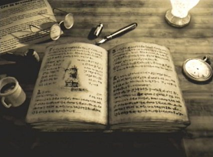
My storyboard was greatly influenced by the recomposing of my Digital Sketches. The first shot was inspired from the opening of Dark Cloud 1, which is a mid shot of a book. The book suggests that the game is being told as a fictional tale.
The 4th shot was inspired by the overall setting of the game - Palm Brinks. Palm Brinks is a city isolated from the rest of the outside world - and is the only city left in the world remaining as far as the main characters are concerned. I chose this as a shot as it's greatly relevant to the story for this reason.

The 6th shot is a shot of a clock - As the main theme of the game is time travel. A clock would be most relevant to help new viewers understand what the game is about. The shot following the shot is an Atlamillia - an object used to travel through time, I feel connecting these shots link perfectly in regards to the game's story.
The 7th shot is a shot of a sword, combining the clock, Atlamillia and the sword are they key to understanding the games story. The games story following two main characters, who use their Atlamillia to travel through time and fight evil - hence the sword shot idea.

The 9th shot refers to the use of transport the main characters use to travel this destroyed world. Due to Palm Brinks being the only remaining city left in the world (as the city itself was exclduded from the outside world) It has the worlds last train. The main characters use this train to travel the world in attempt to repair it. The train was a key factor in terms of conveying how the characters move around the world so quickly.

The making of the overall storyboard was a fun task for me, as due to my love for the game Dark Cloud 2, I was very happy to revisit it and create a storyboard to what acts as the games story. From creating the storyboard I have gained a great feel to how my title sequence would function and how it would cut from clip to clip, and what kind of camera movement would be involved - as shown in the storyboard. I
was debating whether to add any characters to the storyboard, as the whole world is deserted in the game, I couldn't decide if it would be a good decision. To improve if i was offered the chance I would attempt in adding the main characters to the storyboard in an attempt to bring some life into the title sequence.
was debating whether to add any characters to the storyboard, as the whole world is deserted in the game, I couldn't decide if it would be a good decision. To improve if i was offered the chance I would attempt in adding the main characters to the storyboard in an attempt to bring some life into the title sequence.
Dark Cloud 2 Storyboard Digitalised

For digitalising the storyboard I decided to combine Adobe Photoshop and Illustrator In order to achieve the most out of my Storyboard. I had an issue in regards to deciding what colours to to select for the first 4 shots.
The storyboard begins from a mid shot of the book, and tracks into the pages. The Camera then tracks out revealing the two moons and the second title. The Camera then tracks in once more revealing the third title.The camera then tilts down to a long shot of the city as seen in shot 4.

The storyboard continues from the long shot of the city, to a tracking in, ending up as an extreme close-up of a clock, also revealing the next title. The clip then cuts to a close-up of the Atlamillias, revealing the next title. Following that the the sword cuts in from the right, acting as a pan movement. The sword stops mid way as seen in the storyboard, revealing a second close-up and the title. The camera tracks into the sword, revealing the next title.

I found colours to be my weakest point in creating the digital storyboard.It was a challenge to ensure that I kept the Saul Bass style, however also ensuring that I wasn't over-using the same colours multiple times. I feel that I have over-used orange here, however hope to redeem some uniqueness with camera transition and movement.
Following the blank orange screen the camera tracks out - of the window - revealing the train, and another title. The camera then proceeds to tilt upwards once again, tracking in, and revealing the games title "Dark Cloud 2".
Horror Poster Research

I began researching general horror themed posters as a starter to help understand the mechanics and structures of an effective Horror poster. I selected the three images above as I believe they each successfully create that horror feel.
I took note of the location for the film name, in each of these posters it appears to be located at the bottom. The extreme close-up of the eye in the eye poster is extremely effective in terms of drawing the audience in. The extreme close up creates uneasiness and dramatically enhances the general atmosphere for the film. In addition the hand which seems to be crawling out of the eye itself suggests attempted escapism from the antagonist of the film.
Notable colour scheme here is generally black with a hint of red, a very popular horror colour combination which may suggest dark places, and blood shed.

I believe these posters offer very effective fonts in terms of foreseeing future events. The glow from the Silent Hill text may suggest an alternate world or dimension, possibly followed with unique antagonists or monsters. In addition the boldness of the font feels heavy, suggesting the protagonists struggle within the story, or difficulty to survive.
The Resident Evil poster offers a cloudy/misty effect which may suggest reduced vision for the protagonist(s), further suggesting a stealth-Horror themed film. I believe the poster uses colours sufficiently, meaning that there is a limited number of colours. The overall theme for the poster is a blue-grey colour schedule, which creates a cold atmosphere for the film suggesting deaths.
The Sixth Sense poster flows dramatically well in terms of layout and design. The simple design of the poster displays each individual sense, with a awkward 6th sense placed at the bottom of the poster. In addition the 6 is displayed as a portal with a figure seen walking into it, suggesting the protagonist is returning to location, with changed conditions (IE the 6th sense).
I believe this task was a very appropriate task as I have familiarised myself with general horror standards to be aware of when designing and creating a horror poster.
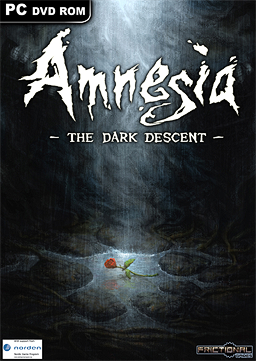
Base Info For Amnesia - The Dark Descent
Amnesia: The Dark Descent is a survival horror video game released in 2010 for PC. Amnesia is an exploration-based horror game that is played in first person perspective. The player plays a character known as Daniel, a man from London who awakens in the depths of Prussian Brennenburg castle with little to no memory of himself or his past.
 The player plays Daniel in an attempt to escape the dark halls of the extremely extensive castle. The player can interact with many objects ranging from candles, lanterns or chairs. With nothing but a lantern the player must proceed to progress through the castle with nothing but a lantern with limited oil levels. Once the oil reaches zero, the lantern will no longer light up.
This is the prime trick of the game, as the castle has many "monsters/zombies" lurking around. The player has no means to engage these monsters in combat, instead the player must use his skills of literally running away from the monsters, including closing all doors, hiding behind walls, or hiding in cupboards.
The game itself delivers incredibly well as a survival horror due to the inability to engage monsters in combat, instead the player must resort to escaping. One of the main features in the game is the Sanity Meter. The Sanity Meter slowly degrades when Daniel is in a dark area for an extended period of time. When the Sanity Meter reaches zero, Daniel may start to have delusions of monsters that aren't actually real. The main effect for this is the addtion to a blur effect to the screen when the Sanity Meter reaches a certain threshold. The player is able to restore the Meter once light is nearby, eg the Lantern or a window.
Amnesia Posters
I have noticed that they keep relatively simple, meaning that there is little to no extra images or text located around the poster. I feel this is effective in relating to the title "Amnesia" meaning that one has loss of memories, in relation to limited information on the page. It's a very powerful approach, however also risky as little information could be a turn off for some audiences.
The Amnesia posters follow a very similar theme, a black gradient with a image of significance in the centre of the page. This helps in enhancing the centered object, also suggesting it's significance to the story, marking it's importance. The objects are the flower on the ground which may suggest fallen life, and the lantern which is Amnesia's key object.

These are my favourite posters of Amnesia, as I feel each one utilises unique colours, and locations effectively by creating a unique atmosphere for each poster. The blue in the first poster combined with the windows suggest a cold abandoned atmosphere whereas the green emphasizes the darkness of the game. The green could also be viewed as an effect similar to how night vision would work, further suggesting this the Amnesia text is blurred which could relate to how the Sanity Meter works in the game itself. (More blur=more insanity).

I take appreciation to these posters due to their simplicity. Using a gradient in these images are an effective way to represent the dark halls of Amnesia. I discovered during my research that the majority of posters hold limited information. In these particular posters the font type is more recognizable.
The font seems to represent the flames - perhaps similar to the few torches seen throughout the game. The wavy texture may also suggest the protagonists loss of memory and his "wobbly status".

In these posters the textures are more apparent. They seem to be created through the use of blurs, bricks and wall textures. Textures are a key point to consider when creating a poster as they can be vital in terms of generating the atmosphere for the poster. Textures can not only be used for backgrounds, they can also be used to create unique fonts and to highlight specific parts of the poster.
Understanding the conventions of the Horror Genre
Silent Hill - Clip Analysis
The clip begins with the promo which fades out into a black screen. The titles then fade in, which begin to introduce the film. They hold for approximately 4 seconds, and fade back out again. During the title sequence there is parallel audio playing. The audio is of a woman screaming the name “Sharon” however the volume is very quiet. The clip cuts to a low angled mid shot of a woman who screams “Sharon” again. However this time the volume level has been increased dramatically. This shot can arguably be classified as a scare moment, as the camera cuts from the titles immediately to the mid shot combined with the high level of volume – wakes the audience up extremely early in the film. This is extremely effective as from the first 40 seconds, we can already establish the genre of the film, which is obviously horror. In addition the low angle of the shot generates the impression that she is shouting at the top of her voice, out into the darkness
. The character exits the shot before the clip cuts to the next shot. This reveals to the audience that she has moved from her previous position at high speed, as essentially she has left the shot before the camera can cut to the next shot. This is a powerful method as it shows that she is moving fast, and is concerned for Sharon’s whereabouts. The clip cuts to a long shot/ establishing shot that reveals a wooded area. The woman is still screaming Sharon and is running through the forest. This location suggests that it may be difficult for her to seek help with searching for Sharon. There are multiple cuts to long shots of the woman running through the dark forest in her search for Sharon, and finally is cut to a long shot of the woman walking under a bridge.
There is synchronous diegetic sound of beats, perhaps a damaged sign which is being blown about in the wind. This has direct impact on the direction of the films plot. The sound is of continuous beats, which could symbolise the sound of a ticking clock, in resemblance to how much time there is for the woman to find Sharon, before its too late. The clip then cuts to an extreme high angle long shot of a young girl who is walking slowly towards the edge of a huge mountain. The camera takes a huge arc around to the side where the woman is located. The clip then cuts to a mid shot of the woman where she shouts “Sharon” one more time. This indicates that the young girl is Sharon, the person whom the woman was in desperate search for. During the arc, there is synchronous sound of the nearby waterfall which is combined with voices that are moaning. This is an extremely powerful combination as it suggests that maybe she is possessed by someone or something, and raises a lot of questions from the audience.
From the first two minutes of the film, there is very powerful audio which suggests potential for the film to hold a 15 or 18 Certificate, in addition due to the early scare at the beginning of the film, it is more likely that this films target audience is teens or young adults.
Horror Villains - Representative
Horror villains upload from Seventeen17
Illustrator Development - Pen Tool (Pear)

I took the time to practice my illustrator skills using the pen tool. Using anchor points and the pen tool, I followed lines which allowed me to understand the properties of the pen tool and how it functions. This has also improved my confidence of using illustrator and the pen tool to create different unique shapes. I feel I have successfully created a recognisable image as a pear.
Amnesia Research - Moodboards
Amnesia Moodboard - Items, characters, clothing, props


As the lantern is the prime source of light in the game, the player can unlock other ways to light up various rooms. The player can achieve this from lighting candles or fire torches from using matches or tinderboxes that are rewarded to the player from exploring rooms. They play a key role in the gameplay as extremely limited alternate ways to shed light on the games location, especially when running low on limited rare-found oil.
Another method the game uses to create the horror tension is by the abundance of placed doors throughout the game. The sheer quality always has the player on the edge of their seats as they are unaware of what remains behind the door as the game is prone to scares through opening doors.
The game may require the player to search for a unique item to pass through to the next location. This may be similar to finding keys, or creating chemicals to revive the dead to use to your advantage to proceed.
I found researching the items and charatcers very beneficial as I was inspired from some of the items which may be plausible to use as a feature item for the poster to represent the game. Some examples include the candles, chemicals or the Lantern which are objects that are Amnesia's signature items.
Amnesia Moodboard - Art Styles, Location, history, general Mood


For these images I discovered some screenshots of the hub worlds in the game. In these hubs I attained a better understanding in the games artwork. You can clearly see the textures from the stairs and the light emitting from the windows which strongly empahsize the darkness of the room.
Later in the game we discover Daniel is located in a large castle. Although not immediatly recognisable from the inside, I was successful in obtaining images that showcase how the massive castle may look. Upon researching these images I was able to broaden my imagination to a larger range. These images may be effective to place as a background for the poster to reinforce the location of the game.
Amnesia Moodboard - Textures and colours

Textures are vital when it comes to reinforcing a games scenery and conditions. i was able to obtain a stronger understanding in how colours can represent a games theme and genre. In horror the colour red usually represents blood and death, where as blue would represent cold and struggle. In a horror it's unusual to find high contrast colours such as pink or purple.
Amnesia's prime colours are black and different contrasts of yellow through to orange and through to red with an exception of a few rooms being blue or light green which may suggest early morning light. As I discovered from the images Amnesia's colours are strongly convinced through the amount of lighting. The game will take the stretch to display a completely black room if there is zero light in the area, creating a very realistic setting. Yellow and orange are generally colours from light - hence the overall colour theme for the game.

In this moodboard the textures are more apparent and are usually shades black/yellow/orange/red. The textures consist of gritty, ruined themes which enforce the castles age, as well as generate the idea that it has been abandoned. I find textures extremely useful to combine with various parts of the poster, from the background or adding it to the font to create a unique effect.
Amnesia Title Screen Research

The title screen of Amnesia follows similar traditions that I discovered in the moodboard including: colours, textures and location. The title screen can be a creative method to research as personally I was able to generate ideas from the simplicity of the screen. The title screen follows a black background with a small section of a wall that is lit up via the fire torch, revealing the title: Amnesia.
The title screen immediately suggests to the viewer that this game is of the horror genre due to the lack of colours, the texture and the dreary font type.
Although a soundtrack cannot be added to a poster, it's worth noting down. I found the soundtrack to be very inspirational as it perfectly reflects the genre of the game through mirroring the overall dark gloomy appearance for the title screen.
From researching the title screen I have noted that the light sources in Amnesia are the key sources in which make Amnesia a successful horror game. I will be sure to use emitting light sources such as candles and lanterns when designing my poster.
Amnesia Official Poster Research & Saul Bass

I created a moodboard based around more official Amnesia posters in addition to different game box covers. Each poster takes advantage of different camera shot types and positions. Each camera shot creates a different mood to the viewer, for example the long shot of the staircase may represent the Daniels journey and how he is proceeding in circles in regards to encountering monsters as well as proceeding upwards - ie through the games story. In addition the mid shot - close up of the gatherer(a monster in Amnesia) generates a sense of insecurity.
I am a big fan of the establishing shot poster with the purple colours. I appreciate the use of unique colours (purple in this case) and how the tilt in camera creates the feel as the castle is dominant, and how the poster suggests how one man attempts to conquer the entire castle.


I found it extremely difficult to discover Saul Bass styled posters on the web for Amnesia: The Dark Descent. With the images that I discovered I thought that they portrayed more detail than necessary that your general Saul Bass Poster. However I feel that I can appreciate difference in terms of poster design styles which will help broaden my ideas.
The colours used in these posters are more bright and offering such as the blue and red used in the more noticable poster designs. Although different they create a clever sense of dissonance to the viewer when combined together with the symbols that represent Amnesia.
Saul Bass Horror Poster Research

Due to the issue I encountered in being unable to find Amnesia Saul Bass styled posters, I decided to research a general range of horror posters to gain some stronger understanding in how the posters look. From these posters I took a keen interest to the textures they offer and how they can blend in with the Saul Bass design. I am particuarly fond of the Batman poster as the texture combined with the city suggests the city in which the series is it set in, is dirty, and full of criminals.
Typography Font Research

I began using websites such as Dafont.com where I searched through fonts which resembled the horror genre. I attempted to find some fonts that weren't too cliche, meaning avoiding the general bloody gore looking type fonts. I am particularly fond of the Upjohn Rough font and the Epic Slash fonts, I feel they remain Saul Bass style as well as ensuring the Horror genre.

I am a fan of the Massacre, burning wrath and friday13 fonts, not only do they have horror-like names they offer sharpness and effectiveness when being forged into a poster. The boldness of the fonts also ensure they are appropriate when casted into the prime font for the title of the game. I found this task to be enjoyable as researching horror-specific fonts is something that is easily missed in regards to the creating of a horror poster or advertisement. From using the techniques in these typefaces I hope to create some similar designs on paper.
Typography Sketches


I felt like my previous font design was lacking some intensity so I decided to change my method of getting my ideas onto the paper. I changed from pencil to a whiteboard marker which I feel is greatly more effective in creating indepth typography especially for the horror genre.
I used the upjohn rough font as a reference to obtain some unique features such as creating the "o" in a rectangle like shape. I like this design because it feels more compact and slanted.

I decided to further the use with the marker, as I believe it's more appropriate for the horror genre, rather than the pencil. I was inspired by the Epic Slash font for this design. I was intrigued by the R's which seem as if the weight from the top part of the R was supported from the bottom line. The bottom line is placed through the R which while creating the support feel, leads on to a metaphor like "support through the scare". I believe this is a fun typeface to use however the remaining of the letters seem more ordinary.

In this design I attempted a different approach; to keep the design more simplistic. With the previous designs still fresh in my head I created a typeface that is a little different from the general horror theme. I attempted to keep things simple and more towards the Saul Bass theme, however to ensure that I didn't lose out on genre appropriates, I kept the length of the r's and the circumference of the o's longer in length, which is a technique I picked up on during my research in typefaces.

I wanted to expand on my previous idea of keeping the design simple - I also had re-look at some of the typefaces I researched. I was interested in the Monsterslash typeface, one of the few I found that were less intense and compact.
I drew each letter carefully, ensuring each one had it's own unique subtle appearance, more noticably with the H's joints being different in length, aswell as extending the R's length. I found this to be a fun design to create as it feels not only loose, but firm in it's standing.

Although this design could have been approached better, it's core to my development in creating typefaces. Taking the similararities with the Monsterslash font such as extending the R's I reduced it's firmness and unfortunatly as a result it feels a little wonky and unprofessional. I enjoyed experimenting with these typefaces however I prefer the compactness of the more solid typefaces.

Returning to the solid shapes, I wanted to attempt a font that was more challenging. I took the Burning Wrath font as inspiration and eventually created my own font on paper with similar aspects to that font. As a result I feel the font feels very graveyard-like with it's letter designs, more specifically on the R's. Throughout my development in typefaces I have noticed the O's and more noticably the R's recieve aditional treatment and are the prime advantage source in creating the genre type.

My last development for the typefaces involved experimenting with my own font idea in an attempt to create something unique. I believe I achieved this from adding a curved proportion to the letter H, as well as adding what resemble spider legs to the letter R's. I am really pleased with this design - I feel it is my most strongest, however the letter O's lack uniqueness and as a result I feel that this design suffers from it.
From creating my own typefaces I have not only obtained more knowledge on the horror genre for fonts, but I can also begin to think about how my fonts would flow onto my poster design.
Typography Digital Development
 I decided to digitalise some of my typography designs in order to gain a stronger standpoint in terms to which fonts would be most effective on the screen.I took an intense approach to this design as I wanted to gain an understanding to how the more compact fonts may look on the screen, ensuring that the firm fonts are the more powerful fonts for the horror genre.
 I revisited the Saul Bass approach for this design to gain some idea in how it may look on the screen. This font feels more squished as each individual letter, however stretched in terms of letter spacing. As a result I ended up with an italic-like look to it in order to keep it to the horror genre. The over-Saul Bass approach with this design resulted in some loss of horror genre overall, in conclusion it's less effective than the previous design.
 The key focus with this digitalised design was experimenting with the H. The H is formed with a point at the bottom suggesting the more devilish approach, with the crooked top which may act similar to a burnt out flame for a torch - a key item in Amnesia.
Overall in additon to the H experiment, I decided to tackle something similar to the other letters, however they were too rounded for me to achieve any kind of pointy-look experiment. I added some pointy parts to the R in hope to experiment with some of the devilish looks to other letters. For the most part I feel it really helps the font to stand out and relate to the horror genre however it may be too subtle to really define the genre.

Although cliche; I tackled something new with this font. I wanted to attempt a font that resembles blood in some way, however was unsure how to create it without being to obvious, especially with the pen tool. Instead I took one of Amnesia's items: the candle, and formed an image which resembles the dripping of candle wax, also signifying the burnout of the candle light, and loss of vision. This is a really effective method to emphasize the horror genre and I'm pleased with this design.
 With this design I took one of my drawn designs and took it into the computer in an attempt in creating it with the pen tool. This proved to be great practice for my ability to use the pen tool and further increased my skills and understanding with it's functionality.
In regards to achieving the design quality I wanted I believe this design shows it quite well. Each letter has it's own depth which greatly exaggerates each letters definition, almost giving each letter a responsibility to bring to the genre.
Typography Final Design

 For my final Typography Design, I was inspired by the Massacre and upjohn rough typefaces. I wanted to draw my own tyepface which resembled these fonts. Not only do I believe that these fonts are most effective at ensuring their depth and compact definition, they ensure the Saul Bass style, by keeping simple, as well as being parked within the horror genre.
The design is slanted, which fits perfectly well with the Amnesia title theme, suggesting that the protagonist is unsure with his memories, thus confirming he has Amnesia and has loss his memories. Due to these reasons I have chose this font to cast as the main font type for my poster.
Poster Designs

Using all of my moodboards I was able to create 12 designs for my poster. I had some ideas in how I could use textures to create a dark, gritty poster, contrasting I had some inspiration in creating some more simple Saul Bass styled posters.
The first image is inspired from the dark hall ways of the castle in which Amnesia's story takes place. The second image is inspired from the actual castle istself, this design showcases the castle in a titled establishing shot. The third design is where I believe the textures would be most effective - using cracked walls to create a placeholder for the title, with the title itself being placed in the centre of the cracks. The 4th design is inspired from a Saul Bass themed poster I researched, I believe the use of combining the door with the light that emits from the room is an effective method used to create a Saul Bass style poster. The fifth design is more detailed and contains the chemicals in the game which play a vital role in progressing the stories plot. The sixth design uses a cartoon-Saul Bass styled design to create the orb - The games ending item, being held by some Saul Bass styled trees.

The seventh design places an eye in the center of the page, enforcing the danger and suggesting that the monsters are always looking at you. I obtained this inspiration from my very first poster research. The eighth design uses the dark hall way concept, combined with textures creating a more complex poster design. The ninth design uses Amnesia's Lantern as the central focus, I like this design however I feel the lantern is too large, contrasting the text too small in size. The tenth design combines the light from the window and the candle to present the Amnesia title in the dark, in a similar method that the title screen uses. The eleventh design takes the eye from an earlier design, and places it in an extreme close-up which may cause uneasiness for the viewer - a very effective technique. The twelfth design uses the door from a previous design, and creates a shadowy figure effect to resemble what may be lurking around the corner.
Overall I feel that I have created a range of different types of designs, ranging from the simplicity & Saul Bass style, to a more generic horror theme.
Visual Elements & Textures


Texture can highlight elements such as titles, headings, icons and buttons. It draws the eye to calls to action and main title. This is perhaps the clearest way that the trend towards textures is catching on.
When used minimally, texture separates the content from the rest of the poster. It guides the user’s eye directly to the intended element. It can be a great way to separate key branding elements.
You can grab attention in different ways, but two common ways can be easily demonstrated with branding: a textured logo against a clean background, and a clean logo against a textured background.
I researched some textures that may resemble the horror genre, more specifically for Amnesia: The Dark Descent. Using textures for this poster may be an effective techinque, however may result in loss of simplicity and Saul Bass theme.

Following from my poster ideas I created some visual elements that may relate to the game. Each object placed in the moodboard has been altered with, from using the curves technique, and levels effect in order to modify how an item or location may look. For example the eye has received the most modifications, from changing the darkness, opacity, curves level, and adding a subtle texture on low opacity to create a mood for the horror genre.
I used these images as an experiment to how visual elements may look on my final poster. I used key items such as the candle, lantern and fire torch.
Final Poster Layouts


I created a basic layout, to assist in designing a final design for my poster. I plan to create 4 designs and have created a paper template for each of them. I have used text boxes and image boxes as placeholders to represent where each object will be placed. In addition I have added information to how my background may look for each poster.
From creating these basic layouts I have more of an understanding to how each object will be placed on the page.
Final Poster Layout Digitalised


I digitalised my layout designs to achieve more clear recognition to how my layout's may function. I created these in black and white, and added gradient effects to specific portions of each design to emphasise where light may be emitting and revealing parts of the poster.
Final Poster sketches

For my final designs I wanted to ensure that I keep the Saul Bass theme, so I was sure to keep simplicity for the majority of the designs. For the designs I combined and altered them in a way in which would be most recognizable and beneficial to the game and poster to keep it's recognition up.
The first poster holds the textured background with the Amnesia title being placed on a wall, with the window located to the right, emitting light onto the title itself, similar to how the title sequence uses the fire torch to emit light to the title.
The second poster acts as part of the gameplay, with the lantern placed to the left of the center, and the door to the right, suggesting the protagonists movement to the door.

The third poster uses the eye as a reference as the monsters who are always watching the antagonist. The title itself being placed below the eye, next to the candle, similar to the title sequence and my previous design techniques.
The fourth poster is a more advanced version of the chemical design i drew previously. This one properly showcases all the chemicals, connected to their respective pipes. They suggest that the main character is under an effect of a kind of drug, or perhaps need to solve a mystery in order to complete the main game.
Visual Elements EX - Additional Progress

 I had some last minute inspiration for some visual effects I could add to my final posters. The books offer hints and tips throughout Amnesia, in adittion to triggering the game to tell the player the next story. In rare cases they can also be used to solve puzzles in the game. Due to these reasons I feel it would be beneficial to add a book of Amnesia into my designs.

I spent sometime creating books with pencil to increase my capabilities when importing my thoughts and ideas into my final poster. Although a simple shape to draw and create on paper I had some initial troubles in it's dimensions as seen in the images above. I would often encounter issues where the book would seem out of proportion and not appear right. I enjoyed creating these books as I was able to practice my skill with drawing in different proportions and angles.

I previously included the lantern in my intial visual elements. I wanted to experiment with the lantern individually and attempt to accomplish unique styles of the lantern. I feel I achieved my goal and plan to incorporate the lantern into my final design(s) as I believe it is core to Amnesia. From experimenting with different shapes and sizes I was able to achieve a more clear vision in how i wanted the lantern to merge into my final poster.

Using the Pen tool in Illustrator I composed a lantern, from referring to my original lantern designs. This enabled to me to practice my pen tools even further, and I found from my development with the pear I have improved in terms of line placement with the pen tool.
I was able to create solid curves to create a steady lantern design. I am happy with the final outcome of the design and hope to combine the use of different colour Modes and feathering to create the illusion of a shadowy effect.


I was inspired by the rose, one of the most interesting items that represent Amnesia. The rose is seen multiple times in the game and acts as a contrast to the games genre - horror. Due to this I am fascinated by the rose and plan to incoporate it into my final design as a core piece. The uniqueness of having a rose centered on the page surrounded by a dark location really makes the rose stand out as an object of significance. I researched some roses online that I could use to add more Saul Bass elements into my final design. I discovered this rose in black and white, and am eager to experiment with colours to achieve a simplistic yet effective outcome.
Visual Elements - Understanding Feathering, colour modes & Contrast
Feathering is a technique used similarly to the method of applying gradients. When cropping part of an image, instead of applying a fine cut and removing the selected crop part firmly, part of the image is left intact creating a fade out effect depending on the amount of feathering percentage selected.

Manipulating Colours
From my research into Horror Posters and Saul Bass, I discovered that the prime colours that represent the horror genre consist of red, blue and different shades of black. It's generally best to avoid colours such as pink and purple as they aren't usually related to the horror genre.
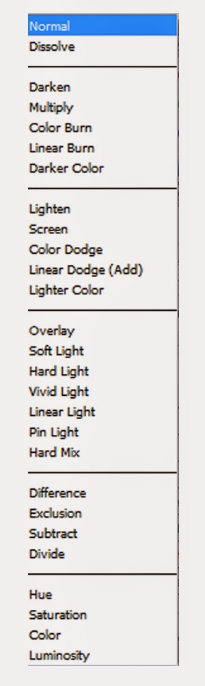
Illustrator and Photoshop offer tools that allow the user to create interesting colours and effects. One of the tools that I'll be using in my Poster development is the "Colour Mode". The colour mode changes the overall colour rules for the layers. Effects like Dark, multipy and Darker Colour would increase the darkness of the overall composition, creating a more ruined look.
 Effects like Colour Dodge and Colour Burn are modes that should generally be avoided in creating horror posters. They reverse the layout of colours creating a neon effect which isn't really suited to the genre. As a result I am particuarly interested in the Overlay and range of "Light" Modes that may potentially be useful in creating a theme for my poster.
In addition to experimenting with different colour modes, I used curves and the Brightness/contrast effects during my previous Visual Elements to create a more darkened appearence to some of my objects.
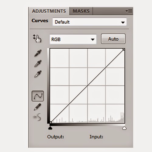
I found this particuarly useful to use on textures. These effects are powerful tools which allowed me to modify any objects (in this case textures) overall colour scheme. I was able to change a brown dirty texture to a blue, cold texture that could represent sense of insecurity.
The Curves effect is particularly effective as it allows me to increase or decrease very specific colours in order to create the colour scheme I desire.


Above are examples of me experimenting with the curves tool - in addition to the ones seen on my initial Visual Elements. As displayed I can create a bloody red texture, or a cold abandoned texture by manipulating Colour Modes and Colour Effects. This will be a useful tool to use to ensure I can create that horror feel in my final posters.
Final Posters - Experiments & Development

I like this title layout as it's very easy to read and clear to the viewer what the game is called.

I modifyed "The Dark Descent" section of my poster to allow it to blend in more with the posters theme. I placed the second part of the title word after word, one below eachother, creating the illusion of descent. I really like this text layout as the large size with the "Dark" really allows the title to stand out and place emphasis on the theme.
I added a red colour to the "Descent" text to suggest the bloody approach. I also believe the colour merges well with the blood splatter I placed slightly above the text "Amnesia". The colour gives the illusion that the "Descent" text is part of the blood that has been splatted across the screen giving a very powerful effect.

To change things up more I experimented with the original title layout I had and intended to use the word descent and merge it with the "Dark" text. I like this approach as the titles position accurately relates to actual descent. The downwards position & motion of the text implying that the descent is backwards which contrasts effectively with the Amnesia title, suggesting that the main character is unaware with what is happening within the game.
I feel that the title looks too plain. Although I feel I have successfully ensured that I keep the simplicity of Saul Bass, the text feels awkward and doesn't fit well with the background.


I wanted to create a 3D effect for the rose when placed on the book however I encountered difficulty when attempting to keep the Saul Bass style and simplicity. This is my result of experiementing with the Rose position. I actually strangely like it as the rose feels just slightly out of proportion, which fits well in relating to the title "Amnesia".
The inconsistency with the proportions is effective as it creates a sense of insecurity for the viewer and may suggest that there is something strangely wrong in relation to the games plot.

With this experiment I moved the rose to the bottom of the poster to fill the empty space and forming a more fluid poster. In addition I lowered the darkness using the Curves technique I researched previously to allow the rose to blend in more with the colours of the poster, more specifically the book.
I like the overall layout of the poster however I am unsatisfied with the position of the "December 13TH" text, as I feel the font and position is inappropriate for the poster. I also think that it looks awkward and too out of place.

I wanted to fix the "December 13TH" text as mentioned in my previous experiment. I decided to move the text to the bottom of the book. Using the Skew Free-Transform tool I was able to mirror the effect of the Amnesia text and created the illusion that the text is part of the book.
This is my favourite experiment with this poster because previously the poster felt too crowded in the lower section of the layout. I believe from placing the release date text on the book I have created a consistent layout in terms of amount of information.
Additionally I rotated the "Dark" text to allow emphasis to be placed on the word, allowing the genre to be further defined.
Final Poster & Further Development
 Above is the image for my first final poster design. I have used my drawings of the book as the main piece for this one, as due to the large amount of books in the game I believe it is a core item of significance for the game. Players who are interested in the game will be able to imimmediately recognize the reference to the game with the book, and for newer players it may spark an interest due to the Amnesia title.
My final designs have changed a lot throughout my development with the roses, lantern and books, this is because I realised how difficult it would be to maintain the simpicity art style of Saul Bass for my horror poster. I believe that the colours I have chosen for this design really define the poster. I also added a texture to the book to allow for more depth with the design - the image to the left is
an image without the textures as a result I feel the poster is too bright and intense on the eyes, distracting the viewer from the actual title itself. I believe the textures helped ease this issue.
Placing the rose at the bottom of the page was my chosen location for my final design; because I wanted to spread out the level of information across my poster, rather than having it all clustered in one place - that would result in bad design and may deter viewers from the poster (and possibly the game).

Above is the image for my second final poster design. I wanted to take a more realstic art style approach with this design, while ensuring I kept the saul bass style. I had difficulties deciding where I'd place the Lantern and how it would fit in.

 As seen in the images I had issues deciding where I would put the lantern, I tried enlarging the lantern, decreasing the size and changing the position however I felt like it always seemed out of place. It was through experimenting I discovered I could make the lantern unusually large to allow it to stand out as an important object.
I used my techniques that I developed during my development and visual elements
 to experiment with the colours and more importantly the opacity.
For my final design I decreased the opacity to around 30% which allowed the texture for the background to come through. I discovered part of the issue I had was that the lantern was too bright in terms of contrast. To fix this I used the contrast effect to lower it's visability and was able to create my final design as seen above.
The creation of the poster changed dramatically from my original ideas, however the visual elements I had previously researched had greatly impacted the end result of my final design. I learnt that there is always improvements/experiments to try with designs, and putting in the time will allow you to reach new ideas that you wouldn't have initially thought of before.
Final Poster (Print Version)


Design Report
Digital Layer Breakdown


Illustrator Development - Pen Tool (Pear)
I took the time to practice my illustrator skills using the pen tool. Using anchor points and the pen tool, I followed lines which allowed me to understand the properties of the pen tool and how it functions. This has also improved my confidence of using illustrator and the pen tool to create different unique shapes. I feel I have successfully created a recognisable image as a pear.
Amnesia Research - Moodboards
Amnesia Moodboard - Items, characters, clothing, props
The core items found in Amnesia's game world consist of the Lantern, oil and various note papers that are found in the game. In this moodboard I found screenshots of the UI screen, a book, a desk, an alchemy lab and the items located on the desk - all of which play a key point in Amnesia's story.
In terms of characters, the player does not encounter any throughout the entire game, instead the player hears the voice of Daniel(the player) who makes comments throughout the game when he locates an item. In regards to enemies the player frequently encounters monsters which may resemble a zombie or as the game describes it: A restless mutated savage that has taken over the human body as a host.
As the lantern is the prime source of light in the game, the player can unlock other ways to light up various rooms. The player can achieve this from lighting candles or fire torches from using matches or tinderboxes that are rewarded to the player from exploring rooms. They play a key role in the gameplay as extremely limited alternate ways to shed light on the games location, especially when running low on limited rare-found oil.
Another method the game uses to create the horror tension is by the abundance of placed doors throughout the game. The sheer quality always has the player on the edge of their seats as they are unaware of what remains behind the door as the game is prone to scares through opening doors.
The game may require the player to search for a unique item to pass through to the next location. This may be similar to finding keys, or creating chemicals to revive the dead to use to your advantage to proceed.
I found researching the items and charatcers very beneficial as I was inspired from some of the items which may be plausible to use as a feature item for the poster to represent the game. Some examples include the candles, chemicals or the Lantern which are objects that are Amnesia's signature items.
Amnesia Moodboard - Art Styles, Location, history, general Mood
Amnesia: with the story being set in one specific location throughout the entire games story proved difficult for me at first when thinking of immediate location images. To solve this issue I took the approach of searching how I could talk about this games mood: ruins, old, castle, dark and atmospheric are the initial adjectives that come to mind. From this I was able to search Amnesia's most gruesome locations which showcase the games general vibes as well as the Time period it was set in.
I created a moodboard from images that I feel would offer most scare potential and create the most adrenaline - Amnesia's main theme. I found images of dark hallways, rotting staircases and degrading ceilings and walls.
For these images I discovered some screenshots of the hub worlds in the game. In these hubs I attained a better understanding in the games artwork. You can clearly see the textures from the stairs and the light emitting from the windows which strongly empahsize the darkness of the room.
Later in the game we discover Daniel is located in a large castle. Although not immediatly recognisable from the inside, I was successful in obtaining images that showcase how the massive castle may look. Upon researching these images I was able to broaden my imagination to a larger range. These images may be effective to place as a background for the poster to reinforce the location of the game.
Amnesia Moodboard - Textures and colours
Textures are vital when it comes to reinforcing a games scenery and conditions. i was able to obtain a stronger understanding in how colours can represent a games theme and genre. In horror the colour red usually represents blood and death, where as blue would represent cold and struggle. In a horror it's unusual to find high contrast colours such as pink or purple.
Amnesia's prime colours are black and different contrasts of yellow through to orange and through to red with an exception of a few rooms being blue or light green which may suggest early morning light. As I discovered from the images Amnesia's colours are strongly convinced through the amount of lighting. The game will take the stretch to display a completely black room if there is zero light in the area, creating a very realistic setting. Yellow and orange are generally colours from light - hence the overall colour theme for the game.
In this moodboard the textures are more apparent and are usually shades black/yellow/orange/red. The textures consist of gritty, ruined themes which enforce the castles age, as well as generate the idea that it has been abandoned. I find textures extremely useful to combine with various parts of the poster, from the background or adding it to the font to create a unique effect.
Amnesia Title Screen Research
The title screen of Amnesia follows similar traditions that I discovered in the moodboard including: colours, textures and location. The title screen can be a creative method to research as personally I was able to generate ideas from the simplicity of the screen. The title screen follows a black background with a small section of a wall that is lit up via the fire torch, revealing the title: Amnesia.
The title screen immediately suggests to the viewer that this game is of the horror genre due to the lack of colours, the texture and the dreary font type.
From researching the title screen I have noted that the light sources in Amnesia are the key sources in which make Amnesia a successful horror game. I will be sure to use emitting light sources such as candles and lanterns when designing my poster.
Amnesia Official Poster Research & Saul Bass
I am a big fan of the establishing shot poster with the purple colours. I appreciate the use of unique colours (purple in this case) and how the tilt in camera creates the feel as the castle is dominant, and how the poster suggests how one man attempts to conquer the entire castle.

I found it extremely difficult to discover Saul Bass styled posters on the web for Amnesia: The Dark Descent. With the images that I discovered I thought that they portrayed more detail than necessary that your general Saul Bass Poster. However I feel that I can appreciate difference in terms of poster design styles which will help broaden my ideas.
The colours used in these posters are more bright and offering such as the blue and red used in the more noticable poster designs. Although different they create a clever sense of dissonance to the viewer when combined together with the symbols that represent Amnesia.
Saul Bass Horror Poster Research
Due to the issue I encountered in being unable to find Amnesia Saul Bass styled posters, I decided to research a general range of horror posters to gain some stronger understanding in how the posters look. From these posters I took a keen interest to the textures they offer and how they can blend in with the Saul Bass design. I am particuarly fond of the Batman poster as the texture combined with the city suggests the city in which the series is it set in, is dirty, and full of criminals.
Typography Font Research
I began using websites such as Dafont.com where I searched through fonts which resembled the horror genre. I attempted to find some fonts that weren't too cliche, meaning avoiding the general bloody gore looking type fonts. I am particularly fond of the Upjohn Rough font and the Epic Slash fonts, I feel they remain Saul Bass style as well as ensuring the Horror genre.
I am a fan of the Massacre, burning wrath and friday13 fonts, not only do they have horror-like names they offer sharpness and effectiveness when being forged into a poster. The boldness of the fonts also ensure they are appropriate when casted into the prime font for the title of the game. I found this task to be enjoyable as researching horror-specific fonts is something that is easily missed in regards to the creating of a horror poster or advertisement. From using the techniques in these typefaces I hope to create some similar designs on paper.
Typography Sketches
I began drawing out some text in the horror-theme in pencil. Inspired from the font Friday13 I decided to add my own touch of creativity to the letters in approach to change up some letters in a different way. Although this drawing is my weakest, it's also my first idea which helped ease my way into drawing typefaces for the Horror Genre. I found it quite difficult to begin creating some fonts - I used my web font research as a reference.
I felt like my previous font design was lacking some intensity so I decided to change my method of getting my ideas onto the paper. I changed from pencil to a whiteboard marker which I feel is greatly more effective in creating indepth typography especially for the horror genre.
I used the upjohn rough font as a reference to obtain some unique features such as creating the "o" in a rectangle like shape. I like this design because it feels more compact and slanted.
I decided to further the use with the marker, as I believe it's more appropriate for the horror genre, rather than the pencil. I was inspired by the Epic Slash font for this design. I was intrigued by the R's which seem as if the weight from the top part of the R was supported from the bottom line. The bottom line is placed through the R which while creating the support feel, leads on to a metaphor like "support through the scare". I believe this is a fun typeface to use however the remaining of the letters seem more ordinary.
In this design I attempted a different approach; to keep the design more simplistic. With the previous designs still fresh in my head I created a typeface that is a little different from the general horror theme. I attempted to keep things simple and more towards the Saul Bass theme, however to ensure that I didn't lose out on genre appropriates, I kept the length of the r's and the circumference of the o's longer in length, which is a technique I picked up on during my research in typefaces.
I wanted to expand on my previous idea of keeping the design simple - I also had re-look at some of the typefaces I researched. I was interested in the Monsterslash typeface, one of the few I found that were less intense and compact.
I drew each letter carefully, ensuring each one had it's own unique subtle appearance, more noticably with the H's joints being different in length, aswell as extending the R's length. I found this to be a fun design to create as it feels not only loose, but firm in it's standing.
Although this design could have been approached better, it's core to my development in creating typefaces. Taking the similararities with the Monsterslash font such as extending the R's I reduced it's firmness and unfortunatly as a result it feels a little wonky and unprofessional. I enjoyed experimenting with these typefaces however I prefer the compactness of the more solid typefaces.
Returning to the solid shapes, I wanted to attempt a font that was more challenging. I took the Burning Wrath font as inspiration and eventually created my own font on paper with similar aspects to that font. As a result I feel the font feels very graveyard-like with it's letter designs, more specifically on the R's. Throughout my development in typefaces I have noticed the O's and more noticably the R's recieve aditional treatment and are the prime advantage source in creating the genre type.
My last development for the typefaces involved experimenting with my own font idea in an attempt to create something unique. I believe I achieved this from adding a curved proportion to the letter H, as well as adding what resemble spider legs to the letter R's. I am really pleased with this design - I feel it is my most strongest, however the letter O's lack uniqueness and as a result I feel that this design suffers from it.
From creating my own typefaces I have not only obtained more knowledge on the horror genre for fonts, but I can also begin to think about how my fonts would flow onto my poster design.
Typography Digital Development
Overall in additon to the H experiment, I decided to tackle something similar to the other letters, however they were too rounded for me to achieve any kind of pointy-look experiment. I added some pointy parts to the R in hope to experiment with some of the devilish looks to other letters. For the most part I feel it really helps the font to stand out and relate to the horror genre however it may be too subtle to really define the genre.
Although cliche; I tackled something new with this font. I wanted to attempt a font that resembles blood in some way, however was unsure how to create it without being to obvious, especially with the pen tool. Instead I took one of Amnesia's items: the candle, and formed an image which resembles the dripping of candle wax, also signifying the burnout of the candle light, and loss of vision. This is a really effective method to emphasize the horror genre and I'm pleased with this design.
In regards to achieving the design quality I wanted I believe this design shows it quite well. Each letter has it's own depth which greatly exaggerates each letters definition, almost giving each letter a responsibility to bring to the genre.
Typography Final Design
For my final Typography Design, I was inspired by the Massacre and upjohn rough typefaces. I wanted to draw my own tyepface which resembled these fonts. Not only do I believe that these fonts are most effective at ensuring their depth and compact definition, they ensure the Saul Bass style, by keeping simple, as well as being parked within the horror genre.The design is slanted, which fits perfectly well with the Amnesia title theme, suggesting that the protagonist is unsure with his memories, thus confirming he has Amnesia and has loss his memories. Due to these reasons I have chose this font to cast as the main font type for my poster.
Poster Designs
Using all of my moodboards I was able to create 12 designs for my poster. I had some ideas in how I could use textures to create a dark, gritty poster, contrasting I had some inspiration in creating some more simple Saul Bass styled posters.
The first image is inspired from the dark hall ways of the castle in which Amnesia's story takes place. The second image is inspired from the actual castle istself, this design showcases the castle in a titled establishing shot. The third design is where I believe the textures would be most effective - using cracked walls to create a placeholder for the title, with the title itself being placed in the centre of the cracks. The 4th design is inspired from a Saul Bass themed poster I researched, I believe the use of combining the door with the light that emits from the room is an effective method used to create a Saul Bass style poster. The fifth design is more detailed and contains the chemicals in the game which play a vital role in progressing the stories plot. The sixth design uses a cartoon-Saul Bass styled design to create the orb - The games ending item, being held by some Saul Bass styled trees.
The seventh design places an eye in the center of the page, enforcing the danger and suggesting that the monsters are always looking at you. I obtained this inspiration from my very first poster research. The eighth design uses the dark hall way concept, combined with textures creating a more complex poster design. The ninth design uses Amnesia's Lantern as the central focus, I like this design however I feel the lantern is too large, contrasting the text too small in size. The tenth design combines the light from the window and the candle to present the Amnesia title in the dark, in a similar method that the title screen uses. The eleventh design takes the eye from an earlier design, and places it in an extreme close-up which may cause uneasiness for the viewer - a very effective technique. The twelfth design uses the door from a previous design, and creates a shadowy figure effect to resemble what may be lurking around the corner.
Overall I feel that I have created a range of different types of designs, ranging from the simplicity & Saul Bass style, to a more generic horror theme.
Visual Elements & Textures
Texture can highlight elements such as titles, headings, icons and buttons. It draws the eye to calls to action and main title. This is perhaps the clearest way that the trend towards textures is catching on.
When used minimally, texture separates the content from the rest of the poster. It guides the user’s eye directly to the intended element. It can be a great way to separate key branding elements.
You can grab attention in different ways, but two common ways can be easily demonstrated with branding: a textured logo against a clean background, and a clean logo against a textured background.
I researched some textures that may resemble the horror genre, more specifically for Amnesia: The Dark Descent. Using textures for this poster may be an effective techinque, however may result in loss of simplicity and Saul Bass theme.
Following from my poster ideas I created some visual elements that may relate to the game. Each object placed in the moodboard has been altered with, from using the curves technique, and levels effect in order to modify how an item or location may look. For example the eye has received the most modifications, from changing the darkness, opacity, curves level, and adding a subtle texture on low opacity to create a mood for the horror genre.
I used these images as an experiment to how visual elements may look on my final poster. I used key items such as the candle, lantern and fire torch.
Final Poster Layouts
I created a basic layout, to assist in designing a final design for my poster. I plan to create 4 designs and have created a paper template for each of them. I have used text boxes and image boxes as placeholders to represent where each object will be placed. In addition I have added information to how my background may look for each poster.
From creating these basic layouts I have more of an understanding to how each object will be placed on the page.
Final Poster Layout Digitalised
I digitalised my layout designs to achieve more clear recognition to how my layout's may function. I created these in black and white, and added gradient effects to specific portions of each design to emphasise where light may be emitting and revealing parts of the poster.
Final Poster sketches
For my final designs I wanted to ensure that I keep the Saul Bass theme, so I was sure to keep simplicity for the majority of the designs. For the designs I combined and altered them in a way in which would be most recognizable and beneficial to the game and poster to keep it's recognition up.
The first poster holds the textured background with the Amnesia title being placed on a wall, with the window located to the right, emitting light onto the title itself, similar to how the title sequence uses the fire torch to emit light to the title.
The second poster acts as part of the gameplay, with the lantern placed to the left of the center, and the door to the right, suggesting the protagonists movement to the door.
The third poster uses the eye as a reference as the monsters who are always watching the antagonist. The title itself being placed below the eye, next to the candle, similar to the title sequence and my previous design techniques.
The fourth poster is a more advanced version of the chemical design i drew previously. This one properly showcases all the chemicals, connected to their respective pipes. They suggest that the main character is under an effect of a kind of drug, or perhaps need to solve a mystery in order to complete the main game.
Visual Elements EX - Additional Progress
I spent sometime creating books with pencil to increase my capabilities when importing my thoughts and ideas into my final poster. Although a simple shape to draw and create on paper I had some initial troubles in it's dimensions as seen in the images above. I would often encounter issues where the book would seem out of proportion and not appear right. I enjoyed creating these books as I was able to practice my skill with drawing in different proportions and angles.
I previously included the lantern in my intial visual elements. I wanted to experiment with the lantern individually and attempt to accomplish unique styles of the lantern. I feel I achieved my goal and plan to incorporate the lantern into my final design(s) as I believe it is core to Amnesia. From experimenting with different shapes and sizes I was able to achieve a more clear vision in how i wanted the lantern to merge into my final poster.
Using the Pen tool in Illustrator I composed a lantern, from referring to my original lantern designs. This enabled to me to practice my pen tools even further, and I found from my development with the pear I have improved in terms of line placement with the pen tool.
I was able to create solid curves to create a steady lantern design. I am happy with the final outcome of the design and hope to combine the use of different colour Modes and feathering to create the illusion of a shadowy effect.
I was inspired by the rose, one of the most interesting items that represent Amnesia. The rose is seen multiple times in the game and acts as a contrast to the games genre - horror. Due to this I am fascinated by the rose and plan to incoporate it into my final design as a core piece. The uniqueness of having a rose centered on the page surrounded by a dark location really makes the rose stand out as an object of significance. I researched some roses online that I could use to add more Saul Bass elements into my final design. I discovered this rose in black and white, and am eager to experiment with colours to achieve a simplistic yet effective outcome.
Visual Elements - Understanding Feathering, colour modes & Contrast
Feathering is a technique used similarly to the method of applying gradients. When cropping part of an image, instead of applying a fine cut and removing the selected crop part firmly, part of the image is left intact creating a fade out effect depending on the amount of feathering percentage selected.
I created the image above to research and demonstrate how feathering works and how i want to apply it to my poster. From increasing the feather percentage the opacity gradient effect is exagerated. I believe this is a useful technique to use when working with textures and other images. It's a powerful tool that allows immense experimentation with gradients and colours. I plan to incorporate this technique into my final poster designs, specifically with the lantern. From applying feathering to the lantern, I can create a blurred effect - representing the sanity meter in the Amnesia game.
Manipulating Colours
From my research into Horror Posters and Saul Bass, I discovered that the prime colours that represent the horror genre consist of red, blue and different shades of black. It's generally best to avoid colours such as pink and purple as they aren't usually related to the horror genre.
Illustrator and Photoshop offer tools that allow the user to create interesting colours and effects. One of the tools that I'll be using in my Poster development is the "Colour Mode". The colour mode changes the overall colour rules for the layers. Effects like Dark, multipy and Darker Colour would increase the darkness of the overall composition, creating a more ruined look.
In addition to experimenting with different colour modes, I used curves and the Brightness/contrast effects during my previous Visual Elements to create a more darkened appearence to some of my objects.
I found this particuarly useful to use on textures. These effects are powerful tools which allowed me to modify any objects (in this case textures) overall colour scheme. I was able to change a brown dirty texture to a blue, cold texture that could represent sense of insecurity.
The Curves effect is particularly effective as it allows me to increase or decrease very specific colours in order to create the colour scheme I desire.
Above are examples of me experimenting with the curves tool - in addition to the ones seen on my initial Visual Elements. As displayed I can create a bloody red texture, or a cold abandoned texture by manipulating Colour Modes and Colour Effects. This will be a useful tool to use to ensure I can create that horror feel in my final posters.
Final Posters - Experiments & Development
I wanted to experiment with some attributes for my poster, in this screenshot I have the text "The Dark Descent" placed immediately below the "Amnesia" text. I believe this method of text layout clearly displays the title however feels a little bland and lacking in terms of colour and title uniqueness.
I like this title layout as it's very easy to read and clear to the viewer what the game is called.
I modifyed "The Dark Descent" section of my poster to allow it to blend in more with the posters theme. I placed the second part of the title word after word, one below eachother, creating the illusion of descent. I really like this text layout as the large size with the "Dark" really allows the title to stand out and place emphasis on the theme.
I added a red colour to the "Descent" text to suggest the bloody approach. I also believe the colour merges well with the blood splatter I placed slightly above the text "Amnesia". The colour gives the illusion that the "Descent" text is part of the blood that has been splatted across the screen giving a very powerful effect.
To change things up more I experimented with the original title layout I had and intended to use the word descent and merge it with the "Dark" text. I like this approach as the titles position accurately relates to actual descent. The downwards position & motion of the text implying that the descent is backwards which contrasts effectively with the Amnesia title, suggesting that the main character is unaware with what is happening within the game.
I feel that the title looks too plain. Although I feel I have successfully ensured that I keep the simplicity of Saul Bass, the text feels awkward and doesn't fit well with the background.
I decided to remove the plain text of Frictional Games and added the logo to the scene to see how it would react. The logo fits perfectly in terms of texture and overall appeal. I found difficultly with finding a good location for the logo, as the "games" part was remaining difficult to notice. Overall I like how the logo looks when combined with my poster as having a signature logo on my poster would help viewers recognise the producers of the game.
In an attempt to further experiment with colours, I used the Curves and levels tool to test the blue colour and how it might work with my design. I feel the design contrasts well with the redish lantern. From doing this there is further depth placed on the lantern, suggesting the lantern is a prime object of significance.
I wanted to create a 3D effect for the rose when placed on the book however I encountered difficulty when attempting to keep the Saul Bass style and simplicity. This is my result of experiementing with the Rose position. I actually strangely like it as the rose feels just slightly out of proportion, which fits well in relating to the title "Amnesia".
The inconsistency with the proportions is effective as it creates a sense of insecurity for the viewer and may suggest that there is something strangely wrong in relation to the games plot.
I like the overall layout of the poster however I am unsatisfied with the position of the "December 13TH" text, as I feel the font and position is inappropriate for the poster. I also think that it looks awkward and too out of place.
This is my favourite experiment with this poster because previously the poster felt too crowded in the lower section of the layout. I believe from placing the release date text on the book I have created a consistent layout in terms of amount of information.
Additionally I rotated the "Dark" text to allow emphasis to be placed on the word, allowing the genre to be further defined.
Final Poster & Further Development
Above is the image for my first final poster design. I have used my drawings of the book as the main piece for this one, as due to the large amount of books in the game I believe it is a core item of significance for the game. Players who are interested in the game will be able to imimmediately recognize the reference to the game with the book, and for newer players it may spark an interest due to the Amnesia title.My final designs have changed a lot throughout my development with the roses, lantern and books, this is because I realised how difficult it would be to maintain the simpicity art style of Saul Bass for my horror poster. I believe that the colours I have chosen for this design really define the poster. I also added a texture to the book to allow for more depth with the design - the image to the left is
an image without the textures as a result I feel the poster is too bright and intense on the eyes, distracting the viewer from the actual title itself. I believe the textures helped ease this issue.
Placing the rose at the bottom of the page was my chosen location for my final design; because I wanted to spread out the level of information across my poster, rather than having it all clustered in one place - that would result in bad design and may deter viewers from the poster (and possibly the game).
As seen in the images I had issues deciding where I would put the lantern, I tried enlarging the lantern, decreasing the size and changing the position however I felt like it always seemed out of place. It was through experimenting I discovered I could make the lantern unusually large to allow it to stand out as an important object.I used my techniques that I developed during my development and visual elements
to experiment with the colours and more importantly the opacity.For my final design I decreased the opacity to around 30% which allowed the texture for the background to come through. I discovered part of the issue I had was that the lantern was too bright in terms of contrast. To fix this I used the contrast effect to lower it's visability and was able to create my final design as seen above.
The creation of the poster changed dramatically from my original ideas, however the visual elements I had previously researched had greatly impacted the end result of my final design. I learnt that there is always improvements/experiments to try with designs, and putting in the time will allow you to reach new ideas that you wouldn't have initially thought of before.
Final Poster (Print Version)
I printed out my posters to gain an understanding in how they might look in the real world. Unfortunately the posters didn't produce in the best quality - making the whole posters seem blurred of pix-elated. I believe the posters secure much more professionalism on screen due to the properly rendered textures, fonts and colours.
Design Report
Aaron Riley - http://www.idaaronriley.blogspot.co.uk/
Click Unit 3
During my initial Horror poster research I struggled
to decide on a film/game to select. I found researching horror genres to help
me make a decision. I was able to gain a stronger understanding on what makes
the horror genre and the conventions that follow them. I was torn between the two media products:
Amnesia the Dark Descent, and Silent Hill. I chose Amnesia because I was
inspired from the extreme atmosphere the game offers. The sound, setting and lack of equipment
really makes the game a must play for Horror fans. In particular I took an interest to the title screen. Amnesia’s title screen offers a
very minimalist style, utilizing the lack of space very well.; and allowed me
to develop inspiration in relation to the Saul Bass theme. The title screen
consists of a black screen with a shade
of light emitting from a lantern.
As mentioned I spent a time researching the Amnesia
title screen; I was also fascinated by textures and they effect they offer to
designs. Textures can highlight elements such as titles, icons or a point of
significance. Relating to the title screen I discovered that textures play an
important role in ensuring the effectiveness of a poster. Amnesia’s walls and
gritty areas offered me an opportunity
for me to expand my knowledge in how I can use textures to enhance the visual
aspects of my poster. I looked, experimented and developed with many different
typefaces, as I was determined to create an effective font to work with my
textures. I discovered using felt tip pens allow for more depth and definition
in the fonts. This helped me address an
issue I encountered regarding ensuring the Saul Bass style with my posters. I
struggled to discover many Amnesia-Saul Bass styled posters, instead I
researched general Saul Bass themed posters and was able to gain inspiration
though my research and development in typefaces.
I produced my poster through research, experiments,
development and practice. My research plays a core part in terms of my
development of my final poster. I was able to discover many Horror and Amnesia
posters, which greatly helped me to realize the conventions of the horror
genre. Following from this I developed an effective typeface and Visual
Elements for my designs. I was originally fixed to the Eye visual element I
created and planned to use it for my final poster. Upon developing extra visual
elements I was able to expand my imagination to new ideas and thus formed my
final poster. As I approached the stage
of poster development I created some designs in which I was able to put these
new ideas to practice and experiment with my imagination. I also created some layout templates to gain
an understanding in how some of my posters may look when presented on the
screen. This was an effective technique as I was could grasp how I could use
textures and light sources to form a
poster design. Through research into the
horror genre I developed the ability to reinforce my knowledge of colours and
how they impact the poster as a whole. Red can be associated with blood, and is
usually combined with a black shade which helps bring out the genre and create
the scary atmosphere. I experimented with different techniques which can be
used to manipulate colours in a unique way that may change the overall vibe
from the poster. Combining techniques
such as manipulating colours using effects such as Curves or Levels, and the
use of different textures can be a very powerful tool practice and experiment
with to produce new, unexpected results. With this knowledge I advanced into
Adbobe Photoshop & Illustrator to compose my final poster. I used many
different tools such as the Pen tool, crop tool, the feathering technique and my typefaces, of
which I was able to develop my skill with further throughout the Unit.
I was keen to use textures, feathering and colours to
create an effective poster. I wanted to create a gritty dark atmospheric design
with a typeface that brought out the games genre with depth. I achieved this
through texture experiment and development, such as trying out different types
of textures and changing their respective sizes. From doing this I was able to
bring out a specific selection of a texture which resulted in more clarity in
terms of it’s visibility ultimately enriching the dark gritty atmosphere. Once I was satisfied with the texture, I experimented
with the opacity and curves levels of my poster to achieve a more darker,
abandoned feel. I believe I chose strong
colours and typefaces needed in order to produce an effective poster. The
slight red tint suggests a bloody environment and may imply death or injuries
within the game. Combined with font the colour contrasts with white and dark red,
effectively allowing the title to stand out and be recognized.
The process of producing these posters again would
hold an advantage compared to the original attempt. I went through the process
of establishing the conventions of the horror genre, and what makes a poster
look professional and clear. Due to this I now understand typography, textures
and positional layout and how they can affect designs indefinably . With these
developments I believe a second attempt would offer me potential to further develop ideas and create
stronger, more potent designs. I would have liked the opportunity to experiment
with the level of detail that can be added to a poster; IE the “Out now” and
information parts of the design. I wasn’t able to spend time researching and
development of the text outside of the main title. I realized this when I created
extra information, I found that after evaluating my design that I couldn’t find
the appropriate place or size for the
additional text.; I resulted with placing the text at the bottom and top of the
each designs respectively. I was able to create a last minute change with my
book design and place the text on the book which I would have liked to
experiment more with.
I believe that my weakest process in this unit was
creating the actual poster itself. I struggled with designing posters that
relate to the Saul Bass style and simplicity. Often I would find times where I
was tempted to use visual elements that were too complex and unrelated to Saul
Bass. Because of this parts of my work lacks consistency and I believe my final
posters suffer from this. I wanted to spend a lot of time in developing ideas
and conducting research that would help inspire ideas in relation to the horror
conventions. I believe my blog shows this and thus is a stronger section of my
work. If I were to grade myself for this work overall, I would finish with a
Merit.
Digital Layer Breakdown

Texture with reduced opacity.

Used curves and Levels to achieve a darker colour for my texture.

Added a blood splat for my poster.

Importing lantern image for poster.
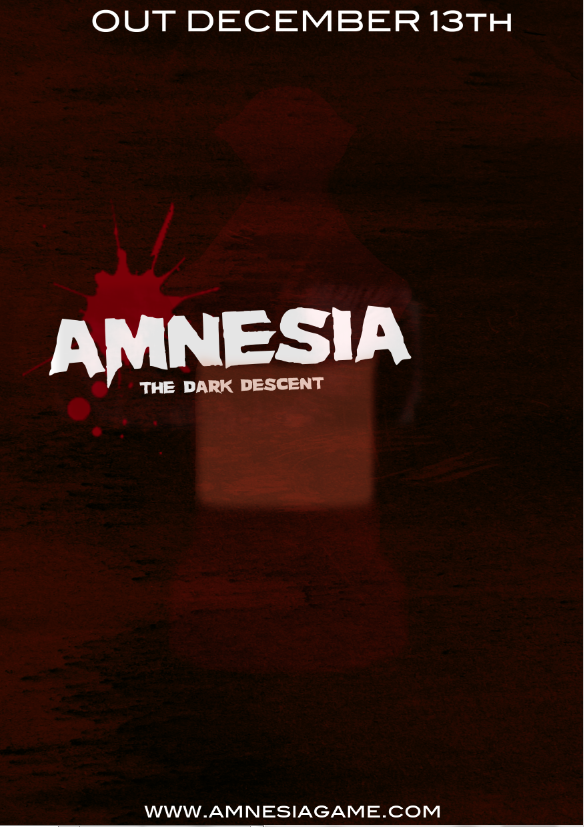
Addding text to poster

Added texture for my background

Added book image for my poster

Applied texture to my book.

Added rose to my design.

Added text to my poster.
No comments:
Post a Comment