One Point Perspective
One point perspective techniques consist of following the end of every line to meet one specific point of the image. In my case the point was the door. From learning this i practiced creating observation drawings where the centre would act as the starting point for all the lines. This was a new type of task for me and i was very eager to begin drawing. I was able to develop skills in which i had not been used to using much. At the beginning i found it to be a tough challenge as i couldn't grasp the lines and how they were supposed to all meet.

fig 1 - one point perspective

fig 2 - one point perspective (observation

fig 3
In fig 2 I drew the hallway i was looking down. I found this a great opportunity to reinforce my object location skills, as it allowed me to use the point as a reference to not only manage the objects size but the location also.
Two Point Perspective
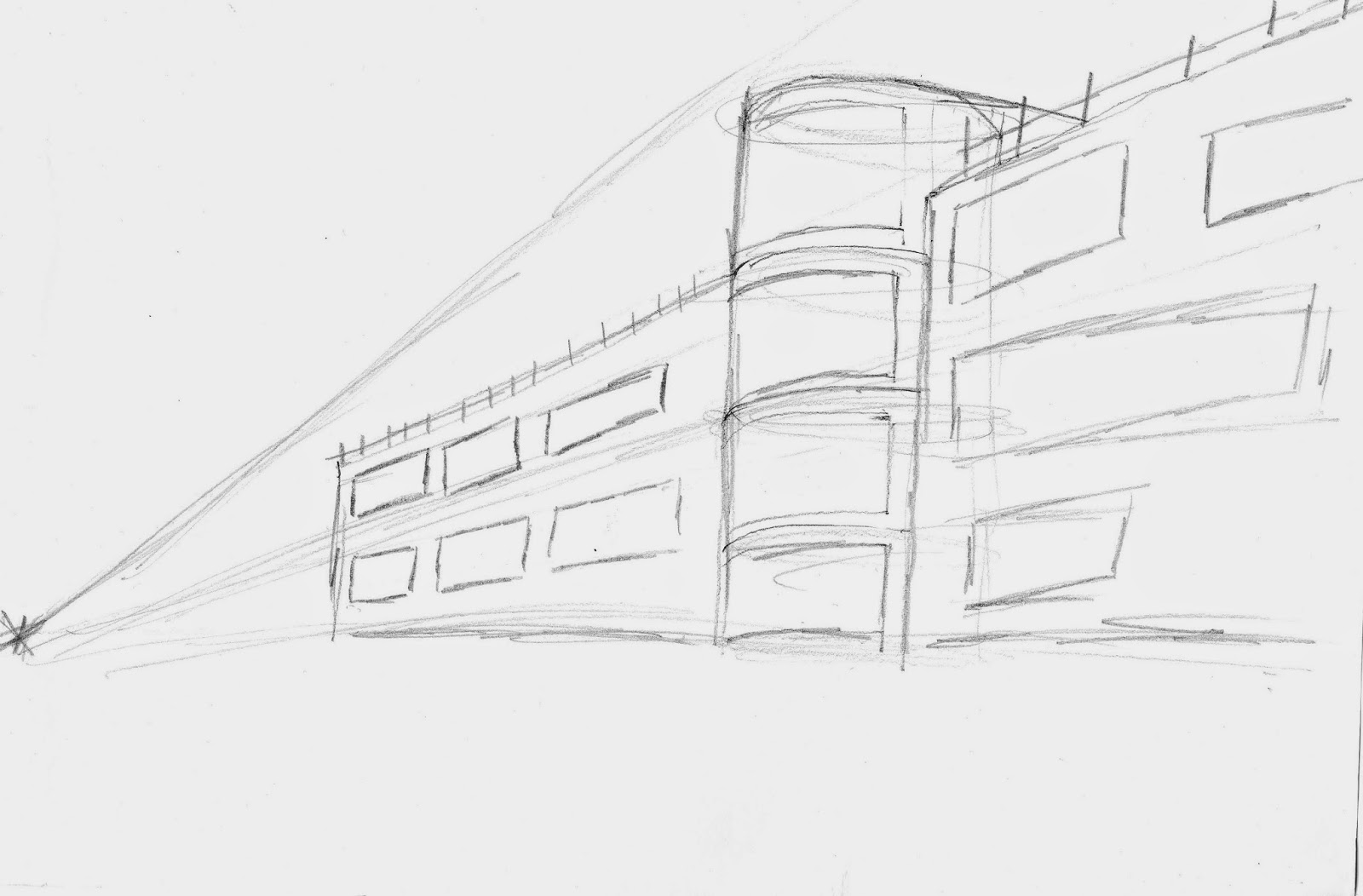
Similarly to One point Perspective, Two Point Perspective is typically the same however there are two points which lines can follow to form an image. For me the hardest part of the challenge was discovering which line follows to which point of perspective. This often lead to my drawings to seem distorted in regards to size and location. I attempted to draw a building consisting of two points of Perspective.

Observational Drawing
Following my development from my one and two point perspective drawings i attempted an observation drawing of junk with consists of a variety of shapes including boxes and cylinders.

I utilised my obsveration and drawing skills and attempt to draw the objects from a number of different angles. During this task i encountered many challenges and a lot of trial and error. basing off the idea that further away objects are projected as smaller i attempted to create a light sketch of the outer lines of all the shapes (also known as ........) By using this technique as a guideline i found the task to be more easier in terms of managing the location of the shape on the page and it's size.

IMAGE HERE
Analytical Construction Drawing
In these drawings i attempted to draw some more objects using Charcoal instead of a pencil. I found this exercise a unique experience, as I'm not used to drawing with charcoal. During which I discovered some new drawing techniques, such as drawing with the side of the charcoal to create more developed lines and shading. I find this a very effective technique in regards to size proportions.

The most difficult part of the task was the fact that I was unable to erase any mistakes, meaning which i had to work with them and incorporate them into my drawing. In addition i found adding detail was difficult as I found the charcoal to be inaccurate when attempting to draw at a very specific point on the page.

Negative & Positive Shape Observational Drawing
During this exercise I drew some equipment which were placed in random locations. The ultimate challenge i found with this task was the proportion of the drawing. I found multiple times that my drawings would look as if you were looking down on them rather than looking at them from an angle.. I attempted to use perspective techniques however only encountered a little improvement.

Regarding the overall sketches of the objects I feel as if I have improved in regards to actually getting the objects on the paper in relatively similar appearances. I shaded in the blank spaces of the paper to emphasize the negative space in relation to how the objects were placed.

I feel I need to improve my drawing proportions next time, however I feel that I am more aware in regards to where the objects are located has improved.
Convey & Concave Forms
Albrecht Durer

I was inspired by Artist's like Albrecht Durer. He is famous for his convey and concave forms drawings. This drawing, drew by Durer in 1508 is a drawing that has inspired me greatly due to it's powerful representative in terms of representing tone. The use of tone clearly establishes depth and definition in regards to the sheet.

Here is my first attempt at a Albrecht Durer styled drawing. I took a chair and placed a white blanket over it. I have attempted to convey tone and use line to define corners and edges of the drawing. I found this exercise extremely challenging in terms of getting the image onto the page. I couldn't comprehend how to draw the lines and tones in order to not make my drawing seem flat.

This is my second attempt at drawing the same object, at a different angle. I feel as if I have took a big step compared to my first drawing. From learning from my first drawing I discovered to add more lines to represent tone, and where creases appear to help emphasis that on my drawing. In terms of adapting to the Ablercht Durer drawing I feel I made a reasonable attempt, and hope to improve in the future.

Here is my attempt of drawing a new object, this time a scrunched up scarf. I found that tackling this drawing helped me understand proportions a little better. I feel I have made progress with drawing the outline of the image, however I feel this drawing lacks depth in regards to tone.

I decided to take a different approach to tone and draw something unique. I took this pencil sharpener which has rounded edges and proved to be fun practice to draw and develop my skill in representing tone. I feel I successfully applied tone to my drawing in particular the actual sharpener inside the shape. I added a darker shade to the side of the sharpener to emphasize depth and proportion of the sharpener. I achieved this by using a technique called hatching. In addition I wanted to avoid the mistake of making the drawing seem flat.
Side View/Profile Drawings
John Singer Seargent


I looked at John Singer Sergeants' work in an attempt to establish stronger understanding and perspective in drawing portraits and side view drawings.
Side View/Profile Drawings
Working off John's drawings I attempted to practice my skills in drawing human faces by starting with the basics. I began by utilizing this simple step by step process of composing the human face. From repeating this I was able to develop base skills needed to form a human face on paper. I found this technique was useful to me as; a simple method to adapt to when drawing human form. In particular a useful method to learn the human face portrait which proved helpful for myself as human faces are my weakest skill in terms of drawing.

In addition to developing skills with portraits and faces I wanted to learn the elements of composing a drawing structured in a size view. I found this to be a new challenge all together as you have to use your imagination to picture the face form and how it could orientate around to the side. To develop this skill I used the similar step by step process used in the full-on view. Similarly I was able to understand the base templates for composing a side view drawing.

After practicing the portrait and side view drawings, I wanted to take my skills even further by combining the two techniques into a half portrait/half side view drawing. I believe from drawing this I can establish stronger understanding in how composing a portrait in any view/position may appear. I was able to achieve a this standard with the image above, in particular with the head size and face features.
The most difficult part of this drawing was understanding how the head fits onto the neck. As seen in the image above I struggled on the nose and chin area. Eventually I was able to learn from my errors and produce a decent looking portrait.


I began to develop my skills into imaginative portraits of a fictional character. Using the step by step process I had previous learnt, I was able to compose a convincing portrait (left). I added my own touch to the drawing by slanting the eyes making my character seem serious or angry. The most difficult part of the drawing for me was adding the facial features, in particular ensuring the eyes angle correctly, as well as the nose size. with the eyes I had issues understanding the perspective in which the two should link. From using my perspective knowledge the further away the object the smaller it should be; which is the issue I encountered during drawing the eyes. (left should be smaller than the right due to portrait angle)
The second image (right) was my first attempt in drawing an actual human portrait without the base lines to act as guidelines. Unfortunately due to the angle of the human portrait I had difficulty grasping the size of what I could see. In my attempt for this drawing I was able to push myself further in an attempt to see how I could cope without the guidelines. I plan to practice my portraits more.
Continuing from my skills in drawing portraits I further practiced my skills in terms of composing the drawing, and ensuring the correct proportions for facial features. These two drawings showcase my development from straying away from the guidelines. Instead of jumping into the deep end and remove the base guidelines completely from my drawings I decided to ease myself into it which is what I achieved here. The first image(left) shows minimal guidelines - noticeably the lines that cross over the face whereas the second drawing shows no guidelines in place.
I was keen to develop my skills in human portraits (due to it being my weakest area). I believe this method provided to perfect stepping stone in order to develop my techniques in the human form.

The next challenge for me was a close-up portrait of a person with added objects; in this case glasses. The glasses provided me with the opportunity to take a different style of approach to this drawing. I was able to compose this drawing with no base guidelines at all, and just drawing what I see. I found it difficult to achieve the correct proportion for the neck, but in terms of the human face I have developed my skills in portraits.

To explore different aspects of the portrait and side view drawings I used the skills I developed when visualizing the portraits in a different method. I placed my hand on the table and attempted to visualize it there and create a drawing of it. I was able to add some extra definition to the drawing by adding tone around edges that were less visible to me.
From this drawing I was able to understand how the skills I have developed could be used to produce other drawings with different outcomes. In addition similar techniques can be used to compose other parts of the body - not just the face.
Rembrandt Van Rijn


He was born in 1606 and was a dutch painter and etcher. He is famous for his geometric approach to his wire frame drawings. Using 3D shapes such as cylinders, cones and prisms he was able to take the next step and produce a human form drawing using these techniques to guide him.
He is widely known for his success in portrait drawings in terms of volume. I am inspired by Rembrandt and thus using the geometric approach I attempted my own drawings of human form beginning with the wire frame approach, then progressing onto adding volume and continuos line drawing.
Geometric Forms - Postural Analysis

Learning human form was a challenge in itself in which it requires you to visualise the person in front of you and record what you see onto paper. After looking at Rembrandt I took his approach of wire frame to drawings; by drawing actors as stickmen. Although a traditional approach it's very effective in terms of understanding the human form and how parts of the body ie. arms, legs, hands and feet function together. For example when standing up I discovered that instead of drawing a straight line for the back, I drew a curved line for a more realistic approach. I experimented with many different positions in order to gain a stronger grasp in ensuring my drawings don't look stiff or out of place.

I eventually progressed onto experimenting with many different postures for my wire frame drawings. I was able to develop my skill in visualising and recording, as well as develop the ability to accurately draw the human form in a more natural state. I added in objects such as boxes and chairs to gain an understanding in how adding objects may change the drawing style. In particular how i could draw simple objects and incorporate them into a natural stance and into the drawing.

Continuous Line Drawing

Concept Art - Places, People and Objects

I creates a brainstorm of ideas that I may want to include in my development. I was mostly interested in the parallel world theme which consists of opposites such as an ocean which translates into a desert or wasteland, a sky which changes from sunrise to day to sunset and finally to night. I believe these concepts hold potential for creativity and possibility to continously spark new ideas as things are always changing in our world.
Location Research

I spent some time looking at different locations that may relate to my story. My story changed a lot throughout my development as i initially struggled to create a solid story plan. As a result I have created two mood boards which one relates to my initial idea of seasons and the vibes they emit. The other refers to my updated ideas that consist of the multiple locations. The mood board above consist of a mix of later and initial ideas I had. Originally I planned to create concept art that relates to opposites, such as the ruined city and time of day. Although I am still interested in these ideas I plan to incoporate them later into my work to enhance or develop my outcomes.
The more recent approach I took includes broad open lands of mountainous regions, fields with a fantasy touch of floating islands. I believe this fantasy approach is more exciting as fantasy lands can range from a huge range of ideas, and can always be developed into new appearances, stemming from the imagination.

My original plan was to work off the seasons idea as I really took an interest in the way which the colours of seasons represent each other and stand out. In particular I am inspired from these images above as they each hold intense colours that create the illusion of strong emotion and ever changing atmosphere.
With the typical colours being blue representing winter, orange with autumn, green with summer and pink for spring I believe that taking an imaginative approach with colours, you can intensify or reduce the level of expressiveness with each colour to allow others to flourish. From doing this you can achieve different effects and place emphasis on different emotions. For example winter may be recognised by sadness due to the dark cold approach whereas spring may represent birth or the beginning of something new.

Initally I struggled with inspiration with my items and objects because I was unsure in how my story would use them. However from creating a moodboard I was able to develop ideas in how to incorporate them into my story and create a focus on them. I plan to create swords as my prime object source for my main character. Other objects such as the lantern and gems are used to escape the void in which the world is becoming In essence they are key items as they allow restoration to parts of the land which suffer from it. (loss of life & colour) Due to my story being heavily focused on the time limit I decided to include some clocks as reference to the lack of time, and perhaps include some time travel.
From the construction of this moodboard I was able to develop ideas in which objects to include in my story. I plan to be evaluative on this later, in regards to if they objects worked or not.
Manga & Anime Artwork
Japanese Anime - Facts & History
Anime is a style of Japanese film and television animation, typically aimed at adults as well as children. Anime is an abbreviation for animation in Japanese. Anime is a diverse form of art with methods and techniques that have been adapted over time, due to technology advancement.
Even though anime is an abbreviation for animation, anime generally focuses on the setting, camera shots, camera movement and art style rather than movement and animation itself. Anime consists of many genres and is distributed theatrically by television broadcasts, over the Internet and directly to home media.

Anime was first created at the beginning of the 20th century. Japanese artists and filmmakers were inspired by western animation, more recognizable as cartoons. The Japanese experimented with the techniques that were being explored in the west, thus anime was developed. Very few complete animations produced at the dawn of anime are still around today, mainly due to commercial nature.
The earliest Japanese animation titled Katsudo Shashin – Moving Picture in English, was produced around 1907 to 1911 consists of a 3 second film loop of 50 frames depicting a young boy in sailor suit who writes kanji, turns removes his hat and salutes. It was made private rather than public as the creator’s identity is unknown.

Toei animation produced the first colour anime in 1958 known as Hakujaden – known as The Tale of the White Serpant. Hakujaden was considered the first modern anime, Toei later went on to produce the famous titles today: Dragonball in 1986, Sailor Moon in 1992 and One Piece in 1999.

Fig - Goku from Dragonball
Towards the 1970’s and 80s, anime was further developed and became accepted in the mainstream in Japan. With the popularity of famous titles rising, many anime series began to become fan subbed due to the internet. Typically Anime is produced with Japanese voices, later with further increase in popularity and technology, anime like Dragonball became world-wide famous and eventually became english-dubbed.
Itaru Hinoue
Itaru Hinoue was born on 1st March and is a female artist from Osaka in Japan. She is one of the founding members of the anime company: Key. Hinoue entered a vocational school to pursue her dream of becomming a proffesional artist. Hinoue was the sole art director for Keys first three titles; Kanon, Air and Clannad each of which has been very successful in not only the Japanese market, but world wide as well.

Above is an image featuring the lead female characters in Clannad. Hinoue has a very distinct art style that has kept it's consistency over the years. For example her character designs always have very small noses, with the mouth located very close to the nose, which results in an abormal amount of space between the mouth and the chin.
I took an interest to Hinoue, as the fact she was the sole artist for such popular artists is an inspiration to me. I also like her colourful approach to drawing as it creates powerful vibes and emphasizes the sense of emotion.
My story
My story received massive changes throughout my development through this project. Below is the final story plot.
My story follows a female character who embarks on a journey to restore the world to it's original form after being altered by an unknown entity. My prime focus on my development became colour after researching and experimenting different styles and techniques.
The world begins to lose it's colour turning grey. If left unchanged for an extended period of time, the effected area begins to degrade and eventually dies. (creating a void?)
Initial Character Ideas

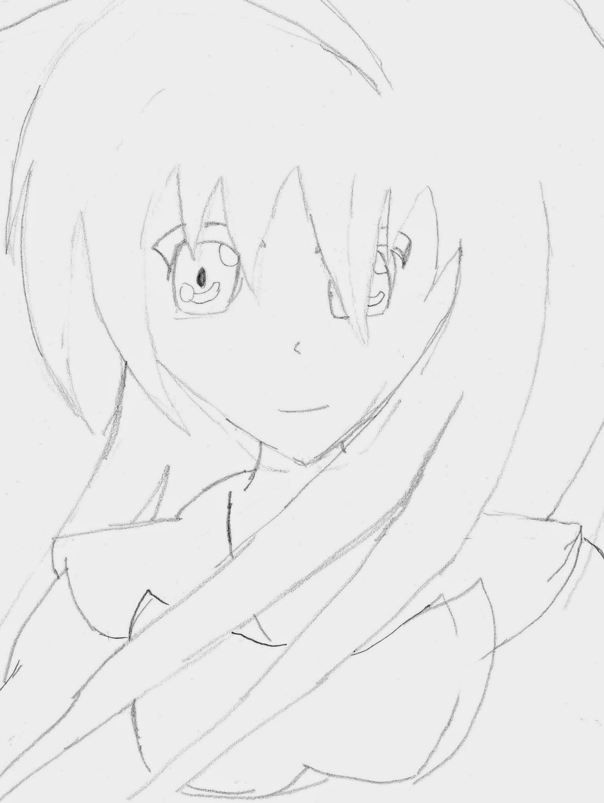
With an anime-style in mind I decided to jump straight into composing my own anime character. Unfortunately I struggled to tackle the approach and ended up with a distorted looking image. I had a lot of struggle drawing the eyes and positioning the features on the face. I believe for a first attempt my strongest section was the drawing of the hair. Although a weak drawing overall, I was able to challenge myself in tackling a new style; ultimately this has motivated me to improve my approach.
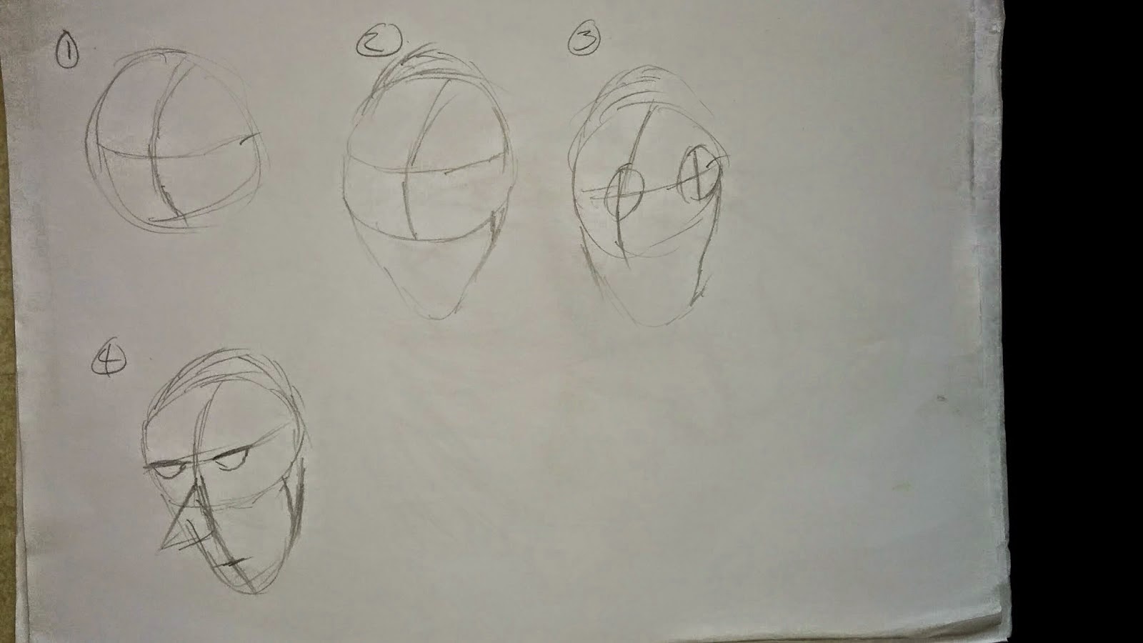
Character Development - Revisiting the Basics
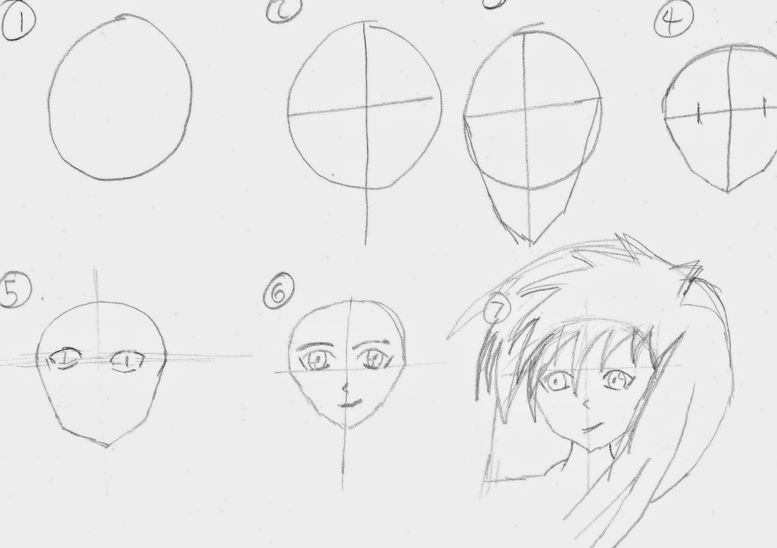
To Improve my ability to draw in the anime style, I decided to take John Sergeant's approach approach to drawing and utilise it in a manga way. I began by following steps to compose a manga character. The steps are very simple. They begin by creating a circle which resembles the head, and adding in guidelines, (crosses) to help recognize the position of the eyes, nose and mouth. As of step 5 I discovered that a careful approach is required when creating the eyes, as slightly off-centered eyes can result in a wonky looking character.
The final step would involve creating the hair. When drawing the hair I encountered scaling issues. I would often find that the hair seemed too large for the character as a whole which created a unique fantasy look. Ultimately from revisiting the basic steps of human form I was able to develop more confidence in my ability to draw manga.
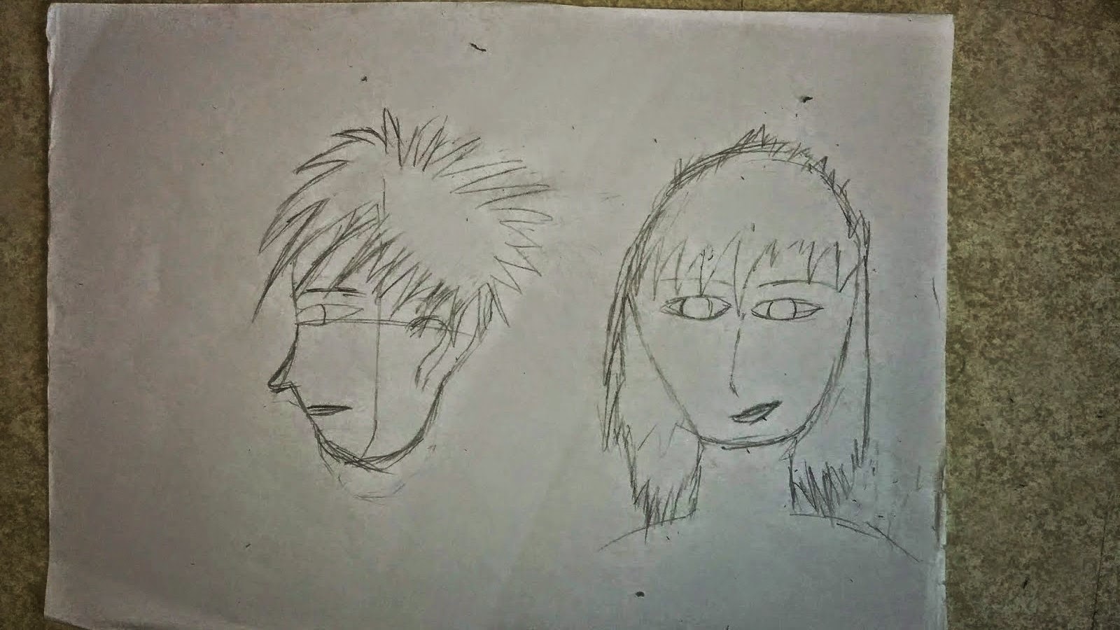
Improving on Initial Ideas

After revisiting the production of human form I decided to tackle another attempt at drawing some characters. I drew these new drawings in a close-up shot in order to practice my ability with positioning the eyes . I believe I have had more success with this drawing as the drawing as a whole feels more life-like compared to my previous attempt. I had some issues with the hair line, in particular I'd find the fringe would overlap with other parts causing some hair parts to be too long or too short.
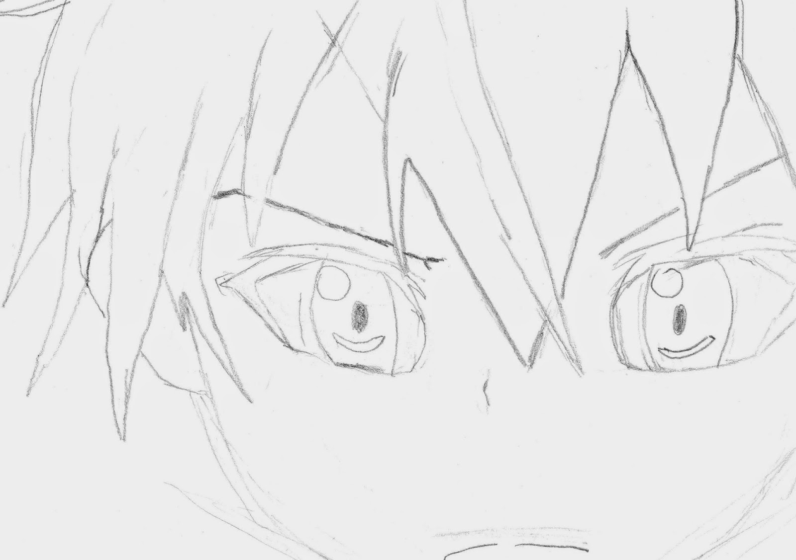
My second re-approach to initial ideas allowed me to evaluate mistakes and lack of ability in my previous drawing and practice them in the next. I decided to sketch a character that possesses a more indepth hair line. From practicing the hairline I was able to overcome concerns I had regarding adapting to the manga style. In regards to the eyes, I believe I have improved vastly when compared to my original drawing. I am able to comprehend eye proportions and compose them onto paper from my imagination.
Main Character Development (Portrait)

With more confidence in drawing a characters face and features, I began to compose my characters appearance. I came to the conclusion that my character would possess long hair and wield a sword as her weapon. The image above is my first image of my character. This image acts a a root for the development of my character as I plan to work off this drawing.
I found it a fun experience to draw this character, as I wanted my first image to hold some uniqueness. Due to the manga nature I decided to add an additional feature to her face to suggest confusion or lack of understanding. I believe small details like this will help develop my characters personality and bring her to life.

This drawing enabled me to place more emphasis on my characters long hair, allowing it to be more distinguishable. The process of creating this image included multiple trial and error attempt's on the neck part. I wanted to have a strand of hair which fell past her shoulders and in front of her chest. Due to this I discovered issues regarding the proportions of the neck. I would often find that the hair would be located exactly on the second neck line, which created the illusion that my character had a long neck.
To solve this I eventually came up with the solution and increased the size of the hair. I like this image overall as it further emphasizes my characters personality, presenting her in a more serious tone.
After practicing my ability in drawing characters, I began to compose my own character's style. After working in close-up work space, I tracked out into portrait view which acts as the next step to forging my character. From tracking out I attempted to draw more of the body of my character. I believe I was able to give my character a unique style in terms of the hair and face, however when it came to drawing below the shoulders I became stuck and found it difficult to continue drawing. I will practice this in order to develop my drawing ability of the body.
WaterColouring

After encountering issues with drawing the lower body part I was cautious when approaching this drawing. I decided to challenge my concerns and tackle an almost full body drawing. As a result I am happy with this drawing, I can clearly see my progress in my drawing ability and am excited to see more results. To place more definition on the hair I added in additional strokes to remove confusion when distinguishing the hair and body between each other.
I also took an approach to shading in order to make the image feel more natural due to the position of my character. Using Durer's technique I was able to establish more depth in the clothes on my character. It's also in this drawing I was able to draw the hair at a more desired length. I wanted to achieve the recognition that my characters hair is longer than a usual length. I believe from doing this I am able to give my character a sense of identity.

I began using water Colours for the first time. I use a marker to redefine the hair lines in order to ensure no loss of detail when using water colours. I was able to create a vivid-like red which gave my character an intense look. Initially I was planning on only colouring in the hair, as my story is about the loss of colour in the world; and with only colouring in the hair I could create the potential for a hidden power within our character thats immune to effects. I found using the Water Colour's a fun experience as I had never used them before. I believe they allow potential for a more intense look, and have worked well in this case.

With the loss of colour theme- I decided to take the opportunity to practice colour opacity levels with water colours. From mixing in white and black I was able to create very subtle lighter versions of black, in which I used to colour the clothing. In doing this not only was I able to create a sense of depth with my characters clothing, I was able to ensure the black and white colour theme with my drawing.
After looking at the drawing I feel that overall the red worked well for the hair, but I believe the clothing would have benefit from a more of a digital approach to colour.
Marker Pens & Shading

Marker pens can be used to add additional depth and defintion to an image or drawing. I wanted to experiment in using a marker pen to see what outcomes I could produce. A marker pen makes a difficult material to use as it's unable to be erased, meaning that any mistakes are permanent. With the drawing above I used a marker pen to compose it, while using a pencil as a guideline for the majority of the drawing.
I believe the use of a marker pen is effective for emphasizing an image, or part of an image however in the method I have used it here feels a little bland. I plan to practice with different marker pens colours to see what different results I can achieve.
I was able to practice some more shading with this image, in particular with the cloak I have my character. The shading creates the illusion of 3D within the cloak, due to this I believe it's an effective approach. I plan to practice it in my next sketch.

With this drawing I focused primarily on the shading aspects. Although I developed a stronger understanding with shading, and how it might be used in combination with a light source. I believe that my proportions of the face suffered as a result. I focused too heavy on shading whereas I should have focused on proportions and position first, then moved on to shading.

I wanted to restore some of the loss of proportion from this drawing, more noticeably in the eyes and face size. I attempted a different technique which involved using a marker pen to overwrite the pencil shades. I really like the effect it created with this image, especially with the ribbon. The shape and size is much more distinguishable when compared to the pencil version, ultimately emits a powerful look to the drawing.
Full Form Character - With Added Object

This drawing is my second attempt at drawing a full body version of my character; also my favourite drawing thus far. Not only is the hair length fully recognized in this image I was able to successfully draw the body of my character in good proportions. I spent a lot of time ensuring my accuracy with the body was decent. I developed confidence in drawing the body as a whole, and feel my ability to draw has progressed in a large chunk from my original state.

I wanted to experiment with a slightly different look to my character to add my own style. With keeping the long hair length I slightly altered the way in which I drew my characters face. I achieved this by making it more round and compact which allowed me to develop a new sense of drawing style. I really like the eyes on this image, I believe it accurately shows my development in composing facial features.
Digitizing my Character

Using Photoshop I began to develop my character in the digital world. For this image I used simple tools, including the paintbrush and paint bucket to fill the white space. I was able to establish an idea in how my character might look like in the digital world. I believe my character feels a little too bright with the colour, perhaps due to lack of shading of additional features. I plan to expand on this and search for solutions in how I can evolve the production of my character.
Vector Art - Monochrome/Black & White
Vector Art is the use of geometrical techniques in use with points lines, curves and shapes to represent images in a computer graphical form. Detail can be added or removed from vector art.
Monochrome is a technique used in paintings, drawings, or photographs to reduce the amount of colour to one, and instead use different shades of the colour. It is usually limited in colours and uses contrast instead use of multiple colours.
Monochome in combination with vector Art can allow the production of very interesting results.

Olga Griga
Olga Griga is an Artist that began work in 2006. They specialize in creating vector images, with use of limited colours (usually 1, 2 or 3.) The images use colour to represent detail, creating a very unique look to their productions. Their vector images use a silhouette style in order to ensure a minimalist look. This is an effective method to create the illusion of detail. I hope to achieve similar results, and experiment with the technique and perhaps modify it into my own style and produce some interesting outcomes.

Vector Art Experiment

I was inspired by the monochrome/vector style and decided attempt my own digital approach. I am fascinated by the way these images look, as the shades of black are very effective in adding depth to my characters. I used the black and white effect in Photoshop, combined with the stamp filter in the filter gallery. I achieved some very interesting images. Once the effect had been applied I could use the paint bucket and paint brush tool to easily smooth up the outline of the image.

Improving on the Monochrome/vector style I re-visited one of my previous drawings and placed it into Photoshop. Using similar techniques I used in my first monchrome experiment; I developed this image further and captured the illusion of detail with the image. From ensuring the simplistic approach I improved the proportions of the image, ultimately generating a new style and increasing the appeal to the image. I found experimenting with monochrome effects a really fun activity as it's a new technique I've never used before.

From revisiting this drawing, I was able to add more intensity to the hair. With the monochrome style I can visit places that didn't work well in my drawing and use the paintbrush to colour over it in black. This is an effective process as it allows my drawings to appear more lifelike.


I took this drawing a step further beyond the monochrome/vector style and placed it into the silhouette style. I achieved this by placing a black colour overlay over the image which formed the drawing into a full black concept. From experimenting with this I was able to create links with my place concept, and develop ideas in how I could create a concept piece with both my character and place in. I hope to build upon these foundations to create new exciting concepts.
Final Character

I began developing my Photoshop skills with textures and colouring. After my monochrome style, I was inspired to experiment with the filter gallery in Photoshop. I was able to achieve a subtle paper- pencil texture with precise settings in the filter. This placed emphasis on the image as a whole, giving it a unique look.
I used a new technique that requires a lot of time and precision to develop colour. I would begin by adding a new layer for each respective colour and fill the whole layer with a solid colour. (IE for the hair I filled a whole layer with red) I then proceeded to decrease the opacity levels to around 30% to allow the texture to be seen. Following this I selected the circle selection tool and increased the feathering amount between the numbers of 2 and 20 depending on the level of accuracy required. From doing this I could then delete the colour around the hair, forging a convincing coloured texture. As I approached the outline of the drawing I would decrease the feathering amount lower and lower to ensure precision, and that I don't accidentally delete some colour from the hair.
Although a time consuming technique, I believe the approach I took has granted me the experience of new techniques, therefore I have understood the importance of time management and accuracy when producing a piece of work.
Initial Place Inspiration


I was inspired by this Photo I took for this location. I wanted my story to begin in a school where everything begins as normal. In an attempt to visualize the way in which I wanted my school to look I drew this image which is inspired by this photo. I feel as if the proportions of this drawing was off, making it seem as if the building is slanted.
To solve this I revisited my previous work, and created a second drawing in which I use one point perspective in order to gain a stronger understanding in how to structure the building. I believe my second attempt at this drawing is more powerful compared to my first. As following the one point perspective has acted as a guideline for me in ensuring correct proportions are met.

This drawing is supposed to resemble a large bridge, in my story it's the place the first battle occurs with my character. This drawing offered a new challenge for me as I had to create the two bridge structures facing each other in a 3D view. This proved a challenge to ensure that the structure of the building was consistent and fluid throughout the entire drawing. In addition, I utilised the thought that the two were mirroring each other and used my imagination to keep the two relatively similar in terms of scale.
I took it upon myself to begin shading in this image. The left bridge structure being shaded in the front, and the right bridge having shading in the rear. I thought this was a clever approach as the different shading angles could suggest light and dark, IE the protagonist and antagonist in my story, further emphasizing the battle that would take place.
The Legend of Zelda: Skyward sword

The Legend of Zelda: Skyward Sword is a RPG game produced by Nintendo for the Nintendo Wii in 2011. It's over world consists of a land that is located in the sky. I took an interest to the floating islands, and believe it's fascinating how the fantasy approach to having a world in the sky could work.
World of Warcraft: Nagrand

This image is taken from the popular MMORPG called World of Warcraft. The game released in 2004 and is still going strong as the most popular MMO out there on the market today. This screenshot is captured from Nagrand, a zone which almost entirely consists of floating islands. I really like the way the light contrasts with the background in this image, in particular how the further the background is away, the more blurred it becomes.
Floating Island Development

The drawing above is my first image of a floating island. I drew the island in a small scale, to grasp an idea in how a floating island may look on paper. I understand that the bottom section of the floating island is recognized due to it's rocky structure. With the surface on top of the structure being smooth. I drew a tree on top the island to create the sense of a floating structure.

I wanted to experiment with some different materials for this design, as I believe that I could achieve some interesting results. I decided to experiment with some chalk which I thought would create an interesting texture for the floating island. Similar to the charcoal shading method, I tilted the chalk and used it's side in a motion that would represent the structure of the texture. When creating the grass and tree leaves I would use a circular motion and deliberately leave some gaps to suggest the the top isn't as solid as the rocky bottom.
Although I was able to develop some interesting textures I feel that the chalk gave the island a childish look due to it's bright nature.

Using the monochrome/vector technique I developed for my character; I decided to experiment with the floating island. I was curious if the floating island would still be distinguihshable as a floating island if the majority of it's detail was removed. I feel the island is still recognisable as a floating island; I plan to use this later in my work.
Limbo Inspiration

Limbo is a PC puzzle game that uses a plethora of shades of the colour black. I am intrigued by the graphical layout of this game and it's clever use of blurs, feathering and opacity levels.
I believe the game uses a similar approach to my monochrome experiments, however in a much more effective way. The game places all of it's characters in a full black - creating a silhouette style. The eyes of the characters consist of white circles which is a clever method.
The background generally consists of trees and buildings, all of different shades of black and grey. The lighter the shade of the tree - the further away the tree is to the player. In contrast the darker the shade of the tree, the closer it is to the player.

Although the game uses a silhouette theme for it's characters; all of them are recognizable as characters. For example the main character in this shot is clearly recognized, and the character to the right has legs which resemble a spider. Due to it's size the spider could be presented as a boss in the game. Clever mechanics like these are techniques I'd like to learn and incorporate into my own style of work.
Limbo Inspired - Forest Development

Inspired from the Limbo game, using Photoshop I created my own forest using similar styles from limbo. I began by drawing a tree, scanned it into Photoshop, and duplicated it multiple times. I would then proceed to colour them all in black, and randomize the opacity levels of the trees to create the illusion of distance between them. I found this process to be a fun activity, as exploring the creative approach to designs is exciting to see what outcomes can be produced.

I began experimenting the pen and was able to develop new techniques. I practiced various techniques such as dots, crosshatching and dashes. Although simple they provide different advantages when applied to a drawing, for example a crosshatching technique may be used to provide reference to shading or darker tones. Dashes can be used to connect small parts of an image or be used to add minimal detail to sections that need it.
I practiced line depth by placing different amounts of pressure with each stroke. The first stroke I placed mininal pressure which results in a light faded line, whereas towards the last stoke I applied maximum pressure creating more density and colour with the stroke.
Simple techniques such as dashes can be used to represent a style of art in a drawing. For example mulitple dashes stacked together could represent the grass. I practiced using techniques such as crosshatching, dashes and waves in 3D. I was able to distort the lines in such a way that created the illusion of 3D. By applying minimal pressure in specific places I achieved the look I was after. This task allowed me to develop skills that I was unaware of before in regards to basic pen movement such as the 3D effect and pressure levels.

Using crosshatching as a technique and a marker as a material I used my inspiration from the spider boss in Limbo and began to compose simplistic designs based on this reference. Due to the intensity of the marker I was able to create the spider in a simple manner of a few strokes. The fire in the center of the image represents the light source in my story, where the spiders eliminate it, causing it to degrade.
I believe I have successfully developed a unique style to this image through crosshatching. I was careful to not over do the amount of crosshatching so that the tree could still be recognized as a tree.

Using the limbo/monochrome theme I attempted to develop a section of a castle in Photoshop. In this image I experimented with a texture to see what impact that would have on the image. I believe the texture eliminates the simplistic feel to the style, thus making the image feel tacky.
Creating my own Limbo style - Paper & Digital

The style in the Limbo game inspired me to create my own world in its style. I wanted to use the Silhouette theme in a clever way in which shows the land slowly being robbed of it's colour, and being coated in a shade of grey. I'm excited to develop this style as I believe this is an effective way to showcase how the world changes when it gets robbed of it's colour.
I began my using a marker to create the outline of a mountainous region. From using the marker I ensured the simplistic approach I was looking to take. From there I could scan my image into the computer and begin experimenting with colours.

From importing my work into Photoshop I was able to change the colours of my world. I created an all grey scene which would resemble what the world would appear like when depleted of colour. I believe it emits a sad depressing emotion within this scene, which is the atmosphere I was aiming to create.
I added a texture to the top part of the land resembling grass, to add more realism to my image. With experimenting with the filter gallery I was able to create the illusion of wind that moves the grass in a subtle way.

In addition I attempted to draw a spider which is climbing over the hills. The spider is the source of colour depletion, and I try to suggest that with gradients that gradually change the colour from green fading to grey. I like the way the grey contrasts with the colour, suggesting the grey is overpowering the green colour.
Julie Fain
Julie Fain is a graphic designer and fantasy artist who first started out in web design. She is known for her work which resemble fairies and magic. I am really interested in her work, in particular how she uses colours to contrast with her designs. The vibrant colours really bring out the colourful vibes in her work.
She has a powerful technique of using silhouettes in conjunction with the light of the moons/planets she frequently uses in her work.


I really like these images as they have powerful fantasy vibes to them. Both images have a similar object that is placed as center of attention; in these cases a moon and a planet. Both have glow effects that light up the scene and create a fantasy like atmospheric world. In the first image I am intrigued with the reflection on the watery surface, it really brings the world to life.
Place Development - Artist Inspired

After looking at Julie Fain, I was inspired by her designs and wanted to attempt to take my own approach. I found a moon texture and cropped it into a circle. I then added a glow effect to forge a moon. I took the silhouette characters and floating island I had created before and decreased the scale so that they would fit inside the moon.
I believe I successfully capture the vivid, fantasy style approach to this image and am happy with the result. From placing the character and floating island into one scene I am able to gain a sense in how my world might look. The island could represent the main characters home, or sanctuary (a safe place from the depleted colour world).

For this scene I used Adobe After effects to compose the ocean surface. I used the Fractal Noise effect to forge the illusion of a water surface. I took the moon from my previous design and placed it at the end of the ocean. Using feathering and colour modes, in this case curves I could lighten up a specific area of the ocean which creates the illusion of a reflection. I found this to be a fun design to create as I was always excited to see what other possibilities and potential changes I could make to my design.
I believe the dark approach I took to this image emits a dark tone, which resembles the dark nature of my story.
Manipulating Colours
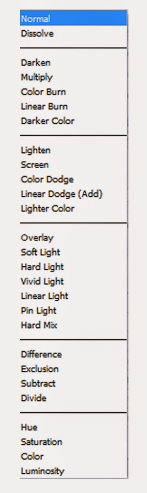
Illustrator and Photoshop offer tools that allow the user to create interesting colours and effects. One of the tools that I'll be experimenting with in my development is the "Colour Mode". The colour mode changes the overall colour rules for the layers.
Effects like Dark, multipy and Darker Colour would increase the darkness of the overall composition, where as effects like Overlay, screen or any of the Lights would generally increase the overall brightness of the composition, each with slightly alternate impact.

In addition to experimenting with different colour modes, using curves and the Brightness/contrast effects in a combination with the colour modes are a very powerful tool, allowing further manipulation of colours and change even more.
I found this particuarly useful to use on textures. These effects are powerful tools which allowed me to modify any objects overall colour scheme. I was able to change a brown dirty texture to a blue, cold texture that could represent sense of insecurity.
The Curves effect is particularly effective as it allows me to increase or decrease very specific colours in order to create the colour scheme I desire.


Above are examples of me experimenting with the curves tool - . As displayed I can create a bloody red texture, or a cold abandoned texture by manipulating Colour Modes and Colour Effects. This will be a useful tool to use to tone down some unwanted colours, or alternatively increase the density of the texture if needed,

My final Piece for my place. I combined the two previous designs into one. I added the floating island in the ocean scene which suggests the island is moving, or perhaps it rose from beneath the ocean. To enhance this image further I added a shadow on the ocean to represent the shadow of the floating island, making the scene seem more realistic. I believe I have achieved the fantasy theme for my place, and feel I have developed my ability in using Digital software, especially in Photoshop and After Effects.
Object Inspiration

I was interested in producing some drawings of swords for my character as a sword is my main characters weapon for fighting. After referring back to my moodboard I realized that swords can come in a variety of different sizes and proportions. I begun by composing some swords in the different styles. I was interested in swords like the Master Sword from the Legend of Zelda, and rapiers such as the sword style pirates would use.
I would often encounter issues with managing the proportions of the handle from the sword, and find myself in situations where the handle would be slanted when compared to the blade length of the sword. To help manage this I used the technique of tilting the pencil to the side to act a ruler and guideline for my sword. From doing this I could more accurately measure the proportions and create a straight line.
Object Development

Having being interested in this sword style I decided to develop it further. I took a more careful approach when drawing a second image for this sword style. I wanted to make the sword appear more bold and large. I achieved this by spreading out the mid-section of the sword (the joint between the handle and the blade). I feel this created a more impact look to the sword, adding more depth and definition.

I took my drawing into Photoshop and began to add colour to the sword. I also added a stroke to add a more bolder effect onto the lines of the sword, hinting at a manga style. I decided to complete the rest of the drawing by using the paintbrush tool to add the edge point of the sword.
When adding colour to this drawing, I took a slightly lighter shade of red for the upper part of the handle, in attempt to add some diversity to the blade. I added a very subtle water colour texture to the sword, more noticeable on the blade, to create a slight sense of realism. I like the sword style overall, however I feel the sword appears a little too messy in terms of composition and outline.
Lantern Development

Due to my world being engulfed in grey darkness I decided to create some props which could represent the restoration or recovery of the loss of colour throughout the world. One of my ideas I had was to create a lantern which holds a white flame centered directly in the lantern, and when used can drain life force of it's user to fuel the land of colour once again.
To produce this, I began by sketching of what could resemble a lantern in my story. I found this initial process quite difficult, as i had never drew an object like this before. I used techniques I developed when drawing junk in class, such as drawing cirlces that represent the base of the lamp. This allowed for easier structure later on when it came to joining up the lines.

Using the techniques I was able to compose a stronger drawing, in terms of structure. The lantern above uses the guidelines I had practiced in class to form the image of a lanter. I believe this lantern is my stronger drawing due to it's more upright position, when compared to my previous drawings.
I plan to scan this image into Photoshop to fix some wonky parts and experiment with the Limbo/Monochrome vector style I had previously developed with my character and place.
Limbo Inspired - Lantern Experiment

Using shape tools, duplicate tools, and selection tools, I was able to fix the errors I previously had with my drawing. I was able to use my drawing as a template and forge a more firm image of a lantern. Using similar techniques, I applied a filter effect and a black and white overlay to my lantern and was able to achieve a vectored version of my lantern. I have proven that I can use software to aid my drawings in structure and form more powerful firm images using techniques.

In the above image I experimented with the silhouette style with my lantern. I was curious in regards to how I could import an object into the same scene as my character and location, however I struggled to discover an appropriate place for it thus far.
By turning my vector image into a Silhouette I have gained a stronger understanding in to how my object may relate to my character and place developments. I believe the black silhouettes suggest the dark nature of my story and are powerful in terms of relating to the plot.
Pendant Development

I wanted to develop a jewel that could be recognised as a pendant, as well as holding some kind of unique feature. I wanted the pendant to contain a massive power that could restore colour in parts of the world and replenish the disastrous time in the world. To achieve this I drew a simple oval shape and added crosses which imply the sealed reality of this power. I was sure to draw the cross large enough in order for it to be relevant and clearly noticeable. I plan to take this pendant into Photoshop to stretch my developments.
Pete Harrison - Aeiko
Pete Harrison also known as Aeiko is a Graphic Designer/Website Designer and Motion Graphic producer. He specializes in creating flashy bright effects in digital software. He uses clever techniques to create the illusion of a club-like atmospheric condition. He uses feathering, glows, opacity, blurs and gradients in a combination which emits a lively, energetic aura.


The above images are examples of his work. I am interested in the way he positions these effects to amplify the atmosphere generated. The images offer colourful vibes which are presented with a plethora of special effects that really make the designs stand out.
I hope to practice these techniques and develop my own sense of creativity with his work as inspiration.

After researching Harrison's designs I began to develop my own style using similar techniques. I applied creativity and inspiration to produce new outcomes with styles that could represent power or life.
I utilised Photoshop by taking advantage of it's colour tools and features. I was able to colour the pendant in a colour which would match the red hair of my protagonist which suggest the similarities between the two.
I also experimented with creating a sparkle effect. from creating tiny shapes and applying several glows and adjusting the settings I created tiny circles which represent the power that the pendant hold.
Final Object Concept Designs

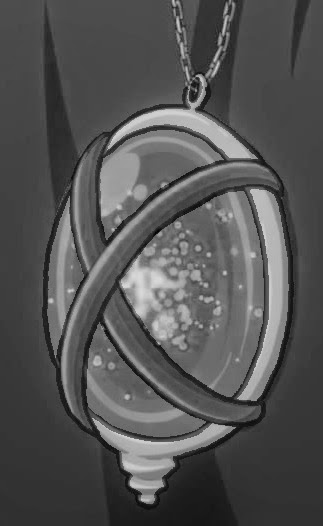
I wanted to take a more subtle approach to the particle/sparkle effect to my pendant designs. To achieve this I placed the sparkles from the outside to the inner part of the jewel. I liked this idea as I thought the particle effect would represent the power that is sealed within the pendant and suggest an explosion of power which is waiting to be released.
I applied a tint effect to create a black and white version of my pendant which could represent how it might look if it became engulfed in the darkness of the world. I believe these are effective designs as they hold lots of meaning due to their design (the cross representing the a cage for the sealed power) and the impact particle effect which represents the burst of power awaiting release. Overall I have enjoyed creating these designs as I was able to learn the art of simplicity and how effective using simple shapes such as circles could amplify the appearance of an object or piece and develop the concept in a new interesting way.
Evaluation
For this task we were required to produce a range of artwork for a developed concept. We were to independently plan, research and execute a piece of artwork for an object, place and character using the skills we have developed thus far in unit 1. The work could include a variety of different approach methods, including drawn and painted techniques to digital processes and developing using software.
I was initially a little stuck when it came to approaching the task as I was concerned for my ability to draw and how it might affect my development of ideas. I begun by approaching this task by producing a brainstorm of general ideas that I might want to base my story on. I believe I was able to generate inspiration to effectively dawn the beginning of my concept designs.
Originally I was keen to develop ideas for an opposite theme, more noticeably the seasons theme. I was interested in the possible techniques and outcomes I could develop to really get my ideas to flourish. Eventually I became inspired by the manga/anime theme and decided to research the history of anime, and research some artists. After I had researched some artists my work began to stem. Although my drawing ability appears weak at first, I believe from this task I have slowly began to develop my ability through practice and determination.
Overall, I believe that my work is mostly successful. I was able to meet all the task requirements, and even began to develop my own style. I had utilised some techniques that I had previously practiced in the first half of Unit 1, in particular one point perspective and object depth. Because of this my concerns for my ability to draw was slowly erased as my practice proved worth while especially once I used digital techniques to develop my drawings to a more professional standard. My monochrome/vector approach to character designs, as well as my digital concept art for my location are my highlights for this task. I was able to produce work using new techniques, that I had never used before to develop my own individual style.
As already mentioned, the most difficult part of the task for me was the drawing aspect. Having struggled to achieve strong proportions for my designs in the past I was concerned with the quality of my outcomes produced. I believe my blog effectively displays this, and shows my development with drawing (although still not to my desired level) I have proven that I can improve upon my weaknesses to attempt to develop more creative work. If I were to improve an aspect of my work, I would practice my ability to draw characters even further to achieve a more desired skill level. In addition if I were to attempt this task again; I would select and research a solid story from the beginning as one of the reasons I initially struggled with this task was due to my undecided story plot.
No comments:
Post a Comment