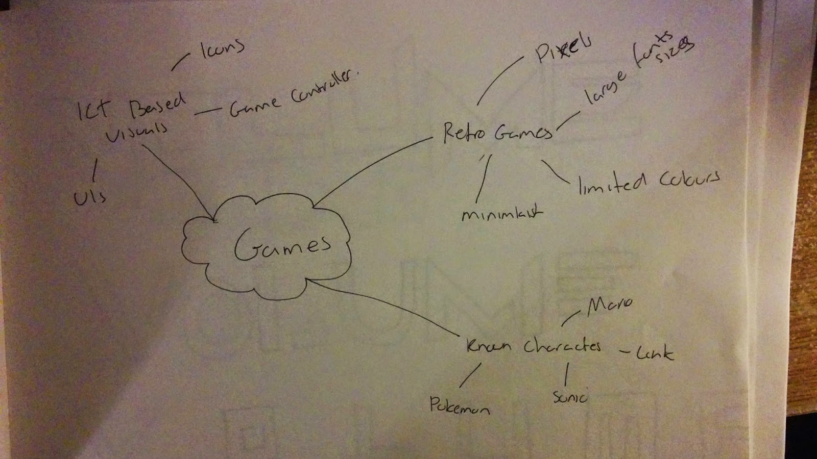
Typeface Research

I composed a mood board containing various expressive typefaces. I was able to gain an understanding in what expressive words actually mean, and how they can be used to convey a message or meaning. In this case the dieting word would show an expressive meaning due to the D being larger and bolder, whereas the G is thiner, thus showing the process of dieting. I also like the Shelter expressive word, as it's clever use of the T in the word acts as a shelter for the word as a whole. I like the Clock expressive word, I believe this one is very powerful as it uses no graphics, just letters to form the illusion of a clock.
Typeface Experiments/Designs

I began creating patterns using only one letter at a time. I would type a letter and experiment with the rotation, size and proportion of the letter to attempt to forge a pattern or image. I found this an exciting task as I was able to develop my visual imagination to how something as simple as a letter could be used to create something unique.
My most favourite design is the butterfly design. I composed this entirely through the letter C. By using a font which would have the letter C quite curly I was able to duplicate the letter multiple times and form the illusion of a butterfly. With this design i experimented with some colour to gain some more convincing results.
I am fascinated with the way letters can form all kinds of shapes. The bottom left image uses the letter T, and forms an image that could suggest a distorted monster, emphasizing the potential of typography.
Typeface Drawings


Above is my first attempt at expressive typefaces and development. I attempted to use a variety of different approaches by enlarging certain letters, changing the proportions and by placing the letters in various locations. One of my designs use the word Energetic, in a capitalized format, with each letter joint together. I then proceeded to enlarge the entire word as a whole to fill up the square, suggesting the energetic vibe from the word. Words like knock were quite effective words to express as I could draw the word from various perspectives. In one perspective I drew the word as if it had been knocked, in another I drew the word to be a door, emphasizing the knock on the door.
Expressive Typeface Development

I took my designs into a digital stand point where I could further develop my designs. For this design i used a combination of font and the pen tool to achieve the effect I was after. In this design I attempted to compose the word in an italic form, with a line that would go straight through the word as a whole. I achieved this by linking each letter with specific parts, making a line. The line would represent electricity, thus emphasizing the fast paced nature of the word Energetic.
By using free transform tools such as warp, distort and skew, I could change the appeal of the font. It gave me freer access over what I could modify and change. In particular I was able to use the skew tool to make the N appear like a lightning bolt.

This image shows my experimentation of colours. I was able to change the background to a black with a soft white gradient in the centre. This provided me with the perfect platform necessary to increase the visual appeal. Additionally I changed the colour of the typeface to a white, to allow it to be visible.

This image shows the next step of development with the word. I was able to change the gradient to a yellow streak which strikes straight through the centre of the page. This increases the illusion of liveliness in the word, thus increasing the expressiveness of the word energetic. To reinforce this and allow the word to become more powerful, I duplicated the word multiple times, decreased the opacity and placed the layer behind the main layer. Additionally I increased the size of some of the layers to give the illusion of speed and effectively expressing the word energetic.

My next design was to use the word Board. my initial idea was to use the B ad a board it's self and have the letters jumping off it. I referred to the word as a board for water pools and used the letter R to express a slide for the word. I also duplicated the layer multiple times and gradually decreased the opacity levels giving the illusion that the letters have jumped off the board and are falling. The issue with this design is that the R feels out of place and can cause issues when reading the word. I hope to solve this in the future.

In an attempt to fix the issue with the R being read in the wrong order, I decided to remove an element of expressive and take a more simplistic approach. To do this I changed the letter to be of the same style as the remainder of the falling letters. This allows for easier reading, at the same time giving ensuring the expressive value of the board being an actual board.

The next expressive word I looked at was the word Knock. I like this word as I believe it has potential to portray different meanings when used in different proportions. The image above features the N as a door itself implying the word Knock. Additionally I have altered the way in which the letters C and K are positioned. I used the free transform tool to rotate them slightly, givng the illusion that they have been knocked.

I developed the word Knock by experimenting with some different tools. I used the reflection tool to essentially reflect the K's in opposite directions. My goal with this design was to give the illusion that the letters have been knocked out of proportion, thus placing emphasis on the expressive value.

I used the word Surfing as my next typeface. My aim with this word was to express the illusion of the word actually surfing. I was able to achieve this by essentially increasing the size of the F and allowing it to act as if it was a board with the "ING" part of the word surfing.
I believe this design is effective in terms of expressing the words meaning however the position of the letter F could cause slight confusion in the reading process. I attempted to solve this by placing the letter F closer to the "SUR" part of the word with the "ING" further at the end.


Quotes: Typeface Visual Development - Research

I looked at examples of expressive sentences. I like the top left sentence as it places emphasis on the word fine, allowing the expressive value to increase. This means the sentence would be read: Another Fiiiiiine Mess. It uses a curly font as opposed to a grungy type; which is the opposite to what would usually be associated with the word mess.
I have also taken an interest to how the quote; I love you every step of the way, which appears to have been written on actual steps, literally meaning each individual step. In contrast you could argue that the way the sentence has been written, it appears to be going down the steps which could suggest an decline in the love. Taking in these techniques into consideration I plan to develop my own expressive sentences.
Quotes: Typeface Sketches

The next sentence was: Rumours don't define who you are. I experimented with different positions for this and sizes. Eventually I was able to enlarge the words Rumours, Define, You which in contrast to the actual message could conflict with eachother. I was able to give the quote two completely different meanings, suggesting that Rumours define you if you let them define you. In contrast taking the time and having patience and being less hasty would allow the actual meaning of the quote to be revealed - similarly how you need to relax and not be bothered by rumours if they aren't true. I like this philosophical approach as I believe communicating two messages in the same quote is very powerful technique.
My next sentence was: Would you kill someone you love because of Love? With this design I was able to place emphasis on all kinds of words due to position and enlarging them. In some cases I could express the words: Kill, Love giving the quote an alternative meaning, suggesting that you're killing the love. In addition I attempted to use the Y from You as a graphic to act as an arrow piercing through the heart (the O in love) as seen in my last drawing.

My next sentence was: The Light at the end of the tunnel. I liked this sentence as I saw potential with the N's in tunnel, and could be used to give the illusion of an actual tunnel. As seen in my drawings I experimented with different variations of the sentence to discover new ways of portraying the tunnel. I also used the sentence Two is better than One, which is a phrase from a love song. The idea being that two is more powerful than one I experimented with ideas that would express visually. I used enlarging techniques to enlarge the size of the word TWO to signify it's power and importance.
Typeface Research

I began researching effective typography I could use for expressive sentences. I discovered that each typeface could be used to generate a different appeal. For example using a font like Friday13th on a word like LOVE would be an effective approach due to the fact that love would usually be associated with more heart warming styled font. This would create uneasiness, and create a sense of opposite desires, an effective technique to use in approaching visual sentences. I hope to use these fonts in a style which could generate this effect, ultimately to see what impact that would have on the quote as a whole. Using fonts like these you can distort or alter the meaning of a quote completely.
Quotes: Typeface Visual Development

I developed my expressive sentences in Photoshop. With this sentence I attempted to place emphasis on the word: one. I was able to achieve this by enlarging the text and placing it directly below the remainder of the text. My goal with this design was to create an opposite effect, by making the "one" appear of more importance. You could argue that "2" which is presented in it's numeral form is more effective due to it being more easily interpreted when compared to the text formed "one".
This design was my first I developed in the digital process and believe it serves as the perfect stepping stone in order for me to improve my ability to express meaning in these visuals.

One of my favourite designs is my development with this visual. This design uses a simple structure with slightly altered rotation values on two words which completely change the way this sentence is interpreted. I was able to achieve this by placing the numbers 2 and 1 parallel from each other. Following this I placed the word "Is" in a smaller size value and placed it next to the "2". I could then use the 2 as a basis and branch off with the words BETTER and THAN. With this design I was able to achieve the meaning of the sentence in a visual expressive standard. With the words "BETTER and THAN forming the shape of a greater than symbol, it makes this design powerful in terms of expressing the meaning of the phrase: 2 is better than 1.

Building upon the same foundations as my sketches I wanted to see if I could recreate one of my designs in a digital form. This design follows a simplisitic layout which uses the words "I got the" in a capitalized enlarged form, placing massive emphasis on them. I then proceeded to place the word "power" below the sentence in a less enlarged state. Additionally I changed the font of the word power to emphasize a more feminist nature. From doing this I was able to achieve an opposite effect; where stereo typically a fancier font which be associated with a more gentle word; rather than a harsher word like power.


I believe I was able to successfully redesign this visual to allow it to read: I got the POW -- er. I was able to achieve this by placing the phrase "POW" in capitals, followed by enlargement and increasing the bold factor. Additionally I changed the colour and incorporated a red flash visual into the text, to allow great impact to be interpreted when reading the word, ultimately marginally increasing the expressiveness of the sentence.

I took some time to experiment and develop my own favourite phrase from one of my favourite shows. The Phrase: Flaming haired blazing eyed hunter refers to the describing vocabulary people refer to when talking about a specific person in the show. I decided to attempt to use my techniques to attempt to communicate this phrase in an expressive manner to describe this character visually.
I was able to achieve this by using a font that would emphasize the "fire" nature of the text. Additionally I placed the words "blazing and hunter" in a layout that would visually represent an eye. I then placed the word "eye" in the centre of the visual, accompanied with a small red gradient to allow the word to be seen, and amplifying the power of the visual to represent an eye. I like this design as I believe I was able to visually express the meaning of this sentence.


The phrase "would you kill someone you love because of love" holds potential for expressing the meaning in different ways. For this phrase I placed the words on a black background with red colour. From doing this I was able to express blood, as the font type I selected combined with the colour of the text was able to symbolize death and give this phrase a darker meaning. Initially I wanted toplace emphasis on the words Love and You to give the phrase an alternate meaning. In addition I coloured the words pink to allow for a deeper connection with the phrase to be established. The above images show my experiments with these techniques, each emitting different effects and having unique impacts.

Following from my previous designs I wanted to emphasis the words kill and love to create a deeper meaning in the phrase. I achieved this by colouring the words in a different colour to allow them to stand out. In this image I coloured them red to represent blood. I believe that the most powerful element in this image is the typeface. The typeface expresses death due to it's jittery outlines and extended strokes with the font.

I developed on this idea further and coloured the word "because" to express a secondary phrase within the meaning of sentence. Reading the coloured words reads "kill because love" which could suggest someones strong emotion of love, developing their desire to kill because of a love. I like this as it really develops upon the meaning of the phrase.

My first design on the quote "Rumours don't define who you are". I capitalized "Rumours, Define, You" to give the phrase a secondary meaning. It can read two ways; Rumours define you, or rumours don't define who you are, meaning that depending on the person, different meanings would appeal. (see my sketches of more information for the meaning of the phrase).

I experimented with fonts in this design, however unfortunately the typeface I used didn't fit well with the design and communicate the message effectively. I tried rearranging the words in a position that would convey the phrase "Rumours Define You, more obviously, while still expressing the original phrase. Additionally I attempted to arrange the whole phrase in a compact nature to emphasis how rumours spread.

With this design i wanted to experiment with different typeface further to see if I could achieve a different approach. I used an inky-appearing type to suggest how the rumours were man made- similarly to the typeface's effect. I believe I was able to achieve a darker impact with this typeface, and have discovered the importance of selecting the correct typeface to match the phrase itself. In addition learning from my previous design, I have experience I lesser effective type, thus improving my skills in selecting appropriate typefaces.

I decided to tackle a different approach with this design, and experiment with the position and colour of words to create a new technique. With his design I have duplicated the words multiple times and placed them at a diagonally angle. Following this I then randomly selected a word from each line and coloured it with a bright colour. Due to the compact nature of this design I was able to emphasis the rumours part of the phrase. My goal with this design was to emphasize this by spreading out the phrase over the entire workspace, suggesting the method in which rumours are spread.

I began to work with textures on this design; I wanted to achieve a wanted look to emphasize the "who" word of the phrase. By emphasizing this word I was able to generate a more powerful impact by essentially asking the reader "who are you?". This was an effective way to build upon the meaning of the phrase and communicate a bunch of emotions to the reader. I was able to achieve this by placing a texture that would represent a wanted poster as the background. Next I changed the typeface of the stereo typical wanted poster theme. Following this I enlarged the "who" to allow strong impact on the word and generate the effect I mentioned earlier. Additionally with the "who" placed in the centre of the wanted poster, usually an image of the wanted person or object would be placed there, placing a further massive amount of impact on the word.

I made some improvements with this design to allow a more convincing visuals and ultimately communicating the message in a more expressive manner. The improvements I made consists of enlarging the majority of the text to allow for a more powerful and firm expressive manner. Additionally I removed the border/box I had on the previous image, and enlarged the word "who" further which allowed me to build upon the foundations I mentioned in my previous image.

With this expressive phrase I began to take advantage of enlarging specific sections. In this case I enlarged one of the letter n's to represent a tunnel in a visual perspective. I believe that by enlarging the letter I have successfully created a more visually appealing approach; promoting the meaning of the phrase overall.

I worked off my previous design and begun to develop the tunnel visual in my expressive phrase. I was able to create the image of a tunnel using the two n's in the word. Following this I positioned the text to represent the travelling of the world or globe, to imply how the light is at the end. I believe that this image provides a solid foundation which proves how I can build upon them - in my next images.

Following similar structure to my previous design, I was able to develop the idea further and form a second more powerful visual to express the meaning of the phrase. I was able to achieve this by positioning the text, and changing the size values to form the illusion of an outline of a light bulb. I placed additional emphasis on this by increasing the size of the word "light" signifying it's importance. I believe that this design expresses the phrase more powerfully compared to my previous design because of this.

Finally I added a texture to my design. I selected a grungy-like texture, decreased the opacity and set the colour mode to overlay. This created the subtle effect on the design, reinforcing the tunnel visual. I believe that the addition of this texture holds more of an impact to the overall appeal to the design, ultimately increasing the expressiveness and visually expressing the meaning of the phrase.
Recipe Moodboard

For the visual recipe task I composed a mood board consisting of a plethora of ingredients (at least 2 of each) of the materials needed to create Melon Pan. I was sure to include a cartoon version and a realistic photo of the respective ingredient. From doing this I was able to gain understanding to not only what ingredients are needed to create Melon Pan, but also how each style could be featured in a Visual Recipe. In this case the ingredients needed to create melon pan are:
- Eggs
- Flour
- Salt
- Sugar
- Vanilla Extract
- Butter
- Water
- Yeast
- Powdered Milk
Components Mood board

I created a second mood board consisting of the components needed to create Melon Pan, following the same method as the ingredients mood board I added a cartoon version and a photo version of each respective component. I wasn't sure that I was going to be using each component as an image in my visual recipe, however it was useful in terms of gaining an insight to the style of my visual recipe. The components needed to create Melon Pan are:
- Whisk
- Fork
- Bowl
- Oven
Art Styles & examples

I began looking at different art styles for different visual recipes. Initially I had struggled to picture how a visual recipe, however after researching some art styles of visual recipes I have discovered that a visual recipe can be created using any kind of style. They can be simplistic like the pancake visual recipe located at the top right of the page. I like this design as it's very simple and effectively give all the information to what you can do with eggs and what kinds of things you can make; a very clever layout.
Visual Recipes can also be as complex as the cinnamon rolls recipe located to the bottom left. Additionally using layouts such as the top left recipe is an effective way of structuring the ingredients and what you do with them. The recipe is essentially telling its reader that all ingredients need to be placed into this one place, which is a powerful technique. I have learnt that the image needs to be simple yet complex enough so that the user can distinguish what ingredient is which. For example how would you distinguish salt from sugar in a visual style, what makes salt and what makes sugar.
History & Representation

A melon pan also known as melon bun or melon bread is a type of sweet bun from Japan, that is also popular in Taiwan, China and Latin America. They are made from an enriched dough covered in a thin layer of crisp cookie dough. Their appearance resembles a melon, such as a rock melon. They are not traditionally melon flavoured, but in recent times it had become popular for manufactures to add melon to melon bread.
Initially I thought about using Japanese Media; Manga as a representation for my visual recipe. I had thought about using various manga characters, or present my visual recipe in a manga format.
Melon Pan Research

Variations of Melon Pan exist including some with a few chocolate chips between the cookie layer and the enriched dough layer. Non melon versions are flavoured with caramel, maple syrup, chocolate, or other flavours, sometimes with syrup, whipped or flavoured cream, or custard as filling.
Various colours and themes of Melon Pan exist which suggest different flavours as seen in the description above. Traditionally a Melon Pan is coloured the same as bread.
Video Game UI Moodboard

I decided to stray away from the anime theme and select a theme more fitting for a visual recipe. I was inspired by video game's user interfaces and how they're led out. I have composed a mood board showcasing various video games UI's and how they use lay out and present various items. In video games such as MMO's and RPG's there are often cooking skills and recipes, which present the required materials to make the consumable.
In particular I like the way the UI's are set up in sections, and each item is categorized into a specific area. For example weapons will be placed in one section where as clothing would be placed in another. I could use this with some inspiration to lay out my visual recipe with categories - components and ingredients.
Skyrim UI - Inspiration

I was primarily interested in Skyrim and the layout of the UI. The UI uses a slick black theme in which amplifies simplicity in design. Although the UI is generally covered with text, I have taken an interest to the style of the layout. Games like World of Warcraft use icons to present items in game and where there is a multiple of said item the game adds a number at the bottom right of the icon to indicate how much of a multiple said item is.
I believe that composing a mood board of different examples of skyrim UI's I am able to generate a stronger insight to how my visual recipe might be presented in terms of lay out. Due to the complex instructions of making Melon Pan, I believe that a simple UI would benefit the complexity and allow for easier reading for my visual recipe.
Talent Tree System - Inspiration

I took an interest to the talent tree system often found in MMO's and RPG's. In particular the layout and how the talent tree system flows downwards (in some minor cases upwards) which could be suggested from a visual recipe perspective how all the ingredients flow into one IE the Melon Pan. I was also inspired by the icons in the talent tree systems, as they can have different multiples for each respective talent. From a Visual Recipe perspective the multiples could each talent could be portrayed as a multiple for each ingredient.
In this Mood board I look at various styles of talent tree systems, in particular Skyrim wow and BLC. I have noticed a similar trend in talent trees and UI's.
Font Research - Japanese Styled Fonts

Due to Melon bread originating from Japan I decided to research some Japanese styled typefaces that i could possibly use for my visual recipe. Most of the fonts offer a bold, stroke effect which suggest that the font has been composed by a heavy layer of ink. The fonts prove as an effective typeface due to their boldness and depth. I have come to recognize how foreign fonts like these could be effective in creating a visual recipe. By having a foreign themed typeface like these as the title for a visual recipe, users can easily distinguish the origin and nature of the food they are making. The fonts I have chosen are compact and hold definition, allowing for easy reading for the viewer, while ensuring uniqueness.
Font Research - Video Game Styled Fonts

In contrast to the Japanese themed typography I decided to take the time to research into various video game styled fonts. As Japan has a heavy focus on video games, I feel that combining the use of video game type and Japanese type would be an effective design technique.
The video game typeface differ from the Japanese styled fonts I had previously looked at. Although both typography are generally bold and hold depth, the video game styled fonts are more up-right, and have no extra sections of the text or exaggerated letters. I believe that using video game font would be more effective in terms of allowing the visual recipe to be easier to read.
Ingredients Sketches

I began composing visuals in the form of sketches. I was able to refer to my mood board that I had created on ingredients, and develop convincing graphics of ingredients. The image above shows my sketches of salt and eggs. I wanted to attempt to allow easy recognition between salt and sugar; To achieve this I drew the container for the salt in a container with the multiple flat surfaces. I improved from my initial design of drawing the salt in a standard container with no texture.
With the eggs I was able to draw three eggs and make them appear that they were resting on each other. I begun to add some toning to represent the 3D nature, as well as adding a crack to further imply the image is an egg.

With these set of visuals I begun to develop sugar. I was challenged with the thought process of thinking how sugar is portrayed visually. I drew multiple forms of packaging for the sugar, each with a slightly altered variation. To emphasize the sugar I drew a few small cubes next to the packaging as sugar could be viewed as sugar cubes.
Additionally I drew the sugar pouring out into a bowl to gain an idea to how I could incorporate some components into the visuals at the same time. I believe I successfully composed a visual with sugar and a bowl present at the same time, however I resorted into writing the word sugar on the packaging to ensure that it wasn't mistaken for flour.

I referred to my ingredients mood board as I was unsure how to compose butter. I discovered that butter could be portrayed in few forms, most with the text "butter" placed upon the graphic. I drew a plethora of ideas in regards to how I could portray butter. This ranges from different packaging, from pots to wrappers and to plain out of the box styled butter. From drawing these I have gained knowledge in understanding how visuals could be drawn in different styles and the effect it might have on the visual recipe.
During these designs I used some toning where necessary to allow for more recognition for the packaging of the butter. I particularly like the butter in packaging as it is more distinguishable as butter where as the circular butter could be misinterpreted as cheese.

In this set of drawings I drew variations of powdered milk, yeast and vanilla extract. Initially I had struggled in thinking of a suitable approach to draw powdered milk due to it coming in many different forms. After referring to my mood board and conducting some further research I was able to draw powdered milk in the form of a container that would be associated with powdered products. I have managed to narrow down the image, to allow it to be more recognizable as powdered milk or a protein bag.
With the vanilla extract I was able to compose a container that would be most appropriate for an extract. I believe that the process of digitalising the vanilla extract will allow for more recognition for the product.

The final ingredients I composed was the flour. I spent a lot of time looking at different variations for flour as it can be presented in a large range of different packaging. I believe that drawing all of these variatons have granted me stronger understanding in how I could portray ingredients visually, and more importantly provide me with the platform required to tackle the visual approach in a digital form.
I feel that the process of drawing these products has allowed me to realize the details that make visuals graphically recognisable as the products they are.
Digitalising Ingredients

I decided to take on the digital approach in a catoon-ish manner as I believe that this style would be more appropriate for my visual recipe being presented as a game UI. I realize that the process of adding colour to my sketches has allowed my products to me more recognisable, and are able to be distinguished between each form, especially like sugar and salt.
Additionally I took the time to alter some variations and proportions of my sketches to allow them to to feel more up right and to a more professional standard. I plan to combine these ingredients into the style of icons, as I had previously researched.
Composing Icons
Above are my ingredients in icon form. I like the idea of using icons to display the multiple of measurement needed to make Melon Pan. I believe that this style offers a simplistic, minimalist approach and is easy to read and understand. I had also used abbreviations for my multiple measurements instead of the full word, IE, TBSP for Table Spoon as using the entire word would be too long and make the icons appear to a less professional standard. By doing this I can ensure the minimalist style.
For Icons like the bowls I wanted to attempt to keep two images on the same icon to avoid confusion to the reader, to achieve this I put a large bowl and a small bowl on the same icon, accompanied with two X1's; meaning that you will need a small bowl and a large bowl.
Layout Sketches

I referred to the Skyrim UI layout and composed my first design. The left section consists of the ingredients needed to make Melon Pan and the right consists of the instructions. The instructions are to be read: Icon + Icon = Icon format. I have left some spacing below each set of instructions to allow for any comments or written details necessary to allow the visual recipe to make sense.
In the center of the screen consists of a clock which indicates that you are supposed to place the Melon Pan in the oven for 20 minutes at 180C. Originally I had planned for this design to work digitally. The text located at the bottom of the page would alternate depending on what step you were on. Once you were at the last stage of the recipe the text would instruct: place into oven at 180C for 20 mins. Similarly the image at the center of the page would change to a larger version of the icons for each respective stage.
The issue with this design is that the design is more suited for a software rather than a visual recipe.

 This design was inspired from the screen shot taken from Skyrim to the right. This Layout follows a similar read style to the talent tree systems, meaning that you read it downwards. In this case I have renamed the ingredients to "mats" meaning materials in game terms. I feel this is more of a video game style and successfully created this appeal. I added arrows across the design to allow for easier understanding for the
 reader in terms of reading direction. The second column follows a similar format to my previous design. It uses a downwards reading cycle with the format: Icon + Icon = Icon. I have also created a square for each stage of the instructions to allow for any details or information that cannot be expressed visually.
After reaching the end of the column, I including the baking instructions which uses a timer to indicate that the Melon Pan must be placed in the oven at 180C for 20 minutes.

After some thought I had realized that the process of making Melon Pan is complex as in you have to make two different types of dough separately , then merge them together at the end. To tackle this I altered my ideas slightly to feature easier understanding by visually separating the instructions for each dough.
I followed the same format with icons and talent tree systems of reading downwards however I split them so that the reader can easily understand the making of two dough's. At the bottom of the page I placed another set of icons to indicate the merging process of the two dough's in the format of Dough + Dough = Melon Pan, accompanied with the timer and temperature to suggest the oven process of the instructions.

After creating my previous design I had realized that the ingredients section may also require some separating to allow for easier recognition. I was able to achieve this by creating two rows for the bread dough and the cookie dough ingredients. I also named the ingredients as Materials as reference to a video game style. Followed below the materials are the instructions, with the timer and Melon Pan Icon in the center to further suggest the merge of both dough's.
The issue I encountered with this was that this design may confuse some readers due to it's inconsistent layout. The materials section is read from left to right, however the instructions section is read downwards similarly to the talent tree system in video games.

With this design I was sure to stay consistent with the reading layout. The materials are located to the left, presenting each icon which would represent each individual ingredient. I then proceeded to separate both Dough's and added a secondary section for instructions at the bottom, accompanied with arrow from each dough suggesting that they both merge. I ensured to add the timer to suggest the time needed in the oven, with a Melon Pan icon at the end to reinforce the merging process with the instructions.
Initial Idea - Digital Layout

I was unsure to how I was to begin producing my visual recipe digitally, so I took a step back to one of my early designs and combined it with the Skyrim research that I conducted. I was able to produce an initial idea for my visual recipe and gain a stronger perspective to how I could produce it.
I used the template for my first design; meaning that this design is designed to fit software rather than paper. The difference with this design is that I added different flavour tabs located to the far left of the design. The user would be able to select each tab to view instructions for each flavour. The square in the center of the page would display an image related to the step depending on which part of the instructions the user would be on. To match the image, some information would also be displayed at the bottom of the page as seen in this design; the user can then proceed to hit the arrow button to proceed to the next step. I used a black theme for this design, as reference to the Skyrim designs.
Final Visual Recipe Development

I began developing my Visual Recipe, using the icons and designs I had produced. The first step shows the construction of the visual recipe, and how it looks without any details. You can see I have successfully separated both Dough's for the ingredients and the instructions. This will allow for easier understanding for the user.
At the bottom of the visual recipe I have created a section which would describe the result, further suggesting the merging process of the two dough's. This will be accompanied with text and visuals to ensure that the reader understands this.

The next screen shot shows my development with adding in all the necessary information and visuals needed to produce Melon Pan. This was also the first opportunity I had to see how my visuals might look in their respective state. I believe that the visual recipe is simple to read due to the icons being easily recognizable and the layout being structured in a way that the instructions for both dough's are understandable. I had issues attempting to discover methods to alternate the layout to allow the reader to understand the making process.

I added some more visuals to allow for easier understanding to the reader. In particular I added in the timer which would inform the reader how long each process would take. For the bread dough I added a timer to display that the bread would have to be kept covered and left in a warm place for one hour. The visual reinforces the important of this. Additionally, like my designs I added a second timer for the actual baking process of the Melon Pan, informing the reader that the Melon Pan must be baked at 180C for 20 minutes.
I chose a colour theme for the timers that would most fit the Skyrim-UI design style. The grey and black approach allows the timers to stand out as objects of importance, aswell as being clear to the reader.

To further increase the visual appeal of the timers I created I added a red overlay to the timers. I believe this overlay allows for more precise accuracy in regards to how long each process would take. For the Keep covered in warm place for 1 hour, the complete red overlay allows the reader to instantly realize that the timer is displaying one hour, as opposed to one minute or less.

I wanted to achieve a more powerful visual for the background as most Skyrim UI's look stylistic due to the texture or background image. I decided to take this approach and experiment with a Melon Pan as a background for the image. Initially the Melon Pan was too bright, which deterred the Skyrim theme. To fix this, I found an appropriate level of opacity to darken the overall background image and achieve a more suited style.

I experimented with some layout positions for my overall design. I revisited my research and discovered that I had subconsciously deterred away from the talent tree system which would involve reading downwards. To solve this issue I experimented with position and was able to find a solution to allow the visual recipe to fit the style more effectively, while retaining the visual appeal of Skryrim.
I believe that this position shown in the image is much more powerful compared to my previous layout. The Ingredients are placed directly above each dough, with each dough giving detailed descriptions of the making process with the arrow at the bottom of the page suggesting the merging of the two dough's effectively.

The above image is my final visual recipe. I was able to achieve a more professional standard by adding some features similar to Skyrim. I referred to my mood board and was able to add some additional visual elements to my recipe that would enhance its overall appeal. I achieved this by adding abstract shapes to each corner of the sections of the visual recipe. I believe these subtle changes really alter the visual recipe, giving it a more defined finish.
I found this task to be a challenge itself, due to the cooking/recipe theme to be new to me. Additionally the complexity of my chosen food allowed me to explore different visual aspects, and discover my own style to forge the visual recipe; through icons that would represent multiples of each ingredient and talent tree system layouts.
Festival Poster
Brainstorm
I began producing a Brainstorm of ideas for a festival idea. In this brainstorm I record ideas of a potential games festival.

I produced a second Brainstorm generating ideas for another festival idea. In this brainstorm I record ideas of a potential music themed festival.
Research - General Themed Posters

I begun my research by looking at existing festival posters. The first festival poster consists of mainly a green colour, which allows the poster to stand out. The poster consists of a travelling music station offering a visual to the viewer of how the festival might look. The green colour combined with the music station suggests the festival may be aimed at a family target audience due to it's gentle appeal. However you could argue that the typeface used for the "Sounds Loud" festival could suggest its aimed at more of a young audience. Due to the layout of the poster including level of detail I believe this is a successful poster in terms of grabbing attention.
The second poster is presented in a pink background, immediately making the poster bright and catching the eye. Although pink is stereo typically associated with females the blue silhouette coloured bike chain/film roll at the background could argue that the the festival is aimed at both genders. I believe this silhouettes used in this poster create a very engaging atmosphere, suggesting the target audience may be teens or young adults. The use of boldness in the word Bicycle and the thinner approach in the Film Festival offers variety in the typeface. Although the typeface is simple I believe it is effective in terms of relating with the style of the poster. I believe the level of detail in this poster is at an acceptable level, however the presentation feels quite standard. I believe this is due to the placement of all the information being located directly under the main image of the poster, creating a stale look.
The third poster "Japan Film Festival" uses the colours red and black effectively. In my opinion the techniques used to allow contrast with the two colours are powerful. They are clearly presented and grab the viewers attention. The size of the typography used are also at a good proportion, however I believe the position of the text could imply the front page of a magazine cover, instead of being a festival poster. The poster holds a mix of realistic images and a simplistic theme which in my opinion works well for the purpose of the poster. The clever positioning of the camera to create the red ray of light is effective in terms of allowing the text to stand out. I believe the level of detail in this poster is also at an appropriate level. Additionally, unlike the previous poster the information is placed around the poster, instead of being placed in one location. Due to this I feel that the poster accurately displays the information to the viewer.

The first festival poster in this image uses a plethora of colours to attract the viewer. Additionally the colours reinforce the active theme of the festival, especially in regards to the name "Knock Summer Festival" The typeface also uses a texture which is a fitting technique combined with the name. The sky in this poster is coloured a bright blue, with streaks of darker and lighter shade which create a 3D feel. Due to this I believe this emphasises the fast paced vibe for the festival, suggesting that the target audience is young teens. The level of detail in this poster is very minimal however, the use of dark boxes outline the information, making of more clearly to see. The choice of the colour black is an effective colour to select as it fits with the stroke outline of the main typeface.
The second poster uses a yellow background combined with a purple colour for the main title. Unfortunately, although the boldness of the title allows the poster to stand out, the yellow doesn't really fit with the purple colour. I would have selected more of a darker colour to allow the title to stand out more to the audience. Due to this I struggle to pinpoint the target audience of this poster. The boldness of the title could suggest it's aimed at young adults/teens however the yellow colour emits more of a childish-looking theme.
The third festival poster ensures a very minimalist style. It uses three colours: red, blue and white to present the festival. The orange-red combined with the light blue and white create a summer-like feel to the poster. the main image seems to be a combination of an ice cream and a guitar, suggesting the overall attraction of the festival to be a place you can enjoy summer while listening to music and eating ice cream. This technique would be very attractive to the viewer however due to the white background I believe the poster lacks initial attention grabbing. The level of detail presented in this poster is at a decent amount. The use of different colours also make the information look more appealing, instead of looking dull and resulting in the viewer to lose interest.

The first poster is a famous festival poster called Download. The first noticeable thing about this poster is the bold font. Although small and simple I believe the chosen typeface is effective in grabbing the users attention due to this reason. The main title is accompanied with an animal who has his teeth on the title suggesting that the target audience for this festival is adults. The name download also implies the festival is media related festival - with the name itself being immediately attractable to the viewer. The poster itself is actually very minimalist, excluding the level of detail. It is mainly made up from logos from music bands that are appearing at the festival and objects such as flames or tree branches which emerge from the side of the poster. The level of detail in this poster consists of a large chunk of white text, although i feel a little unnecessary the bands logos redeem the poster.
The second poster is one of my most favourite posters as I feel it holds a balanced level of detail and images that make up the poster. The use of the colour red as the background is an effective colour to use as it grabs the users attention. It also relates to the theme of christmas which is an additional plus. Although technically not a festival poster, I am intrigued regarding the layout and position of images for the poster. The poster uses a silhouette minimalist theme, however the top section of the poster has a plethora of images consisting of christmas trees, snow and decorations. This suggests that the party is targeted at all ages and both genders. The poster uses a simplistic font, however I believe it fits with the silhouette theme of the poster.
I have mixed opinions regarding the third poster. To an extent I believe the use of shapes are powerful in terms of conveying the layout to the viewer, however the white background eliminates some of it's potential. The reason for this is that I believe that the white background feels plain compared to the remainder of the layout. Although a music festival I find it difficult to distinguish the genre of the festival just from looking at the poster generally. This may deter some people from acknowledging the poster. The poster uses two main colours: purple and blue which although well contrasting colours, the use of placing the colours on separate sides indicate that the poster is trying to split up the information, which isn't the case.
Research - Typography on Posters

The first poster uses bunch of different fonts combined with the checkboard layout, in addition with the title being placed at the centre of the poster it is the first place where a viewer would look. Although a unique technique, it is effective in drawing in the viewer and poses the question: What would the films be about? Due to the typeface 's interesting and unique layout. The colours are also randomised which reinforce the questionable film genre.
The second poster uses a typeface combined with an image to establish it's genre more effectively. The typeface is interesting to me due to it's skewed layout. It appears to be bent with the center of the text being more upwards. I believe this is a good technique to create a sense of depth and diversity with designs. The use of the image being placed in between the two words give opportunity to convey some extra information in a more visual manner.
The third poster combines use of boldness and depth to create a 3D look. Although simple I believe this technique effectively attracts the eye due to its diverse design. The white colour accompanied with the red stroke allows the text to stand out regardless of the colour for the remainder of the design. This allows for a more open approach and design ideas.

I selected the first poster in these selection of posters due to it's large font type I was fascinated with the clever use of size and actual word to form an effective expressive word design on a festival poster. The word "WOW" is partnered with the large font size emphasizing the word it'self as it actually echoes in your head when you read it. The text is coloured in some light shades which reinforces the echo for the word. Additonally the position of the word should be noted also, with the word being placed in the centre, it offers opportunity to extend the viewers attention span as after being drawn directly the the centre of the poster the viewer can scan the poster as whole. As opposed to the standard reading method from top to bottom. (left to right)
The second poster uses type in an effective way in terms of boldness and attractiveness. The font is accompanied with a mix of black colour, and the same colour as the background for the poster. To allow for attention grabbing, the words that are the same colour as the background are presented with a black border to bring the letters from being invisible to a very effective visable letter with a clever design. The letters appear to represent the arty theme for the festival due to their creative touch.
The third poster holds a very minimalist typeface, due to this I was eager to review it. It uses two slightly different versions of type, one which is more bolder than the other. The simple style of the text suggests the target audience is an older generation due to its compact well established nature. I believe this typeface works effectively due to the bolder setting on the word festival. It does this by placing both text close together which although only one word is slightly bolder, both words are seen upon first glance.

The first poster is extremely powerful in terms of typography. It uses a plethora of techniques including gradients, opacity and textures to forge an effective type face. The use of gritty textures suggest the target audience is of an older generation, with the decreased opacity levels allowing the text to appear more soft - more suited to the summer feel. The opacity levels additionally allow the colour to appear through the texture which draws the viewer to the space around the text also. The text is presented in a bold manner which clearly presents the advertising festival to the target audience.
The second poster combines type with a secondary object. The font itself is very compact and "tight" emphasizing the "madness" in the word. The font is placed in a circle which could resemble a clock, relating with the word midnight. The circle consists of a reduced colour opacity to allow more depth, bringing more attention to the actual title.
I like the third posters typeface as it creates the sense of art due to the density of the font. The typeface emphasises a paintbrush or inky appeal with the simple colour of black contrasting effectively well with the remainder of the poster due to the white background.
Music Posters

With deciding to select music as my genre for my festival posters I proceeded with my research by looking at various existing music posters. I took an interest to the first poster due to it's unique minimalist layout. The poster uses a limited amount of colours including different shades of blue, white and black. I really like the way the poster utilizes a combined silhouette/cartoon theme with a bunch of graphic while maintaining a simplistic appeal. The most effective graphic with the poster would be the piano keys that appear above the title. It is immediately recognized by the viewer and can be quickly revealed to be a music themed advertisement. The silhouette city in the background also emphasize the "night" theme of the white nights poster combined with the use of colour making this poster a very powerful graphic.
The second poster uses the colours red and black to appeal to the viewer. Relating to the text of "hot" concert the colours fit appropriately to the graphic, suggesting a metal/rock theme to the concert. The guitar placed in the centre of the poster, with surrounding flames emphasize the hotness of the event. Although technically not a festival poster, I believe the graphic of a singular concert poster is relevant due to its relations with a festival, which may contain multiple elements of the sort. I feel the typeface this poster lacks in appealing to the viewer. Although the word hot is enlarged, the typeface for the word Concert feels stale and too standard, resulting in some interest loss regarding this poster.
The third poster uses an interesting silhouette theme to appeal to it's target audience. The silhouettes emphasize the party/dace atmosphere suggesting a music themed festival. Using silhouettes on a poster is a powerful technique as it allows the poster to be more eye catching to the viewer due to the boldness. I believe that the level of detail presented on this poster is at a good standard however the position of the information feels a little too plain IE from top to bottom.
Specified Research: Electro/Trance Posters

I begun looking at more electro/trance posters as I find these graphics very interesting due to their bright vivid style. The first poster is composed of mainly triangles that have been re sized and rotated around to create a futuristic style. There have also been a number of glows which have been placed around the triangles to emphasize the dance/music theme. The background consists of a pink colour accompanied with particles that emit different sizes and slightly different proportions. This resembles the lights that would usually appear on a dance floor, resulting in an effective festival poster. I really like the typeface in this design, more noticeably in the A's and the R's. The typeface feel like a tron inspired font, reinforcing the energetic vibes.
The second poster takes features from the first poster and places it into a more subtle - minimalist style. It uses triangles, similarly to the first poster and places them more randomly around the work space. A subtle gradient is used in this design, with the poster appearing more bright in the center, while edging darker towards the edge. This creates an effective contrast as it catches the eye by placing more emphasis on the title of the festival "colorphonic sounds" Due to the subtle nature of this poster, it appears less energetic compared to the previous poster. Additionally it achieves this through opacity levels. Various opacity levels are changes throughout the poster to create a sense of depth with the posters background allowing the triangles that have been placed behind the triangles to be visible.
I found the third poster interesting due to it using an actual model of a person to feature as the main attraction to the poster. The person is presented in a fashion that could be recognised as dancing, thus emphasizing on the posters genre. In addition, I believe using a photo of a female on the poster is a traditional representation of women as sex objects. The woman is also seen with a lack of clothing suggesting an attempt to reel in male viewers. I'm a big fan of the metallic nature of this typeface design. Combined with the glows it generates an electrifying atmosphere for the poster, thus effectively relating powerfully with the name "Electro City".

The first poster uses a bright pink blow emphasizing the energy of the festival and grabbing the viewers eye. The poster uses a black gradient to fade out the bottom half suggesting that the festival will be held underground. This is also a clever technique as it allows for more space to add information about the festival. Although the level of information is limited, the poster successfully managed to fill up the space on the screen.
The second poster uses an interesting style. The entire poster is made up of multiple lines that have been mirrored through the poster. In addition they have been coloured multiple colours which could suggest the high speed nature of the festival. The typeface used in this poster resembles Tron. Relating to the lines this suggest that the lines are actually supposed to resemble the tron pathways. I believe this is an effective technique to use for such a simple approach. The poster successfully delivers the energetic dance theme for the music festival.
The third poster uses a photo of a city to form an urban atmosphere. Combined with the use of the subtle rays of light this effectively links in with the name of the festival: Urban Sounds. The Expressive word approach to this poster is interesting as it completely matches the photo of the city in the background of the poster making up the entire poster. The use of colours are dimmed, which suggests a more older age target audience approach.
Bristol Festival Posters

The first poster in this section uses a bottle as a signature object. The bottle is easily distinguishable due to its large, red centered appeal. The red contrasts well with the blue background of the poster drawing attention to the bottle. The text "BBQ MUSIC FESTIVAL" is placed in the centre of the bottle providing a strong opener in terms of being the first thing that the viewers eye notice. The text is followed with a soft drop shadow to allow more depth in the text, making it more sharp compared to the rest of the poster. The poster is composed with a bunch of information that has been jotted around the outside of the object. The use of different proportions in terms of some letters, emphasizes the posters own style. I feel as if the poster have potential in terms of design elements, including contrasting colours, typeface and layout, however the level of detail feels a little overwhelming for the eyes.
I like the simplistic approach of the second poster, it used a consistent green approach throughout the style, allowing viewers to easily recognize the festival. This is reinforced by the black border that had been used at the centre of the poster providing a solid platform to portray information. I like the way the text is different sized throughout the poster, it creates a unique style to the poster and effectively fills the white space.
The third poster uses a simplistic theme, consisting of a textured text and a camera as the main focus. The camera appears to have a straining light source, revealing smoke, combined with the red textured title it could suggest a horror film festival. I believe that the position of the main title is effective as its quickly the first object the eyes are drawn to due to its large size and high contrast colour. In combination the date is positioned below the camera, also coloured in red highlighting the importance of this detail. The use of white space in this poster is effective, and is not clustered with unnecessary information.

I was interested in the first poster here due to its use of multiple colours. It uses a plethora of colours which make up the poster. In this case each colour represents different days of the festival and what events would happen on each. I believe that this is an effective way to separate each event and day, however the use of colours may give different vibes to the target audience, particularly giving the wrong idea about the genre of the festival. I do like the bold font used in this poster, I feel that it is positioned effectively in terms of not cluttering up the page and overlapping.
The second poster uses a balloon to represent the main image of the event, in this case the Bristol balloon festival. I have taken an interest to the way the poster effectively uses silhouettes to portray the main theme of the festival. It uses a large balloon to present the information, instantly making the audience realize what the festival is about.
The third poster called Brisfest, uses colours effectively in terms of ensuring consistency throughout. The large image of people at the centre of the image suggests the lively atmosphere of the festival and draws the viewers eyes straight to it. Additionally the use of type is effective here as it uses a bold title to announce the name of the festival, as well as keeping the festival date and location and at a reasonable size so that it's immediately seen on the page.
Hand Drawn Typeface

I began by developing my ideas through basic pencil. From looking at typography for current music festival posters, I started to generate a visual image in my head in how the font could look. The first typography I drew consists of all capitalized font, to allow it to stand out more to the audience. I wanted to attempt to keep a digital/electro feel to the font. To achieve this I added exaggerated points at the end of the V, U, M and E. In addition i kept the letter O in a more of a square shape to represent that visual feel.

The second font takes a different approach, and uses elements which separate parts of some letters. I feel the gap in some letters create a unique style, and could represent the digital clock approach in a different way. I begun to draw this style, based on a sections of a digital clock that would have some parts of the letters faded out to do malfunction or error. I believe that the approach to the font would definitely attract the eye however some parts of the word may be hard to distinguish.
The last typeface in this image uses a subtle hint of digtal, by squaring up some letters. Additionally I attempted to create some diversity to the font by increasing the spacing. I was concerned that the large spacing might decrease the attractiveness of the font, so I ensured I that I designed this font in a capitalized format. I like this font, as I believe it could be powerful in terms of filling up white space when necessary.

To experiment further, I decided to use marker pens to establish a sharper look to the text, while adding depth and density. I began using my first hand drawn design as a reference as I wanted to achieve a more powerful "in your face" design. I was sure to keep the same style as last time, including the digital clock approach, use of capitals however spending more time on the accuracy of the scale of each individual letter. By doing this I could establish consistency throughout the test, so the letters O, L, E are all the same height, where as the top of the V, U and M are at their respectful higher height. This allows the text to look more professional. I begun to experiment with colouring the letters with a black to add more depth to the text. In addition I experimented with adding lines across the letters, as seen in the letters L and E to achieve an effect which would slightly represent volume levels.
With the second design on this page, I was inspired to experiment with spacing between letters. Instead of increasing the spacing between letters, I decreased it to see if that would have the same effect. I believe the design doesn't feel as sharp as my previous designs, mainly due to the lower case letters, and squished effect it has. However the overall attractiveness feels easy on the eyes with the E being slightly rounded, it could suggest a music festival for a more younger audience.

 I took the second design from my first set of pencil hand drawn designs and decided to attempt to develop it further. I used two different coloured marker pens for this design. The design consists of following a similar pattern with the separated parts of each letter. However this time when designing the text
I attempted to keep the font closer together to allow for easier visibility for the viewer. I selected the colours pink and purple in order to establish a more energetic vibe. Additionally I added lines across the text which represent the volume levels that would normally be seen on a radio.

With this design I experimented with different materials further - in this case I used chalk to express my imagination. Following from the idea I had with the volume levels, I wanted to attempt to express this through different techniques. For this design I used purple and red chalk. In the first design I attempted to subtlety produce the volume level effect in each of the letters. To achieve this I used a technique which consists of tilting the chalk piece to its side and moving it very quickly from left to right, thus creating the effect. I really like this effect as I believe it gave me an opportunity to express my imagination and ideas in a different method.
The second design in this image was an experiment of the first design. I attempted to take the design a little further and add an outline. The outline would represent the energy or electricity being supplied to the volume levels. Additionally they could be viewed as a potential glow effect to increase the appeal of the typeface. Using the same technique with the chalk I was able to create a background for the text to gain an idea to how my text could look with different opacity levels being applied. From these designs I have learnt that changing the opacity levels could be an effective approach for my poster in order to establish a stronger chance of grabbing the users attention and conveying information in a more simplistic manner.

This drawing shows an additional experiment I produced with the chalk technique. I combined a previous drawing of the typeface I had developed with the chalk technique to see what kind of results I could produce. Although I feel the marker pen design was much more effective in terms of sharpness and overall appearance. I believe that the use of chalk on the bolt I added below the text creates an interesting effect. By using the blue and yellow colours I was able to create a combination of three colours, including green. As a result I created a 3D effect which fits quite nicely with the font style, due to the styles sharpness.

I decided to revisit marker pens in a more professional manner, and began experimenting with graphic pens to enhance my results. With being inspired by the bold capitalized theme, i developed my ideas further by adding additional qualities. In the first image I added a more exaggerated bolt, however I feel it was too much and over the top for my design, due to its already bold nature.


For my next typography designs I experimented more with simplicity in order to keep the broad, sharp appearance for my font. To achieve this I came up with an idea to begin developing the type from shapes. I placed the V as a triangle, and the O & U as more of a rectangle.square shape. Then I could proceed to add the inner parts of each letter. I like this design as I believe it conveys all kinds of messages to the audience. It uses an abnormal/simplistic approach. The triangle appears to represent the play button, while the remainder of the text ensures the digital/bold design. I also attempted to draw the E in a different style in order to convey volume levels, similar to one of my previous designs. The typography as a whole feels different, yet powerful suggesting to the audience a new, different festival which may attract all kinds of people.

In order to develop this design further, I wanted to make it appear more compact and original. To achieve this I placed all the text together and began to compose a typeface that would fit my genre. My development through these designs consists of ensuring the consistency with keep the text straight in terms of lines aswell as keeping the depth in terms of line appeal. I began to compose typography designs that could combine all my features together while still feeling like a music festival, and being readable to the viewer. I was careful to ensure that my designs didn't fall into the graffiti-style category as I wanted the type to have a clear genre. I believe the use of the marker pen I was able to re-initiate the sharpness of this design, as a result I believe the marker pen was a perfect tool to render out my typeface as a pencil would lack the solid colour needed to reinforce the effectiveness of this design.

Above is my final hand rendered typeface design, I was finally able to master the straight line at the bottom of the text. Additionally I ensured that all letters were consistent in terms of proportions. My only issue with this design is that the letter M is a little large in scale compared to the rest of the design, however I feel my typeface creates a sense of funkiness and energetic vibes due to the simplistic yet sharp style.
Developing a Typeface/Logo Designs
Volume Design 1

With this design I begun by taking a birds eye view shot directly downwards of a CD, scanned it in and placed it into Photoshop. I was then able to use the CD as a basis for some typography. I created a music symbol using the pen tool and was able to form convincing graphics.
I used one of my hand drawn designs of type I had previously created by hand and imported it into Photoshop. In Photoshop I could then give the text a more of a sharper look by colouring it in black.

I began to develop the typeface that I had previously imported. I achieved this by colouring the typeface in a light pink colour, and applying 2 layers of strokes. To accomplish the two strokes, after applying the first stroke, I converted the layer to a smart object, which I proceeded to rasterize, which allowed me to add a second stroke on top. I feel the strokes add a more sense of volume to my text, emphasizing that fact they are close together.
I enlarged the text to make it fit across the whole CD. Initially as seen in my previous step I was intending to have the text placed across the centre of the CD: acting like it had been written on, however the quality felt like it was lacking.

I proceeded to experiment with new techniques, in this case I took advantage of copy and paste. I took the shape tool and created a rectangle. I could then duplicate the rectangles multiple times to form volume levels. I merged all the layers together to allow for easier management. Using the Transform tool I was able to rotate the music levels to add a subtle sense of displacement.

I experimented with colour for the volume levels. I decided to colour each individual volume level to represent the colours of the music symbols: Pink, blue and yellow. Adding colour to the design enabled me to increase the liveliness the logo currently holds.
I decreased the opacity of the volume levels to very subtlety decrease impact, and allow more focus to the actual text of the logo.

The image above shows the final version of this design. I decreased the opacity level of the volume levels a touch more. Additionally I duplicated the volume levels and reflected them across the the lower half of the design to fill up the void space. From doing this I was able to achieve a slight distortion effect due to the pink volume levels changing to blue.
Due to the tracked in shot of the logo I wanted to add more diversity to my design. To achieve this I duplicated the VOLUME text and increased the size of the text. Following from I then decreased the opacity levels and creating a reflection effect on the CD. Overall I feel this design is a powerful first attempt due to its simple - cartoon-ish nature. The logo is bright, colourful and attracts the human eye to the design. However I believe that the cartoon-ish nature of the design conveys difficulty in establishing what the target audience is. Perhaps a future development in fixing this issue.
Volume Design 2

With this design I wanted to work with a texture as a background to gain some inspiration to how a my poster could possible function with textures as a background. I began by finding an appropriate texture for my music text. From this I uses the curves adjustment to remove all colours from the texture except shades of black and white.

I was inspired from some of my research and wanted to create an underground festival/concert atmosphere. To achieve this I added some more randomness by using the line tool to create triangles. By darkening the background further and deleting the fill of the triangles I could begin to connect them together and create more of a rough texture.
In preparation for colour, I ensured to make the outlines of the triangles clearly visible to allow further emphasis to be placed on them later.

The final step to this design was adding the colour. From ensuring the outlines of the triangles were white, when I added a curves effect to the scene I could decrease the RBG levels, while increasing the red and blue colours to change the colour from white to purple, while maintaining a dark background for the texture. This creates an effect similar to the tron style I discovered during my research.
I took another font from my sketchpad for this design, as I felt a font with more spacing was more appropriate for this graphic. I then proceeded to add a subtle purple glow to the font emphasizing the energetic feel. From duplicating the text, increasing the size by more than double and decreasing the opacity level, I produced an interesting effect in which I believe reinforces the dance/trance theme.
I feel I have successfully achieved a design which utilizes texture as a background. I was able to develop an ability to create a tron-like design and produce a stronger vision in how I could use textures in my work.
Volume Design 3

With this design I wanted to expand on working with textures, this time incorporating them into text. I believe this removes the energetic feel to the design and creates more of an underground - vision setting. To produce this design I used the shape tool for composing each letter. From adding spacing and breaking off parts of some letters, I believe I was able to reinforce that underground look to my design.
I then took a texture and performed a paste special technique in which I placed the texture into the text itself. From adding a drop shadow effect to the design I could create a sense of depth with my design, ultimately allowing the texture to feel more real and metalic.

I wanted to experiment more with the past special technique and begun to form designs based on new textures which presents a slightly different appeal. In this design some of the letters appear slanted, creating a heavy feel to them. This could suggest the nature of the festival/concert which would offer a more heavy music theme to it.

I begun to experiment with some more colour with this design hoping to achieve a mix between the underground theme and the dance/trance theme. To achieve the colour on the texture I took a slightly different approach by adding a colour overlay blending option. From changing this option I could then decrease the opacity to allow the texture to be seen. I believe this is an effective way, because you can more accurately select the colour you want as opposed to curves due to the dark nature of the text itself.

My final design for this concluded with an interesting texture. I used techniques from my previous designs with the tron to achieve a more energized texture. Using a gradient I was able to change the textures colour from yellow to red to purple. I believe this design more strongly achieves a mix of the underground and dance/trance theme compared to just adding one colour. From experimenting with colours I was able to achieve this.
I believe this design strongly conveys the message of an underground/trance/dance theme to the audience due to it's darkened colours, and drop shadow. The darkened colours and drop shadow help reinforce the underground nature of the festival while the multi-colours and texture suggest the trance/dance theme of the festival creating a solid mix between the two.
Volume Design 4

My inspiration for this design comes with the desire to produce a neon-nightlife themed title. I was able to achieve this by rasterizing the text and creating transparency with the fill inside each individual letters. I then proceeded to seperate each letter on individual layers which allowed for more precise editing. Following this I added an outer glow coloured in a pink to form a neon theme.

To create some more diversity to the text, I began to experiment with colours and eventually concluded that a multi-colour would look most effective as it could emphasize the more friendly-energetic vibes.
I was able to achieve this by merging the layers into one while ensuring the glow effect was still active and applying a soft gradient which consists of multiple colours across the text. I feel the colourful text is effective in terms of standing out to the audience and communicated the energetic vibes in a positive manner.
Typography Research

The first font uses a bold nature combined with a solid line visuals to create a defined appeal. The font distorts some areas of letters to create an electric current like-graphic which would be powerful for my poster due to the font emphasising the liveliness within the festival. The second font builds upon the techniques used in the first font, randomising the letter layout creating a more messy effect. I believe this font suggests an active nature within my festival.
The third font takes a different approach in how it's presented in a less bold fashion. However it still combines the use of a compact digital visual by keeping the letters in a square position, suggesting the digital appeal. The fourth font places the majority of the impact on the E. From looking at other fonts I have noticed that the E can be changed to suggest a different effect depending on the values that are changed. In this scenario the E has been rotated, which could subtlety contrast with the music volume levels, suggesting a more relaxed atmosphere. The fifth font builds upon foundations with the first and second font, with the majority of the differences noticed on the E. the E uses a a graphic that could be suggested to volume levels, further reinforcing the impact of the volume type expressiveness.
The seventh font uses a mixture of effects to suggest different visuals. It's consists of a bold nature accompanied with a strikes visuals which implies the digital graphics. This fits well with my trance/electronic nature as it reinforces the genre. The eighth font uses techniques that compose the type in a digital clock format, building upon the foundations in the previous fonts. The ninth font takes the techniques used in the seventh font in a more simplistic nature. Additionally it combines the bold nature on the first font which allows the font to be more appealing and eye grabbing to the viewer. The tenth font uses a bold defined preset with a large amount of spacing. The creates the illusion that allows the font to be read over a longer period of time, ultimately increasing the impact of the type. However due to the letters being the same size, and generally at a smaller scale, could decrease initial impact of the type if used as a main title. The eleventh font uses a stroke to outline the type, combined with a white fill, could open up potential in terms of colour. The italic style of the font also reinforces this due to the style compressing the letters together, making the font appear larger and more visually appealing top the eyes.
Poster Designs

With typography ideas fresh in my memory I began to develop some ideas on paper in how my festival poster may look like. With the typography used in the image above, I tried to use a similar to style to the ones I had researched in order to create the electro feel to the poster. The bold digital font used in this design really allows the text to stand out however I believe the main text Volume would benefit with some enlargement.
Unfortunately due to the sheer amount of ideas I had, I ended up placing them all into one poster design which resulted in the poster appearing harsh on the eyes with a large amount of actors that are placed in the scene. With the actors I have used in this design, I believe if I were to produce this design on digital software, I could use the tools to my advantage and reduce the clutter amount by reducing opacity levels and cropping out unwanted areas. This would allow for increased white space resulting in more opportunities to add important text. In conclusion I am happy with this design in regards to visual elements, however the amount of visual elements used in this design is excessive.
I was able to gain insight to how some of my visual elements could be incorporated to future use.

With this design I intended to incorporate a speaker like object as the prime focus of the scene. I like the design in terms of the speakers linking in with the name of my poster Volume. I added sound waves around some of the speakers and the text to amplify the meaning of the festival suggesting the loud, energetic vibes the name might give.
I was inspired by one of my previous researched posters in terms of adding in the information. I labeled three info tabs at the bottom of the poster, each accompanied with lines at the bottom and top of the text. In a digital perspective these lines would be presented with multiple colours and have glow effects to suggest the trance theme to the audience. I believe this design functions well with the prime object of speakers, however the white space in the centre of the poster feels too much, as a result this design loses some impact in drawing in the audience to the poster. A solution to this could be importing more visual elements in the center of the speakers, or moving the title to the centre to draw attention and fill white space.

I was inspired from one of my previous researched posters in regards to the line texture overlay. I decided to attempt to use this overlay as a prime focus in one of my designs to see what results I could accomplish. With this design I gave the overlay a slight personal alteration, and changed the proportions to look like a V. My goal with this change was to attempt to place emphasis on the first letter of the word Volume ultimately drawing attention to the main event title. I drew over the final line of the overlay in a marker to add more definition to this effect.
For this design I used a typeface that I had previously been developing, this gave me an opportunity to see how one of my typefaces might look in a poster. I have taken an interest to the very strict structure of the layout of the typeface, in particular how the O's and U's are more squared. I wanted to build upon the information sections I had produced in my previous design, and incorporated them into this design to act as a breakthrough to separate the overlay from spreading over the entire poster. From doing this I was able to achieve a more in depth perspective in how I could present information onto a poster, ensuring the level of detail is at a decent level to ensure that it provides enough information regarding the festival, but doesn't deter the viewer.

My prime idea with this design was to produce an idea using a city as a visual element. I wanted to build upon the underground idea which may be more suggestive with adding elements like a city. I added a pulse line, as I had previously looked at in some of my initial ideas as I feel it would be more fitting for this design to bring out the genre. Following a similar typeface I placed the typeface at the top of the design. I followed this by adding volume levels into the scene and attempted to place them behind the text. In a digital perspective I would decrease the opacity and be sure to place the layer behind the text layer.
I believe that the volume levels place more emphasis on the text and its meaning, reinforcing the genre of the music festival. I also thought that this idea might benefit by switching the text and city around to allow for a more fitting presentation regarding the underground theme. With the text being placed below the city this would amplify this idea.

After revisiting some of my previous designs and research, in particular the CD design I had produced, I decided to attempt to produce a design related to the CD to see what results I could achieve. I begun by composing the CD in the centre of the screen and placing the word Volume across it. From doing this I was inspired to turn the whole scene into featuring a CD player. I was able to create this effect by producing and placing music buttons on the bottom of the page, play, pause, fast forward and rewind. I believe this gives more emphasis on the CD player, to finalize I added a on/off button. With this visual element created, and featuring as the prime element to the scene, I made use of the white space above the CD player and added in some spaced where information could be input.
I particularly like this design due to its simple, yet unique layout, however I believe that ultimately the design lacks initial impact to draw the users attention.

With this design I was inspired to use a different typeface into my ideas. I also wanted to attempt to build upon a more simpler theme to see what results I could achieve. I begun my using the tight typeface I had previously developed and placed it at the top of the page. Following this I placed a line through the text which could suggest a neon like theme, in which the line provides energy to the text, bringing light and life to the design. I was inspired from this idea and developed it further by adding the 10 and MAY to the design as see next to and below the main typeface. My idea with these type is that they represent the date that the festival would unfold and that they act as like a neon sign.
I also referred to some research to gain an idea to how I could fill the remainder of the white space without cluttering it with information. I was able to achieve this by adding lines in specific places which represent a texture, and accompanying the information with a diamond-like border which would hold a solid yet simple structure for the design/

I was inspired from my previous design which uses the diamond border as a structure for the text and design. I attempted to use that as a basis for the volume text in this design. As i began to compose the structure I had inspiration to change the border into a more familiar shape, in this case a star. I like this idea as I believe it would attract the target audience more effectively. I added the date of the festival at the bottom point of the star, as this place would prove most fitting as it can easily be distinguished as the date of the event.
I used inspiration from a previous design and added the information at the bottom of the design accompanied with the neon lines. I feel this is the most fitting place for the more information as it avoids unnecessary clutter. Additionally I added a line overlay across the design to fill more of the white space.

I wanted to base a design completely off texture to see what kind of effect I could achieve while ensuring the minimalist style. I was inspired from one of the posters I had researched which uses triangle as a whole basis for the background of the design, and just places the main title at the centre of the page. Basing off the idea I used my own typeface and placed it in the centre, as I believe this typeface would be most fitting for the triangular texture design.
Accompanied below the main title I placed borders for the information to be presented, perhaps location price and date. I believe the poster might benefit from the removal of the extra lines i added to information poster (left and right) they feel a little too much and out of place. This design gave me the opportunity to see how a design my look with only using texture as a form of of visual elements. I like the simplicity of this design and believe it effectively draws in the audience to the poster.

My next design, features a different approach, with a combined use of arts and craft, and digital software. I wanted to build upon the city idea (with the city referencing the underground theme) in a unique style. I began taking black and yellow paper and cutting them out into different sized squares. Using glue I stuck the black paper to the white paper to in a proportion to create the illusion of a city. This was an opportunity for me to see how using different materials outside of software could impact a design.
Following the city I was able to create the text using straight line pieces of paper and produce a volume levels visual element for my design. I then scanned this design into the computer to allow for development with colours ultimately gain an insight to how colours might impact my designs.

After scanning in the design I had created using paper cut outs, I was enabled with the opportunity to experiment with colours in how the design was visualized in my head. I coloured the main background in a dark blue to represent the darkness of the sky, as opposed to white this was the first, yet biggest change I made to the design that impacted the design as a whole much more. From doing this I then changed the colour of the volume levels to a light blue, and the text to a white to allow for more visibility and impact to drawing in the viewer.
I believe this task has not only allowed me begin to think how my designs could look as a finished product, but was fun composing the idea as well.
Visual Elements Initial Ideas

After creating some designs, I was immediately inspired to produce some visual elements that I would like to digitalise and research, ultimately using in my main posters. I noticed the frequent use of shapes, specifically triangles and diamonds throughout my designs, so my first idea was to create the triangles in a scene in which they could be interpreted as a speed signs(arrows) which would suggest the trance/electronic theme of my poster. My next visual element was using the pulse effect in my designs. I believe the pulse effect not only represents the heart rate, but suggests and increase heart rate due to the possible hype and energetic vibes the poster emit.
 I produced some visual elements that would represent a dance mat layout, as I believe this would be most appropriate for emphasizing the theme of the poster. Followed by the dance mat I also created a sound wave and sound buttons as seen in my previous designs. I believe that using one of these as a subtle visual element could add an extra impact. For example adding the fast forward button image onto the poster next to the main title could suggest the festival is fast paced and offers energetic vibes.
I was keen on the idea to experiment with the city idea as I believe its a powerful visual element to imply the underground theme. I also added some more visual elements that could be used subtlety throughout the poster to create unique effects such as the stars and circles. I believe that using simplistic shapes like that would feel more recognizable to the user. I also added the volume levels as a visual element, as I believe the volume levels are a powerful tool to use as a house-style like element to allow for easy memorable elements for the viewer.

I wanted to begin building upon possible textures that I could use in my poster development. I was particularly interested in the circles as I believed they represented the bubbles or atoms, suggesting a like dream world which is largely associated with the trance genre. In combination with the circles I took an interest the line diagonal overlay as I believe the overall look of the overlay creates the electronic feel, suggesting the viewer is looking through a camera (often seen with lines, more noticeable in older cameras).
Visual Elements Development
Texture Moodboard 1

Texture can highlight elements such as titles, headings, icons and buttons. It draws the eye to calls to action and main title. This is perhaps the clearest way that the trend towards textures is catching on.When used minimally, texture separates the content from the rest of the poster. It guides the user’s eye directly to the intended element. It can be a great way to separate key branding elements.You can grab attention in different ways, but two common ways can be easily demonstrated with branding: a textured logo against a clean background, and a clean logo against a textured background.
With my main theme for my poster being underground trance/electronic festival, I begun to build upon my texture research and development in order to find textures that might be suitable for my poster. I have created a mood board on my favourite textures that I could use in my poster development, I believe they all offer powerful potential in terms of acting as the background of my poster.
I believe that texture research is important as it allows one to gain an understanding in how textures could be used to convey a message to the user. A texture could also
Texture Moodboard 2

I created a second mood board on textures, this time focusing more on a pattern and electronic theme. I was able to compose a mood board consisting of a cyber/computerized theme which I thought could benefit my ideas and prove useful in terms of the production of posters. I created this mood board with a different theme in order to have a variety of different themes for my poster, as I want to see if I can create posters that have the same theme, but presented in a different style.
These potential textures could be used as an overlay or a background for my posters, possibly with a reduced opacity, as some of these textures are too complex, which would result in a cluttered presentation for the layout of the poster.
City Moodboard 1

An seen in my initial ideas, and designs I am keen on the idea to add a city to my poster development, as the introduction of a city would emphasize the underground theme for my festival. I followed this an looked at a variety of different cities that have an image taken from a plethora of different angles. Not only would each angle offer a different experience to the poster, but create a different appeal to the target audience. For example the colour and amount of buildings could suggest something completely different.
I was able to find these images of cities which could be used in my poster designs, I would describe them as skyscrapers, digital cities or dark city, which would suggest an American-themed poster which gave me the idea to base the poster in San Francisco.
City Moodboard 2

With this mood board I took a slightly different approach than the first. I wanted to collect some images of a city in a more closer angle, suggesting that the festival is actually ad-midst the city. I believe this is more effective as if the shot of the city was taken from an establishing or long shot, it could suggest a travelling festival, with the city being it's next destination. To avoid this I collected a plethora of images that have a more closer shot.
I have taken an interest to the images that show the city in a dark tone, but illuminated with night life such as the bottom row shots of the city. I believe this would be a more effective approach as it suggests the festival would be taking place during the evening, almost like an extended concert.
Moon Moodboard

With the location of my Underground trance/electronic festival set in San Francisco, after referring to some of the posters I had researched I was inspired to call the place of the underground: Moon Series. As a result I thought it would be interesting to research some moons to place into my designs as a signature image to reference the location of the festival.
In order to ensure that the poster was more of an underground theme, I decided to only research moons that were slightly obscured by the clouds, or darkness of the night. I believe this change will allow for some uniqueness than just importing a moon as my signature object, ultimately I believe the clouds would fit with the grungy textures I had researched.
Music Symbol Moodboard

To build upon some of my initial visual elements I decided to develop some of my ideas and collect a range of different music buttons presented on different operating systems. I found this interesting as each OS usually has a different style in how the buttons are styled. Because of this styles can be easily distinguished, for example the top right image consists of an iphone play screen.
I believe that using buttons such as a play button as a visual element for my poster could suggest that the "volume" of the music is going to be increased, amplifying the meaning of the main title. Although these visual elements are small I believe that incorporating minor effects like these would impact the overall vibe of the festival poster, ultimately increasing liveliness.
Volume Levels Moodboard

The next visual elements I decided to produce a mood board on is the volume levels that I have used consistently throughout my development. I want the volume levels to act a recognizable signature for my poster, as I believe that it is most relevant to the title of volume. From looking at a range of different volume levels I have discovered a range of differences with each type of volume level image. In particular the colour and distance spacing is different throughout each one. This means that developing volume levels in the correct style is important. For example the top right image is presented in a yellow/orange colour which may suggest a summer music festival. The spacing between each block of the volume levels can also have an impact as a larger spacing gap could suggest a slower paced song, whereas a tight, composed block of volume levels could suggest a more upbeat, faster song which could represent trance.
I have also noticed a popular trend with the graphic of the volume levels. The volume levels are often duplicated, positioned below the original volume levels, and rotated to act as a reflection to the originals. I believe this theme is interesting and plan to experiment with this technique when composing my own festival posters.
Visual Element Production

With the theme of my poster in mind being trance/electronic set underground I began to compose additional visual elements from scratched. In this particular set of visuals, they can be distinguished as glows and sparkles to emphasize liveliness of the festival.
The top right visual was created by using the circle tool multiple times, shrinking in size towards the out skirts, then accompanied with a lens flare at a brightness which covers the shapes. My goal with this visual was to produce a dance floor type of light. This would be a powerful visual in terms of suggesting the genre of music to the audience.
The second visual was creating by adding an outer glow with carefully adjusted properties on a line. I cropped out the outer glow by rasterizing the layer and using the crop tool I was able to eliminate the glow on one side and create a unique effect that could be used to emphasize a section, or crop out a section of a poster.
The remainder of the visuals in this image consists of shapes created in the forms of stars, which have been duplicated and randomized in size to create a variety. I then proceeded to change the colour to white and add a glow overlay. These stars could be used in combination with the dance floor light to suggest a magical atmosphere or highlight a specific area, perhaps the main title.

I spent some time producing a range of different lens flare in different sizes, shapes and proportions. I plan to use the lens flares as additional effects to highlight sections of importance like the title. Lens flares are powerful tools to illuminate and attract the viewers attentions due to their bulky, in-your-face nature. However, although a powerful tool excessive use of them can destroy a graphic, too many of them can make other sections hard to see, and deter the user completely. They can be best described as a double-edged sword, and should be used in moderation.
I believe that lens flares are most potent in my designs, due to the genre of my festival. They can act as lights to represent the dance floor, suggest the active night life, or can be used to further imply the underground nature of my festival.

Building upon the pulse effect I developed, I took the opportunity to digitalize the idea, to express my imagination of how the pulse might look in its nature form. I was able to create this design through clever positioning of the line tool in Photoshop. By creating multiple jagged edges I have created an effect which resembles the pulse effect.
In regards to using this in my final posters, I am unsure in how or where I could use this in my poster, without it seeming over the top. I plan to experiment with its uses, positions, and size to attempt to discover an effective location for it.

The first visual on this image, is the volume levels I had researched and developed previously. I was able to create a range of different ups and downs for the volume levels to allow for flexibility when importing the graphic into my poster. I am excited to experiment with the potential of the levels. I was able to create it by simply taking the square tool and creating a rectangle which I proceeded to duplicate and place in positions in which could build up into volume levels.
The second visual on this page, consists of triangles which I had taken from my designs, and attempted to produce a neon effect with. I was able to achieve this through textures and inner, and outer glow effects. I then proceeded to place the images next to eachother. I like this visual as it could be incorporated into a music button graphic, or simply suggest the genre of the festival.
The third visual, consists of a triangle which I have warped to create a similar style in terms of speed to the second visual, in a texture form. I believe this could be combined with one of the textures I had looked at in my mood boards and form an interesting style. From producing this visual I was inspired to look at pattern themed textures.

Following from my development of the pattern visual, I was inspired to create a mood board representing different pattern textures that I could use as an overlay to a section of my poster. The patterns could be used as an overlay to the main title or background texture to amplify the overall appeal of the graphic further.
For example the bottom left pattern is a resemblance to the diagonal pattern I had created on some of my previous designs. I believe that importing a graphic like this combined with lens flare visuals could create a convincing camera-styled poster. Similar to lens flares I feel that excessive use of these patterns could overwhelm the viewer with different effects and deter them from the poster.

In one of my previous designs, more noticeably the first design, I used circles as a visual. I decided to develop them further and create an element that could be potent for an actual poster. I was able to achieve this by using the circle tool adding a stroke overlay to the outer area of the shape and decreasing the opacity to allow them to appear less cartoon-y. I then proceeded to duplicate the circle and modify the proportions of the circles to allow for a more randomized particle effect.
I believe that this effect would be effective in terms of creating a dream like state, as most associated with the trance genre. I will be sure to experiment with possibilities in my poster designs.
Developing a Poster

I begun working on this poster slowly over the course of the unit as a style similar to the Saul Bass style and simplicity. I wanted to attempt to create a poster which would use Saul bass in a trance theme which ended up proving most difficult.
I begun the poster by creating the keyboard strokes as seen in the first image. Although not associated to trance I attempted to work with it. In the second image I composed a city using similar techniques to my hand rendered designs and visual elements. I was able to create the layout and place it above the keyboard strokes, which would suggest the underground theme of the festival. I selected a dark blue background to suggest the time of day.

I proceeded to add a moon to the scene to emphasize the time of day being night, which I thought was effective. Following which I placed a large rectangle at the bottom of the keyboard with the title inside. This design is unfinished due to the fact that I believe it wasn't suited to the trance/electro theme I was aiming for. The simplistic style felt more of a classical approach for music and would have been best suited for that genre.
In conclusion the production of this poster has provided me with the platform required to develop a poster related to the style - using textures lens flares and the visual elements I produced and researched.
Poster Development 1

I begun my first poster development by creating an A3 page and colouring the layer background in black. I then proceeded to take the paintbrush tool, with a large brush size and a feathering amount of around 40px I created two brush strokes on the top part of the page. Following which I added a drop shadow to colour the edge of each stroke in a purple colour. This would be the basis for my design.
I proceeded to add the circle visual element I had created and placed it into the composition. I was then able to experiment with the position of the circles and play with opacity levels as seen in the images above. My goal at this stage was to create the dream world state, as reference to the trance genre.

The next step was to amplify the visibility of the effect and attract the users attention, without over flooding the design. I was able to achieve this by using some of my lens flare visual elements and warping them to a position that could suggest rays of light. I begun experimenting with different colour techniques, however I immediately decided to stick with the blue theme as the colour is most suited for the dream state, whereas red or orange might be associated with summer.
I decided to experiment with position and place the effect at the bottom of the composition to see how it might look. To further develop I placed a metallic texture, one that I was used on my mood boards into the scene to gain a feel to how it might look. Additionally I thought it would be effective in producing the underground theme.
I also began placing the text at the center of the screen with a font I had researched. I was able to develop insight to the future of the production of the my poster and how it might be presented in terms of layout.

The next step was to produce the text. I was able to achieve this by discovering metallic texture, which was I was inspired to create due to one of the posters I had researched. I created a mask over the Volume text that I had created which allowed me to import the texture directly into the volume text layer. Additionally I added a diagonal line overlay to the poster here, although its very subtle and hard to see in a small image, I believe subtle changes like this really add up to amplify the theme of the poster.
My first initial idea with this design was to create the neon separators I was keen on creating in my designs, as seen in the image above.I intended to use these as a border to information I plan on adding including, dates, location, time etc. I believe that these felt out of place in my experiments here, and feels tacky in relation to the remainder of the poster. This resulted in the removal of this idea.

I took a step back from the neon separator idea and moved the location of the effects, back to below the poster. I placed the title slightly above the effect and proceeded to rotate it to a position that would feel more appropriate, as seen in the second screen shot. I believe this subtlety creates a less stiff atmosphere to my poster, and although a small change, can greatly impact the appeal.
Taking inspiration from my visual elements and designs I decided to import a fast forward stereo button to my poster to suggest the fast-paced theme of the festival, and it's genre: trance/electronic. I was also sure to add the metallic texture that I had added onto the main title to ensure consistency throughout my poster.

I begun adding in text to my poster, I used a simple font that is easily readable. I placed to price and contact information at the bottom of the poster in a smaller font and decreased opacity, as due to the sheer amount of information located in one place I wanted to ensure that the reader wasn't overwhelmed with information to take in. I then proceeded by adding the location of the music festival at the top left of the composition. I gave the text "Moon Series" a larger font as it would be the most recognizable place for the audience, and thus makes it a more important piece of information. I then added the remainder of the location below the Moon Series text in a smaller, decreased opacity font so that it isn't center of attention, but easily noticeable due to the bold moon series font, creating a chain of events. Additionally I used the same technique on the time and date of the festival which is located at the top right.
The next step was to incorporate the city into my poster. I realized due to the nature of my poster a simplistic city would be unfitting, as a result I took a city from my city moodboard and placed it into the scene in a decreased opacity. I also made some modifiers to this city, by adding a feather to the bottom of the city, to allow it to appear part of the poster, rather than just stuck on. Additionally I believe that I have successfully produced the underground theme, with the effects placed below the city, they could be representing the lights and energetic vibes which come from the festival, suggesting the underground.

I wanted to fill up the white space (black) in the poster as I believe it felt unfinished, and increasing the cities' size would distort the image. I took this opportunity to add the volume levels I had created in my visuals.The first poster shows the volume levels imported into the poster, filling up the emptiness, and the second poster shows the reflection I mentioned during my volume level mood board. I was able to achieve the reflection by using the same techniques of duplicating and rotating. Additionally I changed the colour to a slightly darker blue to allow a more distinguished appeal.

I experimented with the pulse effect that I was unsure if I was going to use or not with my poster. I placed the pulse effect in the center of the poster, in between the volume levels. Personally I like this, however have received mixed feedback in regards to if it should be removed. My reason for liking the pulse effect is that it makes a connection with the volume levels, suggesting the louder music, increased heart rate, emphasizing the energetic musical vibes of the festival.
The second image above shows the use of additional lens flares. Using the lens flares I created in my visuals I carefully placed two lens flares on the text volume. I placed the first one underneath the V, as the point of the V proved for a powerful location as not only is the first letter the most effective letter to emphasize (due to reading order, left to right) the V's pointy nature acts as a good placeholder for the flare. I also placed lens flares located at the top of the poster to act as separators, similar to the technique I had wanted to create with the neon effects. I believe that using the lens flares at this point is powerful in making the important information noticed.
Poster Experiments 1

I was satisfied with the city image I had chosen, as I picked it carefully due to it's colour and shot angle. I wanted to experiment with different cities to see if I could re-create that powerful view through different techniques and experiments. Both images above show experimentation with that however, due to the shot angle, in comparison to be a tilted shot, I feel that the poster loses some form of identity and becomes more static. I believe the original city I had selected is most fitting for my poster as the 3 dimensional approach created a subtle style to enhance the expressiveness of my poster.

In an attempt to improve the overall appeal of the poster I made some drastic changes to the poster, by moving around the entire composition which allowed the text "Volume" to be less harsh on the eyes (due to the background being a bunch of effects). Initially I liked the idea of having the city being placed at the top, as it suggests the underground theme, however I have grown to like this version more. I made some curves adjustment to add more blue to the poster, which would ultimately generate the dream state that resembles trance. I actually prefer this version over the blue/pink previous version because of that reason. Additionally I added in the text "underground" and "Music Festival" to the composition, using the same metallic texture and glows as the main text. I changed the colour of Underground to a darker theme, to resemble the underground.
I took two screen shots, one with the city and one without as honestly I couldn't decide to which I preferred without properly analyzing them. I came to the conclusion that I prefer the poster with the city as although the location has been reversed, the glow effects could suggest to be part of the sky hence emphasizing the dream state once more. The final modification I made in these designs, is the addition of a second pattern. Located at the top of the poster I added the arrow texture as a very low opacity around 15%, to add to the plethora of subtlety effects I have been creating.

I took some screen shots of different colours of the word Underground as I had realized the previous dark colour I selected was unreadable, especially when combined with the dark theme. Out of the colours I believe the most suitable selection for the text would be the dark green or dark blue colour. I believe that although still dark colours, the text is more readable, while still maintaining the colour which would resemble the underground theme. In contrast I believe that colours like yellow or orange deter the theme, and don't fit with the consistency of the the blue style.

I experimented with different colour variables with my poster to see if I could produce different appeals with different colours. The colour correction techniques used involves curves, levels and hue & saturation which allowed me to not only change the overall colour of the poster, but increase the impact of specific areas of colours throughout. From changing the colours of my poster I was able to emphasize a different nature with my poster.
I believe the most potent posters in this screenshot is the purple and red posters. This is because of their higher saturated colours which allow the posters to appear more compact and grabs the eye more effectively. With the red colour I feel that it doesn't quite fit the theme of the city, although it offers a powerful appeal with the remainder of the poster. The purple poster in contrast offers a lesser impact with the remainder, however fits the city theme suggesting night life. Additionally the purple colour would be more recognizable as a trance state, emphasizing the visual impact of the poster further.

Following my development through colours, I began to look at colours for the typeface as I hadn't looked into it that much throughout the development and experiment process. Initially I wanted to select a silver-like colour to reinforce the metallic visual I was inspired by. After experimenting with colours I was able to discover new ways to impact my target audience.
My favourite colour choice for this type was the blue colour seen in the top left of this image. I feel that adding a subtle blue colour to my typeface allows more life to the poster, giving it a slick touch. In comparison I feel that other colours alternate the impact of the typeface to an extent where the typeface feels distorted or out of place from the remainder of the poster. It results in an awkward looking colour that doesn't appeal well due to the addition of another colour, essentially ruining the colour scheme and style for the overall poster.

In this set of images I experimented with the position of the Music festival text. Since I reversed the positions of the city and trance state effect I feel this opened up potential to experiment with different positions and try new effects. In the first Image I placed the text slightly above the volume level visual. I feel that this didn't work out too well for my poster as the intense nature of the trance state effect, makes the text a little hard to read and appears harsh on the eyes.
In contrast with this, I decided to place the text on the reflected side of the poster;being the bottom. From placing the text at the bottom of the poster I believe that the it's easier to read and distinguish, however feels positioned a little far away from the main title text. The next experiment in the third image uses the opacity technique to add a subtle approach to the type. I enlarged the text and decreased the opacity which essentially merges the text with the trance state effect. I have mixed opinions regarding this process as you could suggest it merges effectively with the effect and appears more as a visual, however you could also argue that the merging process with the trance state effect makes the text too difficult to read and comprehend.

The first image shows an experiment with the volume levels graphic, where I attempted to fill up white space by using the graphic in a different position, essentially reflecting positions of the main text and volume levels graphic. Unfortunately it didn't have as much as an impact as it did in the original position and I feel that my poster would suffer from this. I have learnt that by keeping my main text on white space, it allows for additional clarity; making the name of the festival appeal more to the viewer.
The images above show experiments with the position of the details text. By changing the position of the text I attempted to modify the value of level of detail that is presented throughout the poster. The second image shows the text that was originally placed at the top right being placed at the bottom right. Although I believe that this enhances the visual impact of the trance state graphic, the bottom section of the poster appears more compact and clustered with information which could deter the viewer from the poster. The third image shows my experiment with moving the details downwards above the volume levels. I feel that this position potentially offers more recognition with the viewers attention span however it deteriorates the effect of the volume levels graphic due to the text hiding it.

I experimented further with the position and quantity of visual elements within my poster. The first example shows the reversal of my visual elements, similarly to my previous developments, however this time with more updated, developed graphics. By removing the city element and increasing the size of the remaining visuals I was able to enhance the effect of the graphical expressiveness within my poster. The second poster shows the same poster, with reduced quantity with the trance effect I produced. I wanted to experiment to see if a reduced level of flashy effects could still draw the viewer in effectively, however I feel with a reduction of too much effects, the poster loses its genre of the trance/electronic music poster.
The third and fourth images show the poster with slight colour alterations to allow a more in depth, defined appeal with the colour. I used a colour correction technique to enhance the vibrant colours of the poster. Additionally I experimented with the position of the title "underground music festival". Initially I thought I could highlight this detail more by placing it separate from the main title, to allow the poster to express to the viewer how unique the festival is; being set underground. unfortunately I feel that the separation of the two type lessens the visual quality of the main title. A change I feel was successful was the addition of a small gradient in the centre of the poster. This subtle change allows the type to stand out more, and pulls the eye to this specific point.
Final Poster 1

My first poster uses a combination of visuals to suggest the trance nature, as well as incorporating a city image to reinforce the underground theme. With this poster I used the rule of thirds to assist with lay out as originally I had issues with finding an acceptable place for the title where it won't clash with the eyes and reduce clarity. I was able to separate the poster with the trance state effect, the volume levels and the main title and the city. This poster communicates the details of the festival and genre of the festival by using colours to emphasise the energetic, lively atmosphere. The blue and dark appeal combined with the lighting effects reflect the night life atmosphere that would be a prime event at the festival.
Poster Development 2

I began developing my second design by taking a grunge texture from my texture mood board and placing it has my background. I then proceeded to add a solid layer with a dark brown texture and decrease the opacity as seen in the second image. From doing this I have created the basis for my poster design. I then proceeded to add a warped texture to the composition in a decreased opacity, to allow the colours to blend together. The colour manipulation is important as I was interested to create a red themed poster, which is hard to create with a blue texture.

I added in a mask to the layer coloured black, in which I could then proceed to crop out, using the selection tool combined with a decent feathering amount. With careful feathering I could create a dark effect around the outside of the texture. This enabled me to create more depth to my poster and give me an enhanced basis for the poster to form. Afterwards I begun eventually increasing the red in the composition by adding a curves, hue and levels adjustment, in which I could create a convincing colour balance distortion and change the colour scheme to a more red theme as seen in the third image.

After manipulating the red colour and creating a red theme, I was able to begin composing my text. I used my chosen typeface and typed it out on the scene. I rotated it to give it more life and free-form in the scene. I actually applied a texture to my text which proved difficult to change the colour. To solve this I went through a plethora of methods of rasterizing and combining layers to allow the colour to be changed one step at a time. Once I achieved this I was able to add a inner drop shadow to the text to create a sense of 3D, when contrasting with the background.

The next step was to amplify the overall appeal of the main text further. I achieved this by adding multiple variations of drop shadows to the text. By increasing the size of the text enough I was able to create the illusion that the drop shadow is joint with the dark background I created previously.
Following similar techniques I was able to produce the same styled texture to font with the text music festival. I changed the brightness of the the festival word to be a little higher than music to create some variation throughout the design. I ensured to add an intense drop shadow to these words too, to help increase visibility to the audience. This is because same coloured background usually don't work well with the same coloured text. Using techniques such as drop shadow I was able to eliminate this concern and proceed with my red theme.
In the third image I had added a second mask to the scene, this time I placed the mask at the top section of the poster to create more white space(black) and allow room to add information regarding the festival as well as some more visual elements.

I began adding in lens flares to my composition. I took the lens flares from my developed visuals and placed the first set to the bottom right of the main text. This was where I had planned to add additional information regarding festival details. I believe that adding the lens flare here will help make the information more distinguishable.
I took another set of visuals and placed the glowing circles layer at a slightly decreased opacity to reduce brightness. The emphasis of these visuals were to amplify the overall appeal of the title and bring out the trance/electronic theme. I proceeded to add the main lens flare to the comp, particularly one at the bottom left and one at the top right. I believe these locations were most suitable for these visuals as they centre the main title, bringing attention to the middle of the screen. The main lens flare themselves represent the lights that would display on the dance floor, further suggesting the theme of the festival. Although the trance/electro theme is quite heavy, I wanted to make the poster appear quite energetic in contrast.

I added some additional visuals to the poster to reinforce the energetic vibes. I imported the light streak I had previously produced and placed it below the colour correction layers, which immediately changed the colour of the light streak to red. Following this I could then alter the size through image manipulation and produce multiple streaks of different sizes and variations. I proceeded to place the streaks around the poster. Additionally I added a subtle volume level graphic behind the later of volume, to allow consistency through posters.
Afterwards, I produced information details regarding the festival. After creating the first poster, I was inspired to attempt a similar technique, in regards to changing the size and boldness of certain parts of the details to allow specific parts to stand out. I placed the location of the festival at the top right of the page so that it's easily distinguishable from the remainder of the poster, as I believe it's the most important part of information. I then placed more information in the bottom right corner of the poster. I accompanied the text with separators to decrease over-cluttering the poster itself. Finally I changed the colour of the website to an orange/red colour to allow it to be easily seen by the viewer.
Poster Experiment 2

After producing the moon mood board during my visual element development I begun to experiment with different moons to fill the void in my poster (top left). I thought that adding a moon image would be an appropriate image to place into the poster, as it can relate to the location of the underground music festival. Above shows screen shots of my experiments with different moons. As a result I believe that the last screen shot shows the most effective moon, as the red colour fits well with the colour theme of the poster. Additionally, the term "Red Night" is often referred to the process of going out with your best friend at night and throwing away your troubles partying all night, which is an effective metaphor for the red moon emphasizing the potential activities that may partake at the festival.

I wanted to experiment with some existing effects on the poster, in this case I spent some time experimenting with the light streaks and their positions. At first I believed that placing the light streaks at bottom would place too much emphasis at the bototm of the poster. However these screen shots show what the streaks would look like if placed in other positions.
After placing the light streaks at the top right of the poster, I believe that this eliminates the black space and makes the poster feel overly-packed with effects. In combination with eliminating the void space, it also lowers the effect of the dark clouds which appear to be passing next to the moon. I had liked the original location as the black space link with the moons graphic effectively due to this reason.
With the third experiment I tried placing the light streaks at a different angle; as underlines for the titles. Although this places more emphasis on the title I believe that it appears tacky and out of place to the title. In conclusion I believe making slight alterations to where the light streaks were originally placed would be the most effective method - perhaps making the more subtle.

With these next set of images I experimented with type location as a whole. The first image shows music and festival being placed directly under the volume text using the letter "m" as a separator. I like this method however I believe that the text feels squished. I also altered the position of the Moon series text and placed it below the moon in a decreased opacity which create a unique effect. Additionally I moved the date of the festival to the top right corner; I actually like this change and believe it's an important detail to emphasize.
The second poster uses an enlarged Music Festival type, as well as a slightly different colour to differentiate the two type. To compensate with the increased size of the type and decreased space at the bottom I moved some information at the top right op the poster. Unfortunately I believe that this location clutters the poster too much resulting in a lack of quality.
The third poster essentially flips the layout of the poser as whole to see how the poster might appear if actors positions were reversed. I believe that reversing positions like this creates a messy atmospheric vibe from the poster, essentially removing the trance vibe which is unfortunate. The poster feels warped and distorted, creating an uneasy feel which would deter the viewer.

The next experiments consists of altering the colour appearance for the posters. I used a plethora of techniques and tools including colour balance, levels and curves to change the colour. I believe this was a great opportunity to gain insight to how colours could affect the appeal of the poster. The first image uses a blue theme which feels quite powerful in terms of trance/electro vibes however the colour feels too saturated for this poster.
I attempted a more purple/pink theme for the poster, however I feel that the colour doesn't fit some sections of the poster such as the moon. Finally I experimented with just the colour balance for the third poster. This allowed me to increase specific colours of the poster to create a new subtle atmosphere. I was able to increase the blue and yellow colours by a very little amount which altered the poster in an interesting way, while maintaining the aspects which make up the genre of trance/electro.

I received some feedback on my posters, and decided to revisit some visual elements that express my posters genre. The first image shows the removal of a lens flare located to the bottom left. From removing the lens flare at the bottom left I eliminated some of the initial energy and impact the poster expresses. To accompany this I removed some of the red texture located at the bottom of the poster which rejuvenates the loss of initial impact and restoring the ability to draw the attention to the viewer.
The second image shows experiments with the location of the lens flare. I moved the lens flare to the top left of the poster and reflected the position of the moon. From changing the position of the moon I was able to emphasize the word Moon in Moon Series, similarly to the techniques used in my expressive word development. Additionally the lens flare acts as a light source for the poster, reinforcing the lively atmosphere of my poster.
The third image shows my reconsideration with the amount of lens flares and lighting effects I currently have in this poster. I experimented by taking a step backwards from my previous development by removing the more excessive ones. Although this allowed the poster to appear easier on the eyes, I feel that it has lost some initial impact.

I referred to my visual elements to develop my ideas on the city inspiration. I selected an appropriate city image to reinvent the idea I had with the underground music festival. With placing the city at top and the texture at the bottom of the image I was able to suggest the appeal of an underground music festival similarly to my previous design. With this poster I selected a completely different shot angle of the city - in this case I selected an image of a city from a low angle establishing shot. This suggests the shot was taken from an underground perspective reinforcing the underground theme.
Additionally I changed the effects on the typeface to fit the trance/electro theme more effectively. I added a more brighter colour to the typeface, followed with the stars placed around the text as opposed to the side. This enhanced the typefaces appeal; which would attract viewers due to the energetic nature. With the second and third images the most noticeable changes is the moon located at the back of the city. I edited a moon into the poster, similar to my original design. I achieved this through feathering and layering techniques to allow the moon to appear part of the actual image ultimately enhancing the night life feel. The third and second poster also shows the differences between lens flares; one with and one without. I wanted to secure a poster that would use effects like the lens flare effectively to a point where I could achieve an amplified expressiveness of the trance nature. However I wanted to avoid going over the top with necessary lighting effects.

With the new style in mind, I wanted to revisit the colour scheme, and experiment with different appeals with different colours. The first image shows a purple re-colour; which suggests the time of day to be much later than my original colour scheme. The purple colours imply a late night theme and could be effective in suggesting peak important times to attend the festival. Additionally with trance and electronic music being usually assosciated with purple and pink; the colours in this design really promote the genre of the music festival while ensuring the underground appeal.
The colours in my original selection appears to generate a more dusk-theme suggesting the dawn of the peak times of the festival. This could imply that a new vibe of music has been born, raising the awareness of the poster. I attempted to achieve a new style with the blue and green re-colours of my poster however I don't believe they generate an energetic feel as much as the purple and orange colours. Green could suggest a night vision effect, which is usually associated with cameras night vision, however I believe that this colour is not immediately apparent to the viewer and as a result the poster loses some initial impact because of this.

In these images I began developing on the information sections within my poster. I changed the position of some of the details, which consisted of placing them around the bottom or top sections of the poster to allow for an appropriate level of information to be displayed without overwhelming the viewer. My favourite design is the last image which shows the information evenly distributed throughout the top and bottom sections of the poster. I have remained the contact details in the same location as I believe this to be the best location for it due to the black background which allows the details to be read clearly. Additionally I added some colour to parts of the details within the poster such as changing words to red to highlight significance.
I made another adjustment on the last image which uses some techniques I developed in the process of producing my first poster. I have duplicated the "music festival" text layer, increased the size and decreased the opacity. I believe this technique creates an effect which essentially echoes the trance nature. Although a subtle change you could argue that this change was too much, over cluttering the poster with effects.
Final Poster 2

My second poster uses a red theme and communicates the energetic vibes and genre of the trance/electronic music festival through lens flares and lighting effects. With this poster I originally wanted to focus on a more unique colour scheme in an attempt to challenge myself and discover new potential. Additionally I used a moon image and placed it in the background of my poster, which contrasts effectively with the name of the location for the festival: Moon Series.

I built upon my initial second poster and was able to develop a style which would emphasise the underground theme more effectively as well as ensuring the trance/electronic genre of my music festival. I found keeping the balance between the trance and underground theme, initially a challenge as the two are essentially concerned with two different visuals: grunge and lights.
I like this poster more than my original because of the more simplistic approach and reduced lighting effects. I altered the colour slightly compared to the pure red style I had previously, as I believe the orange colour emphasizes the dusk time of day, and with night life being the prime for trance music, contrasts effectively well suggesting the birth and beginning of the festival.
No comments:
Post a Comment