Kuldar Leement
More examples of Kuldar Leement's work can be found at http://www.kuldarleement.eu/
Kuldar Leement is a modern artist who specialises in concept and digital artwork for video games. I have taken great interest to his work specifically for his abnormal approach to his pieces of work. In a plethora of examples of his work, his designs would often feature worlds that appear distorted or abstract. He achieves this by warping objects and shapes and position them in a way which feels unnatural to the eye; a very effective technique used to produce very inspiring concept art.

I am particularly drawn the effective use of established colour balance in the image above. The moon/planet suggested shape contrasts very powerfully with the remainder of the scene, emphasising a fantasy atmosphere. In addition, with the bright moon being placed in the centre of the scene; it acts as not only an object, but a background due to it's large proportion, emitting an opportunity to develop on the use of colours. In this example Leement has utilised the colours black and white together respectively, as well as combining the use of a third colour: a turquoise blue which acts as an intensifier for the scene, ultimately reinforcing the fantasy approach.

The birds-eye view establishing shot in this image amplifies the 3D approach to the city. The shot is very effectively used in this image due to it's abnormal position. We can see a human figure who appears to be holding onto some railings - while looking directly downwards to a the city and rocket. This creates an uneasy presence, as it emits the feeling of falling suggesting a worrisome emotion.
The use of colours used in the image create a focus on emphasising the centre - the rocket. It achieves this by placing lighting which appears to be emitting from above the rocket. My analysis on this image is that the techniques used effectively creates an abnormal camera shot create a sci-fi look, suggesting the location is set in space - perhaps on a planet with low gravity - explaining the reason for the abstract shot. In compliment; the light which is centred on the scene, acts as a reference to the surface - Similarly to how it would look when underwater.

The size of the ruined buildings are large in terms of proportions which emphasise the unnatural feel to this image as they appear as if they are about to collapse - reinforcing the dead/uneasy emotion to this image.
Emrah Elmasli
Emrah Elmasli is a fantasy concept artist. More examples of Emrah Elmasli's work can be found at http://emrahelmasli.tumblr.com/

This image could be interpreted as an establishing shot of the next zone in a game, or just simply the first shot of the castle in a clash of events (such as a game or film). The concept uses watercolours/digital techniques and focuses on the castle which is the main source of interest in this scene. The first element I noticed when looking at this concept was the clever use of lighting to suggest time of day. The majority of the scene appears to be in a darkened tone suggesting danger. However the use of lighting on the castle, due to it's large nature and the tip of the trees are presented in a lighter tone, which imply sunlight, ultimately revealing the time of day as dawn. I believe this contrasts well with Leement's work in terms of clever use of lightning. They both use lightning effectively to a standard where it impacts the entire concept, in this case time of day.
I noticed a subtle element with the trees in the background of this concept art. The tree's that are located behind the tree's closest to the castle have blurred aspects which conclude the essence of distance suggesting the castle is located deeply in the forest.

This drawing has been rendered beautifully to the extent that it powerfully creates emotion and produces a darker tone. This image uses a combination of drawing techniques and digital processing skills to render. The use of grey tone effectively create a negative emotion, suggesting a more traditional time period, or perhaps a neighbourhood consisting of more rural elements.
Similarly to Leement's concept art of the fantasy moon; this concept uses very limited colours. The majority of the image is coloured with grey tone, however with the use of the orange colour is dotted around the concept drawing the eyes to the fires. I am fascinated with how Elmasli achieves this as the use of colour draws the eyes to the fires, similarly to how the eyes would be drawn to the fire(light) in the real world.

This image uses a plethora of toning techniques to create a contrast between the dark and colourful atmosphere. The brushes used to create the clouds are effective as they develop their own texture within and emphasise the dark conditions. The techniques also appear smudged, in order to reinforce the dusty surroundings, which link in with the falling rocks. I really have taken an interest in the way the artist has used minimal use of the colour blue to create the sense of distance. Vertically across the centre of the drawing the artist has used the colour blue to form the sky. The minimal approach suggests the distance away from the main image, creating development. I really like this approach as it really creates the sense of distance.
A slight hint of shading has also been used in this image, more noticeable contrasting from the bottom left to the top half of the drawing. This could suggest a large rock that is falling, or suggesting the distance from the castle to the horse rider. Ultimately this allows the image to seem larger and more fulfilling, especially combined with the use of the dusty/smoky conditions.

I took an interest to this image as it uses a technique I had previously looked at in Unit 1: One Point Perspective. With the sun being the meeting point for the one point perspective you can begin to feel a sense of length and distance within the shot. Combined with the perspective technique the drawing uses a technique where further away objects are drawn in a smaller size. This is noticeable with the tower in the background. To emphasise scale even further the man seen at the bottom left of the image is really small in terms of scale when contrasting with the remainder of the image really emphasising the proportion difference with the rest of the scene creating a very powerful atmosphere.
The use of blurs and feathering is noticeable in this scene, particularly with the sand, and to represent the suns rays of light. The scene is considerably darker around the edges, with the prime light source of the scene being the sun, objects such as rocks, stone heads and sand that appear in the desert are well shaded creating the sense of 3D and depth, instead of the surface being flat.
Rogue Telemetry
More examples of his work can be found at http://roguetelemetry.tumblr.com/archive

This image was created using digital techniques. The image uses one point perspective in an angle which suggests the shot was taken while moving at a high speed. The one point perspective emphasises the energetic feel to the image by creating a sense of distance. The image uses a plethora of glows and visual effects to produce a futuristic theme. I am fascinated with the angle of the shot, as with the tall building being presented in a slightly slanted manner, creates a sense of abnormality, making it seem that the building is almost about to fall.
With the lower levels of opacity at the peak of the image, it subtly reveals textures which indicate a ceiling for the the city, suggesting the city is caged in. In contrast the lower levels of opacity could be suggesting a futuristic approach for solar panels or some source of electricity. I'm fascinated with the vibrant colours in this image, I feel the use of glows and tall buildings create a mix of fantasy and futuristic designs.

This image takes a darker tone in order to create a rurual atmosphere for a more realisitc design in a city. Similarly to my previous research I have noticed that this one uses a two point perspective in order to establish an angle for the image. Due to the nature of the shot, it appears to be drawn from a higher up perspective, ultimately granting a wider view. The use of two point perspective allows the viewer to gain a feel of larger scale. This concept uses colours in a more darker tone, in contrast with the reflective lights from the windows and the cars headlights, it reinforces the suggestion that the image was created with a rainy setting.

I feel inspired by Cambiaso's work due to his nature of producing work with a wireframe approach. He uses 3D objects such as cylinders, cubes and spheres to add volume to his concept, much like the way I practiced in Unit 1. I believe although the concepts lack features such as eyes and mouth, the proportions of the people hes drawn is remarkable. Cambiaso has used pencil to generate his ideas. Simply by increasing the scale of volume within his drawings he has successfully produced an art piece with surrealistic elements with the rectangular heads. Majority of the art uses cubes as a geometric shape to forge volume within his drawings which is effective due to the composition and proportion of the shapes which forge the human form.

This image builds upon the foundations in Cambiaso's previous volume based wire-framed drawings into a more natural human form. I believe that this process is effective in terms of developing the human form to forge realistic proportions. Additionally, a powerful technique he has used within this drawing is toning. The image appears quite dark hiding some of the characters faces. This could suggest their dark nature of leading troops into battle. I also appreciate the way he has used toning to develop depth and a sense of diversity within his work. The art itself looks as if it was composed with a pen and a light brush with a various selection of gradients. The darker colours also emphasize the time in which this art was set in.

The first notable element in this image is the changed colour. The orange/brown colour could suggest a more desert/poor themed art which represents with the contents. In contrast the colours could suggest the time of day which would be sunrise or sunset. Cambiaso builds upon his volume-metric shapes once more and combines the use of some concave and convey techniques to forge the creases in clothing. Additionally he uses subtle toning techniuqes to portray a sense of depth within his work.
Carravagio

I particularly am fascinated by the effective use of tone with concave and convey techniques that Carravagio uses. This drawing is presented with a man who is covered in a robe/cloth like clothing. The way Carravagio uses crosshatching and similar techniques is very effective to conduct a drawing that represents a light source.
Additionally he as payed very specific attention to detail, especially with the books and various other props that are on the table. He also uses similar toning and shading techniques on the books and other props to really promote the realness in the scene. I hope to practice with similar techniques with my own work in the future to see if I can practice my ability with concave and convey ability.

An effective contrasting colour with this drawing is the blood that seeps out of the neck. It really creates this horrific atmosphere for the viewer which is further emphasized with the way that Carravagio has drawn the mouth and other facial features. He has composed them in a large bold nature which could suggest that Medusa was surprised/ambushed or in shock when she was beheaded.
Rubens

I was drawn to the way in which Rubens composed this drawing of a horse. The horse entails a lot of great detail which primarily focuses on two specific colours: brown/orange and shades of black. I am fascinated with the way Rubens uses colours to establish tone and a sense of realistic atmosphere within his work. He has spent time carefully colouring his work which has really shown in the final piece. The use of colours are effective due to the large amount of precision and detail used. The composition of the horse itself is also very effective.
The most interesting aspect for me is his accuracy and ability to construct the horses head. The horses head appears as if it has been payed more attention to than the rest of the scene, however this may just be due to the additional features the horse has. The eyes of the horse has been composed with care and you can clearly see the white space within elements of the horde where Rubens has attempted to show a more defined light source.

With this art piece I am particularly drawn to the overall composition of the scene. The scene uses a large array of a green and blue colours which could emphasize the nature within the scene. Rubens has spent a lot of time with a paint brush to accurately compose elements of the scene. The blurry effect could suggest a dream like state from an outsiders point of view, especially with the establishing shot in which the scene is drawn in.
A notable feature I like within this art piece is the clever reflection on the water from the building. Rubens uses a darker shade of his current colours, additionally combined with the effective proportion values to convey a reflection on the water.
Recapping the Human Form

To recap human form I began experimenting with many different postures for my wire frame drawings. I was able to develop and recap my skill in visualising and recording, as well as recap the the importance of accuracy to draw the human form in a more natural state. I added in objects such as boxes and chairs to gain an understanding in how adding objects may change the drawing style. In particular how i could draw simple objects and incorporate them into a natural stance and into the drawing.
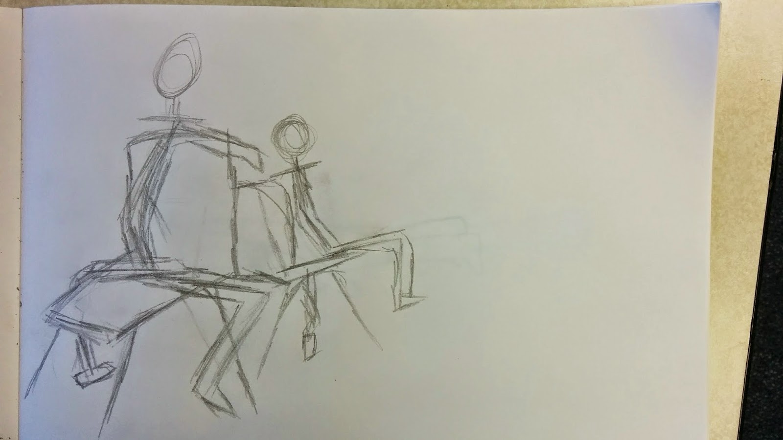
I began to add volume and compose drawings in a 3D geometric form using shapes such as cylinders, prisms, ovals and cones. The added volume would emphasise the geometric form and thus bringing the drawings more to life; ultimately straying away from the wire frame style. I found adding volume to be an interesting development as I was able to recap my understanding the progression of creating the human form.

The main image of focus here is the large image on the right. It shows additional clarity of my recapping and development with adding volume to the human form. I have ensured that I pay more particular detail to this image. I believe that the recapping the human form has allowed me to refresh my knowledge in drawing and composing a natural image.
Continuous Line Drawing

I revisited the technique of continuous line drawing. The technique itself consists of keeping the pen on the paper at all times. This includes when mistakes are made, which really challenges your human form ability. It challenges you to consonantly think about what you are doing with no breaks and no interruptions until your drawing is complete. You are forced to develop your thinking ability regarding the composition of human form. I liked this task due to the challenge. I believe I was able to convey effectively the image of a person onto paper.

This drawing shows the second attempt at drawing a continuous line human form concept. I encountered some difficulties with the drawing of the legs and had to revisit this. The legs in my model were crossed over which I found difficult to convey. I believe I was able to effectively recap the human form as an outline. I plan to add more detail with my next drawings to attempt to develop my ability.
Development with the Human Form

These drawing were composed with a pen marker which added lots of depth to my drawings and definition. By using a pen I had to proceed with caution as any mistakes that I had made could not be erased and I would have to attempt to work with it. I found this task even more challenged than the continuous line drawing as although the drawings with the pen allow more time, any mistakes cannot be erased. Additionally I was also able to add more detail to my drawings, including using some pen techniques such as zigzags. I believe that this work showcases my development with human form effectively especially with different materials allowing me to stress my ability further.
An additional material I used in these designs were water shading. I would use a paintbrush with water and smudge over elements from the ink to create shading. I was able to establish an understanding in how to convey tone relating to a light source.

In this drawing I was able to add a prop into my drawing to allow further depth. I am really pleased with the way in which the toning came out in this design as I believe i have effectively toned the image to a natural/believable light source. I ensured to shade the section under the arm, in combination with the sections under the legs and the furthest away arm which could suggest that the light source is shining directly at the image. If i were to improve this image I would add some additional toning to the prop to emphasize the 3D nature.

_-_WGA12716.jpg)
Da Vinci composes effective portraits largely of heads which consist of a huge amount of detail and depths. These close-up drawing really establish a sense of diversity within his work. His careful attention to composing the shape of the head really emphasizes the proportions of his drawings allowing his heads to appear extremely natural. Additionally he uses shading/toning techniques to amplify this further through creating a light source. The first image shows his attention to detail on his faces. He is able to capture an image and visually interpret it into a natural portrait. He uses subtle techniques such as crosshatching to add impact and diversity to his images. I am inspired by Da Vinci and hope to practice my own techniques and develop my understanding of creating drawings with correct proportions and size values.
Heads Development

A challenging task for me was the composing and forging of drawings of heads from a primary source. In this task we were presented with traditional models of heads which were presented with a plethora amount of detail. You can see my first attempts in the drawings above, in which I really struggled with. Due to the plain white colour of the heads I found it difficult to establish line location and amount of depth. Additionally I found it difficult to master the art of drawing a face that wasn't flat. I'd find myself always edging towards the flat 2D drawing approach rather than a drawing with a sense of perspective.

These drawings show my next round of attempts with composing the heads. I believe I have slightly improved from my first attempts. In my second attempts I use guidelines to help guide me with achieving the correct perspective for the heads. Unfortunately the majority of the drawings remained flattened rather than being forged with a sense of perspective. I also began to add detail to the heads to represent a more natural image.

As I continued to practice with the concept of the heads I was able to develop my visual interpretation ability. I continued to use structure lines within my work to help establish a sense of perspective. I believe that this became more apparent in these later drawings. Additionally I was able to add a more powerful amount of detail, however I struggled a lot with the hair. Due to the complexity level of the hair I struggled with obtaining an idea for how to record it visually on paper. I wanted to avoid drawing basic shapes such as swirls so I attempted to record what was actually there which proved difficult due to the lack of definition with the detail on the model.
Portrait

After developing my skills in drawing heads that I would consider abstract I attempted to utilize my skills into a new process. With this drawing I focused on drawing a portrait of a classmate. I was able to use my skills that I developed through drawing the heads which consists of obtaining a sense of perspective to ensure that the head does not appear flat, and demonstrating my ability to record detail from a primary source. Overall I found this task challenging as the modeled heads lacked definition of most features due to it's white, bright colour.
Museum Artwork

This first image shows a few of my drawings during my trip to Bristol Museum. I was able to capture a range of different elements at the museum and convey them into drawn form. It helped me develop my drawing ability in a different way and challenged my ability to draw from primary sources. With the large range of sculptures and artifacts I found myself overwhelmed by the amount of potential elements I could draw to practice my ability.

I drew a range of different sculptures, one which is one of my favourites is the lantern that hung from the ceiling. This large object provided me with a very difficult challenge in which I was to capture the proportions of the lantern correctly. One difficult element was the middle flame which in the museum was presented on a slight angle which proved difficult to convey into a drawn perspective. The museum provided me with many opportunities to practice my drawing skills using a range of unique primary sources.

Additional elements included the piano which similarly to the lantern offered a challenge in terms of capturing the proportions correctly. The most challenging aspect of the piano were the keys themselves. They keys themselves almost promote their own one point perspective image within. All the keys actually point towards one location (if that location were far away) which creates a skewing effect on all of the keys. This was particularly challenging to draw due to the fact that there were so many of them requiring me to think carefully about each individual one.
Architecture Development & Perception Practice

I began practicing drawing different architecture from primary and secondary sources. This drawing shows my first attempt at drawing a room. I had some issues with composing the table in the centre of the drawing due to the sudden change in proportion on each side. Unfortunately the table ended up appearing wonky and unnatural. I had difficulties understanding the value of proportion and encountered many attempts to try and fix the issue. I tried to align the table proportions of both left with the right and left walls however I couldn't smooth the position correctly.

With these drawings I attempted to develop my ability in drawing more specific objects. The first object was a lamp in which was a simplistic first object to draw. I wanted to ease into the drawing process and gradually develop my ability in drawing more complex architecture rather than struggling with the complexity involved with some objects. The second drawing is of the table which surprisingly went exceedingly well. I was able to grasp the proportions of the legs which provided minor complexity due to the layout. Additionally I was able to successfully obtain the correct position value of the table top itself.

I wanted to experiment with a final simplistic object before advancing and developing my skills. From drawing junk objects in unit 1, I wanted to refresh my memory with drawing more random objects, in particular the cylinders. I found a primary source table that I could practice this on. The table itself was composed of glass materials which increased the difficulty of the drawing. I believe I was able to successfully draw this table wit correct proportions, however I struggled a little when it came to emphasizing the material that is glass as I find it difficult to draw clear, see through material objects.

I began drawing a more range of architecture. In this drawing you can see my first attempt at composing a bed. I drew this bed at an angle to generate a more challenging task for myself. Overall I was able to capture the proportions of the bed effectively as well as add some of my own location scenery (subtle walls). Unfortunately I struggled with adding detail to the bed, which mostly consisted of using concave and convey techniques to show creases in the bed sheet. However this made the image appear a little stiff. In contrast I am happy with my development with understanding proportions with this drawing.

In this drawing I began practicing using one point perspective drawings to prepare for the secondary section of the unit. I was able to capture the visuals of a hallway to practice my perspective ability. I believe that this drawing captures the sense of perspective effectively. Additionally I was able to practice drawing some 3D objects in this scene to create a sense of depth and diversity, particularly with the frames.
I believe I could have enhanced this further by adding tone and shading to the drawing. The most difficult section of the drawing for me was the drawing of the door closest on the left. Due to the obscured vision of most of the door I found it difficult to grasp the doors position.

I was able to practice my ability in drawing some inner architecture. This drawing itself uses a sense of two, one point perspectives due to the two separate paths. I found this drawing a challenging drawing because of this. However due to the practice in the previous drawing I was able to compose this drawing more effectively. Building upon the foundations in my previous drawing I was able to use tone effectively, I shaded in sections of the stairs which could be representing a light source from above. Additionally this helps ensure that the stairs are recognizable and increases the clarity.

I began drawing some full scale buildings. I enjoyed this drawing as I have never attempted to draw a full scale building before from a primary source. I was able to capture the one point perspective with this drawing which I had previously practiced. Additionally I was able to add some detail to this image which largely consisted of the windows. I encountered some difficulty with the tallest section of the building as it had such a different proportion value compares to the rest of the image.

I experimented with the a different perspective with this drawing which largely consisted of straight on view. This allowed me to pay more specific attention to detail and develop my ability to capture it visually. I found this drawing the most challenging due to it's heavy amount of features and detail. Additionally I was able to create a subtle sense of depth with the house by drawing the top window sections with an angled side wall. I believe for the most part this drawing was really successful. In addition I developed my ability to visually record detail.

Building upon the foundations of drawing buildings I decided to practice my ability with two point perspectives. I was able to find a building and drawing position that allowed me to practice this. The two sections of the buildings almost mirror that which greatly allowed me to develop my ability. The hardest part of this drawing was composing the door which was slightly difficult to see, as well as the top part which I found drawing the jagged section of the castle like shape to be challenging in a two point perspective.

To combine all of the skills that I have developed together up to thus far I decided to challenge myself with a larger scale room that involves lots of architecture/props. From my previous drawing with the bed I was able to develop upon the lack of concave and convey techniques and practice this here. I believe that this allows the scene to appear more natural compared to the previous bed drawing.
Additionally I was able to capture a sense of depth with drawing this room as I ensured careful attention to size and position values of the objects. I believe from drawing architecture I have developed my ability to capture perspective more effectively from a visual stand point.
Vehicle Development

I challenged myself with a new type of object to draw which was a car. I have never drawn a car before and believe that it would provide with me with a unique challenge to develop my drawing skills in a different area. For the most part I believe that this drawing of a car went relatively well. The strongest element in this drawing would be my ability to capture the outline and proportion of the car. My weakest element would be the addition of detail. I found it difficult to add detail to the car as I wanted to avoid making the doors appear too obvious, and wanted them to blend in more effectively. I intend to improve this.

This drawing shows my second attempt at drawing a car. I was able to capture the proportions of the car even more effectively than my previous drawing. Additionally I was able to place more emphasis on the detail of the car. One of my concerns with this drawing was the doors. I wanted to ensure that the doors where embedded more subtlety into this drawing which I believe that I was able to achieve. I feel that I have improved my ability to draw with cars massively from my first attempt and am happy with this drawing overall. I believe that some improvements could be made regarding the tyres as I had some issues obtaining the circular form of the wheels.

To develop my ability further I practiced drawing a car from a different perspective. From drawing the car from a different angle I have challenged myself with a whole new approach. I believe that drawing the front side of the car plasced heavy emphasis on ensuring the details and specific features where in proportion. In contrast drawing the car from a front angle I proceeded with caution when capturing the outline of the car, as an outline that was out of proportion could deter the front view of the car and as a result in the drawing to appear very unnatural.

This drawing of a bicycle provided me with a unique challenge in which consisted of capturing a lot of detail. I found the bike extremely difficult to draw so I drew some guidelines to help me understanding the perspective. I drew the guidelines in a triangular shape to forge the shape of the bicycle. I was able to capture the proportions of the bike exceedingly well, however I struggled when drawing the wheels. In particularly the tyres of the bicycle provided with a challenge due to the awkward features and proportion combined with the rounded shape.
Burning Chrome
Burning Chrome is a short story, written by William Gibson and first published in Omni in July 1982.
Burning Chrome" tells the story of two free-lance hackers - Automatic Jack, the narrator and a hardware specialist; and Bobby Quine, a software expert. Bobby becomes infatuated with a girl named Rikki and wants to become wealthy in order to impress her. Jack has acquired a powerful Russian "icebreaker" program that can penetrate corporate security systems. Bobby suggests that they use it to break into the system of a notorious and vicious criminal known as Chrome, who handles money transfers for organized crime, and Jack reluctantly agrees to help. The break-in is successful, and Jack and Bobby empty Chrome's bank accounts, but they discover afterward that Rikki had been working in a brothel with ties to Chrome. She uses her earnings to buy a set of cybernetic eye implants for herself and go to Hollywood; the news leaves both men devastated, as they have grown to love her, and Jack never sees her again.
Character Research

I created a general moodboard to showcase some example characters that could be themed around Burning Chrome. I ensured the use of mostly cyber themes that could relate to Burning Chrome. As I was mostly interested in the cyber-punk theme most of the example images I recorded emphasize this through different means. Some images feature an obvious punk theme featuring textured attributes and elements with clothing. Others feature a more futuristic/cyber theme with the consistent use of a robotic eye/cyber glasses which is inspiring. The moodboard has provided me with a reference to existing example props that I could use to refer to for inspiration.

Before jumping into my character development, I decided to re-visit the basics and practice my skills with the basic structure of the human form. I was able to develop a clearer understanding in how the human form looks in terms of structure, as well as learning techniques to draw the human form from multiple perspectives. The most difficult process I found was the step up from simple line drawing, to adding volume to my drawings. Additionally I had to consider the natural form, and common mistakes and errors to fall into such as having a straight back rather than a more natural arched one.
In this image I drew structure lines to help me gain an understanding in where significant form changes were occurring, most notably at the knee, waist, stomach, chest and shoulder height. Originally I also struggled in gained an understanding with size of the head, however further practice helped clear this and I was able to draw a human form drawing with no structure lines (see far right image).

In this image I was able to improve on my human form perspective. I began using less structure lines to help me learn how to draw the basis of human form on my own. I was able to add more volume to my drawings with an effective approach to gaining more depth in terms of perspective. I believe I will need to improve my ability in drawing hands, as most of these basic human form drawings lack detail in hands bar one image. I found the drawing of hands to be difficult due to obtaining the correct finger size.
With the step up from line drawing to adding volume I was able to clearly demonstrate my development, and the forging of human form.
Initial Ideas

I was inspired by the cyberpunk theme and began constructing my own character inspired from Burning Chrome. I was able to achieve the proportions to a somewhat believable standard thanks to my practice with human form development, however when it came to constructing the hands, and arms, I encountered some difficultly in regards to obtaining correct postural appearance. I will practice this character in order to develop my ability in drawing characters as I believe that my ability to draw characters is my weakest point.

In this drawing I was able to develop upon my ability in adding facial features to my character. This character in particular was inspired by Riki from burning Chrome. I attempted to begin drawing the body features and outline, however with this drawing I focused on the elements of more portrait orientated design. I was able to establish a skill level, as well as adding extra volume IE facial features to my character. I believe that beginning to develop my ability in drawing detailed full body images is the next step. I am happy with my development with this design as I was able to practice adding facial features, an element that I struggle with most with human form.

These two drawings show my development with adding detail and features to my characters. After adding the volume I was sure to develop my ability to draw characteristics. The first drawing on the right shows my experimentation with developing my ability with features including position, size differentiation and proportion. The second drawing on the left shows my first finished character design of an interpretation of burning chrome. The strongest element in this design is the proportions of the head and main body, however I still had some struggle when it came to forging the hands and arms especially when it came to give my character a prop to hold.
This character is my first inital idea for drawing a cyberpunk themed character. The main element with this character is the glasses feature. This emphasizes the cyber theme with the electronic device. I hope to practice my development with human form more.
1980's Moodboard

I was inspired by the 1980's theme as a possible art style towards Burning Chrome. Due to Burning Chrome being set in a more traditional time era (80's) I decided to research on some existing 1980's fashion trends. I noticed that the fashion trend mainly consisted of flashy, bright clothing combined with wristbands and bold clothing such as skirts or leg wraps.
I am interested in this style and plan to interpret this into some of my character developments through Burning Chrome. I am particularly interested in the style of some of the clothing and how it's largely differ from today's fashion sense. I hope to produce some interesting drawings and development through my work.
1980's Development

I was inspired with the colourful vibrant theme of the 1980's fashion style. After researching elements of the 1980's fashion I was able to begin to compose my own interpretations. Due to burning chrome set in the 1980's I decided to use my initiative and experiment with my own interpretation from a 1980's themed Burning Chrome. Although not strictly 1980's fashion, (more 70's) I began developing basic human form structure in preparation for the addition of a unique clothing style for some characters. I have learnt the importance of developing an ability to draw from a perspective and give my characters a sense of posture or/and pose to show their personality and ultimately represent the theme of the 1980's.

These images show my development with adding more defined clothing elements to characters of the 80's. I had begin to understand the perspective in which human form is drawn through. In particular my understanding with drawing from different perspectives had increased. Additionally I was able to practice adding various clothing to my characters in a 1980's fashion sense. This task was interesting for me due to the sheer difference and contrast between different clothing and the change in fashion sense compared to 2015. Clothing is much bolder and colourful, which proved an interesting challenge for me as drawing characters in a different fashion was unique and something I have never attempted before.
Continuous Line Experiments /w 1980's

I revisited this image later and was able to brush up on defining lines that did not function naturally. Additionally I was able to practice my ability in drawing hands as this had been a feature in which I struggled with initially. The finger less glove approach allowed me ease into the learning process of drawing hands and how they compose to a natural feature.

In this drawing I experimented with the continuous line approach once more, particularly with the bottom half. I attempted to create a sense of 3D with the dress by drawing the left section of the dress with a smaller size proportion. This drawing in particular uses more features and characteristics. Specifically this drawing is my first attempt at adding facial features to my characters. I found the most difficult facial feature to be the mouth. The shape of the mouth was a little difficult to draw. I hope to practice this in the future. This character resembles a generic character that might appear around the scenes of burning chrome.

With this character I attempted to draw a 1980's themed character in a portrait perspective. This gave me the opportunity to buidl upon the foundations in my previous drawing. In particular I could practice and develop my ability to draw character facial features, in specific the mouth. In this drawing I was able to achieve a more natural emphasis on the face and was able to pay attention to more in-depth detail.
Additionally to the facial features I was able to practice my ability in drawing hands. To practice this I have my character holding a prop, in this case glasses which I interpret as cyber-glasses, similarly to one of my previous characters. I like this drawing as I feel my drawing skill has increased through developing ideas.
1980's Formal style Development

I decided to focus on developing my drawing ability through the opposite gender. This design shows my first attempt in drawing a male character that was originally inspired to be from the 1980's, however you could argue that the formal approach I have taken to to this drawing could be used in the modern day. With the formal approach I could develop my ability in drawing a different gender. This drawing focus's on the structure of developing human form with a formal approach. Up to thus far I have practiced my ability in drawing more relaxed/free proportions, however with this drawing you can see my development with a more formal appeal. The most difficult part of the formal aspect was the collar and ties. I feel that because this part requires most detail I initially struggled, I plan to improve this for my next drawing.

Building upon the foundations from my previous drawing I was able to add more volume in terms of to the face and add more defined clothing. I like the formal theme as it allows me to explore more various types of clothing and fashion. The formal interpretations could suggest the professional standard of Bobby and Jack as hackers.
Notable developments from my previous drawing include a more natural stance, as my previous drawing appeared stiff and too upright. Additionally I was able to add more characteristics which includes stubble, hair and facial features. I improved upon my ability to draw hands in this drawing, as the previous drawing was more focused on the human form structure in a formal perspective. I now feel more confident in my drawing ability in regards to a formal approach.

This image is my final development with a formal character. I took the idea to the next step by attempting to draw a character from a different perspective. This proved difficult in particular with the head shape, as the position of the ears was difficult to distinguish. I was able to practice adding tone to define my character with a more 3D appearance. I developed a stronger understanding with shading, and how it might be used in combination with a light source.
Additionally I was able to add more features to my character, particularly the clothing. I was able to practice subtle concave and convey forms with the jacket as this character has a more relaxed appeal as well as an unbuttoned jacket. I was able to develop my ability with perspectives and toning.
Cyberpunk Development (Portrait)

I decided to revisit the cyberpunk theme from my initial ideas. In particular I was inspired by the cyberpunk shades which could suggest a matrix themed world. This drawing was drawn in a portrait perspective, and I was able to develop my ability in drawing hair. I practiced the individual hair strands which I believe is a core element in forging a final character. Additionally with the cyberpunk theme, similarly to the 80's theme I was able to practice drawing facial features on a character in regards to proportion, position and size. I was also able to practice accuracy with composing the head.

I wanted to experiment with a different look to my character and develop another style. With ensuring the cyberpunk theme I was able to add different elements such as the singular eye glass. Additionally I drew a male figure with slightly longer and fuller hair compared to my previous male formal designs. To ensure the cyberpunk theme I was able to cover the lower section of the mouth by drawing the clothing a mask which extends over the mouth. This simplistic drawing allowed me to explore different ideas within a specific idea (cyberpunk). Another notable element is the eyes, I drew the eye with a semi-circle shape to emphasize the concentration or angry look with my character.
Cyberpunk Development (Full Postural Form)

This drawing shows my first attempt at drawing a full form cyber punk character. I was inspried by Automatic Jacks robotic arm, similarly to the Terminator, and by doing so I was able to create more robotic-like characters. I designed this character in a long coat with added elements on the top section which could suggest a more robotic theme. To emphasize the robotic theme more, I drew simplistic facial features which generated this illusion.
Due to the eyes with no pupils, could suggest that this character has lights (LED) for eyes rather than huaman features. I also tried a unique approach with this design by ensuring the clothing was more straight and compact. By doing this I could suggest the material in which the clothing is made of. I had intended to make it appear as if the character was wearing a metal coat, and feel that I achieved this through the lack of tone and bloated coat design.

This character design builds upon the foundations with the previous design with the robotic character. After being inspried by Automatic Jack I decided to attempt to create my own inspired interpretation of him. The forging of this character was achievable through referring to my previous drawings with the 1980's theme, in particular the formal approach as well as some cyberpunk themes.
This character uses a multitude of elements from both, with the most notable formal elements being the clothing, and cyberpunk elements being the eye scope/radar and the obvious robotic arm. I plan to draw some full scale robotic arms in the future however this was my first attempt at drawing a robotic arm. I believe I was able to achieve a believable looking robotic arm by drawing the fingers with a more precise square proportion as opposed to the curved rounded fingers. Additionally I improved the design of the previously used glasses as a prop in my character designs, to a full radar with a more developed appearance in this design. I like this design as I believe it was challenging due to the amount of elements required to forge the characters appearance.

I began using a technique to add some shading into my character designs. The technique involves using a paintbrush to use sentiments from the ink to subtlety darken sections of the image. I began by tracing over my original drawing a with a marker pen and erase the pencil markings on the drawing. I could then use the technique to wash down specific sections of the drawing by using a paintbrush with water.
I was also able to gain insight to adding a light source to my image to enhance the overall appeal and hint a 3D effect. Notable sections that toned was the right sides, the glasses and sections of the jacket to emphasize these sections more than others.
.jpg)
I experimented with some more materials, in this image I used Acrylic paint which allowed me to define areas of the image for more in-depth colours. Additionally I was also able to develop a sense of how colour could impact my work. I attempted to work off the shading and toning in my previous image and incorporated the same techniques with the Acrylic paint. I enjoyed painting this image as I was able to experiment with other materials, instead of developing ideas just through a digital method.
Unfortunately my lack of inexperience shows in elements of this painting especially due to the colour marks. However I was able to develop my understanding in how my work can be impacted through the use of various materials, additionally I was able to develop an understanding in how mixing colours with each other and with water can create a different outcome. Adding less water will add a thick style, whereas adding more water will smooth the colour out, allowing less brush strokes to be visible. I have learnt the art of time management importance.

After experimenting with Acrylic paint I was inspired to develop my idea in Photoshop to gain a stronger understandign how colour can impact my work. I was able to change colours to my preference and experiment with different colour themes. I selected different shades of colours to emphasize toning and suggest the addition of a light cource within my character. Notable examples with the toning would be the legs. i was sure to use a darker colour on the right leg to add more diversity, which also could suggest a hint of 3D perspective for my character.

These drawings showcase my final drawings of my character development each with an appreciable amount of detail and body elements. The first character takes the 1980's fashion into the cyberpunk world. I attempted to draw this character with a 1980's theme and combine it with cyberpunk. After developing my 80's theme I was able to forge an idea in how the 80's fashion sense was. I also used the large boots taken from my previous design and used them with this character. Additionally to emphasize the cyberpunk theme I added extra elements such as the armbands and the cyber radar.
The second character builds upon my previous male cyberpunk development and utilizes it in a different perspective and an additional prop (gun) to emphasize the villain nature. I used subtle line dashes in the leggings to add more depth to and volume to my character, similarly to the concave and convey drawings I produced in Unit 1. My favourite element with this character is the long coat. I attempted to draw the character running and had some issues figuring out how the coat would look. As we had never done any drawings on moving human form I was concerned with my ability to draw the coat. I ensured to draw the coat as if it were being elevated slightly through gravity and wind as opposed to just a straight 0 velocity downwards coat. I am satisfied with the result in this drawing and believe it appears natural and believable for a concept art.
Tazio B - Characters
Tazio is a Deviant Art user who has created a plethora of designs and concepts. He has a majority large count of character concepts. Additionally he has produced some of his own interpretations of characters relating from Burning Chromes story.

Tazio explains how he used brushes to create a complex background. He was able to produce all the neon signs, details and used no textures. I believe that this image has a heavy obvious influence from the cyberpunk atmosphere. I am intrigued with the care and technique he has used in composing this design. The lens flare at the top of the image really brightens up the image emphasizing the bright cyber feel. He has used a plethora of techniques from blurring, smudging, colour correction and free transforming to forge the image.
Final Character

Building upon the full scale character design, I attempted to draw a female version of a character that could be interpreted into the cyber world. This character drawing features the most amount of detail yet and took me a long time to develop and ensure I had all the proportions correct. The most challenging aspect with this design was the top half with the clothing to ensure that it looked fitting and natural for the character. I wanted to ensure that all the lines met and it was obvious with the fashion sense. The long boots were also an interesting and unique challenge as I had never drew anything like it before. The boots themselves were challenging in terms working out where the knees would start, as I wanted to avoid giving her long, unnatural looking legs. Overall I am satisfied with this design due to it's detail and believe it is one of my best drawings yet.
Digitizing my Character

Using Photoshop I began to develop my character in the digital world. For this image I used simple tools. I used the paintbrush and paint bucket to colour my character. I was able to develop an idea in how my character might look digitally. I gave my character a purple/pink theme which I believe is a cross over between the vibrant colours from my 80's development and the cyberpunk theme. I gave my character a red coloured eye which emphasized the cybernetic eye with Burning Chrome. With using Photoshop features like these become more apparent. I can take the next step in developing my character.
Filter effects & Development

Inspired from my Unit 1's vector work I attempted to experiment with this characters colour values. I was able to advance to the Filter gallery and apply a stamp effect to my character. From doing this I could then experiment with darkness and lightness values to forge a vector image for my character. I believe that the vector character placed heavy emphasis on the armour which really promotes the "punk" nature for Burning Chrome.
Although powerful I feel that the lack of colour has a negative influence on Burning Chrome and may not fit the story correctly. Arguably the black and white could emphasize the more traditional date in which Burning Chrome was written.

After applying the stamp filter onto my character to create a a vector design I decided to withdraw on the heavy impacts the effect generates. I was able to soften up elements of the character which allowed me to add colour to the skin to create a more subtle look. I believe that this design is more effective in terms of promoting the "punk" nature of Burning Chrome's theme. I feel that the design also reminds me of Dark Link from The Legend of Zelda series due to the dark eyes which emphasize a dark motive from the character. Additionally I added a shadow by creating a circle layer and setting the feather amount to around 20px.
Digital Development

I was able to practice with the filter gallery and practice different techniques with images. I was able to create a range of different visuals for a character, each with a completely different appeal. Some filters, when modified correctly allowed me to create a graphical stroke effect which could promote the artistic value within an image, whereas other allowed me to focus more on lighting elements to enhance the overall art style for an image.

This image shows my final character design. I was able to develop a much more unique character compared to my Unit 1 designs. This character features a blue and green colour scheme to emphasize the cyber nature. In combination with I have added shading to this character by selecting a soft brush tool. I was able to change the blending mode and add a soft blue-green transition gradient which really promotes the cyberpunk theme as well as granting my character a more developed design.
Additionally I was able to filter a leather texture into my characters clothing. I was able to achieve this by performing a paste special technique to add emphasis to the characters clothing, bringing out a more believable design. A subtle addition to this design is the eyes. I was able to keep the eyes a dark colour, as well as adding a blue pupil to suggest a cybernetic eye, further reinforcing the cyberpunk theme.

I created a general moodboard to showcase some example locations that could be themed around Burning Chrome. I ensured the use of mostly cyber themes that could relate to Burning Chrome. As I was mostly interested in the cyber-punk theme most of the example images I recorded emphasize this through different means. Some images include a bright vivid rural location, whereas others appear more futuristic using Google Glass type designs. The moodboard has provided me with a reference to existing example props that I could use to refer to for inspiration.
Initial Idea

This drawing shows my initial idea for a location for Burning Chrome. I was excited to begin the location development as I believe that my ability to compose concept locations is stronger than my ability to draw characters. This first idea uses the bases for Burning Chrome overall. It is a large city that could be associated with the cyberpunk theme.
I used techniques from Unit 1, in particular the one point perspective drawing technique. In this drawing the point of perspective is drawn to the bottom left of the image. I believe that using this technique I was able to add more depth to my drawing as well as create a more natural scene. The buildings in the background create a sense of scale for my drawing. I used subtle 3D drawing techniques to create more realism. I will build upon these foundations in this idea to create more specific and develop some Burning Chrome locations.
Location Development

This drawing features my one my first ideas. In the story of Burning Chrome the main characters consistently visit a bar. I decided to build upon this and develop my own bar in a visual standard. This drawing although does not have any particular noticeable theme I was aiming for a cyber-punk theme. I had initially struggled with the perspective and proportions of some elements, particularly the stalls as their sizes should decrease to emphasize that they are further away. I had practiced drawing architecture in my previous posts, this drawing granted me the opportunity to apply a theme to an architecture and create an idea from my imagination this being a bar. I plan to improve upon this and develop the scene further.

This drawing features my developed concept of a bar. I had realized the mistakes that I had previously made and was able to improve upon them by adding a sense of perspective. In this drawing I use a two point perspective guideline to help guide me with proportions and positions of elements that I had struggled with last time. In this drawing you can clearly see that I corrected the issue with the stalls being the same size and they now correctly decrease in size as they reach a further away position.
Additionally I was able to expand upon the theme of the cyber bar and make the theme more recognizable. To distinguish the theme I added a pipe element at the top of the bar to suggest a less realistic theme. This could suggest an Underground hint or emphasize the cyberpunk nature. The drawings with the architecture in the previous tasks help me develop this idea further and add more depth to the drawing by adding corridors, walls etc.

I decided to build upon the idea of producing a large city with tall buildings and designs that would suggest a cyberpunk theme. This drawing uses a lesser amount of perspective compared to my previous drawing. The perspective is focused more on the bottom half of the drawing which draws attention from the road to underneath the bridge. I was able to build upon the foundations in my first drawing and create a drawing that uses both perspective and depth. The larger buildings emphasising a sense of scale for the theme. This drawing provides a different view of perspective compared to the previous drawing reinforcing the sense of scale.

I designed this drawing to develop my ability to draw 3D scenes. I had noticed that with my previous drawings I found it difficult to show a side to my cyberpunk city with a unique view. This drawing uses a unique perspective which could suggest some of the more downtown urban areas of my city. I ensured to continue to use the large scale of tall buildings to emphasize size. I was able to practice drawing buildings and elements from a different view angle which allowed me to approach the city differently. Additionally the practice of drawing in 3D has broadened by thinking process sparking new ideas for the cyberpunk theme.

I was inspired to draw and compose some new locations for the Burning Chrome story. The idea of a cyber-punk bar also reinforced this as I began to think of other locations for a cyber theme. Initially I was inspired by the fast paced cyber-technology being that transport is a lot faster and instantaneous. Similarly to how tron uses fast paced vehicles to suggest this. In this drawing I was inspired to create a more in depth look at some of the elements that would feature in a cyberpunk world.
One of the ideas was inspired by a more futuristic train which could be suggested as a bullet train. This image also used a hint of one point perspective to forge the scene. The train itself is seen approaching the station from outside the scene and thus is smaller in scale. The most interesting element in this design for me is the angle of the perspective. The drawing uses a slightly warped perspective allowing the elements to come together in a different angle (IE diagonally instead of up,down,left,right etc).

I was inspired by how using different views would impact the perspective of the city. In this drawing I was focused on using a window to illustrate this idea. In the centre of the image is a pole that represents the holding and structure of the window frame. I also added a bottom line to attempt to make this more obvious. Using this structure as a template I began to compose buildings that could be presented in 3D scales and forge a city. This method of drawing restricted me in regards to how experimental I could be with buildings.
I was challenged with only drawing specific sections of buildings in 3D to create a full looking city, as well as creating the idea that the camera is pointing out of a window. Unfortunately I struggled with this and plan to improve on my ability to draw buildings in awkward perspectives.

I challenged myself with this drawing to attempt to draw from an overhead view of the city. I was challenged with the task to think about how the each building would forge together including shapes and sizes. Additionally to avoid the scene from appearing too repetitive I attempted to draw each building with a diverse shape to grant the drawing a sense of depth. The construction of the tall buildings allowed me to develop a stronger vision of a cybercity and think about how each building might differ from each other The most difficult part in this drawing was the understanding in how each building extends from top to bottom. It was important to create the overhead view without misplacing the origin point of each building. Specifically ensuring the buildings don't stem downwards to the same point.

This next drawing focuses on the "punk" aspect more so than the "cyber" theme. I originally wanted to produce a grungy abandoned looking scene that could suggest a hideout for thugs or thieves of some kind. I feel that this drawing achieves those atmospheric conditions. I was able to challenge myself by adding in stairs as a core element in the scene. The drawing could suggest the inside of one of the tall buildings in my previous designs. It would display the dark grunge nature in an abandoned atmosphere.
In this drawing I use one point perspective as a guideline for my scene. The point of perspective being the back wall I was able to compose the windows in a more natural proportions. Instead of standard squares I followed the lines from the point of perspective to grant the image a more believable scene. I like this drawing as I believe it could grant a stronger visual view in how some of the city buildings may look like inside.

This drawing shows a specific location in the cyberpunk city. Due to the heavy emphasis on the cyberpunk city I wanted to explore some of the more closed places. This drawing uses one point perspective to compose an alleyway. The alleyway could suggest the "punk" theme of Burning Chrome and suggest a more darker tone. In this location I was also able to focus on a number of props including dustbins, doors, a ladder and lights. I learnt the importance of developing powerful props to enhance the atmosphere within a scene.
The challenge with this drawing was the composing of elements in such a small space. Due to the alleyway presenting objects and scenes with a smaller value of scale as the elements reach a further away position, I initially found it difficult to compose a scene showcasing an alleyway in a one point perspective. I found this an interesting challenge and hope to practice techniques such as these within the digital world.
Dylan Cole
Dylan Cole is a production designer, concept artist, matte painter in the film industry. He is best known for the digital artworks and matte paintings for Avatar and Return of the King. He uses photographs combined with 3D images and adds effects to achieve a Photo-realistic concept.
I am inspired by Cole as many of his artworks are large in scale and feature cities with a range of different buildings with really generate an obvious theme.
.jpg)
.jpg)
The top two images feature a large city-scape. I can really appreciate the sense of depth and scale he has added to his work. The first image features a few notable taller buildings which really enhance the scale of the image, especially with the taller images being further away in the distance this is emphasized. He has also achieved some effective lighting with his designs. The second image looks as if it's set in the dawn due to the blue colours. You can see he has colour corrected some sides of buildings which adds further diversity into his work. In his work (more notably the top image) he uses a blurry effect to create atmosphere. The misty/foggy effect in the center of the image could suggest a wasteland or an abandoned city. I hope to use some of these techniques with the development in my location pieces.
Final Piece - Cyberpunk City

I used this 2D texture to compose a 3D city. I would achieve this by manipulating the layer within 3D space and using the ZYZ axis combined with changing values of parameters I could begin to forge a 3D city. On this image I used glow effects in combination with colour correction techniques and masking to emphasize the atmosphere. I could use masks to remove windows that were unnecessary to remove some of the bright elements of he scene.
.jpg)
This image shows the wire-frame standout for my first 3D city in After Effects. You can clearly see each building within it's own wire-frame placeholder where you can individually move each specific building. To edit a buildings contents I would have to open the pre-composed layer to access the components.

This image shows my first 3D city with little wire-framing. You can see the fully fleshed out 3D buildings which could refer to a cybercity in which could be Burning Chromes location. I spent careful time on ensring that all the buildings were different sizes and proportions. An issue that I became aware of was the position of some buildings. The buildings would sometimes overlap if they were placed on a slightly different positive or negative value within 3D space. Half of the building would disappear and morph into strange proportions. To ensure that no buildings were overlapping I changed the camera to a different view mode which gave me a different perspective on the buildings which also allowed me to modify the position of buildings if needed.

This image shows my first finished 3D cyber city created within After Effects. In this image I used a plethora of colour correction techniques, specifically a bluer blending mode to enhance the darker elements within the city. Additionally the blue colour allowed the promotion of the cyber theme which is associated as a reference to a cyber theme. Additionally I was able to add a motion camera blur combined with circle elements with a blurred/feathered edge to create the illusion that the 3D city is viewed from a camera.
Example Video
This video shows an animation of my first 3D city.
Cyberpunk City Developed

I was able to develop this idea and produce a second 3D city that could represent the location of Burning Chrome. I was able to use similar techniques and 3D space manipulation to generate a 3D image. Additionally I used colour correction techniques and glow effects to enhance the overall appeal for the city. I was sure to design the city in a dark time of day to promote the cyber atmosphere.
Using an appropriate image I could create a realistic skyline for my second 3D city which adds further depth as well as creating a larger sense of scale.
Example Video
This video shows an animation of my second 3D city.
Cyberpunk City Developed (3rd)

I was able to build upon the foundations in my previous modeled 3D city and produce an enhanced version. I had noticed that in the second city the lack of roads and lower content had restricted the camera view due to the fact that a lower camera would eliminate the realistic nature of a city (no roads).
I was able to solve this issue in this 3rd city by developing the lower content. I was able to add roads to the city to create a more realistic view. I used similar techniques which included glows and colour correction to enhance the appeal of the city. This includes the brightening of the windows and the darkening of various other areas which really promotes the cyber atmospheric city.
Example Video
This video shows an animation of my third 3D city.
Props Research

I created a general moodboard to showcase some example props that could be themed around Burning Chrome. I ensured the use of mostly cyber themes that could relate to Burning Chrome. As I was mostly interested in the cyber-punk theme most of the example images I recorded emphasize this through different means. Some images include a cybernetic eye, whereas others use interesting matrix themed props or standard electronics such as a Laptop. The moodboard has provided me with a reference to existing example props that I could use to refer to for inspiration.
Tazio B - Props
Tazio is a Deviant Art user who has created a plethora of designs and concepts. Although majority concept art for characters I was largely inspired by his ability to create a futuristic/cyber laptop/typewriter.

Tazio explains the process in which he created the Typewriter which was through taking a photograph of an older pre-existing typewriter and manipulating it through effects and techniques to create a computer that looks at the same time futuristic and retro. I am inspired by this and hope to develop ideas to a final piece which could be similar.
Props Development

I was initially inspired by the cybernetic eye described in Riki's possession in Burning Chrome. I began drawing an eye that could suggest the cyber theme for Burning Chrome. This drawing itself features the shape of an eye with the center of the eye including iris/pupils to feature a cybernetic theme. I was able to achieve the cyber theme by adding additional features around the eye to highlight this element. Around the outer pupil I have added small circles and a large circle that surrounds this in broken elements. This could represent the scanning of specific objects as scanners and could generate the imagination of the circles rotating to emphasize this.

I was able to build upon the cybernetic eye theme in the form of a laptop. My intentions with this design focuses on the addition of the eye on a laptop screen would could suggest that the laptop has it's own personality This could also symbolize the cyber world of Burning Chrome suggesting that the story is set within a virtual world (inside the laptop) similar to that of the Matrix. The construction of the drawing itself features a laptop. I was able to develop a sense of perspective with my design to ensure that the proportions follow through correctly. Additionally I was to follow these proportions with the eye to create the illusion that the eye is inside the laptop screen rather than just on top. I feel that this is a really interesting concept and develops the world of Burning Chrome more visually.

Due to the fact that Burning Chrome is set in the 1980's I was inspired by the actual technology that they were using in the time. The more traditional PC's were designed in large box type components, much different from the flat screens we have today. I was interested in the huge difference and change in technology from the 80's to the modern day and how technology has developed. I feel that drawing these computers will grant me a broader imagination in terms of final pieces for my props development.

After drawing the cybernetic eye combined with a laptop I was inspired to draw more oldschool/retro computers. Computers have changed dramatically throughout the generations from massive box screens to modernized flat screens. Having researched into older computers I was able to develop a sense of style and theme for the 1980's style of Burning Chrome. I found drawing these computers a fun task, as well as nostalgic as I have never attempted to draw a more traditional computer rather than a modernized version. Computers were traditionally more squared which includes the peripherals (mouse and keyboard) and were generally more bulky. These computers may be a more accurate representation of Burning Chrome compared to the modernized laptop as due to it's older age, Burning Chrome may be set in the 80's.

After practicing drawing more traditional computers I was inspired by the 1980's theme Burning Chrome. I had practiced drawing roller skates due to their large popularity in the 80's. The first roller skate I had drawn is the top left drawing. It contains a simple rollerskate proportion which allowed me to develop an understanding in how the roller skate may look. I was then able to develop the idea onto more advanced and in-depth rollerskates (to right, and eventually bottom) which included more defined features and elements to forge a more natural drawing.
On the last drawing I encountered some issues with the wheels. I would often find that the wheels appeared less round and unnatural. Due to the nature of the roller skate, in particular with the metal section which holds the wheels, I had to work around and think where the wheels would be if the metal section was non existent to allow the wheels to appear more rounded.

Following from the 1980's rollerskates theme I was inspired to draw some longboards/skateboards. To emphasize the cyberpunk theme more for Burning Chrome I decided to add a futuristic element to the boards by transforming them into hover boards. The hover boards themselves feature a very standard shape with mostly unique patterns that could suggest more futuristic theme. A essential futuristic element that I was sure to add into my drawings was the bottom section. The bottom section features an object different from wheels. It uses a feature that would push the hover board into the air, such as a large amount of air that would elevate the board. I believe that these features help make the board more distinguishable.
The second design has a more distinct proportion to it. One of the issues I encountered with this design was the fact that the board began to look like a spaceship due to it's compressed size. I was able to combine the features of both the designs to create a more effective drawing (top drawing) which uses features of both my previous drawings.
Bumper Cars

I created a moodboard showing my research into some existing bumper cars. I created this moodboard as I believe that bumper cars may have similar artistic style to the fantasy hover-car. Due to their sleek design including a base with no wheels, I am inspired by this and plan to use bumper cars as a reference to my possible designs. Additionally I was fascinated by the vibrant colours and designs which could refer to the bright vivid colours of the 1980's fashion style. I hope to incorporate this research into my designs and create hover-cars inspired by them.

I had drawn some modern cars in the architecture section of the unit. I was inspired by this and building upon the foundations of the hover-boards I was able to up the scale of the hover theme and forge a hover car. The hover car uses similar elements to the hover board which largely consists of important features such as the device that elevates the car located at the bottom where the wheels woud usually be. I found the drawing process of this hover car to be challenging as I was to use elements from my previous car drawings as well as elements from the hover boards to forge the car. I attempted to add additional detail to really add a sense of depth to the hover car. I hope to experiment with different proportions for my car.

This hover car uses a more simplistic, futuristic developed look. I found this drawing more fun to compose due to it's simplistic theme, it feels easier on the eyes and each element (eg the drivers seat) is more distinguishable. Similarly to the exhausts on a plane, I added my own interpretations onto the front and back of the car. This also allowed me to build upon the proportions which created a more futuristic style compared to the original design. Additionally the top section of hover car can be elevated which opens up to allow access to the drivers seat which is a more modernized (expensive) look similar to that of Ferrari's when their doors are elevated to allow access. I like this drawing as I feel that it appears more believable to fit the theme of Burning Chrome.

This drawing showcases my last drawing of a hover car. The main difference in this design is the bottom section. I was inspired by the theme of bumper cars, in which are seen at festivals and theme parks. The bumper on the bottom could suggest a more futuristic appeal due to the fact that there are no wheels. To emphasize this further I was sure to follow a similar art style to my previous drawings which features the sleek design. The inner hover car would be accessible with the elevating doors. Additionally I attempted to add a hint of 3D within the car itself. Sections of the car feature inner sections which I was able to achieve by constructing multiple lines to emphasize this. I belive that this would be more apparent if the car featured some additional toning. I believe that the hover car was the most challenging aspect for me to compose throughout due to it's heavy requirement of unique detail to forge the hover cars features.
Terminator

I was inspired by the Terminator series which include Arnold Schwarzenegger as the terminator. Arnold is seen consistently with effects that could suggest a cyber/futuristic theme with his robotic hands and eyes. I appreciate the way in which these visual effects were created. The robotic eye is presented with a red LED similar to that of a computer switch to really generate emphasis. Additionally I was extremely fascinated by the robotic arm as I believe it could resemble Automatic Jack's arm. I was inspired by this and plan to compose some drawings related to this element.

I was inspired by the robotic arm in Terminator in combination with Automatic Jack's arm. I attempted to forge my own robotic arm. I found the initial composition of the arm to be difficult especially with the quantity of box shapes that I used to link each element. This first robotic arm was inspired by the more traditional approach for technology, in particular the 1980's computers. I decided to attempt to use this style to forge the robotic arm with a similar style. I believe that for the most part I was able to achieve this, however there were times when I struggled with understanding how each shape linked onto another, I was concerned that the proportions would be affected. I was only able to compose half of the hand element for the arm, I intend to practice this in my later designs.

These drawings show my development with the robotic arms, as well as a more modernized theme for the style. These arms feature a considerable increased amount of detail compared to the first design. I spent additional time on these designs ensuring that the proportions and sizes where much clearer and obvious. Additionally the extra time that I spent composing the arms allowed me to add more detail to really emphasize the cyber theme and the robotic arms style.
I included two different perspectives with these arms. The first arm features a side-on view which showcases the arm and its features from a side perspective. The second arm is a more direct view which allows the detail to be seen more clearly and adds more depth. The challenge with these drawings provided me with the skills needed to enhance the appearance for designing a robotic themed arm.

These robotic arms show my development compared to my previous drawings. I was able to add more depth and detail to my drawings and obtain a more established look. The robotic arm on the right is my second attempt at drawing this arm (the first arm that I drew) I believe that I have improved on my ability to draw these arms and I feel that the images show this. I was able to understand more effectively how the pieces of the arm function and forge the arms proportion.
The second image focuses a lot more on depth and is a more modernized version of a robotic arm compared to it's counterpart (image on the left). In this particular drawing I was able to pay much more attention to specific elements of the robotic arm, in particular the hand. I was able to place more emphasis on the hand including each specific joint and finger connection parts.
Final Piece - Automatic Phone

This idea was inspired by Automatic Jack's and Bobby's ability to hack. I produced a 3D model of a phone created a bright light ray effect to produce the illusion that the phone is turning on. The concept behind this design consists of two ideas. The first concept is that the phone is automatic and can switch on via reading your mind. I believe that this emphasizes the future and creates a very futuristic theme.
The second concept is that the turning on of the phone is hacking process of Jack and Bobby. After creating my 3D cities I found the production of a 3D phone to be interesting and exciting as the creation of a 3D object was my first attempt of designing an element so different.
Example Video
This video shows an example animation in how the phone can turn on automatically via hacking or the brain.
Developed Phone Concept - Combined Location and Phone

The final concept I produced involved the combination of two of my final ideas. I was able to merge two of my most favourite final pieces (the city and the phone) into one. The theory behind this concept is that the story of Burning Chrome is set within a computerized world, which refers to the Burning Chrome inspired city being presented within a phone. This has allowed me to develop on ideas and gain understanding in how I can merge ideas into one concept to forge a more effective piece.
Example Video
This video shows an animation with my 3D city playing inside my 3D phone.
Evaluation
For this unit we were required to develop our drawing ability and produce a range of development for a short story. The story I had chosen was Burning Chrome. The work that I had mostly produced began as drawn elements. I was sure to spend a heavy amount of time on practicing my drawing skills so that I could visually portray my interpretation for Burning Chrome effectively. The work would then progress into developed outcomes, whether that be digitally or physically.
After reflecting upon the work I composed and developed in unit 1, I was a little more confident this time around. I mainly wanted to develop my ability to draw so that I could focus largely on the digital developments with a strong reference later. I began approaching the task by researching characters, props and locations. I found a range of different interpretations in pre-existing work as well as potential inspires for my own work. The art style that I was mostly interested in was the cyberpunk theme as well as a 1980's theme which both can related to elements of Burning Chrome.
The character development for my work shows my adaptability and progression in order to develop my drawing ability, as well as adapt to new art styles; a more grungy theme that I hadn't approached before, additionally a 1980's theme which was almost the complete opposite with it's bright and vivid colours. The characters section consist of a plethora of drawings which were important to me as I was able to practice portraying my imagination visually. Later when I was satisfied that my drawing ability had improved I began experimenting with wet paintbrush techniques, acrylic colours and developing characters in digital environment.
The location development for my work was my most favourite. I was able to produce a range of drawings to portray a cyberpunk theme effectively. Afterwards I spent a considerable amount of time designing and producing a 3D cyberpunk themed city with 3D modelling and composing with After Effects. I was able to develop my ability in a wider perspective, as the 3D city granted me the opportunity to view some of my designs from all kinds of different angles and view points. Due to this I was able to produce multiple versions of my 3D city concept which I believe effectively portrays my experimentation, development and ultimately the amount of possibilities with linking drawings to the digital world.
The props development for my work builds upon the foundations of the 3D city during my location development. I was heavily inspired by the 1980's theme from my characters which lead to the production and experimentation of 1980's computer themes such as more traditional computer drawings. I was able to approach some primary and secondary sources that I had never attempted to draw before which was exciting for me. Additionally I progressed into developing my ideas into After Effects which involved more 3D work. I produced multiple unique versions of a developed phone concept which later lead to the combination of my final location piece and props piece to forge an additional final concept.
Overall I have enjoyed this unit. I was able to develop my drawing ability further with adapting to new scenarios and learning new art styles, as well as developing my digital skills further with 3D composing which had broadened my visual recording ability. If I were to have more time, I would develop my 3D concept to allow me to produce even more of a lager range of different ideas. This is a negative aspect of After Effects - due to the largely time consuming process of developing an idea with 3D. In conclusion I am happy with my display of work, as I have effectively researched, developed, experimented and analysed all kinds of different art styles, and improved on them through a plethora of different techniques.
No comments:
Post a Comment