
This image shows my attempt at image manipulation in regards to creating the illusion that this insect is in the cup of caffeine. The technique involved using a mask, which uses the same colours as the contents inside the cup. By hitting ALT I can switch the colour of the paintbrush to the same colour html code of another colour. I then proceeded to draw over the insect, while decreasing the opacity leves by 10% at a time, until reaching 0%. This enabled me to create the illusion that the insect is in the contents. Additionally I applied a drop shadow to the insect by advancing to blending options, to create a more realistic effect.

I began experimenting with images from google. I was able to take a basic photograph of the ocean and forge the illusion of sunset. I created a yellow circle, and cropped out the bottom half. I then proceeded to add an outer glow to the half circle by advancing to blending options. I changed the outer glow colour to yellow to match the sun. I then drew a rectangle to forge the sun's rays across the ocean. I then used the skew transform tool to warp the rectangle to allow it to appear as if it was increasing in size as it reached a closer position to the camera. I then changed the blending mode to soft light to create the illusion of sun rays. Additionally I used curves to create the warm colours within the scene (from blue).
3D Modelling - After Effects

This image shows my second attempt at creating a scene with light rays. The components you see in this image where all created through 3D Modelling. I was able to create the ocean surface through using a displacement map in the fractal noise effect in after effects. I could use the skies layer as the displacement map to forge a realistic surface. Additionally I created the Moon by creating a circle shape and producing a similar technique for the Moon, however I adjusted the values to appear more rough. Using the same techniques from the previous image, I was able to compose a more believable surface with the light rays, as well as using colour correction techniques to create a bright moonlight scene.
Photoshop

I further experimented with Photoshop techniques. This image was inspired from the Legend of Zelda franchise, in which a hand is seen emerging from the toilet. I was able to practice cropping techniques and forge the illusion of a hand emerging from a toilet.


In this image you can see I was able to use levels to crush some of those darker colours, ultimately allowing the scene to appear more brighter.

To emphasize the summery- daytime scene further I applied a curves adjustment in which I was able to increase specific colours such as the red channel. This allowed me to create a slightly saturated scene which is obvious to the summer season.

In this image I was able to practice techniques that involve adding colour to specific sections of images. In this case I was able to apply a black and white adjustment, in which I used the polygonal lasso tool to select an area around the eye. Additionally I added a feather amount to around 5PX to ensure the outline was softened. I could then select the paint bucket tool and colour the eye into a red colour. Following which I changed the blending mode to overlay which created a believable eye colour change.

To further practice my techniques involving adding colour to specific elements, I selected a more difficult image. I was able to find a layer of a city and add colour to only one building. I was able to achieve this by duplicating the layer and applying a black and white filter to the top layer. Proceeding this I selected the polygonal lasso tool where I could crop around a building to allow colour to convey through.

This image shows my next attempt at practicing colour techniques. I followed a similar process in which involved applying a black and white filter to the layer, duplicating the layer and selecting the polygonal lasso tool. I could then crop around the lights of the police car and fill the lights with abstract colours.

In this image I was able to practice my ability in adding textures as overlays for an image, utilizing this to my advantage and create the illusion the camera is behind a window, with hello written through the condensation. I was able to achieve this by applying a textured layer which involves the rain condensation drops over the main image and changing the transfer mode to overlay. I could then select a specific brush preset and change the transfer mode to darken, and opacity to a lesser amount. Then by reflecting upon the way how people would write hello with their fingers I was able to compose a very convincing scene through Photoshop.

In this image I was able to practice filters such as polarize and develop my ability with accuracy within Photoshop. I took an image in which was long in terms of vertical length. I then duplicated the layer and reflected it. Following this I could then use the clone tool to merge the two copies together to create an extended version of the image.
I then advanced to the filter gallery and applied a Polarize effect which created a planet like shape. To improve on this further I took a soft brush and applied a white colour, increased the size to slightly larger than the planet itself and placed a single click in the center of the image to represent atmosphere and clouds.

In this image I was able to work on an image that I thought was Surrealistic and abnormal. The technique itself involved selecting a section of the image with the selection tool, and creating a new layer via copy. I could then apply a drop shadow to the new layer and slightly shift the position of the layer to warp the face slightly which made it appear very abnormal. The technique almost represents shattered glass due to the shapes of the layers, which could be an effective technique.

I began importing my own objects and elements into Photoshop. In this case I imported some leaves and was able to select a section of leaves and duplicate the layer multiple times and warp the position, similar to the technique used in Unit 4. As the pattern became larger I could merge the layers and duplicate groups and forge interesting patterns.


Additionally I was able to use the transform tool to rotate elements of the pattern which created a whole new look completely. I was able to practice the importance of duplicating layers within photoshop and remind myself of the effects that can be produced.

I was able to forge star like images with leaves that I had found. I could duplicate the layer and reposition it to forge a cross. I then duplicated the later once more, changed the colour to a purple colour and rotated the cross once more which forge the diagonal elements.

This image uses two different types of leaves, a brown decaying leaf and a brighter green leaf. I was able to place the leaves on top of each other, duplicate them and rotate them to forge a circle. I could then proceed to merge each versions and duplicate the layers one after another which allowed me to produce an object that almost resembles a ninja star. To enhance the object further I added a drop shadow which granted the object a sense of 3D.

In this image I was able to practice inverting layers. The technique involved importing the roadway layer and inverting the colours to allow for a bright red scene. I was able to learn of an alternate way to colour the scene in it's bright red colours. The same technique was applied for the planet shape, in which I could then create a ray effect. I could create this by taking the rectangle tool and draw a rectangle. Following this I could then select the square selection tool, increase the feathering amount to around 20PX and crop out around the square for a more smooth faded edge. Additionally I changed the blending mode to allow the rectangle to appear less harsh.

I began by importing a grunge texture into Photoshop. I then took the circle tool and drew a large circle at the bottom of the composition. I changed the opacity to around 50% which allowed me to create a more subtle appeal.

I performed some colour correction techniques such as levels and curves which allowed me to increase the channel value of some specific colours and decrease colours that were too harsh. I was able to achieve the image above, a more greener background followed with a more pink/red circle element.

I was then able to begin importing this surreal element I had coloured through Photoshop. I was able to colour the element by selecting the magic wand, selecting the white space, select similar and delete. Then I was able to inverse my selection to select the outline of the image. I could then reapply the select similar technique and select a black paintbrush colour. I could the colour over the outlines to grant a more darker colour. I could then proceed as normal, duplicate the layer and use the paint bucket tool to colour sections effectively.

I was able to import the remaining elements of the abstract creature. I placed the legs below the remainder of the creature to create a more convincing effect.

I was able to create a soft shadow for the legs. I was able to achieve this by creating a circle shape through the shape tool, and with a black colour I could change the feathering amount to 20PX. This created a circle with a more smooth edge. I could then use a transform technique such as the skew tool to rotate the circle to position below the legs to form the illusion of a shadow.
I performed some more colour correction techniques to darken elements around the scene. I was able to achieve this by creating a black solid and selecting the square tool with around 50PX feathering amount, draw a square in the center of the scene. This created a graphic with more darker edges around the scene.

I began creating the text for this image. I was able to use Illustrators 3D tool to forge some interesting text. Once I had imported the text into Photoshop I could manipulate the blending options to add an inner drop shadow to the letters which amplified their 3D effectiveness. Additionally it toned down some of the brighter elements which fit the scene more effectively.


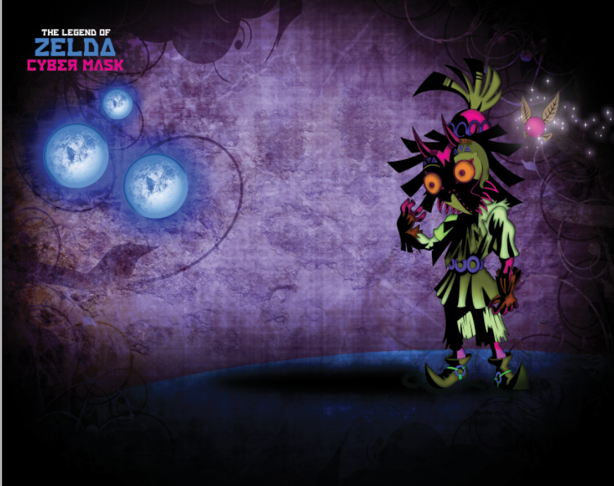
This image shows the beginning of my second attempt with similar techniques from an image that's more personal to me. The image I have selected is Skull Kid, from The Legend of Zelda Majora's Mask.

Using similar techniques to the previous task, I was able to select the white space with the magic wand tool, select similar and delete. I was then able to inverse the selection and select similar once again. I could then take the paintbrush and colour over the outline to ensure the outline is bold and distinct. This allows me to avoid colouring the wrong sections during the colouring process.
I then proceeded to select the paint bucket tool in which I coloured various parts of the image effectively. I could also use the magic wand tool to select a section of the image, and apply a gradient effect for a more realistic appearance.
I selected an image that I thought would relate to the genre of mythical and magic effectively. I selected this image and by using colour correction techniques I could darken elements around the image.

I was further able to pracitce colour correction. I created a green colour as I believe it fit the scene more in comparison to the coloured image. I was able to achieve this through the curves adjustment by increasing the green channel and decreasing the red channel.

Following a similar technique from the previous task I could create a darkened border. I produced a black solid layer and selected the rectangular selection tool with around 50PX feathering value. I could then select from just before the top right, to just before the bottom left, hit the delete key and create an effective feather darkened edge. I feel this adds more atmosphere to the scene emphasizing the dark atmosphere.

I began to import my image to the scene. I positioned the image to the left of the scene to avoid the generic centered assumptions.

I began to import more elements. I was able to create this through the pen tool. Additionally I was able to colour the element green and add a subtle glow by advancing to the outer glow blending options and applying the glow.

Similar to the techniques I had performed in unit 4 for the music poster, I decided to build upon the stars lights elements and incorporate them into this design for increased effect. I was able to replicate the stars and the glow effects by duplicating the effect multiple times for enhanced brightness. I believe this improves the sense of magic and mythical nature.

Following similar techniques to the previous task with the abstract creature, I took the circle tool by selecting the shape tool and drew a circle around the bottom half of of the image. I then changed the opacity levels to around 50% to reduce the solid aspects of the circle. This will represent the floor for my character.

I replicated the technique to forge the shadow. I was able to forge a shadow for my character which is larger in comparison to the previous shadow I created. I was able to create a circle shape through the shape tool and by increasing the feathering amount to around 20PX. This adds more diversity to my work as it suggests a light source.

I proceeded to experiment with various colour correction techniques. I was inspired by the invert colour technique in one of my previous hoax practices. I decided to invert the colour of the composition which I believe produced an effective darker atmosphere for the scene.

I begun adding in text to the scene. I added the type: The legend of zelda cyber mask. I feel this typeface is appropriate as not only is part of the text inverted, but the name itself fits with the inverted nature scene of Majora's Mask. I believe that the purple colours emphasize a cyber like theme due to the brightness of the purple being a contrast between light and dark.

I imported an element that represent a moon which is a prime feature within Majora's mask. I used colour correction techniques to decrease the brightness to allow for more depth in terms of detail. Additionally I increased the yellow and red channels to create a subtle orange colour. I also modified the blending options to add a glow to the moon graphic.
This image shows my final outcomes with this task. I decreased the size of the moon and applied some colour correction to increase the blue channels. I then duplicated the moons and placed them over specific patterns of the background texture which created a fantasy moon flower effect.
Typography Expressive Typeface Moodboard

I created a moodboard that showcases text that express their meaning through graphics. Words such as blur that are actually blurred, frozen that is actually frozen, or gold which is actually gold. I was able to develop an understanding and gain inspiration in regards to producing my own expressive words in Photoshop.

The first expressive word that I produced was Metal. The word is presented on a metallic background which expresses the words meaning. Additionally the word itself is presented with a metal texture which reinforces this. I was able to create this word by locating a font that would be most associated to metal. Fonts that are bold, and often straight could represent metal most effectively. After typing out the word I was able to rasterize the layer and perform a paste special technique to paste the texture into the text itself.

This image shows my second attempt at creating an expressive word, this time with the word skin. The word is presented on a skin background which expresses the words meaning. Additionally the word itself is presented with a skin-like texture which reinforces this. i was able to create this by locating a curved font that would be most associated with skin. unlike the metal typeface, skin is softer and therefore a more curved, relax font would be appropriate. I was then able to perform a paste special technique to paste the texture within the text. In addition i could apply some colour correction techniques to darken elements of the textured word which enhanced its overall appeal.

This typeface is my last expressive word development, and also the most time consuming. I created a black background as I believe the black could represent a burnt nature. By typing the word out I was able to apply a fire texture to the word through the paste special and paste into technique. I spent time constructing additional elements such as the triangular ashes like shapes that emit off the word. I believe that this added a sense of realism to the word itself. I also duplicate the fire texture and placed it above the fire text layer. I could then crop out elements to make the fire appear as if it was rising off the text itself.
Additionally I was able to create smoke by using the cloud filter gallery. I was able to manipulate its position and colour it grey to really emphasize the fire within the word fire, by placing smoke above the typeface.

With this collage I was able to practice my techniques and merge them into one scene. The image above shows my experimentation with different blending modes, combined with colour correction techniques such as curves, levels and hue & saturation. Additionally I was able to experiment with the filter gallery to enable a more vintage appeal to the collage. Concerning the circle shapes I utilized the technique of duplication and duplicated the circle shapes multiple times and placed them next to each other. Following this I could then merge the layers together and change the values of the opacity to a lower level, as well as changing the blending mode to overlay or screen to allow the circles to blend in more effectively.
I was able to practice my ability with the transform tools. In particular I used the skew technique to warp the proportions of the rasterized text layer to generate the illusion that the text is on the road. Additionally I could use a blending mode to create a more silhouette theme for the text ultimately suggest a shadow of a larger text.
Visual Path Collage

By recording my visual path I have captured various elements which include textures, interesting establishing shots, as well as aspects such as locks, sticks and various other features. I was able to compose a collage consisting of combining and utilizing a few elements into one. I was able to practice my ability in blending modes and resizing objects to forge a different scene. Unfortunately due to my lack of experience with collages, this collage didn't turn out as effective as I had hoped. However I was able to gain insight into elements that forge a good collage. In comparison I was still able to practice other collage techniques, in particular, learning about the use of textures to fill the void white space.

With this collage I was challenged with the task of composing a space/surreal theme. I was able to practice my ability further in regards to blending modes, as well as using masking to my advantage with paint brushes. For example I was able to create interesting glowing effects on the center of the collage which emphasizes the main element, which in this case is the deer. I was also able to practice other techniques such as sky replacement. This was a fun task as I enjoyed manipulating the sky with another texture to change the scene completely. Due to the glowing aspects and space like themes of the collage you could suggest the dream-like state genre, similar to that of surrealism.

The next collage builds upon developing my skills with manipulating various medias to my advantage. I took this grunge texture and placed it into Photoshop as a background image.

Building from my experiments with colour correction techniques i was able to perform a levels adjustment which greatly darkened that texture, ultimately crushing the bright features. This sets up the texture effectively for the composing process of the collage.

I selected an image in which portrays a city through an estbalishing shot. I have particularly chosen this image to allow for further development later.

After practicing with various other collage techniques, I used inspiration from them and applied the texture and as overlay blending mode to the city establishing shot which created a unique dream-like atmosphere, similar to that of the previous collage. By duplicating the texture again and changing the transfer mode to screen i was able to restore some elements of colour which changed the scene to a green/brown colour which could refer to the urban colours of the city.

I imported a photograph of a building into Photoshop. I was able to decrease the opacity and change the blending mode to a hard light. This gave the building a less solid appeal, suggesting a dream-like building or an illusion of a building that doesn't really exist. I manipulated the duplicate technique and made a plethora of versions of the same building, each with different size proportions and values. This created a more diverse city, compared to just the one building.

I was then able to import a photograph of a girl. Following similar techniques I modified the blending mode to overlay which gave the girl a transparent look. Additionally when cropping out the girl I ensured to use feathering which left in some elements of the background around the outline of the girl which creates a horror/ghost effect. In combination with the blending mode, you could argue that the whole scene is an illusion. I was able to develop a collage in which portrays a surreal scene through a dream like state, simply by manipulating the correct blending modes, and duplicates layers several times.

I referred back to the original texture layer and created a layer mask. By doing this I could select the soft paint brush and highlight various sections of the image. I believe that this creates a more distinct look and enhances the dream-like subconscious theme of the collage. Additionally I experimented with a subtle curves colour adjustment in which i increased the red channel subtle to increase the effectiveness of the warmer colours.

This image shows the the final version of this collage. To improve it further I produced a lens flare and placed it within the girls vision which suggests the girl is looking at something specific. To enhance the brightness of the scene I duplicated the lens flare and placed a second one to the left of the original which I believe fits effectively well with the original images suns reflection on the building next to it. The use of glowing colours generate an atmospheric surreal scene.

Building upon the surreal theme, I was challenged with clever image placement and proportion values to forge a surrealistic scene. The production of this collage begun with the cropping of the hands. I was able to crop out the hands from an external source and by using feathering techniques, place them at the end points of the arms. The feathering smoothed the process to allow the linkage to appear more real. The most interesting aspects of this collage for me was the continuous repetition of eyes. The placement of the eyes where important as I had to discover the most appropriate feathering amount, particularly with the right mask, to allow the eye to appear its part of the mask. Other challenging aspects included the placement of the photograph over the left mask. By placing the mask into the scene, I could rotate the photograph graphic layer and position it to create an illusion that the head and mask are one.
Throughout the production of this collage I was able to practice and develop my ability with to place elements with accuracy in a scene. I was also able to learn the importance of accuracy and how it can impact an art piece completely.
Nature-Woodland Collage Research


I produced some moodboards that showcase some interesting nature/woodland collages. They all feature similar elements, consisting of trees, plants and other nature related objects. However they technique and design in which they use and manipulate them vary. For example using colour correction techniques such as curves or hue and saturation may allow you to change the colour of layers. For example a blue, darker colour may suggest a more wintery atmosphere. However the atmospheric conditions for a Autumn scene may appear to be brown, or bright orange. Other techniques consist of using filters such as the polar effect which creates a planet-like visual as the main focus for the collage. Additionally, some examples use a silhouette theme which exaggerates the season, which would be mostly associated with summer at a sunset time of day.
The silhouettes could represent the shadow of a person or object. Other collages use manipulation of size to enlarge some elements, which ultimately allows more focus to be on specific objects, such as the mushroom example. Additionally I appreciate the technique used in a few of these collages which highlight the rainbow. The dark colour used in the first example, and later examples allow the bright colours of the rainbow to be easily distinguish and recognised as the first visual element, with the eyes immediately drawn to the difference in colour saturation and brightness.
Photography Moodboard


I went to Ashton manor and took a range of different photos for my collage. The photos consist of a range of trees, branches, bushes, paths and textures. From taking a range of different photos I am able to create a more diverse selection of initial ideas, due to the larger quantity of quality photos. Some photos may be effective to use as a texture overlay, a main object, or be combined with other photos to forge interesting scenery.
Collage Initial Sketches

I was inspired by the earlier planet collage I created through the polar techniques. With this sketch I focused on using some of the branches or tree photographs as a place holder. The main theme with this idea was using the branches as a placeholder for the planet. The branches resemble the "hands" of the tree, generating the illusion that the planet is being held by the tree. From using one of my establishing shot photographs, using clone tool to correct any distortions followed by the polar filter technique in Photoshop I could then forge the planet. With careful positioning and layer management I can then place the planet to appear as if it was being held by the tree. I was also inspired to duplicate some branch layers and place them behind the planet layer to generate a 3D visual element.

This design focuses on creating a mirror reflection as the main theme of the collage. I would achieve this by placing a photograph of a tree or an object that resemble nature in the scene. Then you can duplicate the layer and place it across to the opposite side to create a reflection. In the center of the collage would be the photograph of the stone face. I believe that this photo signifies the most important section of the collage, and thus is the place where most eyes would be immediately drawn to upon looking at the collage. Additionally I was inspired by some of the photographs to add a path that lead up to the head, adding further emphasis to the center of the collage. Ultimately I believe that this would increase effectiveness with the surrounding mirrored elements, as the depth of field would be focused on in the center. A possible addition to this would be adding a blur filter to surrounding nature elements to add further depth.

This collage dcesign was primarily focused on surrounding white space to allow more of an initial impact to the actual collage elements. This collage itself is not only effective due to its white space but the circle design in the center would allow the eye to be drawn to as the first element. I was inspired by the long path photograph I took, and with this design I have placed it in the center of the circle. My initative with this effect was to create the illusion that the path is extending in 3D space. accompanying the circle element, I thought about techniques to perform that would be more effective in developing the collage. To achieve this I added the photograph of the building across the entire top part of the image. I would achieve this by duplicating the layer and placing it along the multiple times. To allow a more believable look this technique could be amplified by flipping the image horizontally to allow a match and fluidity with the design.

With this design I was inspired by one of the previous collages I had looked at. In that collage it featured a circle shape, with rays that were emitting outwards that allowed the circle to represent a sun. The light rays were design with a cartoon-theme due to their flat colours. With this sketch I focused on using similar techniques with the sun, and using a photograph of a hill, duplicate the same one multiple times to create the illusion that the sun is rising. Additionally I placed a tree on top the further hill, with it's roots that spread across the collage. I believe that this adds a surrealistic touch the collage, increasing it's effectiveness to draw attention. This collage would feature bright colours due to the nature of the sun element.

The sketch above uses two perspectives in one image to form a collage. The sketch consists of a large tree, that in relation to one of the photographus I took, would be edited on top of a rising hill top, simialrly to that of my previous design. Following this, the bottom section of this collage represents that of underground. I was inspired to produce this effect by generating ideas and techniques in regards to how I could create my own texture. The underground element would be produced by taking one of the photographs of dirt and using the clone tool to extend the length of the photo. Additionally, by using some colour correction tools such as Curves you could forge the illusion of an underground. I like this idea due to it's extreme perspective.
Nature Woodland Collage Development

I began my developing my collage through taking a standard 1920x1080 document and rotating the canvas to a landscape view. Following this I then took the shape tool and drew a rectangle. Additionally I drew a cirle, by holding shift you can keep the size proportions equal. I then duplicated the circle tool and placed the two circles in a position where they slightly overlap. My original intention with this effect was to produce a bubble silhouette effect,


The next step was adding the building. I was able to import the Photograph of the building I took earlier. I could then use the Free Transform tool and downscale the size of the image. I then used the duplicate tool and the flip horizontal technique to mirror the building to create the illusion of a really lengthy building. Finally I placed the building at the bottom of the layer which reinforced the exagerated length of the building.

In this screenshot I experimented with some colour correction techniques. In regards to the previous screenshot the image appears darker and more grim. In this screenshot however I used tools such as curves or levels to increase the brightness levels of the collage as a whole to give it a more easier subtle look. Additionally I experimented with some blending modes for the building layer. This allowed the texture to work more effectively with the building, especially due to the related colours, the building feels more natural.


Originally, this next step was actually an experiment, however I really appreciated the outcome and decided to use it as part of my complete nature collage. In this screenshot the circle photograph appears in a purple colour. I was able to achieve this by inverting the photos colours. I really like this effect as it creates an awkward, yet effective feel to it. The photograph almost feels alien-like in a way and really creates that opposite effect.

The circle photograph became the view point of where the eyes become most attracted to at first glance due to i'ts more powerful and harsh colours. To accompany this, I wanted to create a visual that would add emphasis to this, however be subtle at the same time. I took one of the photographs I took of branches that had extended length. I placed the photography behind the circle layer, but in front of the textured layer. Following this I added a mask to the layer and used the circle gradient tool with a solid black to white colour scheme. With these tools I could then adjust how much of the photo was viable. Additionally to increase subtlety I decreased the opacity level of the overall layer.


To add more nature to the collage, I used the same masking technique and applied it to two more photographs. The first was some photos of bushes that I took. I placed them to the left and right of the circle element respectively. I placed the layers, below the building layer which creates the illusion that the bushes are part of the path photo. By obscuring parts of a Photo, you can change the diversity and perception of photographs contents completely. The second was a photo of a cracked texture I found on a mud pound. I was able to increased the size of the texture and change the blending mode to hard light or overlay. Then by placing the texture over the building I created a unique effect that could suggest that the building is falling apart, emphasizing the age of the building.

Final Nature Woodland Collage

In the final version, I added a paper texture for the background to increase depth, additionally I added a drop shadow to the circle elements and the base rectangle to develop a 3D further for my collage.
WOMAD Project
General Poster Research

The first poster uses a silhouette theme with a brown background. The brown background could have been created by selecting the paint bucket tool and colouring the background brown. Additionally, in this poster a paper texture also appears to have been used. To create the textured effect, you can take a paper texture, or make your own through the fractal noise filter in Photoshop. Following this you can then change the transfer mode to Overlay or Darken, and decrease the opacity levels to generate a more subtle feel. The poster uses a silhouette camera in a silhouette theme. The most effective way to create a silhouette theme would be to draw, or obtain an image of a camera from the internet and import it into Photoshop. Following this you can then change the blending options to a black, or apply a stamp effect to the camera. Alternatively you could draw this with the pen tool in Photoshop, although it may be difficult to be accomplish. A stroke effect has also been applied to emphasize the silhouette. The most effective technique in this poster would be the use of the colours. The bright vibrant colours contrast effectively with the remainder darker colours of the poster. This attracts attention to the poster. The colours could be created by using the rectangle tool, and using the transform tool it would be possible to skew the bottom section of the rectangle to create the illusion of 3D. This poster is also accompanied with a simplistic type, which is emphasized due to the capitals, as well has the colour change on the "24" highlighting it's significance.
The second poster uses a silhouette them, similar to the previous poster, however this time presented on a beige/white background. The poster itself is composed with city shaped elements, as well as a figure in the lower center of the poster. The city elements could have been composed with the pen tool, or using the polygonal lasso tool to select buildings from a photograph. Once the building has been created via either methods, you can then proceed to either adding a stamp, or changing the blending options to colour overlay. You can then change the colour to blue. In the image of the poster it appears as if the poster uses multiple shades of blue to add diversity and reinforce a hint of 3D. The sitting figure image is the most interesting visual in this poster. Using similar techniques to compose the silhouette theme, you can ensure that the hands and face are on separate layers, and when applying the colour overlay, decrease the opacity a little so that facial features are seen slightly. The text in this poster has been modified with the transform technique, and using the skew tool to skew the text in the proportion of a 3D look.
The third poster uses a plethora of colours. Simiarly the the previous posters it also follows a silhouette theme, however it uses a much larger variety of colours, when compared to them, making this poster stand out the most. The silhouette of the figure is a basic human form image that could be drawn, or found on the internet. Using similar techniques of colour overlay you can then form the silhouette theme of the figure. The most effective element in this poster is the colours. The colours themselves resemble elements of a silhouette theme, and form very abstract shapes. The shapes can be created with the pen tool, additionally they are very compact and tight, grabbing the viewers attention rapidly. However the use of colours could be a turn off for a viewer if they where to find the sheer amount of colours to be overwhelming. The colours could suggest a very lively and playful event, promoting the event of the poster in a very powerful graphic style. Additional elements such the music symbols exagerate the theme for this poster which is obviously music. With the sheer amount of visuals, it leaves little room for the type, which I believe this poster suffers from. To resolve this, the colours size would be decreased a little and the main titles size increased to compensate. There is very little white space in this poster which may prove overwhelming.

The first poster use sa consistent colour theme and housestyle which is obvious throughout the design. The poster is presented on a brown background, which can be achieved by selecting the fill tool and colouring the layer in the desired colour. In this poster it appears that a texture has also been added. The texture can be achieved by selecting the desired texture on the internet, or from taking a photograph of one and importing it into Photoshop. You can then change the blending mode to Overlay or Darken, and decrease the opacity a touch to create a more subtle appeal. The posters graphics themselves are entirely made up from rectangles. The full 100% opacity rectangles present some text of information, where as the decreased opacity rectangles make up the stand/holder for the rectangles which could suggest these rectangles are shelves for information. Additionally with the decreased opacity of the rectangles it creates the illusion of 3D. The text themselves uses a simplistic bold font, which effectively presented all the information with clarity. Using the yellow rectangle at the top of the poster is powerful as the bright vibrant colour of yellow attracts the eye at first glance. Due to the layout of this poster it feels as if the whole poster is covered in text which may be a turn off for some viewers.
The second poster uses a unique, simplistic theme to present it's event. The poster uses a black background which can be achieved by using the paint bucket tool to fill the layer with black. The posters graphics themselves are made of of primarily shapes and follow a specific colour scheme of pink yellow and blue. Due to the bright colours, it creates an old school retro feel that could resemble Pac-Man or a similar game. The three middle graphics are designed to look like badges which I feel doesn't suite the overall event for the poster. On each badge a silhouette themed image is presented, along with text which presents the event of the poster: film, food and music. Due to the bright colours suggesting the retro theme I do not believe that this would have been obvious at first glance. In contrast the bright colours do grab the attention of the viewer. The typeface uses a simplistic theme which ensures consistency throughout the poster. The title text is presented in a yellow colour at the top of the poster introducing Hola Mexico, which is an effective colour and location to use for the main title, making it clear and easy to notice.
The third poster uses a unique graphical style. The poster itself is presented in the style of a newspaper. The first notable element with this poster is the red colour for the background of the poster. Additionally the poster uses squares to separate other sections of the poster, reinforcing the newspaper like graphic style. A key element within this poster is the human figure. The human figure is presented in black and white shades, with an obvious white background which creates the illusion of appearing to be torn out. This effect could be created by selecting the polygonal lasso tool and cropping out the image roughly. Additionally to reinforce this effect, there appears to be a grunge texture added to the poster as an overlay. This texture gives the poster a polished look as a messy, old newspaper. The main title is titled "Listen" immediately hinting that the poster is advertising a musical event, however due to the style of the poster, the genre may be difficult to pinpoint. The text itself is composed with a black colour and a red outline that matches the red background for consistency. I believe that the use of the red and black colours allow the title to stand out to the viewer. Another observation is the creative use of placing the information. The information text is placed at the bottom of the poster in its own border, with the more important information enlarged in size, to avoid the viewer getting deteriorated with the amount of text. I believe that this poster leaves enough white space within the composition to be effective.
WOMAD Poster Research

The first poster uses a green background, This can be achieved by selecting the paint bucket tool and filling the background layer in a green colour. The first two elements that the eye is drawn too is the center image, aswell as the "it's back" text. The center image use a combination of colourful abstract shapes that almost resemble music symbols and the sort. This clearly illustrates the theme of the Womad festival being Music and dance, additionally with it's artistic style, you could argue that it also represents the art of the festival. Arguably the shapes are on top of a circle which you could suggest represents the Earth, being the world festival. Additionally the test "its back" is presented in a solid white, with a black border background, two opposite colours which creates an extremely bold look, placing heavy emphasis on the meaning of the text being: Its back!
The second poster builds upon the sillhouete theme from the first group of posters into a Womad theme. It features a purple background that can be achieved by selecting the paint bucket tool and filling the background layer in a purple tool. The stars can be produced in multiple ways. The first method being the usage of a paint brush with a soft brush setting. This can create more bold stars, which may be more fitting for the poster. Additionally you can specify the location of the stars as you wish. The alternate method would be to select a fractal noise layer and decreased the amount, forging a bunch of small dots which resemble stars. This poster itself is composed which relatively simple graphics. It uses two circles, one at the bottom which could suggest the world, and another circle like image at the top forging the balloon suggesting the travelling of the world that Womad does. The text is placed on top the bottom circle, which could represent the fact that Womad and the world are one, and that is uses multi-cultural themes. The process in creating the black silhouette would include using the blending mode options or by using a stamp filter. The night theme for this poster could suggest that Womad has some interesting events at the evening. In contrast the night theme could suggest that overnight Womad will be coming to your country.
The third poster uses a plethora of compact elements. The poster itself is made up of an orange to green vertical gradient. These colours could represent the sky and ground elements, suggesting a summer themed festival. There appears to be a textured overlay added to this poster which would be achieved by importing the desired texture into Photoshop and changing the blending mode to an Overlay, as well as decreasing the opacity levels to establish a more subtle effect. The main visual within this poster is the centered image consisting of lots of multi cultured references. It uses people, props and objects to reference the multi-cultural theme that is Womad. Additionally due to the compact nature of these elements you could suggest that this visually expresses the bringing of everyone together regardless of race and culture.

Although not directly a Womad poster, the first poster uses some interesting visuals. The background uses a beige colour that could be achieved by selecting the paint bucket tool and colouring in the layer with a beige colour. The background itself is composed of multiple textures. The first texture would be the obvious slanted line texture that could suggest a piece of writing paper or a page from a notebook. The second texture emphasizes the grunge nature of the background, and is located at the top of the poster. The third texture located at the bottom, uses a kind of ink splat texture which reinforces the paper texture theme. To achieve these textures, you can import them into Photoshop, re-position, re-size and colour the textures through colour overlay techniques to colour them. You can the change the blending modes to overlay to allow the textures to blend in more with the composition. Additionally you can use opacity levels to add a more subtle effect. Another technique you can use to achieve a more precise design would be layer masking. You can use layer masking in combination with gradient techniques to mask out sections that are unwanted. The text for the poster is presented in a bold nature combined with a writing graphical style which further suggests the paper theme.
The next poster is presented on a brown/grey background that can be achieved by selecting the paint bucket tool and colouring the layer with a brown/grey colour. You can also take the paint brush tool and select a soft brush to add a little more emphasis on the photo image. The soft brush should also be with a slightly dark colour than the previous colour to allow it to be more visible. The photograph is placed in the center of the poster, bringing attention to it and the first element that you see. This is particularly due to it's bright colours, and it's position. The photograph has been feathered out by selecting the rectangle selection tool and increasing the feathering PX. My favourite element in this poster is the typeface, particularly the colours. It uses multiple bright colours to forge the typeface suggesting the colourful, playful nature of Womad. The main information text is a little overwhelming however due to its quantity, and uses a black colour which resembles dullness. I believe this poster could have been improved in this regard, or by featuring extra visuals to liven up the remainder of the composition.
The third poster uses a pink circle element as the main visual in this poster. The pink circle could resemble an image of the world, which links in with the world theme in Womad. Additionally the bright vibrant colours could suggest the colourful fun nature within the festival. The poster is presented with images that refer to different cultures dotted around the circle image, which could suggest the promotion and spreading awareness of the festival in different places around the world. The typeface is placed in the center of the image, placing more impact and instant recognition on the name of the festival. This is effective as the viewers eyes will be immediately drawn to the center of the poster revealing the name of the festival.

The first poster revists the silhouette theme from previous general posters and takes it in the form of a Womad festival. This poster is presented with a blue background with sun rays. They could be an effective element to fill some unnecessary white space within the poster. The sun rays could also highlight the time of year in which the festival of advertisement takes place - IE summer, a time of year where people like to relax with friends and family, further suggesting that the festival could be a family orientated theme. The blue could suggest the clear blue skies, emphasizing a warm day, however the ice graphics could argue against this and suggest the "coolness" within the Womad festival. The silhouette figure appears as if they are in a dancing posture, emphasizing the dance theme for the festival. The colours for the type are also bright and vibrant suggesting the playful nature of the festival.
The second poster uses a more simplistic graphical style. It is presented on a beige/light brown background with a border in the center displaying a large yellow circle element which could be suggested as the sun. To reinforce this the yellow lines that are displayed directly below the sun could suggest the reflection of the sun rays onto the water surface, emphasizing a relaxed atmosphere within the festival. The main image in this scene is the seagull. The seagull is presented in a black silhouette theme, accompanied with multi-coloured strokes which give the image a less harsh look. Additionally the text used in this image is presented in a handwriting style reinforces the relaxed atmosphere.
The third poster uses a photograph as its main image. The photograph is of a stage accompanied with bright lights during a sunrise scene. The combination of these elements could accumulate to a number of things. The fact that the photo is taken during sunrise could suggest the fact the festival is targeted at a family audience, or it could suggest the dawn of Womad, the world's festival. The stage photograph could imply that there will be a showcase of events or objects, in this case the showcase is arts, music and dance. The typeface used is designed with a bold approach, yet softer around the edges which eliminates any harsh auras and reinforces the family theme for the festival. The type is also coloured in white which allows the type to stand out more due to it's contrasting darker background.
Visual Moodboards

This visual moodboard represents an Asian themed patterns and graphics broadcast. It shows a wide array of patterns that could be potential to use within my poster and visual development to demonstrate elements that would be most associated with Japan. Some patterns included circle shapes, of a variety of different size proportions, as well as different shades of pink. This could suggest cherry blossoms, a key assoasication with Japan, especially during spring times.
Other patterns include images such as the top right pattern, which consists of a swirling visual which could suggest a water/cloud theme, which could be used in development to imply the relaxed atmosphere of the festival. Images like the flowers may also be effective to use to promote the summery theme of the festival.

This moodboard represents an African themed patterns and graphics broadcast. It shows a wide array of patterns that could be potential to use within my poster and visual development to demonstrate elements that would be most associated with Africa, or countries with similar culture. The most interesting patterns to me, would be the top rioght image, which shows a duplicating of multiple patterns in a single file to forge a graphic. The individual patterns look particuarly appealing, which may attract some attention to a viewer due to their abstract yet compact design.
Other patterns such as the top left image which consists of litterally a bunch of swirly lines, could suggest a desert theme. This pattern in particular reminds me of a map from early video games such as the legend of Zelda franchise in which they use squares to represent places on the map. The swirly lines in combination of their bright colours could suggest a desert theme, ultimately suggesting the time of year in which the poster takes place if they were to be used in the poster. The summer theme may also promote the relaxed, fun atmosphere.

This moodboard represents a Spanish themed patterns and graphics broadcast. It shows a wide array of patterns that could be potential to use within my poster and visual development to demonstrate elements that would be most associated with Spain. Similarly to the African themed patterns, these patterns follow the bright/vibrant themed route. The bright themed visuals may be an effective set to use in development, due to the bright colours attracting the viewers attention, ultimately using some Spanish visuals may be great for an eye catching effect. I particularly like the technique in which they showcase the food. The food is show to be presented with a background colour of an alternate colour to the colour that is used in the food image. For example the pineapples are presented on a green/orange/yellow background while the pineapple colours themselves have green/orange/yellow elements. Using colours like this is very easy on the eyes and feels nice to look at, suggesting that the food is fresh and emphasizing its taste.
Typography Research

I selected some fonts that would be appropriate to use as fonts for a Womad festival. The first font uses a bold nature, with the font upright. It uses a soft, subtlety rounded design on some points of the letters that relaxes the font more as a whole. Due to the up right design and bold nature this font could be an effective main title font. The second font uses the bold nature similarly to the first type, however this font is presented with a stretched visual, making it seem larger and bolder in some perspectives. The third font reverts back a little from the stretched theme. Instead this font uses <> shapes at each join point of each letter. These shapes make the font appear more fun due to it's added shape element.
The fourth font follows the previous fonts with the bold nature, however uses a skewed technique which creates so randomness with the letters proportions. I like this technique as it could suggest a playful nature for the festival. Additionally the letter proportions could arguably appear as if they have been drawn on with a marker pen, emphasizing the artistic side of Womad. The fifth font uses a 3D effect to produce a whole different appeal. This font could be effective to use with any design that uses 3D elements as a theme. The sixth design follows the 3D element in a more relaxed, wobbly perspective compared to the previous font which could suggest the fun, playful side to Womad. The seventh font uses similar elements to the 4th font, however in a more upright form. My favourite element regarding this font is the orientation and rotation values of each letter. Each letter has been slightly altered in terms of its rotation to create a more fun/relaxed appeal. The eight and ninth font follows similarity to the previous font, however more so with an upright position, rather than a slanted rotation. The fonts could be effective to use for the information on the poster while maintaining overall style. The last font uses a more compact nature combined with a bold effect which if used with Womad could represent the bursting of excitement metaphor for Womad as a festival.
Developing Hand Rendered Type

After researching some fonts that could be used in regards to Womad, I begun to develop my own fonts on paper. I noticed that techniques included, keeping the typeface bold to emphasize fun and draw the viewers attention to the title, at the same time as not keeping the type too straight to avoid generating a serious effect.
My designs in this image ensure the bold nature of the type. The first design uses a stroke-like style to add more emphasis to the title itself. Additionally I designed the type with a more curved style on the edges and points of each letter. I feel that by doing this I was able to reinforce the family friendly nature of Womad. The second type follows upon that foundation, however removes the bold-stroke like effect. I believe this might be the more effective method dependent on where the typeface was placed within the composition - If the typeface was placed next to lots of visuals, it may need a stroke effect to allow it to be read with more clarity.

The first design in this image, uses a bold nature. I attempted to try a new style with this font. Instead of curving the edges and points on each letter I used a swish-like effect. I was aiming for the same relaxed, bouncy theme with the font from a different approach, however unfortunately the effect I achieved felt like a Halloween /like effect which resembles bats.
I was able to achieve a more bouncy, playful appearance with the next fonts by focusing more on the boldness and slightly off-centered letters. I believe that these types of fonts are most effective for Womad for 3 elements - presenting the festival in a fun, playful manner. Presenting the festival with the target audience as family orientated. Finally and most importantly, attracting the attention of the viewer to present the other 2 elements.
Initial Ideas - Sketches

With this design I intended to incorporate some pattern visuals into the composition as the prime visual element. I was inspired by the Asian and African moodboards I created regarding the patterns. Particularly with the African patterns that involved duplicating the same abstract pattern multiple times. I thought about the idea of placing these patterns inside long rectangles and randomizing the location a little to emphasize the playful nature. Additionally by placing different cultural patterns in the rectangles, I would be able to promote the multi-cultural free theme that is Womad.
I then thought about how I could use the rectangle patterns in productive ways. In the image above I use a border around the title of the festival "Womad" where I intend to place patterns around the outside border of womad as you can see from the image. Not only does this technique use the patterns in a different method, but it uses the patterns to highlight information of importance, in this case the title. Additionally I experimented with using a similar technique for the date of the festival.

After researching some already existing posters, I was inspired by the use of the Earth as a visual element, and thought about various ways to explore the potential usage of it. In this image I use the Earth as a main visual accompanied by sun rays which help to emphasize the world, suggesting to the viewer that Womad is a festival about the world. To promote this further I placed the title "Womad" next to the earth visual. Additionally with the usage of the run rays they help draw attention to their meeting point. In this image the meeting point is the Earth, placing more emphasis on it.
Additionally the run rays could be used to suggest a relaxed atmosphere, or suggest the time of year: summer. Another element that I used in this design was the usage of the drops. I drew these drops to signify a playful, colourful nature of the Womad festival. Additionally because the festival is themed on music, art and dance, I believe the paint drops suggest this.

Originally, I wanted to try something new with this design. The design itself focuses on the usage of basic elements to create a unique, abstract yet distinct look for the festival. I have used a bunch of cirlces to compose the design, which in a digital view would be all multi coloured, which could suggest the playful/colourful theme of the poster, as well as suggesting it's target audience is family orientated. Unfortunately with this poster, it ended up looking more like a space/sci-fi theme rather than a festival themed with arts, music and dance. In an attempt to restore some of the theme, I added in a pattern box, similarly to my ideas with my first design into the bottom of the poster to try and fill some extra white space.

In this design, I built upon the foundations of the earth element in one of my previous designs. In the bottom section of the composition, the world is enlarged in size, creating a 3D-like visual placing heavy emphasis on the world theme. In this design I was inspired to use the glow emitting from the earths atmosphere to highlight the bottom section of the title "Womad". I believe that this would draw attention to the mid/bottom part of the poster, and due to the large image scale, attract a viewer to the poster. This is particularly important as humans have an extremely short attention span.
In regards to other visuals in this design, for the top half I was inspired by some of the previous posters I have looked at. In this design I attempt to promote the Arts, dance and music theme by adding some visual elements related to them. Visual elements would include: musical instruments, such as guitars, flutes etc, circles of random colours to promote art. Finally musical symbols to promote dance. Additionally to promote the multi-cultural theme, I have included some multi cultural patterns, particularly the rectangle box I mentioned in the annotations of my first design. I like this poster due to it's potential to effectively advertise all of the elements of Womad, as well as drawing the viewers attention due to the large scale with the world.

This design uses two main elements as it's focus. I attempted to develop a new method in which I could promote the multi-cultural theme of womad. Instead of flooding the design with patterns, I created a design in which I use country flags to symbolize the "world" in the festival, rather than adding a world symbol itself. The main flag, next to the womad title text will be changed depending on which location the festival is set in this year. IE if it where set in England, it would be an english flag, Spain = Spanish flag etc. This design itself is very minimalist, however I feel due to the lack of some visuals it may weaken the overall impact of this design to the viewer.
Visual Elements

I was able to develop my own visual elements that could be potentially used in development with a poster. I wanted to keep to a vectorized theme to allow for more vibrant colours and bold graphics. I believe that this will emphasize the family friendly nature of the Womad festival aswell as suggesting it's playful attractions.
To create the planet, the first step was to take the circle tool and draw a circle.From entering the blending options I created a stroke effect on the outside of the circle, with approx 20px and a dark blue colour. Then by duplicating the circle shape I could then use the fill tool to fill the layer to a green solid. I could then proceed and by using the pen tool and the lasso tools I could create random shapes within the circle which represented the land of the earth.
To produce the clouds I took the circle shape tool and drew a white circle. I then proceeded to duplicate the layer multiple times and re-size each one from small to large to small. I placed the circles on top of each other to forge the visual of the cloud. The final step I took was the decreasing of the opacity levels for the clouds. By decreasing the clouds opacity level to around 40% I could create a more subtle yet effective visual element.
The production of the rainbow involved creating multiple circles using the circle tool and changing the colour values of each one. I could then merge the layers together, rasterize them and use the skew transform tool to distort the proportions of the rainbow slightly to give it a more believable appearance.
Vector Sun rays

I created a moodboard of sun rays as I believe they could be a powerful visual element to use during my poster development. Particularly on the examples of posters I looked at I noticed an effective use of vector sun rays. They are effective as not only do they emit a colourful playful look, but they also signify the object of interest. For example take the bottom left image on the moodboard for example. All of the rays have a meeting point being the clouds and sun, using the rays effectively as a reference to draw the eyes to the center.
Additionally, they could be an effective element to fill some unnecessary white space within the poster. The sun rays could also highlight the time of year in which the festival of advertisement takes place - IE summer, a time of year where people like to relax with friends and family, further suggesting that the festival could be a family orientated theme. I have noticed that the sun rays tend to stick with a colour scheme, usually yellow/orange or different shades of blue. The blue could suggest the clear blue skies, emphasizing a warm day, where as the yellow could suggest the sun directly or a sunset, which shows potential for different colours dependent on the theme of the poster.
Visual Element Development - 3D Planet - After Effects
.jpg)
My next visual is a involves the creation of a realistic 3D planet in After Effects. I created a new composition at 1920x1080 to allow for full scale resolution in my production. I could then take a 2D image and manipluate it within 3D space. I can then right click on the texture and precompose the layer as a whole. This allows for easier colour correction later, and the addition of other textures or effects.

By advancing to the effects and presents panel I can apply the CC sphere effect to the pre-composed earth layer which forges the texture into a sphere shape. Additionally for electronic posters I could create a gif image by keyframing the rotation of the sphere to allow it to spin continuously, generating the illusion that the planet is rotating.

I was then able to duplicate the pre-composed texture layer and change the blending mode to screen. Addtionally I was able to brighten up the left side of the planet by increasing the light emitter value. I changed the colour of the light to a white, to create a more natural look.

By duplicating the layer again, I can change the values of the light emitter to a negative number, IE 40 to -40 to allow the lights to reflect on the opposite side. If the planet involved animation, the light source would be an effective value to animate with the rotation of the sphere. Additionally I was able to add a light point to the far left and right of the planet to produce a stronger gradient overlay for the planet.

I duplicated the pre-compose layer another time and changed the transfer mode to hard light which brightneded up the right side of the planet, emphasizing the 3D effect. Additionally by double clicking on the original pre-composed layer I can enter the composition consiting of the planet texture. I can then import a cloud texture within this composition which forges the clouds when I return to the main composition.

The final effect I added to my planet to allow it to appear more believable, is a glow. I added a glow to the pre-composed layer and increased the radius, decreased the intensity and increased the threshold to create a more natural glow. Additionally by changing the glow colour to a subtle blue I can create a more realistic planet appearance. Producing my own 3D planet allows me to modify elements and values to fit in designs for my poster.
Poster Development 1

With this poster, I wanted to attempt to learn and develop some new skills by trying something different and new to what I usually produce. I began by double clicking on the background layer to unlock the layer. I then proceeded to take the gradient tool, select the rainbow multi coloured preset and coloured the layer with a rainbow-theme. My original intentions with this was to use multi colours to represent the playful nature of the Womad festival.

I took the circle selection tool and cropped out a range of different circles within the rainbow image. The circles included where a range of different sizes, and of different sections of rainbow image to create diversity and randomness within the range of circles.
Once I had cropped out a range of circles, I shut off the rainbow coloured layer and began placing the circles in a more compact - yet spread out nature to suggest randomness. I could also use the free transform tool to alter the sizes and proportions of any of the circles at any point.

I proceeded to add more additional circles to the composition, including circles with just an outline. I could change the outline to any colour, in this case I chose white for the main circle, and coloured the stroke a rainbow colour for another. I used the polygonal lasso tool to crop out elements of a circle to forge the visual element located on the white stroke circle.
Another technqiue I performed was the use of cropping with the square tool. I took the rectangular marquee tool and procceded to crop out random parts of circles. I believe this added more diversity and randomness to the circles, which could suggest the crazy-fun atmosphere of the Womad festival.

To increase the playfulness and randomness within the poster I took the brush tool, selected a hard brush at a decreased opacity and dotted circles around the composition. I was sure to increase and decrease the size accordingly to add more compactness to the poster. Unfortunately this poster began to look too random, and although I was interested in the use of using multiple colours to forge a poster, I don't believe that the use of lots of colours is effective for this project.

In an attempt to recover the poster I decided to add some more variety of shapes into the composition. I used the pen tool to draw random abstract shapes. I then took the paint bucket and coloured these shapes in a white colour. Following which I decreased the opacity to reduce the sharpness impact levels of the shapes. I believe that the usage of different shapes helped restore the poster design a little, however the poster began to look like an art-themed poster rather than a multi-cultural music dance and art poster.

I proceeded to enter some text within the poster. I selected a general font as a template to text what the poster could look like with text involved. I used the blending options to add a rainbow/multi coloured colour to the text, however I feel that this blended in too much with the colours of the visual elements with the poster, ultimately making the text more difficult to read.
An effective technique I liked with this text was the cropping process of the text. I used the polygonal lasso tool to crop out various sections of the letters and altered their position slightly to create an illusion/shattered effect. It could sync with the remainder of the visual elements effectively as you could suggest that the text is shattering or bursting with excitement due to the happening of the festival.

The image above shows the final version of my first poster. Unfortunately it didn't turn out as I had imagined and lost some of it's impact. A distinct difference in this screenshot compared to the previous one of the addition of a background. In this screenshot I have re-nabled the rainbow background, however I decreased the opacity levels to create a more subtle approach, in contrast with the shape elements that appear more aggressive and abstract.
I plan to use colours in a more consistent manner with my next poster, in an attempt to create more visually appealing graphics.
Poster 2

I began by creating a new project. I then changed the size proportions to be in A3 size as mentioned in the brief. I then unlocked the background layer by double clicking on the layer in the layer palette. I then took the paint bucket tool and took a light blue blue colour and coloured the entire layer with a blue.

The next step involved adding some shapes. The first shape I added was the circle, and coloured it a light blue. The circle represents the world for the "world's festival" part of Womad. I believe that using a world image as the main object of significance would allow the viewer to easily recognize that genre of the festival.
Additionally I experimented with some additional shapes in the background. I was able to create these shapes by drawing a simple rectangle and using the free transform tool I could then manipulate the position and create a surreal - random streaks. I also used a shade of blue/purple for these streaks to ensure consistency.

The next step involved the creation of the planet itself. From entering the blending options I created a stroke effect on the outside of the circle, with approx 20px and a dark blue colour. Then by duplicating the circle shape I could then use the fill tool to fill the layer to a green solid. I could then proceed and by using the pen tool and the lasso tools I could create random shapes within the circle which represented the land of the earth.
Additionally using layer masks, in combination with a soft brush with a decreased opacity. I used the brush to create a subtle white gradient spot which produced a subtle 3D look to my planet.

Using a similar technique, I increased the size of the brush and made a new player. I placed the layer behind the planet layer and using the brush I was able to create the illusion of bright light emitting from behind the planet which could represent the sun, as well as generating a more effective 3D effect.
The previous random shapes I used in other screenshots didn't feel to work as effectively as I thought they would. I was inspired by some of the sun rays techniques used in other's work and examples. I decided to take the initiative and implement it into my own work. I was able to create this by using the pen tool to create a ray with a V type of shape. I then placed the layer behind the planet layer again which further suggested that the rays were coming out from behind the planet. I could then duplicate this layer and using a transform tool such as skew or distort I could warp the shape of the shapes to adjust appropriately. I like this effect as due to it's heavy capacity it adds more emphasis to the planet and increases it's likeliness of being the first element the viewer is drawn too.

I begun producing other elements to add to my composition. In this image I have added in a background element to highlight important text. I was able to create this image by taking the rectangle tool and drawing a rectangle. I could then use the line tool to draw the outline for the additional sides. Then by merging the layers together and using the free transform tool I rotated the image slightly.
In this image I also used a drop shadow blending option to promote the subtle 3D effect I was aiming for. Finally, I took a layer mask and selecting a light to dark green gradient colour and was able to colour in the pixels within the shape. Further adjustments involved using the brush tool and selecting a soft brush on a dark colour to darken the edges. Once my element had been created I could then duplicate the layer and flip the layer horizontally to create a mirrored reflection.

I was able to create some additional elements to liven up the composition with some extra colours and really promote that colourful bold atmosphere for the festival. I was able to create this visual by using the circle tool and the pen tool to forge some interesting shapes. The shapes involved what represent drops. I was sure to follow previously used techniques to my advantage which included using a gradient for the fill for these shapes. This helped further promote the subtle 3D effect with the scene.
I used random bright colours to brighten up the poster. From using the duplicate method I can make multiple copies of the same drop, change the colour through blending options and use transform tools such as skew or warp to alter the dimensions of some of the shape proportions, ultimately creating some randomness in the scene.

To emphasis the gentle nature of the festival as well as promote the colourful cheerful atmosphere I created some cloud visuals. The method used to produce the clouds allowed them to appear with a cartoon-style exaggerating the graphical style of the poster. To produce the clouds I took the circle shape tool and drew a white circle.
I then proceeded to duplicate the layer multiple times and re-size each one from small to large to small. I placed the circles on top of each other to forge the visual of the cloud. The final step I took was the decreasing of the opacity levels for the clouds. By decreasing the clouds opacity level to around 40% I could create a more subtle yet effective visual element.

The next step involved adding the text. In this screenshot I used the Grobold font as I believe it was most effective in terms of creating a playful, bold yet distinctive visual. The font uses a layout that consists of some wonky elements, yet not too sharp and effectively suggests a fun title. To bring out the boldness more, I added a stroke to the text layer by advancing to the blending options. I changed the coloured of the stroke to the same colour as the stroke of the planet to ensure consistency. Additionally I changed the colour of the text to the same colour as the planets fill.
To create some more style I changed the colours of the "AD" to a green colour which matches the colour of the green within the planet. The use of these colours work potentially well as the text has a high clarity level, as well as fitting in effectively with the poster as a whole. I placed the text at the top of the poster as I believe this allows the poster to feel more compact, emphasizing the lively nature of the festival as a whole.

I begun experimenting with some text with the remainder of my poster, particularly with the border visual element. I had decided that the most effective text to use on the border element would be the dates of the festival, emphasizing the importance of the date as "you don't want to miss these dates!" I experimented with using similar styles to the main title for the text, however unfortunately this felt a little repetitive and didn't appeal as much as it could have.

To remove the repetitiveness of the same font, I attempted to try another font that appears more friendly, and subtle, yet still effective with its playful and colourful nature. This font was Tekton Pro. I enlarged the numbers 24 and 26 to highlight their importance as key dates. I felt that changing the colours to anything other than white would ruin some elements of the poster and feel too repetitive with a bunch of random colours.
To ensure consistency I kept the colour as white, same as the clouds. This increased the effectiveness the coloured drops significantly, allowing them to further stand out, drawing the eye directly to the midst of everything.

I begun importing some information of the festival, particularly at the bottom of the poster, as the bottom of the poster remained too empty. After referring to other posters, I was able to obtain inspiration to how the text should be placed. I used the font Tekton Pro once again to ensure consistency, and promote the playful nature, however I used an overall decreased size for this text compared to the date text. I placed the text "World of Music Art and Dance" in capitals to suggest a continuation of the title
. Additionally this text size is slightly larger than the remainder to emphasize that. With the remainder of the text, particularly the contact info, and general info on how to obtain more info was placed at the bottom left. I believe that this allows the viewer to easily recognize important information, as it is all in one place. Due to humans short attention span, this allows for them to quickly learn all information required for the festival. Finally I added the Womad logo at the bottom left to promote the lion and the icon for the festival.

To add further impact and produce a compact poster I duplicated the drop layer another time and altered the position of the drops, in addition to modifying the sizes I was able to increase this. This was an experiment to see if it was too much graphic for the viewer, as overloading them with visuals may deter them from the poster.

To spice up the poster more so I added yet another visual, however I was concerned with going over the top with elements. I was able to produce a rainbow element that I placed at the right section of the Earth. I believe that this element adds a polished touch, and really promotes the bright, colourful bold and fun festival nature that is Womad.
The production of the rainbow involved creating multiple circles using the circle tool and changing the colour values of each one. I could then merge the layers together, rasterize them and use the skew transform tool to distort the proportions of the rainbow slightly to give it a more believable appearance.

The final element I used to help promote Womad as a festival was an element from their website. The element consists of a tent/trees and flags that represent the diversity that the festival is. I believe that using this element helps promote the cultural influence of the festival.
I was able to take the image from their website, and using the fill tool and careful management with lasso tools I could polish up the image further, empowering the silhouette theme that is uses. This also created a smooth edge for the visual element and reduce the amount of stretched pixels that resulted in a pix-elated image. Additionally I feel that this image successfully reduces the amount of unnecessary white space to a more appropriate level, without overwhelming the viewer.

I began to experiment with different colours for the typeface for my poster. I experimented with a range of different colours for the poster, including multi-coloured to refer to the rainbow, green, full blue and a pink/purple colour which referred to the lower visual of the poster consting of the tent, trees and flags etc. I attempted to ensure some consistency with the colours to ensure that the colours do not overwhelm the viewer. I feel that the green colours look like the colours are competing too much, whereas the multi-colours appear as if there are too many colours on the screen and the purple/pink colour appeared too stale.

Final Poster

This image shows my final poster for the Womad festival. I modified the position of some text and toned down the amount of text in the center. This allows the center to be less crowded and overwhelming for the viewer. The important information is displayed with clarity allowing it to be instantly seen and taken in.
Initial Proposal

A Digital Artist Research & Critique

General Collage Research

I took an interest to this collage due to it's surrealistic nature. The collage focuses on a character wearing casual clothing with a gas mask. The masked character is slightly arc'ed emphasizing the weight placed on his back. We can see the character is seen with what appears to be a planet placed on his back, with wires that are attached to him that form the illusion of backpack straps, Finally the character appears to walking on the ocean, or a sheet of snow.
The main noticeable elements in this collage is the obvious planet which could symbolize the character being bound to the planet, similarly to how we are with Earth, and may travel across surreal unbelievable terrain. Another feature in this collage is the LED's that appear a plethora of times around the composition. The lights could suggest the electricity symbolism and how the character is taking the electricity with him due to it's value.
The planet in this collage is similar to a technique I have already practiced in this blog. The planet was most likely created using the Polar, distortion filter in Photoshop, with an added glow and perhaps smudge effect with a high range value to emphasize the electricity power that is flowing through the planet. The next step would be placing the character into the composition. This would be achieved through importing a photograph of a person who is performing an arc posture. Following this the planet layer would be placed below the character layer to generate the illusion that the character is carrying a planet on his back.
One of the most powerful effects in this collage would be the artistic style of the surface the character is walking on. At first glace I personally felt like he was walking across an ocean due to the lighting effects that have been created at the bottom of the composition. That could have been achieved by duplicated the floor layer and creating a mask or add a radial gradient/lighting effect CS6 with a soft light/overlay or multiply blending mode.
In combination with a closer observation I believe that the floor layer was originally a snow layer with an ocean layer blended in. This could have been achieved by placing the ocean layer above the snow layer; following which decrease the opacity and modify the blending modes to a more softer effect. Finally the gas from the gas mask could be generated from a noise filter or a cloud filter on a white background. Following this it could then be shaped and transformed to appear more time gas by changing the blending modes and feathering out areas of the gas.

In comparison to the previous collage this collage takes a more simplistic yet condensed approach. It uses elements and visuals that consist of majority shapes including squares, circles and thick rectangles or lines. In combination with the variety of shapes it additionally uses a large number of small circles that represent a splatter of ink. In the center of the collage is an image of girl. The girl is positioned on top of all the remaining layers which emphasizes the illusion that the girl is peering from the center.
The collage uses a plethora of elements of visuals to produce it's condensed yet simplistic art style, The collage uses shapes that refer to sections of a circle. This would be achieved by producing a circle shape with no fill, duplicate this layer and enlarge it (this creates the thick outline). Following this you could then use the Marquee tool to crop out parts of the circle that is not needed. You can then merge the layers and duplicate them as many times as required. Additionally by reszing and changing the colours you can generate some variation with the design. The next step would be to use the line tool to forge the additional shapes that appear around the collage. By taking an appropriate photo of a model with the correct angle you can import the photograph into photoshop and move the photo to the top of the layer palette. In the collage above they have duplicated the photo layer and added a Movie lens flare for addition glare and attraction.
They have used techniques which involve using layer masks and paste specials. The more notable visuals would be the explosion seen to the left of the image, which actually appears inside the shape. This would be achieved by opening an explosion layer in a separate photoshop document. By pressing CTRL A to select the entire comp, you can copy the image, return to the original composition, select the circle layer, and advance to the edit tab - paste special - paste into. By performing this paste special technique Photoshop automatically creates a mask for the layer in which shows the explosion layer along side the circle layer acting as a fill. You are then free to move the explosion layer around, and enlarge it to your liking.
Additionally in this collage they have added some gradient effects to some of the circle pieces in the center. They were able to achieve this by selecting the circle layer, and select the circle on the actual composition using a selecting tool, IE magic wand. Following this you can then select the gradient tool, select the appropriate colours and radial motion and apply a gradient to the selected piece. Finally they have used blending modes as well as a splatter texture as an overlay for the composition. To achieve this you would place the splatter layer on top of the remaining layers, and using the selection tool you can crop out any unwanted drops. Additionally, they have used a subtle grunge/paper texture visual with this design. To achieve this import the texture you wish to use as the top layer of the layer palette. Following this you can then decrease the opacity, change the blending mode and duplicate the layer for emphasized effect with additional blending modes.

I selected this collage to review because I believe it has powerful vibes that could suggest a screenshot from an animation, or spark the imagination with the idea that these shapes are coming out from the car, ultimately placing emphasis on the car. The collage is presented with an orange/red car centered in the middle of the composition. It has been placed as the top layer accompanied with clouds, some stroke-like effects that could resemble that of a road and a more randomized texture that could suggest plants of leaves.
This collage itself actually consists of very simple techniques to produce the outcomes. To begin they have created a new layer in which they would fill completely white. Following this they would then take a cloud image and place it at the top of the composition. Then by selecting the square selection tool and setting a feather amount around ~35 pixels proceed to delete the bottom half of the clouds layer, in which you can create a believe illusion of merging with the clouds and blank white layer. I believe that this is an effective technique as it generates an illusion of a silhouette artistic style or theme which could be practical for other projects. By adding a Hue and saturation adjustment to the clouds layer, you can then adjust the level of the hue to select a colour that's appropriate for your design. In this case I believe that the purple feels a bit much as an additional colour and doesn't fit the remainder of the colour of the images well.
The stroke-like road effects can be created by creating a rectangle, duplicating the layer and enlarging the size to form the strokes. You can then merge the layers and use tools such as Distort, Skew or warp to modify the dimensions of the strokes to be more curved and less strict with it's straight nature. In this collage, with the upper stroke-like road effects it appears to have a subtle gradient applied. This is achievable by selecting the layer and selecting the elements within the composition by using a selection tool or magic wand tool. Following this you can then select the gradient tool, change the colours to the appropriate colours you wish the colours to fade too and apply a circle gradient on selected elements and/or layers.
With the center texture/pattern effect there appears to be some added smudging or blurring to a degree. The far right part of the texture is warped into this streak effect that would be achieved by selecting the smudge tool/blur tool and smudging a specific part of the pattern all in the same direction. This effect is interesting as it creates an effective subtle visual that could represent the speed with the car. The composition is designed in such a way that it uses the visual elements to draw focus on the car in the center, similar to the previous collage I reviewed used. Finally they have used a blending effect option on the car. To achieve this they added a drop shadow to the car to generate a 3D effect.

I took an interest to this collage as you can see the clever usage and techniques of 2D elements within 3D space. The most challenging aspect for this collage is the perspective of manipulating 2D images into 3D space. It requires the user to think dimensionally instead of a single point perspective. The collage itself is composed of two solid textures which construct the room itself. Additionally masks have been used to darken edges of specific areas, more notably the corners of each point of the rooms walls to emphasize the 3D nature of the design. In the center of the room we are presented with a face that has a surrealistic art approach to it which elevates the strange atmospheric nature of the room. In conjunction with this, it has been resized to fit in the center of the back wall. It uses the back wall as a reference to refer to in order to produce the 3D appearance. To develop the 3D effect further they have used a combination of drop shadows that could amplify the effectiveness of the 3D.
The collage challenges the mind to think in a different perspective. By using 3D features in programs like Photoshop or After Effects, you can achieve the manipulation of 2D objects in 3D space. Although Photoshop and After Effects only function as 2.5D programs, they work effectively well with textures and such. In Photoshop to achieve the walls and transform them into the perspective of meeting a vanshing point (IE the > look), you would select the texture stretch it out from one of the edges and use distortion tools such as the warp or skew tools to drag the perspective points to meet the in the center of the image. By performing these techniques you can then duplicate the layer, move it across to the other side of the composition as a mirror. If there were any perspective errors, you can use the Free Transform tools or, the flip tools to correct the issue. The same techniques would be applied for the ceiling and floor layers.
To conduct the face as an element, there are a plethora of methods that can be used. Begin by placing a photograph of a face into the composition. The first method I would suggest is to use the pen tool, while holding shift to curve and select areas of the face. Once selected you can then crop out areas of the face that is unwanted to achieve such a distinct look. Although this method may be more difficult and time consuming, it provides more accuracy (if skilled with the pen tool) to achieve the desired effect. The second method, and probably the more achievable technique would be to use a precomposed image. The image can consist of a paint splat, or image with a similar appearance. Begin by pasting the splat layer into the composition. Following this select the face layer and hit CTRL A to select the components of the layer. Copy the components and perform a paste special technique by advancing to paste - paste special - paste into. By performing this technique the face will now be masked into the splat layer and can be transformed, enlarged or re-positioned to the correct perspective.
Other techniques used to produce this collage could consist of drawing some elements of the free-form face visuals, and scanning and importing them into Photoshop, Additionally you could use a brush or pen tool inside of Photoshop to attempt to achieve the effect. Although there is a challenge involved when attempting to construct visuals in 3D space. From a mid-shot face on perspective the visuals would begin large and decrease in size as they extend in length.

This collage consists of a large amount of visual elements that focus on being applied over each other to forge a unique visual experience. It uses a wide array of colours, blending modes that allow the overlapping layers to be effective. One of the most notable techniques used in this collage is consistent silhouette theme that appear apparent throughout most of the collage. Although the human figures that are closer to the camera appear to have more distinct features that have been revealed with a decreased percentage of opacity. Depending on where the eye is focused, different scenery may be seen, however when looking at the collage as a whole it feels overwhelming due to the sheer amount of visuals.
One of the most distinctive yet subtle focuses in this collage is the weather effects. The collage appears to showcase a plethora of weather effects in one image. We see lightning strikes, a sun, rain, a suggest snow effect due to the white background and emphasized rain with the addition of the umbrellas as a prop. After further analysis it is more apparent that the collage is located within a specific scenery. The scenery consists of a direction sign, fences and mountains located at the top of the composition.
The production of the silhouettes could be produced using multiple methods. The most powerful aspect of this technique is that it can be performed on all kinds of different images. The technique itself is performed by selecting the layer you wish to transform into a silhouette. Following this advance to Filter and apply a Stamp and ensure that the blackness levels are high in order to fill the entire image. This method is effective as it allows some more depth and definition to be adjusted with the provided additional settings.
The second method consists of applying a colour overlay through the blending options. This is achieved by right clicking on the images respective later and selecting the Blending options. Through this you can proceed to tick the colour overlay box and change the colour to an appropriate colour. The limitation with this method though is that no depth or further adjustments can be modified or created, however with this technique you can decrease the opacity percentage to allow more of the body features to be revealed as seen in this collage.
This collage consists of many different shapes that can be created through the shape tools in Photoshop. The rainbows could be created by creating a circle, duplicating, rasterizing the layer and re-positioning the values to form a rainbow. Following this you can then proceed to use the selection tools to select half of the unwanted rainbow and crop it out. Alternatively you can use layer manipulation to place the rainbow below a specific layer to generate the illusion that the rainbow is continuing below the actual composition. In this collage the artist has used a wide range of different blending modes, more noticeably overlay and perhaps the screen modes to allow the colours to appear less solid, and more transparent when placed on the white coloured layers.
Another technique that has been used in this collage is the feathering process. Objects such as the rainbow, hand and others have had half of their image faded out. To achieve this effect begin by selecting the selection tool and changing the feathering amount to around 10 - 50px. Afterwards you can then use the selection tool and select an area of the image object you would like to fade. Finish by hitting the delete key which will leave the image object with a feathered appeal.

I was interested in the effective production of this collage in regards to various layers blending modes, combined with feathering techniques and methods. The collage is presented with its main feature being the photograph of a girl with close eyes. The element that appears to be extending outwards from the face could be interpreted as a ghost or the soul leaving the body. This could be further suggested through the darker colours of the scene, being shades of browns and greys.
The background is composed with various colours, as well as an interesting texture. The texture gives off grainy specs which could suggest a more traditional/vintage theme. This could be achieved by using a fractal noise filter effect and adjusting the values to very small particles that create the vintage appeal.
The soul aspect of the image could have been created by duplicating the photograph layer and rotating it in a perspective in which the head is pointing directly towards the camera. You can then proceed to experiment with a plethora of effects including the filter gallery, blending modes and lighting effects to re-produce the ghost like appeal with the image. Additionally you can experiment with techniques such as glow and blurs to smooth over sharpened, bold edges to amplify the atmosphere.
Specific Collage Research

I had discussed in my proposal that i was largely interested in the vector style and technique within some collages. To build upon this I decided to begin my research by looking into collages with vector styles. To further promote themes I was interested in I began looking at collages with a music theme/ink artistic style.
This poster utilizes the amount of void white space effectively. It is presented on a gradient background with the transitioning from black to white. The collage itself is presented in the center of the page with a plethora of accompanying elements. The elements consist of various media proposals,such as ipods, mp3 players, televisions, speakers etc. The artistic style in which they are presented in is a vector theme which holds no detailed textures as a feature. As a result the colour are very bold and bright, placing heavy impact on the collage itself. Due to the sheer number of the existing elements, the collage feels quite overwhelming, however it is eye catching. The collage has been constructed through multiple duplication of layers, in which the size proportions, rotations and position values have all been altered to create more depth for the collage. To increase diversity with the collage, there are two circles that have been placed behind the object layers. This slightly reduces some of the overwhelming attributes and is effective due the the solid background colour of the circles.
The construction and production of the various props themselves could have been produced through multiple methods. The first method would be to use the pen tool and draw the shapes within photoshop itself. This method may be more effective for more simplistic shapes such as circles. However for a more selected and distinct image, taking photographs of various props may prove more effective and easier to accomplish with the more complex props. You can the import the photographs into Photoshop and proceed to vectorize them by using solid colours. The final element to mention in this collage is the use of the paintbrush. There are various paintbrush splats that has been scattered around the scene. This can be achieved simply by selecting the paintbrush tool and selecting a solid brush layer - proceed to click at desired places. This effect is powerful due to the relation with the rest of the scene. The messy paintbrush appeal promotes the compact multitude of elements within the scene.

This collage builds upon the foundations of the vector style further by utilizing more distinct vectors and silhouettes. This collage is presented on a purple coloured background with a radial gradient composed within the center. The radial gradient adds more depth due to the bright colour and draws attention towards the center of the image. In my opinion the collage itself is difficult to distinguish a genre, however due to the shapes sizes and proportions I suggest that the center image resembles that of a city. The image is composed of very simplistic shapes, and by simply duplicated the shapes you can replicate that and create a very distinct look. Due to the rectangular nature of some of the shapes I argue that the overall theme for this collage is a night club music theme.
There are a plethora of other elements that are placed around the scene which could represent light or sound waves. For example the top right image could resemble that of a sound wave, further suggesting the music theme. The scene uses other shapes which appear to be in the shape of an arrow which could reinforce this theme, as the arrows could symbolize the volume being turned up, or the play button being hit.
As for the remainder of the scene there are a plethora of circle shapes which compose the majority of the bottom half. Because of their existence the collage holds little to none white space, and as a result I believe that the collage feels overwhelming. The circle shapes are presented with a bold outline which could suggest that the collage is themed towards music/night club, emphasizing a target audience towards younger people. This collage is composed with many elements which result in a fairly high value of complexity within the scene.

This collage continues with the vector artistic style, however builds upon it in a different perspective. Due to the bold colours within this collage you could argue that the main theme would be referring to a punk/graffiti genre. The collage itself is presented on a white background. similarly to the previous collage's this collage makes use of white space very effectively, allowing the remainder of the scene to feel very compact.
The collage itself is composed by a plethora of paint elements which could be generated through physical means by using a paintbrush and producing a range of strokes, or by utlizing Photoshop and conducting research it would be possible to discover some very effective brushes for Photoshop, allowing you to experiment with many different means. The advantages of using physical means is that you can select the exact paintbrush you want, and conduct it how you desire, in contrast the advantages of using digital means is that you can conserve time more effectively. The paint elements themselves has been randomized including the rotation, size and position to create a more unique scene. The purple and blue colours are bright and contrast effectively drawing attention to the collage.
The final element with this scene is the arrows. The arrows have been designed with an extremely thick, bold outline which almost creates a sense of 3D and depth, as well as really promoting the graffiti style. Various different arrow shapes have been conducted allowing for a more diverse selection. Additionally layers have been positioned with care, to generate the illusion that some arrows are forming from behind other layers. This gives the collage a very outgoing and lively appeal.

Although this collage is not directly linked to my desired theme, I feel it is effective due to the colours and elements within the composition. Similar to the previous collage, this collage uses white space effectively. It is presented ona white background which contrasts with the colourful scene. The collage's main notable feature is the face located in the center of the collage which resembles that of a monkey. Due to the design, the monkey appears to have its eyes closed. The monkey face could have been achieved by importing a photograph into Photoshop and vectorizing the layer to remove some detail. You can then using various techniques such as the stroke tool or the paintbrush tool to emphasize some elements. The remainder of the scene feels very abstract and different from the monkey element which creates a very interesting collage. To the left of the collage there are elements which resemble leaves, suggesting a nature theme for the collage. Additionally the black silhouette tree could argue for a more dark, halloween theme. To reinforce the nature theme the collage is presented with butterflies which are coloured with dark colours IE red and black. The use of colours could further suggest the Halloween theme, which creates a very unique genre for this collage: Dark nature.
Subtle elements within this collage include the decreased opacity patterns located in the background. The pattern could have been created with the shape/pen tool, and then duplicated multiple times to forge a pattern. The pattern almost resembles bats, or ants, which I believe reinforces my suggested genre for this collage. Another element is the half circle located at the back of the collage. It is presented in a purple colour with a slightly lowered opacity level, which could resemble the moon within the collage.

This collage builds upon the vector images again and creates a very powerful image. Due to the large amount of varying elements within this collage the genre is difficult to establish. However due to the city elements, silhouettes, half tones that relate to music, it could suggest a theme: City Life. The collage is presented on a blue background with a very subtle light blue radial gradient which draws attention to the center of the image. The collage holds a plethora of ink elements which suggest a busy theme, which could relate to that of the city.
Additionally the scene is presented with many variations of arrows which point to random directions. The arrows could relate to a dance theme, perhaps inspired by games such as just dance where the player is required to step in the direction of the arrow. Located around the compostion are various silhouettes. The silhouettes could have been achieved by taking a photograph of a person performing a specific pose, and thus importing the photograph into photoshop and applying a vector effect to the image, through blending options or the filter gallery - stamp.
To reinforce the music theme further the scene is presented with a plethora of elements that could relate to music. The first element is the halftones which could resmble lights of a dance floor, additionally located at the bottom of the collage are a range of duplicated squares. The squares resemble digital volume meteres which back this up further.
In terms of colours the collage has been designed with and blue and purple theme which could further suggest a dance/club theme. The various range of elements, including the stars also imply that this collage was designed a night time of day.,

I decided to research into a typography themed collage to gain an idea in regards to how one might look and how it might have been composed. The dark, bold colours of the typography suggest that the text has been drawn on. This type of collage is presented with text that would usually be found in streets alleyways and parks where people who are labelled punks would be associated with. Due to this you could suggest that the collage was designed by a younger person, or in contrast could be designed with a younger target audience.
The multitude of colours also enhance the overall appeal for the collage and emphasize the effectiveness further combined with thick text, creates a very compact collage. This collage is so compact that it is sure to fill up all the white space. Leaving no white space is a challenging design idea, however due to the very urban appeal with this collage I believe that the complexity and compact design fits the overall theme effectively.

This collage was designed with a very interesting appeal. The first notable element with this design is the use of a texture as a background. the texture relates to that of a screwed up paper. The paper would have been scanned in, imported to Photoshop and placed as the bottom layer. You can the proceed to decrease the opacity or change the blending mode to achieve a specific look. The paper texture in this collage appears to have been duplicated and selected with the darken blending mode to emphasize the darker shadows. The paper texture itself creates a very unique, messy appeal to the collage.
The collage makes use of white space very effectively by presenting the main features in the center. The main features consist of primarily ink splats. The ink splats could have been created by selecting through the various brushes within Photoshop, or you could achieve this effect physically by splatting ink over paper, in which you could then place into photoshop and achieve a very distinct look. The paint splats fit the genre of the collage effectively due to the messy theme.
The final element within this collage is the city. The city appears to have originally been a photo in which the user has cropped out various buildings, applied a black and white filter and proceeded to adjust various values including the size, position and experimenting with various free transform tools such as skew, distort or warp.

I selected this collage to analyse due to it's abstract nature. The collage features elements that may be hard to recognize, however it somewhat creates an interesting appeal. The collage itself is presented with a sky photography which appears to be set in dusk or dawn, this could be achieved by taking the photograph at the set time of day, or by using photoshop to increase the orange/yellow colour channels.
Another main element within this collage is the circles. The circles have been created by using the circle tool in which you can the proceed to replicate them by duplicating the layer (alt). The replicating of the circles create an almost half tone effect which could suggest music. However some circles appear to have been cropped apart, suggest a more rural, urban theme, especially relating to the colours. This collage uses colours effectively as it keeps to a consistent standard and is sure not to overwhelm the viewer with a multitude of different colours.
There appears to be some added typography which is difficult to make out. However due to the style of the typography, it promotes a graffiti scene which could amplify the more urban appeal. Overall after analysing the elements you could argue that this collage suggests the theme or decay, or deterioration.

This collage revisits the grunge theme and is able to achieve this by applying a texture as the background for the collage. The elements within the scene make use of the white space ffectively and are further influenced by the grunge theme by duplicating the texture and placing it on top of the remaining layers. The blending mode would then be changed to Overlay to allow the texture to fade through.
The main feature of the collage is the image in the center. you could use a camera and take a photograph of a hand being placed over the discs, in which you could then place into Photoshop and vectorize them. Following this you can then ensure that the elements have been effected by the texture by changing the transfer mode to overlay. Alternatively you can perform a paste-into technique to paste a texture into the hand itself. You can perform this by selecting the textured layer (CTRL A) and copying the layers contents, then proceed to select pixels of the hand layer, advance to edit-paste special-paste into. You can the modify the opacity levels and change the position of the texture to create a more unique grunge effect.
The use of colours are effective with this collage as it ensures consistency and standardization with the blue and black theme. The blue and black theme not only reinforced the grunge theme with the collage but could suggest a more colder theme, with the blue.

I wanted to analyse some collages that were more simplistic. Upon researching some more simplistic collages, these three particular caught my attention due to their surrealistic appeal. They all use similar colour themes of pink blue and black. The first collage features a hand which could be achieved by taking a photograph of the hand in a specific position in which you can proceed to scan the photograph into photoshop and apply a black and white filter to them.
The same technique can be followed for the remainder collages. The first image uses a pink circle which could refer to the sun, and due to the colour of pink, reinforces the concept of surrealism within these collages. The spiky elements with the first collage could be achieved through using the polygonal lasso tool, or alternatively using the pen tool to forge more diverse points. The layer would then be duplicated and re positioned, sized, warped and recoloured to create a hint of 3D within 2D images.

This collage features a plethora of elements. The collage itself is presented on a grunge textured background with a multitude of different shapes. The shapes could be constructed by using the shape tool in photoshop and then by duplicating the layer you can then freely resize, reposition elements as you desire to forge interesting shapes. This technique would be performed for many of the elements within this collage. Other more simplistic elements such as the circles could be easily created by using the paintbrush tool in photoshop and selecting a solid paintbrush preset.
In the center of the collage features a photograph of a girl who is clothed in black. The black colours are effective when contrasting with the remainder of the elements in the scene granting the illusion that the girl is peeking out from within the various abstract shapes in the composition. The collage follows techniques that I have previously mentioned about, including the effective use of including white space to allow for a more compact image and design with the collage. On the hat prop of the photograph is an interesting effect. It almost resembles a flare and immediately draws attention due to the contrasting colours and the bright nature, This effect is simply a lens flare which has been coloured to an orange colour. The lens flare has been scaled down to ensure that it isn't too overwhelming compared with the remainder of the scene.

This collage is one of my favorites due to the theme and genre. The collage is presented on a brick wall texture which could be achieved by by taking a photograph of a brick wall. The brick wall had adjusted lightning in the scene. This can be achieved by creating a mask over the brick wall and selecting a soft brush at a large value in size, with a soft light overlay. This creates the illusion that the scene is being lit up, and places a hint of emphasis on the remainder of the scene. The car element of the scene is vectorized with an artistic style composed with using a plethora of brushes to develop the shading and toning with the car.
To further brighten the image, the collage is presented with an element of various shapes with a bright yellow colour which acts as a stroke and really promotes the image within the collage. The typography is additionally presented with a messy art style which suggests a graffiti theme with the collage.
Designs

I began composing some sketches for my collage. With the themes of punk and music in mind I composed my first sketch. This design focuses on placing impact in the center of the image. It features a city element that would be designed with a vector visuals, in which is surrounded by a plethora of elements. The surrounding elements consist of various music symbols and volume levels, including visuals like a radio player.
The most interesting aspect of this design is the use of the simplistic shapes to compose a complex collage. I focused on using a range of different techniques, one of the most simple ones yet effective would be the shapes. I composed abstract shapes around the collage which draw the attention to the center and add impact. It creates a fast paced, rebellious atmosphere similar to that of punks.

This design is one of my most favourites. The design focuses on using a plethora of elements, similarly to my previous design to add impact and emphasis towards the center. The elements consist of speakers that would emphasize the musical genre, combined with the returning visual of the vectorized city. One of my ideas with this collage consists of using the vector city in combination with the ink splatter. It creates the illusion that the city is covered with paint, enhancing not only the musical theme due to the speakers, but promotes an urban/rural punk theme additionally.
To exaggerate this further I added further visuals such as a paint bucket and additional musical symbols to really emphasize the genres of the collage. I ensured to leave enough white space within the collage design to allow impact and the viewers attention to be dragged towards the center. The complex design syncs effectively with the city element which relates to the busy nature of the city.

I experimented with some paints to obtain an understanding in how my design may look in terms of colour. I deliberately ensured to use a quick rough style as I believe it syncs effectively with the genre of punks and the rebellious nature. I selected the colours of blue and pink as I believe they contrast with each other effectively. The blue and pink colours are also stereo typically related with the punk theme, in addition, the colours could relate to a graffiti visual and promote the genre. I used the same visual in my previous design (a background) in a wire-frame standard in which I then applied colour. I was able to develop an understanding to how colour can impact my work before developing digitally.

This design builds upon the foundations of the city further, in particuarly how the vectorized style of the city allows the merging with the ink splats to emphasize the punk nature and generate the idea of the city being covered in paint. In this design I was able to experiment with stars as a visual element. I believe that the stars help promote the punk theme in a unique way. You could argue that the stars add a hint of the skater genre which would also be an effective technique. I was inspired by the sun rays element that I produced and researched in my WOMAD posters. I incorporated this into my design to draw emphasis to the speakers. Due to the lack of white space with the collage I feel that this design may come across overwhelming, however in contrast the lack of visuals could counteract this.

I was inspired by the stars element in my previous design and began to build upon the idea. With this design I revisited the use of white space in a collage and developed a new idea with these elements in mind. This collage features a speaker in the center of the collage which represents the music genre. I then drew multiple circles which gradually increase in terms of size. This suggests the amplification and increased volume of the speakers suggesting an aggressive collage.
Following the stars visual element I added additional streaks which creates the illusion that the stars are shooting out from the center of the collage. The circles that surround the collage really place emphasis on the center of the design - the speaker. Unfortunately I feel that the genres aren't established as effectively with this design. Although the musical genre is clearly established due to the various elements consisting of the musical symbols, radio and sound waves, other genres such as punk/skating are hard to distinguish and therefore I believe that this collage suffers because of that.

I built upon the paint foundations from my previous paint element consisting design and experimented with enlarging the visual as a whole. I enlarged the size of the paint splat and placed it in the center of the page. I then used a similar style to my second design and used the city element and placed that within the paint splat. I attempted to reverse the visuals and create a unique style.
Additionally I used the pink/blue streaks/stripes from my previous collage in this design to experiment with the proportions. I was able to create a design that ensured white space, as well as holding a unique feel. I rotated the element in this design which also gave me insight to how warping my designs and it's visuals could impact the collage as a whole.

I built upon the foundations with warping elements and applied the same techniques to a different visual. This collages prime visual is the musical streaks in which represent the rebellious nature of punks similarly to the randomness with the curves. Additionally I was able to obviously demonstrate the genre of music with the visual element. I drew the music lines randomly across the page to fill some of the unnecessary white space. The graphics approaching from the left represent dashes of ink splats in which I would use to attempt to recover some of the punk genres.
The ultimate aim of this design was to experiment with some different graphical elements, however I feel that the design overall feels a little bland and less complex compared to the remainder of my designs. I believe this is due to the large spacing between each element resulting in a lack of overlapping elements. This could be resolved a little by adding a texture as an overlay in a digital production.
Visual Element Development
Capturing my own Grunge Textures

I took the time to capture some photographs of various textures. The textures above show my own Photos of textures in which I feel will be effective in terms of my collage production. The textures themselves feature a grunge theme in which fit the genre of my collages. The textures were obtained from various materials, mainly concrete and bricks. The photographs were taken of specific sections of walls, roads and furniture such as tables which hold interesting elements. This moodboard shows my selection of the most effective textures, I plan to utilize them into my collage, in particular as a background overlay or to modify the appearance of a particular element of feature within my collages.
Abstract Shapes Moodboard

I was interested in the art style of abstract shapes and how they are created. I produced a moodboard in which showcases some of the most interesting and unique shapes. The shapes themselves are composed with a plethora of different sizes which adds randomization to the shapes, additionally they use different proportions in terms of shape structure which is generated randomly and produces abstract shapes. Some shapes appear more abstract due to the duplication of one shape which then proceeds to be warped through enlargement or other transforming tools such as distort or warp. I am inspired by these shapes and plan to develop my own abstract shapes through both physical and digital techniques.
Abstract Shapes Drawings

After the inspiration from my abstract shapes research I began to develop and produce some of my own abstract shapes. The development itself was a fun and interesting process in which challenged the subconscious mind. Arguably you could suggest that the process of producing abstract shapes is surrealism as I often found myself trying not to think in regards to each shapes structure and let the shape flow naturally. I believe that this is a more effective technique as you are able to develop a sense for abnormal and abstract shapes rather than straying to more simplified shapes such as triangles or squares. I hope to practice these shapes in a digital perspective and utilize Photoshop's Pen Tool.
Abstract Shapes Practice

I began composing additional abstract shapes in Photoshop, primarily using the pen tool, as well as scanning in some of my drawn developments and using the crop tool to adjust some proportions. In terms of developing abstract shapes through the pen tool I was able to challenge myself in Photoshop through the difficulty that initiated from composing abstract shapes with the pen tool. In particular the most challenging aspect was developing abstract shapes, or sections of abstract shapes that would curve or swoop round. Additionally By importing some of my previous drawn shapes I was able to practice my ability in manipulating images through the crop tool and explore additional perspectives through my abstract shapes. I have produced a range of varying abstract elements and plan to incorporate them into my collages.
Physical Production: Paint Splatters

I was particularly interested in the paint splats technique I had observed through my previous research. I believe that the paint splats would be an effective technique to perform and develop with my collages as it appropriately fits the genre and emphasizes the punk genre. I decided to produce my own range of paint splats using various techniques to achieve different results. I plan to then import the paint splats into Photoshop an use transform tools such as skew or distort to alter the proportions of the paint splats and produce interesting effects. The technique itself consists of wetting a paintbrush and holding it over the paper, in which then applying some force you can create some paint splats.

This image shows my second attempt at conducting some paint splats. In this image I use a different technique in which involved applying additional force and wetting the paintbrush more aggressively. I was able to produce some elements in which consists of drips, and more spiked paint splats. The image could be used effectively as an overlay to a background or specific element when imported into Photoshop.

I expanded and explored on my technique with this image. I applied an aggressive force to the flick of the paintbrush. Additionally I flicked the paintbrush in a specific one way direction which created a very unique effect. I set a starting point at the top right of the image and flicked the paintbrush in a diagnal motion. This created a branching effect and the illusion of expanding paints, which could refer to the sun rays effects I had researched and developed through my WOMAD designs. I was able to recreate this effect with a different theme in which relates to the punk genre.

This final paint splat element involves a far more aggressive technique compared to the previous images. I would use a full arm swing to capture the trail of ink across the page which creates a more detailed and diverse image. Additionally by holding the paintbrush close to the paper and bringing the brush bristles backwards, you can flick the paint onto the page and create interesting small dots very effectively. I hope to incorporate these elements into Photoshop to develop the paint splats digitally and utilize them into my collage.
Digitizing Paint Splatters

I was able to scan my paint splats and import them into Photoshop. I was then able to apply a stamp filter/change the blending options to a colour overlay with a black them.e This intensified the colour of black on the paint splats and allowed for a more thick colour. I then used the polygonal lasso tool and selected specific paint splats and enlarged the size. I could then rotate and adjust the proportions of the paint splats to create a more diverse image. I plan to use these elements with the production of my collage.
Vector City Moodboard

I was particularly interested in the vector cities I had previously researched. I produced a moodboard which showcases the vector cities. I hope to produce my own range of vectorized cities in which I could use with my collages. Due to the wide variety of perspectives of the cities establishing shot I plan to produce a 3D City in After Effects, in which I could then import into Photoshop and use the crop tool to crop out buildings. I could then re-position the city as I wish and create a unique vector city.
3D Modelling City Development - After Effects

I used this 2D texture to compose a 3D city. I would achieve this by manipulating the layer within 3D space and using the ZYZ axis combined with changing values of parameters I could begin to forge a 3D city. On this image I used glow effects in combination with colour correction techniques and masking to emphasize the atmosphere. I could use masks to remove windows that were unnecessary to remove some of the bright elements of he scene.
.jpg)
This image shows the wire-frame standout for my first 3D city in After Effects. You can clearly see each building within it's own wire-frame placeholder where you can individually move each specific building. To edit a buildings contents I would have to open the pre-composed layer to access the components.

This image shows the 3D city without wireframing. You can see the fully fleshed out 3D buildings . I spent careful time on ensuring that all the buildings were different sizes and proportions. An issue that I became aware of was the position of some buildings. The buildings would sometimes overlap if they were placed on a slightly different positive or negative value within 3D space. Half of the building would disappear and morph into strange proportions.
To ensure that no buildings were overlapping I changed the camera to a different view mode which gave me a different perspective on the buildings which also allowed me to modify the position of buildings if needed. I could then proceed to move around within 3D space and find a location in which I could screenshot and import into Photoshop as a vector layer.
I spent some more time producing a range of more advanced styled buildings in which I could use to create a more advanced and large city. I plan to use these elements to build a larger city in which could be effective in terms of capturing an establishing scene.

This image shows my second 3D city in which i composed in After Effects. This city features a more varied number of buildings in which could be used to achieve a range of different
Vector Cities through perspectives. Unfortunately the city resulted to be very complex in terms of content, which may prove to more more difficult when capturing appropriate screen shots. The establishing shot of the city shows the larger scale of this city, I plan to use more varied shots such as long shots or mid shots to capture a smaller range of buildings in which I can import into Photoshop as an image.

Further Visuals

I began producing a range of visuals that could be suitable for my collage. The visuals consist of a speaker, musical notes, volume levels, roads and arrows which could be effective elements to use to fill up unwanted white space within my collage. I was able to produce these visuals using shape tools and the pen tool in Adobe Photoshop and Illustrator. Additionally, after practicing my ability in drawing abstract shapes, I found the construction of these elements more fluid. I hope to experiment with these elements in the production of my collages.
Collage Development

I began producing my first collage based around the punk theme. I began by selecting a light grey background for my collage. I took the rectangle tool and composed a rectangle. I could then duplicate the rectangle tool multiple times as seen in the image above. I then advanced to the free tranform tools in which I warped the proportion of the end of the rectangle. I then duplicated the layer once more and flipped it horizontally to mirror the opposite spike.
Finally I placed the two together to forge a spike like element. I positioned the shape element across the center of the image to draw attention towards the center of the collage.

I proceeded to add some colour into my design. I selected the colours pink and blue as I believe the two contrast effectively, suggesting a punk theme. Additionally after conducting some research I feel that the colours of pink and blue where quite common in terms of promoting an urban/rural theme.

I was able to take some of the city elements I created in After Effects, and import them into Photoshop. Following which I could then apply a silhouette theme to the city. I achieved this by rasterizing the layer and applying a colour overlay through the blending modes. I changed the colour overlay to a black colour which contrasts well with the brighter colours of blue and pink.

I was able to further expand on this collage and import some of the ink elements I had created earlier. I rotated the image and performed a skew technique to create the illusion that the paint is 3D. This creates a unique perspective and adds depth to my collage.
I feel that the addition of the paint really promotes the messy punk appeal in my collage suggesting the message of rebellious acts. In addition the pink/blue element I constructed earlier could suggest the reference that the rebellious people feel as if they own the city, and will continue to cover it in graffiti.

To further promote the punk theme I began importing some graphical elements. The first graphical element that I imported was the speakers. I was able to construct the speakers by creating a circle with the shape tool and continuing to duplicate it multiple times. Afterwards I could slightly decrease the scale gradually more and more with each one to create the actual speaker section.
Similarly to the technique which involves obtaining the plane perspective view for the paint, I proceeded to select the skew tool in the free transform option and skewed the speaker to create the illusion of tilt. Additionally once I had constructed the first speaker I duplicated the speaker and placed it on the opposite side of the original. I also flipped the duplicated speaker horizontally which allowed me to create the illusion that the speaks were resting on each other.

The next graphic element I creates was the arrows, by using the pen tool I could construct a curved line, following which I constructed a graphic that resembles an arrow. I then duplicated the arrow layer to forge a secondary arrow. I used the transform tool to modify the scale of the second one for some diversity.
The inspiration for the arrows themselves were inspired from some of the previous collages I had looked at that resembled music. After looking at the arrows in some of the previous collages, I suggested that the arrows would resemble music with how the arrows reminded me of games such as Just Dance, where the player would move their body with the direction of the arrows.

To increase depth and add some diversity I was able to manipulate elements from the paint splats and create a larger range of paint spats. I proceeded to place a secondary copy at the bottom section of the collage would gave the illusion of dripping paint. I believe that by changing the colour to match the colour of the city, grants diversity and a hint of surrealism as you could suggest that parts of the city is dripping with ink. Additionally I feel that this enables the collage to feel more compact, and fill up some more white space.

I begun adding in various other graphics that were inspired by the technique in which I composed the arrows. I was able to duplicate the arrow layer, remove the arrow point and decreased the size of the arrow. From doing this I could then manipulate shapes and create some interesting graphics. I placed these graphics at the top of the city which I believe contrasts with the remainder of the collage effectively. The small curves and curls in the graphic could suggest a more elegant theme. I feel that the addition of these graphics highlight the punk theme more effectively due to that fact that they clash.


After feeling inspired from researching some pre-existing collages, additionally in particular; relating to my previous work with the Volume music festival I imported some half tone graphics to further promote the music theme. I placed the halftones behind the speakers layer which not only relates to the speakers effectively, but could suggest the increase of volume with the music. I believe that by emphaszing these elements I have successfully produced a collage which conveys a plethora of meanings IE: Music, Punk and Elegance.

I had felt that the bright colours of the original element that I created was too vivid and felt out of place compared to the theme that I was attempting to convey. In an attempt to solve this issue I experimented with some various textures that I had taken from a camera myself. I was able to import the texture into photoshop and by performing a paste special and paste into technique of the duplicated pink/blue graphic layer, I added a texture.
I was able to experiment with various different blending modes and had discovered that soft light was perfect in terms of not appearing too harsh or vicious, yet still toning down the bright, vivid colours that it was originally. I feel that this texture promotes the punk theme more effectively.
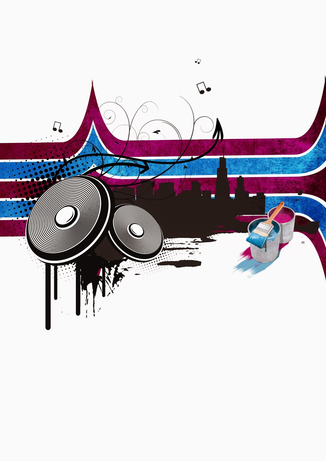
After experimenting with different grunge textures, I decided to forge a new graphic which involved the production of paint buckets. I felt that the paint buckets would amplify the meaning behind the collage which is punk/rock. By using the pen tool I was able to forge paint buckets, and by adding a subtle drop shadow I create create a sense of 3D.
Additionally, following the similar technique with the original pink/blue graphic I added a texture via the paste special technique to the paintbuckets to remove the bright colours of the element. I feel that the paint buckets could relate to the graffiti of the pink/blue graphic. I was able to emphasize this further by using a paintbrush to draw blue and pink strokes below the paint buckets.

Building upon the paint foundation in the previous image, I decided to involve another technique. I used the same technique in which I conducted the paint strokes. I duplicated and enlarged the strokes to a fairly large size. As you can see in this image I placed the strokes on top the blue/pink graphic to generate a further sense of dripping paint. I was able to achieve this by changing the blending mode to Hue. Additionally I feel that the addition of this technique exaggerates the grunge/punk feel massively. I feel that the grunge theme contrasts successfully with the vector theme of the speakers and city.

The final development stage with the construction of my collage consisted of improving the background. I wanted to avoid filling up the white space as I believe it complements my collage effectively. Instead I took one of my texture photographs and placed it in the background for my collage. I experimented with the horizontal and vertical flip positions, and added some additional faint paint brush strokes with an extremely reduced opacity (5 - 10%) to darken areas of the texture.
Collage Experiments & Development

I began exploring a range of different elements and potential experiments I could conduct to achieve a more powerful atmosphere and impact for my collage. The first experiments consisted of altering the proportions, position and size values of one of my primary elements: the streaks. The first image shows the streaks in a vertical position rather than a horizontal plane. I was able to alter the rotation of the image by merging all desired elements, rasterizing the elements if necessary and then using the free transform tool, and holding shift to ensure that the rotation values would stay in sync.
The second image shows a secondary alternative the the positional change of the streak. Following the similar techniques that I listed above I could rotate the streak into a slightly slanted view which I believe improves the rural/urban/punk theme as slanted visuals could suggest a more rebellious structure. Additionally when performing the free transform technique, I ensured to release the shift key as this allows for more diversity and precision in terms of creating a more randomized structure for the streak which ultimately improves the urban/punk theme.
The third image shows a third alternative to the positional value of the streak. Following similar techniques as listed above I was able to rotate the streak in a more diagonal value, in which I duplicated the streak layer and flipped the layer horizontally. This enabled me to create a mirrored version of the streak which ensures consistency. I believe that the first and third images feel a little overwhelming compared to the second image due to the portrait view extending the length in the first image, and the duplication which creates a more complex design.

I began altering the colours of my collage to attempt to create a range of interesting unique appeals. The first image shows the colours altered to a toxic green and bright purple which I believe promotes a more darker, sewer theme. The colours contrast quite effectively similar to that of the pink/light blue with a bright, vivid appeal. The colours promote a more dangerous theme which could relate to the urban/punk theme. The second image shows a more agressive colour scheme with increased colour intensity for the pink/light blue to create a red/darker blue. This adds more impact to my collage and could be effective in terms of increasing impact levels. Arguably the colours represent the American flag and could suggest an Americanized theme. The third image shows an experiment with the colours of green and an orange/brown theme. Unfortunately the colour scheme deteriorates from the original theme and arguably would be more suitable for a grassland/nature genre.
I was able to achieve these different colours schemes by conducting a plethora of techniques, in which consists of curves, colour balance, levels and hue & saturation. These colour correction techniques each come with their own unique UI in which they can ultimately achieve some interesting effects.

I began exploring some alternatives to colour correction methods which consisted of blending modes and inverting techniques. The first image shows my collage in a black and white colour scheme as opposed to the pink/blue colour scheme previously. I believe that this adds impact to my collage overall, however the lack of colour may decrease the effectiveness of the paint genre from my collage. I was able to achieve this appeal by applying the black and white effect as the top layer in the layer palette. The second image shows my attempt at applying an inverted effect to my collage. The invert effect coloured the background with a darker black colour, and the city and paint elements in a white colour which proved to be an interesting result. Unfortunately I believe that the weakest section of this technique was the colour of the streaks. The colours resulted in an orange/green scheme which, like I discussed previously, promotes a more nature theme rather than a rural/urban/punk theme.
To build upon the foundations in the second image I began exploring alternative techniques to improve the colour scheme for my collage. I was fascinated with the white ink colour as opposed to the standard black colour, and applied a black/white colour effect to the streak layer which contrasts effectively with the white paint allowing the elements to be more visible. Additionally I was able to use the polygonal lasso tool and carefully crop the background layer into two separate elements. I could then duplicate both layers and apply a colour blending option to a pink/blue colour scheme with a darken blending mode. This allowed me to ensure consistency with the colours and keep to my original selected colours.

The first collage shows my exploration with altering the size values of some elements. Using the free transform tool I could increase the size of the primary elements. I explored the process in filling up white space in attempt to create a more impactful appeal. Additionally I re-positioned the streak element to accompany the increased size of the prime element. I feel the enlarged size creates an overwhelming appeal for the design and that a modification of some elements current position or enlargement value may promote effectiveness levels. The second image builds upon this in which I explore a different approach. I perform the paste special technique in which can be conducted by selecting the streak layer, hitting CTRL A to select all the contents, selecting the remainder of the elements layer (which has to be pre-merged) selecting the pixels and advancing to paste special; paste into.
Alternatively due to the dark background, by changing the blending mode to a soft light or lighten you can achieve a similar result. The technique itself create an interesting effect in which ensures the genre of the collage as well as reducing complexity levels, allowing the collage to be smoother on the eyes. The third image shows my exploration with flipping various elements and visuals on a horizontal plane. I was able to gain understanding in how my collage may look from a completely different perspective. From conducting this technique I was also able to develop an inspiration for various other image manipulation techniques and processes.

I explored various other image manipulation techniques which involve the modification of the elements within the current composition. I was able to achieve a range of unique composition changes and perspectives. The first image shows a drastic change in the position of the elements. I began building upon the vertical position of the streak visual as opposed to the horizontal position. I placed the speakers element at a downwards position, separated from the main city element. I placed the city element at the top of the streak which could suggest that the streak is a build up to the volume of music. Unfortunately I believe this design lacks initial impact due to the further separation from most of the elements. Additionally the visuals are placed in a position in which white space is consumed much more increasingly than compared to my previous designs in which I feel that the collage suffers from this.
To restore some of the initial impact of the collage I began building upon my original postions for my collage. I was able to achieve this by duplicating and enlarging the speaker visual where I was able to promote the music theme more effectively. Due to the enlargement of the speakers I believe that the element took impact and effectiveness levels from the remainder of the collage away. The third image show my next attempt at manipulating various values. I was able to build upon the positives in my experiments as well as avoid techniques that could create a negative approach. The collage itself branches diagonally from the top left which ensures the compact nature of the collage while not being too overwhelming on the eyes. I merged some of the paint and city elements into the streak graphic by performing a paste special technique on the grunge texture for the streak. This allows for the elements to merge effectively with the remainder of the collage which ultimately promotes the compact nature, reinforcing the initial impact. Additionally I experimented with the colours of the paint splat and halftone audio graphics from a black to a pink/light blue which not only ensures consistency but brightens up the overall collage as a whole.
Final Collage 1

My first collage focuses on a very minimalist colour scheme in order to promote the genres of the collage effectively. The colours consist of pink, blue and with different shades of black/white effectively. I believe that by ensuring a minimal amount of colour, the collage appears less overwhelming and more structured for the viewer. The main elements in this collage are the speakers, my silhouette city, the streaks and the paint splats. From careful positioning, and experimentation through image manipulation techniques such as positional, scale and orientation values I was able to achieve a collage which successfully promotes the urban/punk/graffiti themes.

I wanted to select this collage as an alternative (second collage) to my first final collage. I was able to create this version of my collage through my development and experimentation through different techniques. i feel this collage offers a much more unique perspective compared to the original. The original collage offers a more horizontal layout whereas this collage challenges a unique approach to the layout (diagonally) which I believe enhances the effectiveness of the collage as a whole.
Collage Development

I began producing my second collage featuring off some abstract shapes I created. I created a new A3 document on a portrait perspective. I was able to create the shapes with the pen tool. I was able to create some abstract shapes that feel sharp, and have a straight appearance. I decreased the size of the shapes and placed it in the center of the composition.

Using the pen tool I was able to further develop some abstract shapes following the sharp style. After I had spent some time on the shapes I produced some fairly complex shapes. Additionally I was able to develop my ability in using the pen tool with precision. The abstract nature of the shapes could suggest a speed/car theme.
My original intention with these shapes were to create some designs that would inspire a punk or skater theme, which is building from my previous collage. I enlarged the size of this abstract shape to fill up some more white space and develop a sense of depth and diversity within my collage.

I continued to produce some abstract shapes, this time I used the shift key to create a slightly curved shape. Although this shape was randomized I feel that it resembles that of a tunnel, with a road that is following through. I played this shape atop the remaining layers at a slightly deceased size to allow it to blend in more effectively.


I applied a radial gradient to the abstract shapes to develop a sense of depth. I was able to do this by right clicking on the layer icon in the layer palette, and selecting select pixels. I then selected the gradient tool and changed the colours from a black to a mid-blue. I could then compose a gradient which creates a center point of black colours in the center of the image which draws the eyes to the center of the collage.

I removed an abstract shape as I thought that the shape looked out of place compared with the rest of the abstract shape. By removing this shape I was able to recover the shape, straight artistic style with the shapes, which ultimately represents speed/skating more effectively.
Additionally I advanced to edit - transform and flipped the image on a horizontal scale. I believe that the flipping process of the collage will enable additional graphics to blend in and feel more smooth when placed into the composition.

I was interested in attempting the vector style in my collage for a second time, as I was really interested in the process. I took a screenshot from my 3D city that I composed in After Effects and placed it into Photoshop. I could then proceed to vectorize the image, however this time around I selected the windows and placed them on a separate layer. This enabled me to colourize the windows to a white colour which adds more detail to my collage, unlike my previous collage where the city element is completely darkened and has no window detail.

To emphasize the punk theme more effectively I began creating some additional grunge vector graphics that would promote this. I was inspired by some of the previous collages I had researched in regards to the arrows, so I attempted to produce my own elements.
I was able to achieve this by taking the shape tool in which I drew a rectangle. I was then able to use the skew transform tool and warp the images proportions and position values to create the illusion that the shapes are expanding outwards from the city, reflecting that of a shadow. I could then perform a paste special and paste into technique to import a grunge texture into the rectangles, similarly to the technique used with the arrows. This helps promote the grunge elements ultimately emphasizing the punk/urban city nature.


The next graphical element that I created was a road. There were a plethora of ways to compose this, including photography and digital techniques, however due to the simplistic nature of the road I decided to create the graphic in Photoshop with the shape tool. I could forge the road simply by drawing a rectangle and rotating it's proportions so it appears it's linked with the city. I could use a smaller version of the rectangles in white colour to create the road dividers.
Although a small vector element I feel that the road is an effective graphic due to it's length. Additionally I ensured that the road would extend long enough to reach outside the collage to create a sense of travel and diversity.


I began adding colour to my collage. Throughout the design process I was sure to leave a heavy amount of white space to increase the effectiveness of my overall collage. Additionally the compact nature of the collage contrasts with the remainder of the white spacing emphasizing the impact further. I began to add some colour to my collage's background in which removed some of the blandness that the white background had held. I selected a radial gradient and selected the colours white and sky blue in which I was able to colour the centre of the collage with a white colour which draws attention to the center placing additional impact on the main graphics.

Similarly to my previous collage I felt adding a texture to the background would increase effectiveness and promote the genres of punk/urban/skating/music. I was able to achieve this by selecting one of my textures and placing it into the composition. I moved the layer to the bottom of the layer palette in which I could experiment with the opacity levels and blending modes to decrease the overall harshness of the texture and create a very subtle appeal.
Collage Experiments & Development

I explored a range of different blending modes and image adjustments for my collage. Blending modes would generally consist of (soft,hard,vivid,linear) Lights, or other varying modes such as darken, lighten or overlay. From experimenting with the different blending modes I was able to achieve unique looks for my collage. The first collage uses a hue blending mode from which adds a much more vivid and bright appeal to my collage compared to the original. Additionally by placing the layer as the first layer in the layer palette I could apply a subtle texture gradient to the main collage itself. I believe that this was effective as it acquired the perfect balance in creating a more impacting appeal, yet not appearing too overwhelming for the viewer. The hue blending mode acts as a colour fill replacement for the collage which can be combined with other colours to create interesting effects.
I expanded on this experimentation in the second image where I applied a difference blending mode, in combination with an inverted adjustment. This not only reversed the brightness levels of the background but changed the colour scheme for the primary elements. The first notable change is the orange colours within the abstract shapes, and the second is the white/grey gradients over the city and remaining elements. feel this creates an interesting colour scheme, however the orange colours reduce the original urban/punk genre of my collage, and instead could be relating to an autumn or summer theme. Additionally the dark background removes the the initial drawing of attention from the eyes, as opposed to the other examples which have a soft white spot in the center of the image. The third example takes a step back from the other images, and instead replaces the layer at the bottom of the layer palette. From doing this I have removed the texture on the primary elements and created a more intense colour for the main element. Overall the background itself places a slightly darker grungy theme on the image, emphasizing the urban theme more than the original versions.

This screenshot shows my exportation with the different grunge textures that I had gathered. I had noticed that each texture when applied grants a slightly different appeal. The first image for example creates a slightly more subtle grunge genre, and is soothing on the eyes for the viewer. Unfortunately due to the darker elements within the texture some of the highlighted elements, (the soft light in the center of the image) is more difficult to see, and as a result may reduce the level of initial impact of the collage.
I build upon these errors in the second image in which I explore a different texture and apply some colour correction adjustments in which to brighten up the image. Colour correction techniques involve the use of blending modes (lights etc) or curves/levels. Although these effects are subtle they had a heavier impact on the collage a s a whole. The texture in this image feels to resemble that of ice and could represent the season eg winter. Arguably the cold texture could relate to the genre of the collage being urban/punk and reinforce the cold rebellious nature of punks or the city. Another interesting effect in this collage is the use additional colour on the abstract shapes and the radio player. The use of colour correction techniques severely brighten up these images which I believe creates a more effective impacting appeal. I attempted to tone down some of the brighter elements in the third image with a different texture applied with the same colour correction techniques. Unfortunately the texture didn't work with the collage. It ended up in emitting a harsh bright center, with too little darker elements which creates the illusion that the collage is presented in a photo frame.

I began exploring different colour schemes for my collage. I was able to achieve a range of different colours for my collage by applying a curves adjustment or a hue and saturation adjustment. I could then adjust the brightness/darkness values in combination with the actual colour of the composition. The first colour I experimented with was a green which in my opinion doesn't fit the theme of the collage, instead promotes a more nature genre.
The second colour I experimented with was an orange colour with a subtle touch of brown. I feel that the orange colour on the abstract shapes are quite effective and promote the theme of the urban city, however the colour for the remainder of the background is a little too bright, even when accompanied with the grunge background, and create a touch of summer/relaxation theme. The red and purple/pink colour improve on this slightly however, due to their bright and vivid nature I believe that they would be more effective in promoting a club/dance theme rather than the urban/rural nature of the city. In conclusion the blue colour of collage would be most powerful in terms of promoting the genre due to it's neutral appeal.

This screenshot shows images of my exploration of various other image manipulation techniques which largely involve the enlargement, and alterations of elements/visuals including size values, position and oreintation. In the first image I explore the duplication of the abstract shape element. I duplicated the layer (ctrl J) and was applied a transform adjustment and flipped the image vertically. I avoided selecting the arrow layers to avoid filling up the space too much. Unfortunately I feel that the duplication of this abstract shape is unnecessary and could overwhelm the viewer. To attempt to reduce the cluster of visuals I reduced the opacity however the image still felt too clustered with visuals.
In the second image I attempt to explore a completely different approach to the collage. I enlarged the volume levels element and placed it at the bottom of the collage. Additionally I duplicated the speaker element and placed it on top of the volume levels element. I then proceeded to alter the proportions of the abstract shapes to attempt to create a completely new approach. I enlarged the speaker element to make up for the lack of elements in the center of the image. Unfortunately this collage resulted in appearing too random. I noticed a lack of impact from the collage due to the reduced white space and more spread positioning of shapes. I learnt that creating a compact collage with clever positioning and enlargement values create a more successful collage.
I built upon my mistakes from the second collage and began exploring additional methods and techniques to produce an effective alternate perspective for my collage. I began by flipping the city element on a horizontal scale. Additionally I applied the same technique to the textured bottom image. I then enlarged the speaker element and placed it behind the city element to create the suggestion that the music is playing throughout the city. I reduced the size of the volume levels visual and placed it on the side of the city to emphasize this further. Additionally I altered the proportions of the abstract shapes further. I altered the proportions in such a position which placed further emphasis on the speaker element. I produced some additional visuals for the production of this version. The additional visuals consist of the halftone audio circles. I was inspired by this from my previous collage, in which I placed behind the speaker element to add enhanced emphasis on the genre of music. Another subtle visual I produced for this collage is the audio waves. I was able to produce this by selecting the circle tool and holding shift produce a circle with equal proportions (with a stroke depth of 5px). I could then duplicate the layer and increase the size multiple times to forge the audio waves. I decreased the opacity level and was able to generate the illusion that the audio waves were expanding which suggests the loud volume of the music. In conclusion I feel that the compact nature of the collage is most effective in terms of promoting the genre, attracting an audience and in general enhances the overall impact of the visuals within.

I wanted to develop my inspiration to create a compact collage from the previous screenshot of images. After creating a collage through a range of different perspectives, I wanted to develop my collage through different techniques and processes. The first collage shows my exploration with different visuals. I selected one of the smaller visuals (the star) and enlarged the image through the transform tool. I then placed the start behind the city layer to further imply the rebellious nature of punks in the urban city. To ensure the genre of music I added the speaker visual with a slanted position on the right section of the collage. Additionally I changed the colour of the star to match that of the previous abstract shape colour to ensure consistency. The most interesting element with this design was the use of volume levels in the collage. I changed the position of the volume levels and placed them below the city layer. I changed the blending mode to a colour burn which changed some of the colour to a white. I feel this abnormal appeal is an effective technique to create some anomalous visuals.
I began exploring these techniques further with the second and third images. In the second image I reverse the position of the volume levels and place them at the top of the collage. Additionally I re-visit the use of abstract shapes and experiment with their position at the bottom of the collage. Unfortunately the felt out of place, and caused unnecessary clutter within the composition. I expanded on this on the third image in which I placed the abstract shapes at the top of the collage which creates a border like effect without eliminating too much of the white space. Following the technique from the first image I use a colour burn on a blue colour to create the abnormal perspective of the white crossover colour with the blue. Additionally I placed the arrows I had created to the right of the collage to add some additional diversity and increase the compactness levels. In this image you can see my development from the previous images as I include volume levels visuals at the top and bottom sections of the city, as I believe it successfully promotes the music theme within the urban theme, while not overwhelming the viewer completely.
Final Collage 2

This image shows my second collage in relation to the urban theme. I challenged a more strict colour scheme with this collage. Although I experimented with other various colours I feel that by selecting blue as a primary colour i was able to achieve my desired genre more effectively. This collage consists of a more compact design compared to my first collage. The main elements consist of my advanced silhouette city in which I was able to construct through 3D modelling techniques, the abstract shapes which proved to be an interesting challenge, as well as returning musical elements such as the speakers, and new appearing ones such as the volume levels. I believe that due to the increased volume of visuals this collage could promote a more lively and loud city compared to my previous collage.

After exploring techniques and processes with this collage I developed an alternative second version of my second final collage. This design follows a similar layout in regards to the original, however with a flipped horizontal image canvas, and an enlarged scale for the speaker element which makes it one of the primal elements in the scene. This version of the collage focuses more on the musical theme compared to the original due to the larger emphasis on the music elements.
Design Report
After the production of my music festival poster in
Unit 4, I was excited to begin developing another poster in Unit 34. I began by
conducting comprehensive research of a range of pre-existing posters, which
included both related and non-related posters. I was able to develop an
understanding on the composition and layout of what makes an effective
poster. As the genre differed from my
previous poster’s genre I found the task originally to be challenging. However
after conducing research I quickly became aware of the importance of selecting
colours, visuals and graphics to create
the fun, colourful theme of Womad. Additionally I composed a range of mood
boards that demonstrate the multi cultural theme of Womad. I began exploring a
range of elements that could be effective to produce and generate visuals such
as a textured background, borders or general graphics. A recurring element
within the posters was the use of vivid colours which promote the theme. Not
only do they successfully promote the theme of fun and lively but they catch
the viewers attention and attract them poster.
I began developing visuals for my poster, which
largely consisted of vector images. I wanted to explore the use of vector
images, as they were a new visual for me personally. I was able to use the
images effectively with bright colours to promote the genre and theme of the
festival. A visual element that I found powerful for my poster was the sun
rays. Not only do they emit a colourful playful appeal, but they also signify
the object of interest. Additionally they could be an effective element to fill
some unnecessary white space within the poster.
I was able to
capture the target audience of my poster by ensuring the use of bright colours
and vector images. The poster could appeal to a family while still presenting
all the necessary information.
Additionally I focused on the use of the rule of thirds to ensure a
consistent layout for my poster. I was able to create the illusion of a complex
image through using a multitude of visuals and other elements. I learnt the
importance of careful positioning and experimentation to forge an interesting
layout. An element in which I struggled with through the production of my
poster was the typeface. I had selected a typeface which entailed a bold, large
appeal which not only promotes the theme of the festival, but attracts the eye
effectively. I encountered issues selecting an appropriate colour for the typeface
that my blog demonstrates. I explored a range of different colours to attempt
to compliment the theme while staying true to capturing the eye, however all
colours felt underwhelming. To recover this I explored lighter colours as
opposed to darker colours, in which amplifies the impact of the poster as a
whole. The production of the poster was a fun yet challenging process in which
I was able to explore a new art style aspect – vector styles. I believe through
my development of positioning layout, typeface research and coloiur experiments
I have successfully produced a colourful, fun womad poster that promotes the
fun atmosphere of Womad, while capturing the audiences attention respectively.
Initially at the beginning of this Unit I struggled to
comprehend the elements of what compose a strong collage. I practiced my
ability in constructing a strong collage through various themes such as nature,
abstract and rural. I was able to grasp the foundations in what makes a
powerful collage. I began the collage
task by conducting research of various collages. I developed my understanding
in using visual elements to manipulate images and create interesting effects. I
also composed a design proposal in which I listed my most interested genres,
which followed music, fear, retro gaming and urban/punk. After evaluating
existing collages I became more accustomed to a merged theme of
urban/rural/punk/music, and wanted to challenge my ability to produce an
appealing collage. I became more inspired after researching similar
pre-existing collages. I extended my research to collages that relate to my
desired theme. I noticed the clever manipulation with white space within the
collages, and learnt how producing a multitude of simplistic shapes or images
and manipulating them through careful positioning and scale enlargement can
produce a fairly complex image. I was inspired by the design layout and
illusion of complexity that had been forged in the collages, which ultimately
lead me towards the vector art style.
I began building upon these foundations in my designs
in which I experimented with various elements that I had taken an interest to
through my research. Elements consisted of musical notes, abstract shapes and
arrows. I explored the positioning of these shapes and how altering proportions
or linking shapes together could forge interesting visuals. I found the design
process an interesting task as I was able to demonstrate my ideas visually on
paper, which allowed me to not only record my current ideas, but develop an
understanding and inspiration in how to progress my ideas further into more
complex images. A recurring element that
I had consistently used throughout my designs was the silhouette city. I
believe that the silhouette city became more apparent through my collage
development, especially after the 3D modeling process. Throughout the design
process I was also able to practice my inspired collage layout, which focuses
on the manipulation of the advantage of white space. I realized the importance
of careful positing elements, which I demonstrated throughout my progress.
I wanted to challenge my ability in using the pen tool
through my visual element development. I
began conducting a range of abstract shapes on paper originally, which later
progressed into digital development. The
process of composing abstract shapes was a very surrealistic process. I
approached the drawings with an empty mind, meaning I explored potential with
conducting shapes that appear random through a stream of consciousness. I later progressed to develop my abstract
shapes digitally, in which I challenged my ability with the pen tool in
Photoshop. Not only was I was to learn the art of precision, but also time
management even with tasks that appear less daunting originally. I had also composed a range of ink splats
through various techniques physically.
Techniques consist of flicking the paintbrush over a desired material
while applying a specific controlled level of force. Different levels of
applied force generated different effects, which results into endless
possibilities with the technique. The ink splat process itself was a new and
fun process for me as I was able to develop an understanding of the importance of
experimenting with elements physically in order to enhance digital impact
later. After importing my elements into Photoshop, the scale and positioning of
splats could be altered to create an appealing effect. Specific ink splats
could be selected through the polygonal lasso, or shape selection tool.
Additionally by applying a colour overlay to the ink splat layer, the solidity
of the ink splat contents were intensified, which allowed them to become vectored,
ultimately leading to a potential suited graphic for my desired genre. Overall
I believe the ink splat visuals promote the rebellious theme of a punk, in
which you might find in an urban/rural environment of a city.
The primal visual element for my collage included the
production of a 3D city in Adobe After Effects. Initially I was torn between
the decision of designing a silhouette city with the pen tool, or to create a
city digitally. I selected the more technically challenging route as I believe
that the production of a 3D city enabled me to produce a more advanced city.
The primary process involved consisted of manipulating 2D textures and elements
to forge a realistic city in 3D space. I was challenged with developing my
ability with working in 3D space, which required thinking to establish through the
XYZ axis, rather than just the XY. After rendering out my city from After
Effects I could import the image into Photoshop, where I could select buildings
or sections of the city that was on an angle. Following this by applying a
stamp filter or a colour overlay I could transform the image into a vector
image, and produce a silhouette city. The process of the production of the city
within After Effects allowed me to explore the city from endless perspectives
and angles. This allows me to create entirely unique vectored cities that would
be appropriate for my collage.
The production of my collage proved most challenging
as I initially found the process of composing an effective collage difficult. I
was able to explore the impact of positioning and scale enlargement of abstract
shapes within the composition. Additionally I explored the use of colours,
which is a core element within my designs. I ensured the use of a limited
amount of colours for consistency and fluidity with my collages. The first
collage mostly uses a pink/blue colour scheme with different shades of black
and white, whereas the second collage reduces the amount of colours further to
shades of blue, and black/white.
Additionally the use of reduced amounts of colour ensures the collage is
not overwhelming for the viewer, and doesn’t deter the viewer away from the
collage. Both my collages feature a grunge texture in which I captured myself
through various walls, floors, or other objects. I experimented with the
textures in my collage through different blending modes and layer positioning
within the layer palette. This allowed me to explore different lighten
potentials, as well as different colouring hints. Additionally I feel that the
joint art style of vector images and grunge images successfully promote my
genres of music/urban styles. Initially I struggled primarily with the
positioning of the images and elements, which my blog shows, additionally to
complement my experiments I explored different locations and positions for my
graphics. I explored a range of
positioning experiments for elements which largely included performing
techniques such as flipping the image canvas vertically or horizontally or
using the transform tool. Both collages feature experimentation with the
abstract shapes positioning as I believe this is a primal element which
composed the collage.
Overall I I have developed my ability to compose an
effective collage to a higher standard in which it was originally; I believe my
blog demonstrates my development when compared to some of the earlier collages
I had composed. My work relates to my research effectively through it’s art
style (vector). Additionally I have expanded on my inspiration further by
exploring grunge textures that compliment my themes of my collages (rural/urban/punk).
Another element that is apparent through my development process is the use of
abstract shapes. I was able to take my inspiration that I obtained through my
research and develop my own abstract shapes both physically and digitally,
which I then used to forge my collages. I was also able to develop an
understanding for the use of white space and image manipulation. I demonstrate
this through the use of my own grunge textures, ink splats and the most
challenging visual element; the city. However, in contrast; if I had more time I would have like to explored additional techniques to fill up white space within my first collage, like I did with my second, and develop a more defined sense of story. I believe this is my weakest point in this unit. I was able to develop my
ability in working in 3D space and compose a very convincing city. In
conclusion I have explored a range of different elements throughout the collage
task. I developed inspiration and understanding of composition of collages through
my comprehensive research of pre-existing collages, and then use my inspiration
to practice my ideas and develop them further both digitally and physically to
produce a visually appealing mixed media collage. If I had to grade myself for this Unit, I
would grade myself a Distinction.
No comments:
Post a Comment